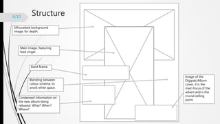
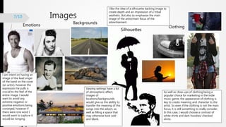
Initial Response (Magazine
Ad)
Abigail Kernaghan
Structure6/10
Silhouetted background
image; for depth.
Main image, featuring
lead singer.
Band Name
Blending between
colour scheme, to
avoid white space.
Condensed information on
the new album being
released. What? When?
Where?
Image of the
Digipak/Album
cover, it is the
main focus of the
advert and is the
crucial selling
point.
Images
Emotions
Backgrounds
Silhouettes
Clothing
7/10
I like the idea of a silhouette backing image to
create depth and an impression of a tribal
aesthetic. But also to emphasise the main
image of the artist/main focus of the
advertisement.
As well as close-ups of clothing being a
popular choice for marketing in the indie
music genre, the appearance of clothing is
key to create meaning and character to the
artist. So even if the clothing is not the main
focus, it is still something to really consider.
In this case, I would choose a contrast of
white shirts and dark hoodies/ checked
shirts.
Varying settings have a lot
of atmospheric effect,
images of
locations/backgrounds
would give us the ability to
transfer the meaning of the
songs into the advert, as
well as filling a space that
may otherwise look odd
and blank.
I am intent on having an
image of the lead singer
of the band on the cover
(an actor), however the
expression he pulls is
crucial to the feel of the
entire image. I would
want to avoid any
extreme negative or
positive emotions being
conveyed, however if
there were one word I
would want to capture it
would be: longing.
Font
Heading Information
Heading
Heading
Heading
Information
Information
Information
7/10
I like a combination of a few of
these fonts. I would have to
decide between having an
individual letter in a bold and
effective font [Left, 2] and then
continuing the heading in a
simplistic font [Left, 3]. OR
using the band’s logo from my
Digipak as the heading of the
advertisement.
My favourite of these
fonts is Lucida Console
[Right, 3] as it is
uniformed enough to
show structure and a
more mature context, but
interesting enough to be
used to display important
information on a
magazine article.
Colour scheme
10/10
Content10/10
The main message of the magazine
advert for my band, song and artist
will consist of the release of the new
album. It will therefore include an
image of the album cover at the
bottom with some additional
information to do with purchase.
I would like the feeling from the
main image to be fairly
mysterious, and include a profile
image of at least one member of
the band. The expression of
longing/quiet determination.
With a full body shot to include
all articles of clothing to create
depth of character.
Given that the name of the album (which I
changed) is ‘Rituals’. I believe that images and
themes that mimic this name would be highly
effective. This could be something as blatant as
a ritual symbol, or a more subtle silhouetted
image of people that could possibly be
performing a ritual, or undertaking a tribal-style
pose.
The colour scheme could be
connected across all formats of my
coursework. Therefore similar
colours that I would like to use for
my digipak and music video. These
include grayscale with a pop of
vibrant colour (to avoid being
dull), combined with the influence
of nature and natural elements.
The reason for this is that the
setting for the video is being
stripped back to nature, to show
the raw emotion and desperation
of the characters.
To create depth to the images and to grab readers
attention I am using the contrast between a silhouetted
background, and a full colour, full body image of the lead
singer with an easily interpreted expression. This is to
create a balance between abstract and physical, which I
think conveys the feel of alternative indie-pop. Combining
the literal and theoretical worlds. However, another way
that I could establish depth is through other camera
methods such as planes of focus, lighting and space.
Therefore making the background image more out of
focus, less emphasised by key lighting, and more shallow
use of space.
The proportion of each element is
important, as this conveys varying
significance between the images and
text. But also shows that I can make
the most of the space I have when
designing a product. It needs to be a
balance between lots of detail to peak
interest and prevent dullness, but not
too much that it creates noise for the
reader, and it is unclear what the
selling point is. It is also important that
although there are a few different
components, the photograph of the
lead singer of the band is not
undermined by other features.
Design12/10
BASTILLE
New! Album; Rituals, featuring
the hit singles Pompeii, and
Flaws.
Available on January 1st 2017.
Until then, check out their
Facebook page for interviews
and exclusive information.

Magazine ad initial response

  • 1.
  • 2.
    Structure6/10 Silhouetted background image; fordepth. Main image, featuring lead singer. Band Name Blending between colour scheme, to avoid white space. Condensed information on the new album being released. What? When? Where? Image of the Digipak/Album cover, it is the main focus of the advert and is the crucial selling point.
  • 3.
    Images Emotions Backgrounds Silhouettes Clothing 7/10 I like theidea of a silhouette backing image to create depth and an impression of a tribal aesthetic. But also to emphasise the main image of the artist/main focus of the advertisement. As well as close-ups of clothing being a popular choice for marketing in the indie music genre, the appearance of clothing is key to create meaning and character to the artist. So even if the clothing is not the main focus, it is still something to really consider. In this case, I would choose a contrast of white shirts and dark hoodies/ checked shirts. Varying settings have a lot of atmospheric effect, images of locations/backgrounds would give us the ability to transfer the meaning of the songs into the advert, as well as filling a space that may otherwise look odd and blank. I am intent on having an image of the lead singer of the band on the cover (an actor), however the expression he pulls is crucial to the feel of the entire image. I would want to avoid any extreme negative or positive emotions being conveyed, however if there were one word I would want to capture it would be: longing.
  • 4.
    Font Heading Information Heading Heading Heading Information Information Information 7/10 I likea combination of a few of these fonts. I would have to decide between having an individual letter in a bold and effective font [Left, 2] and then continuing the heading in a simplistic font [Left, 3]. OR using the band’s logo from my Digipak as the heading of the advertisement. My favourite of these fonts is Lucida Console [Right, 3] as it is uniformed enough to show structure and a more mature context, but interesting enough to be used to display important information on a magazine article.
  • 5.
  • 6.
    Content10/10 The main messageof the magazine advert for my band, song and artist will consist of the release of the new album. It will therefore include an image of the album cover at the bottom with some additional information to do with purchase. I would like the feeling from the main image to be fairly mysterious, and include a profile image of at least one member of the band. The expression of longing/quiet determination. With a full body shot to include all articles of clothing to create depth of character. Given that the name of the album (which I changed) is ‘Rituals’. I believe that images and themes that mimic this name would be highly effective. This could be something as blatant as a ritual symbol, or a more subtle silhouetted image of people that could possibly be performing a ritual, or undertaking a tribal-style pose. The colour scheme could be connected across all formats of my coursework. Therefore similar colours that I would like to use for my digipak and music video. These include grayscale with a pop of vibrant colour (to avoid being dull), combined with the influence of nature and natural elements. The reason for this is that the setting for the video is being stripped back to nature, to show the raw emotion and desperation of the characters. To create depth to the images and to grab readers attention I am using the contrast between a silhouetted background, and a full colour, full body image of the lead singer with an easily interpreted expression. This is to create a balance between abstract and physical, which I think conveys the feel of alternative indie-pop. Combining the literal and theoretical worlds. However, another way that I could establish depth is through other camera methods such as planes of focus, lighting and space. Therefore making the background image more out of focus, less emphasised by key lighting, and more shallow use of space. The proportion of each element is important, as this conveys varying significance between the images and text. But also shows that I can make the most of the space I have when designing a product. It needs to be a balance between lots of detail to peak interest and prevent dullness, but not too much that it creates noise for the reader, and it is unclear what the selling point is. It is also important that although there are a few different components, the photograph of the lead singer of the band is not undermined by other features.
  • 7.
    Design12/10 BASTILLE New! Album; Rituals,featuring the hit singles Pompeii, and Flaws. Available on January 1st 2017. Until then, check out their Facebook page for interviews and exclusive information.