Downloaded 221 times
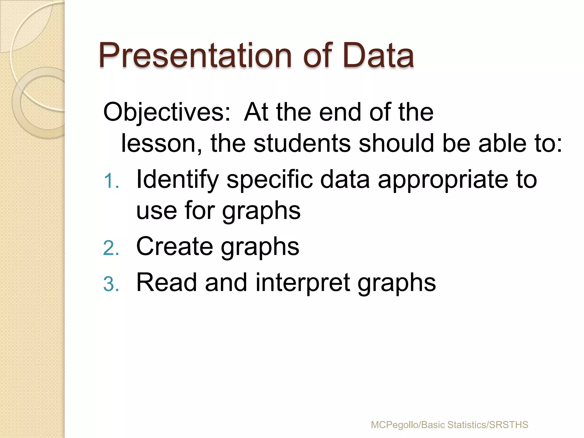
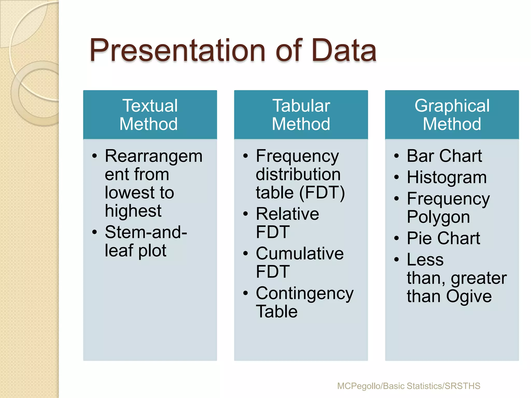
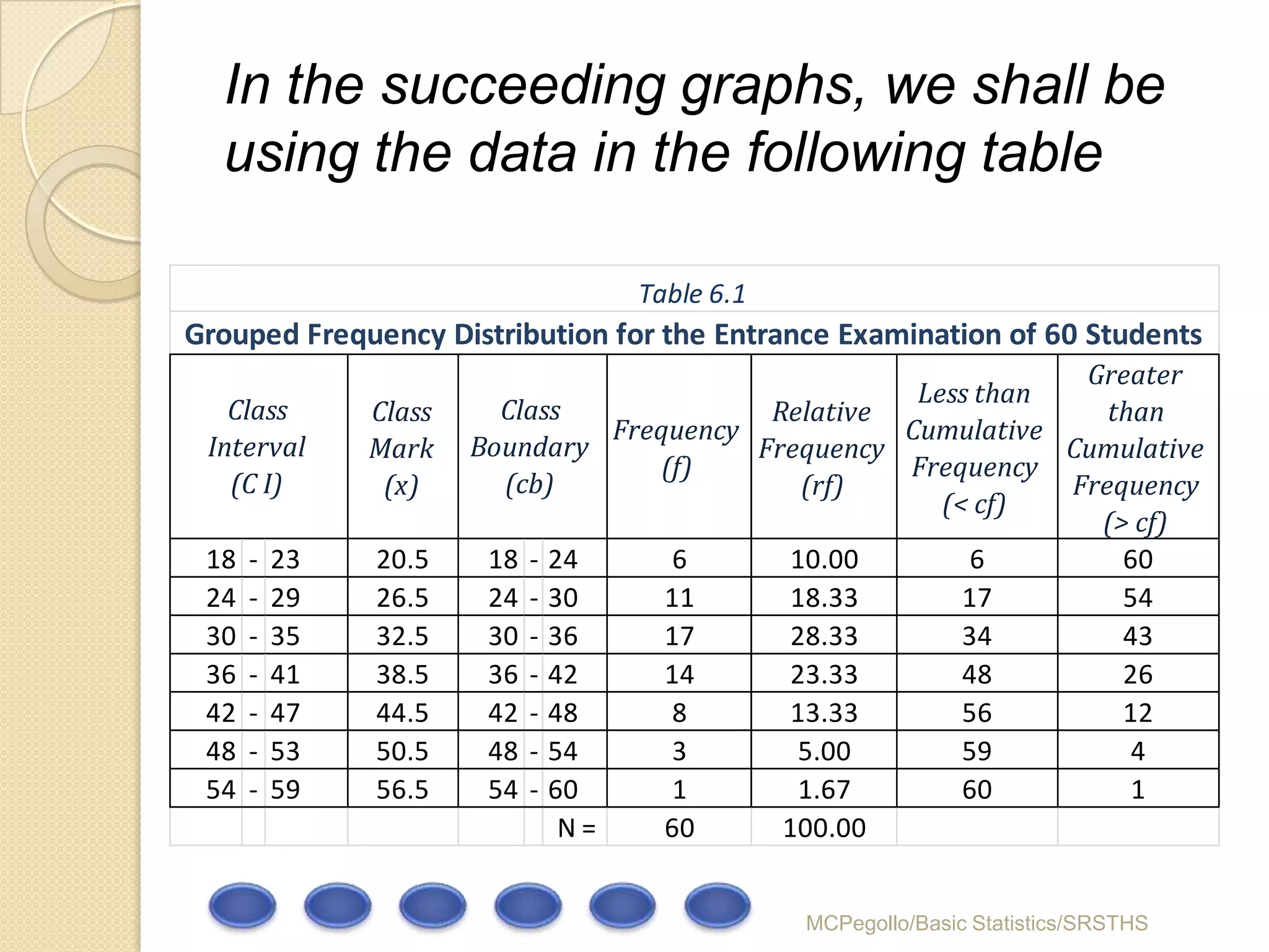
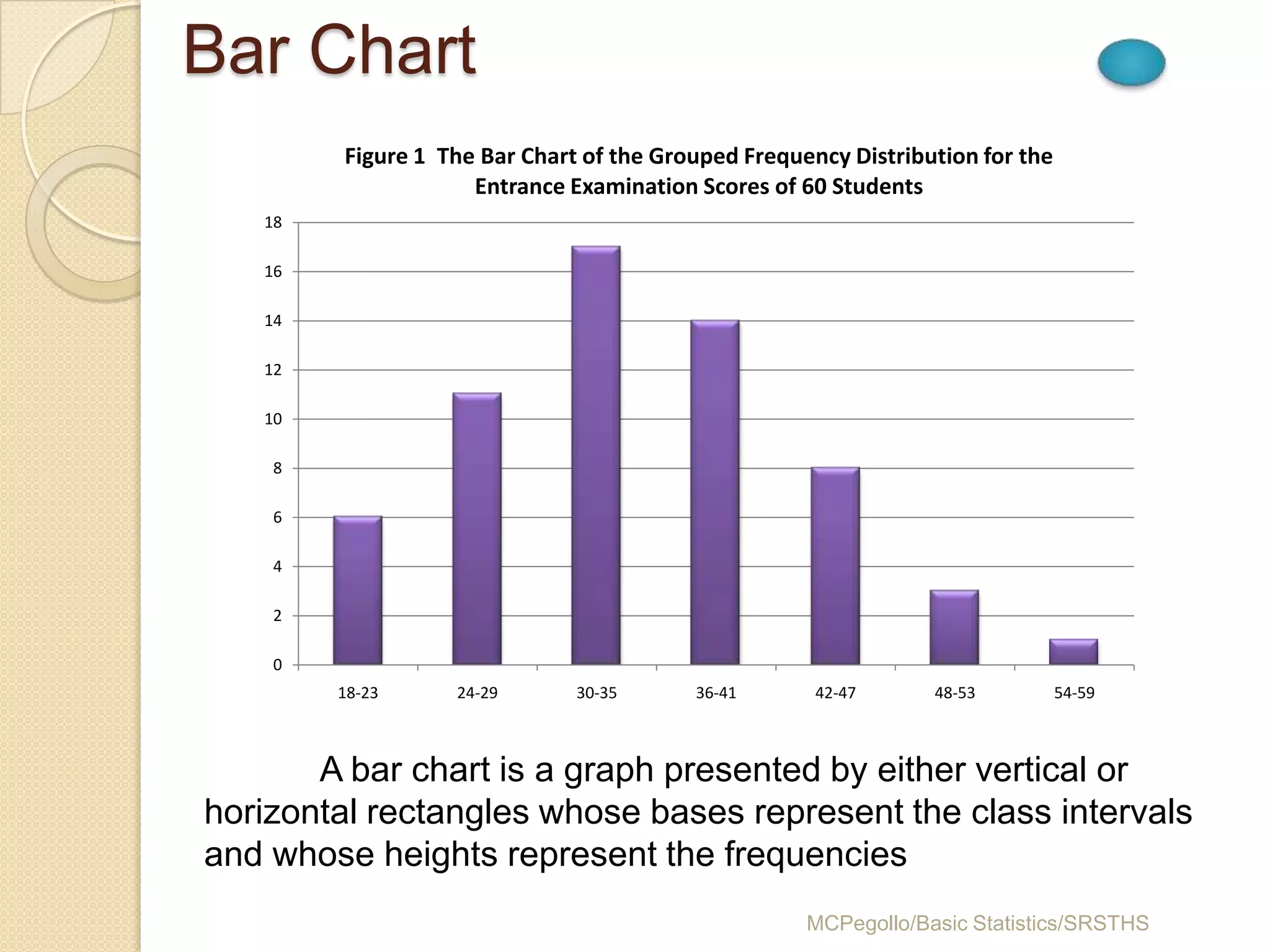
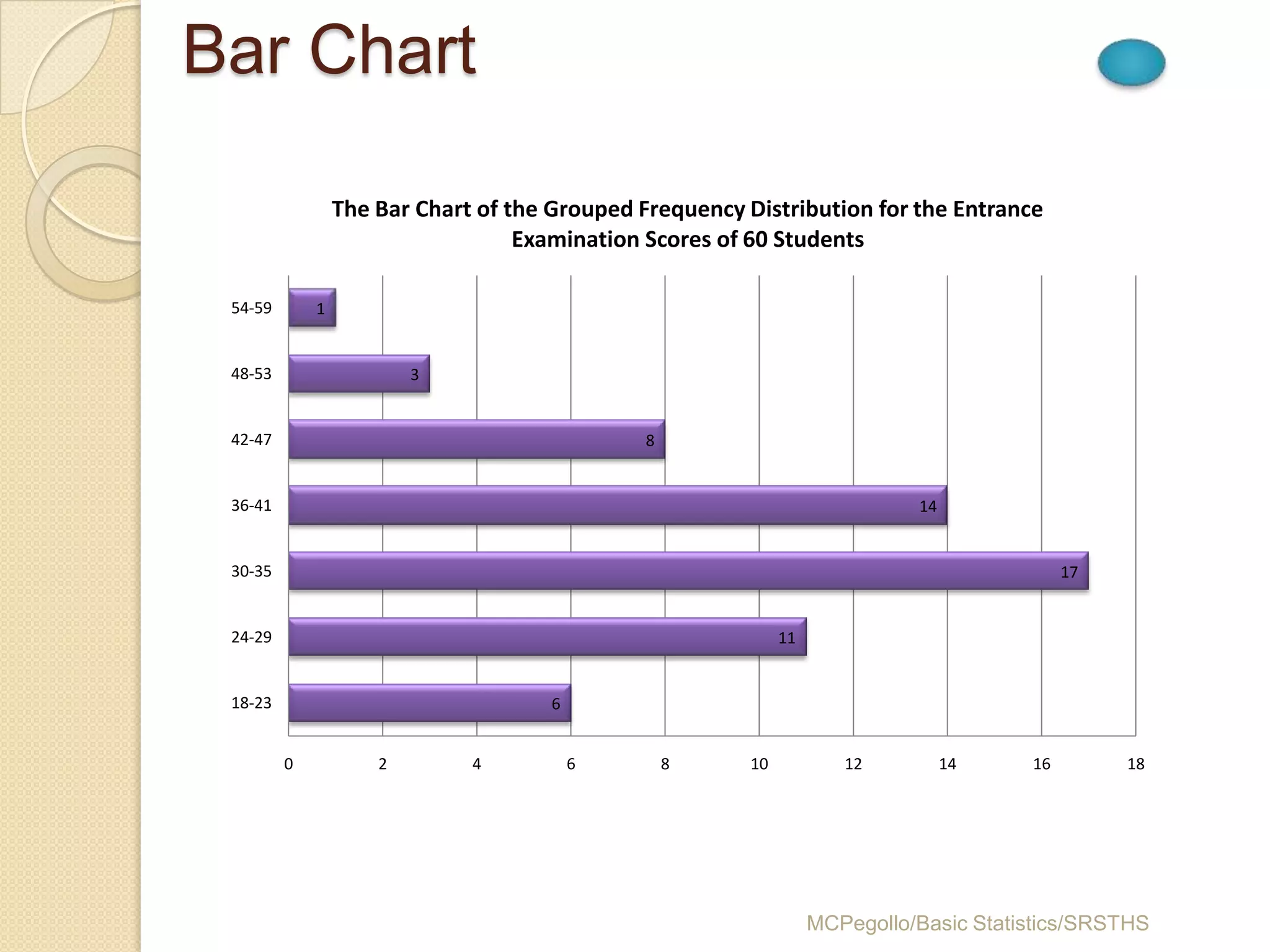
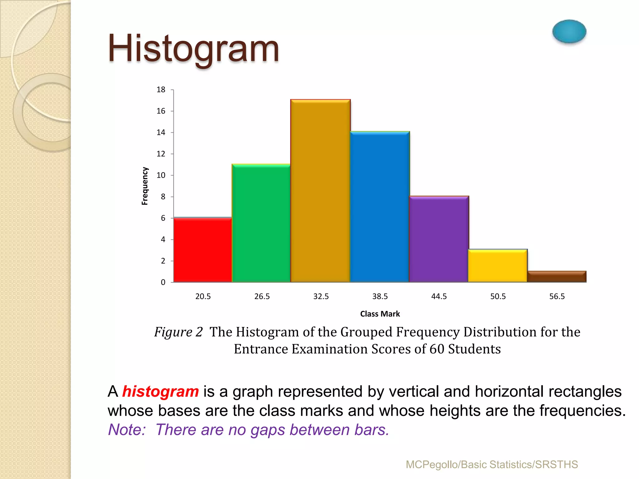
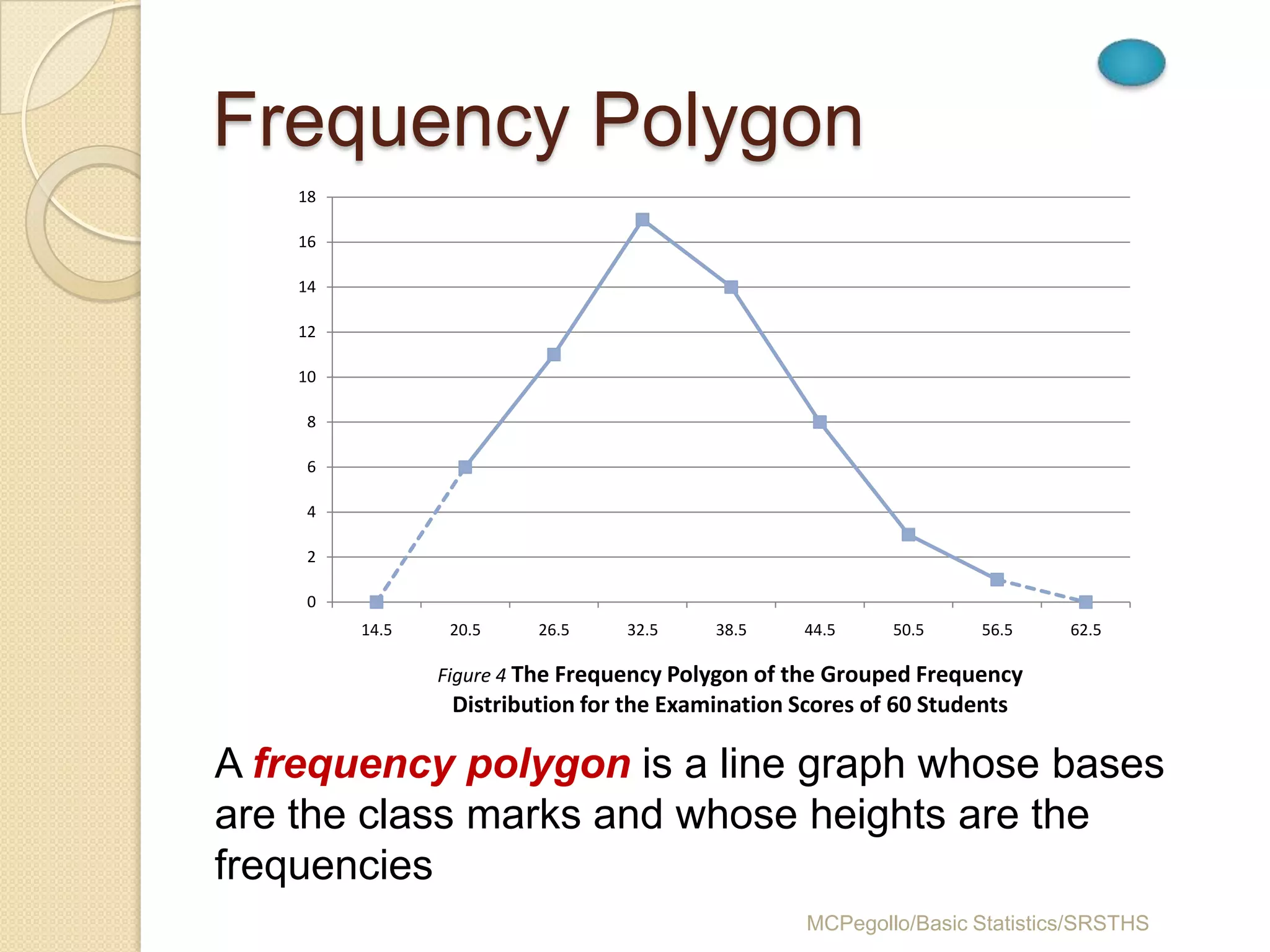
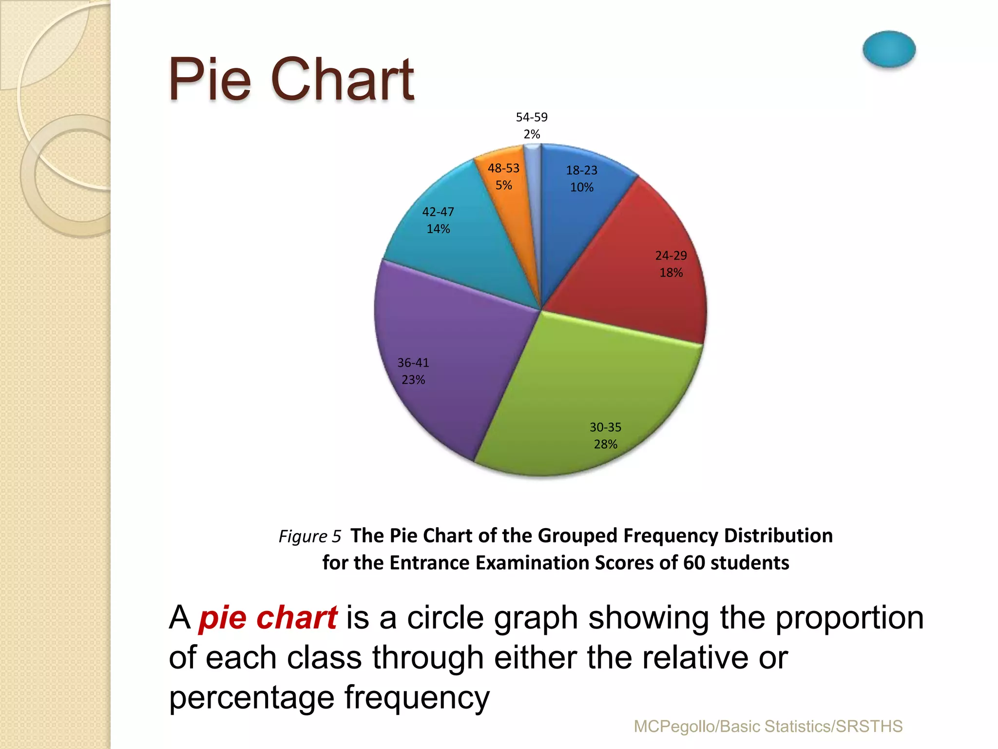
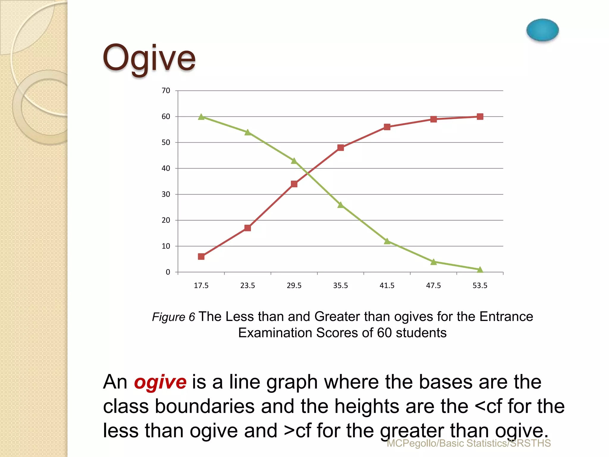
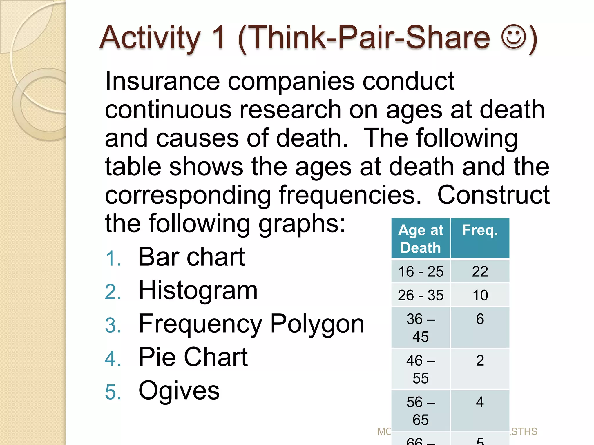
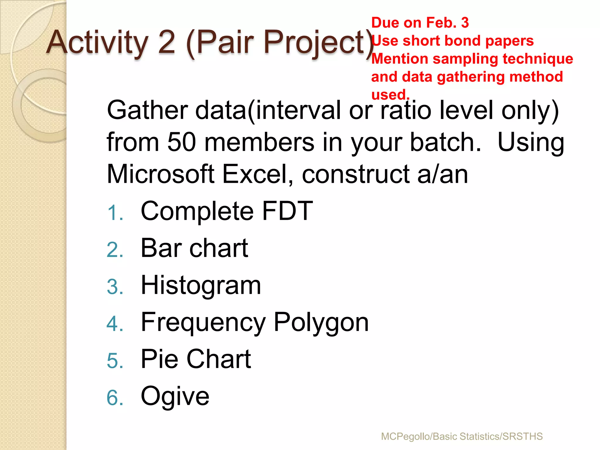

This document discusses different methods for presenting data graphically. It begins by listing the objectives of the lesson and identifying textual, tabular, and graphical methods. Examples of various graphs like bar charts, histograms, frequency polygons, pie charts, and ogives are then shown and explained using sample data on examination scores. The document concludes by assigning activities for students to practice constructing these different graphs from sample data sets.


