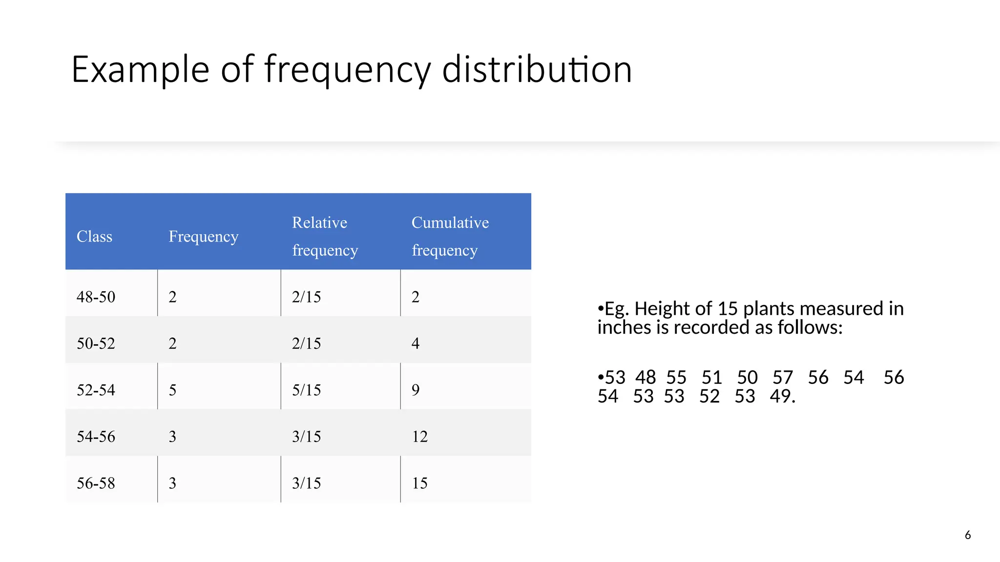
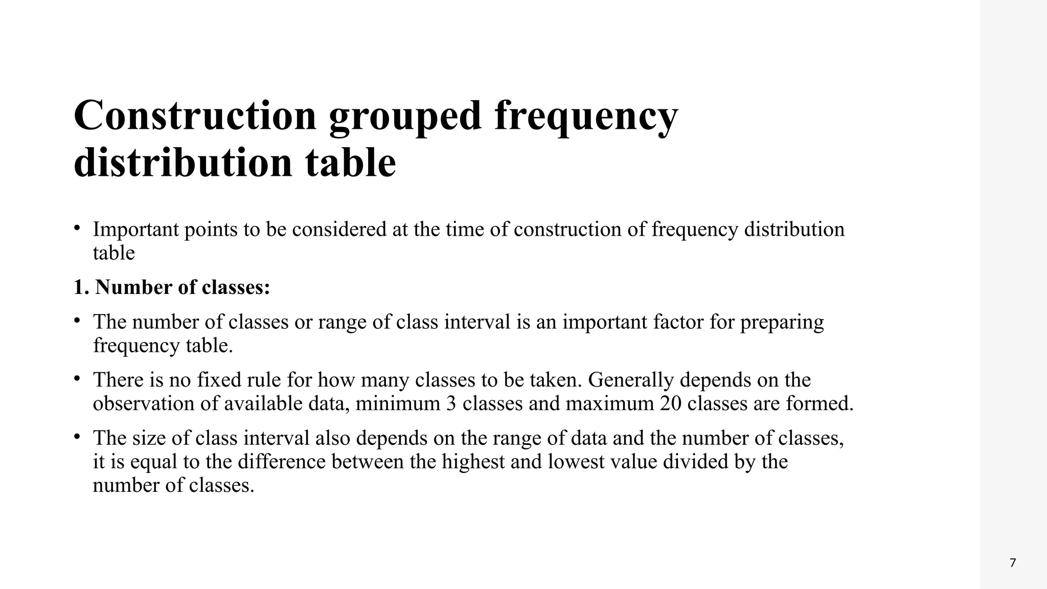
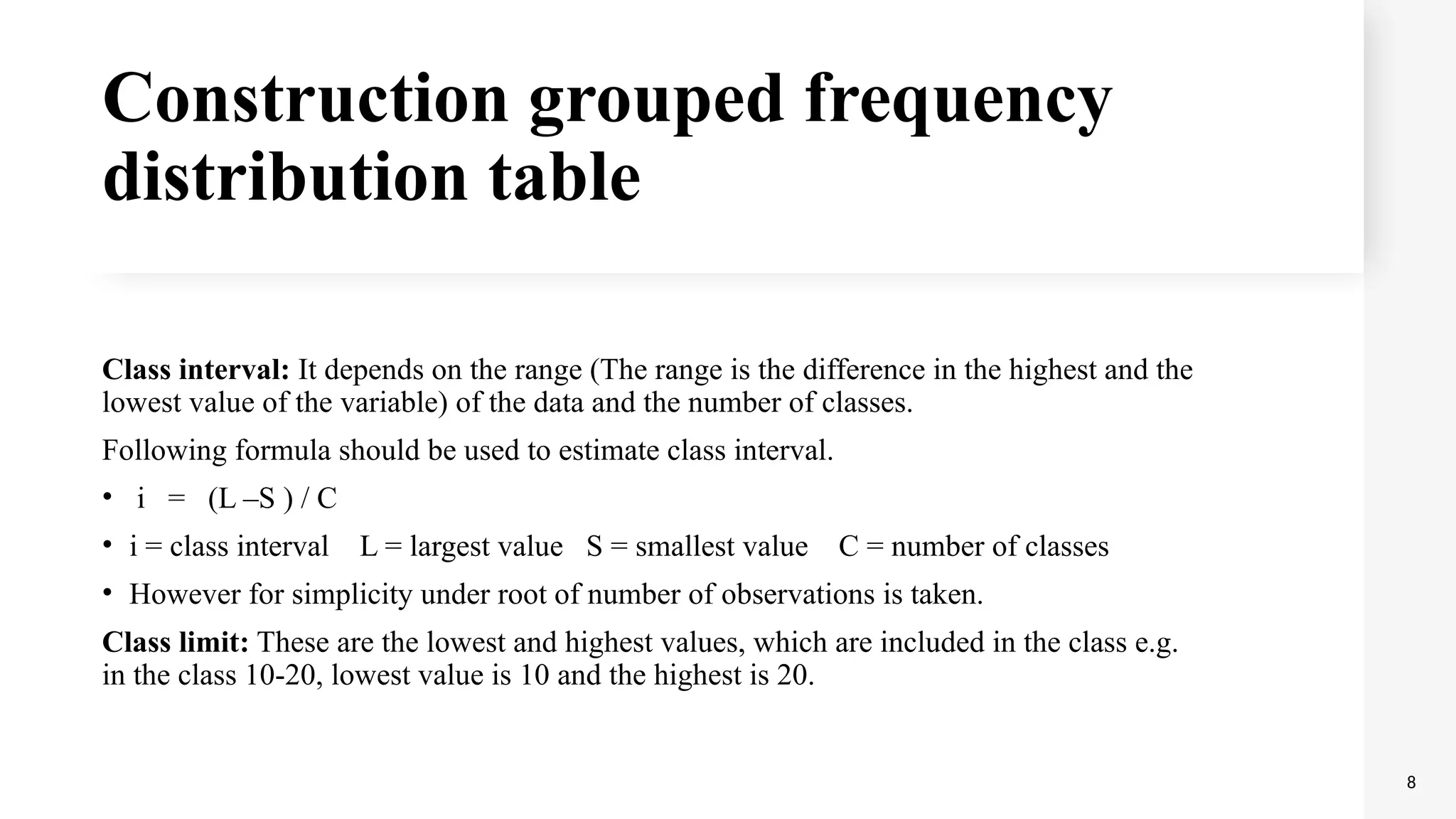
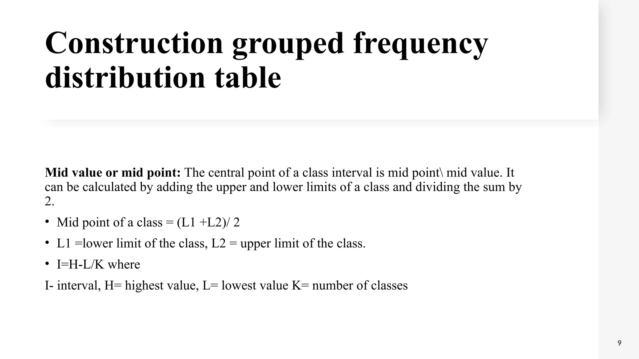
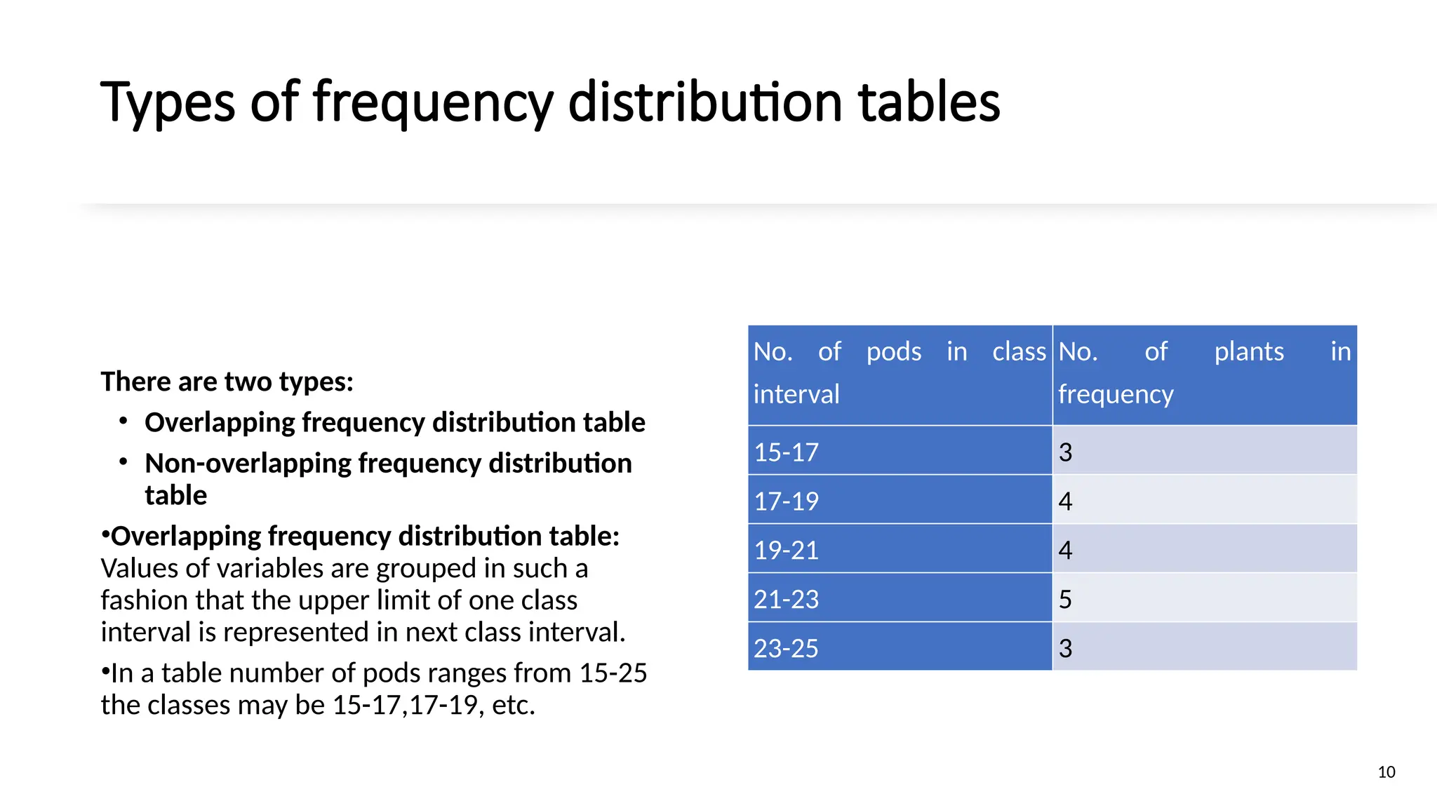
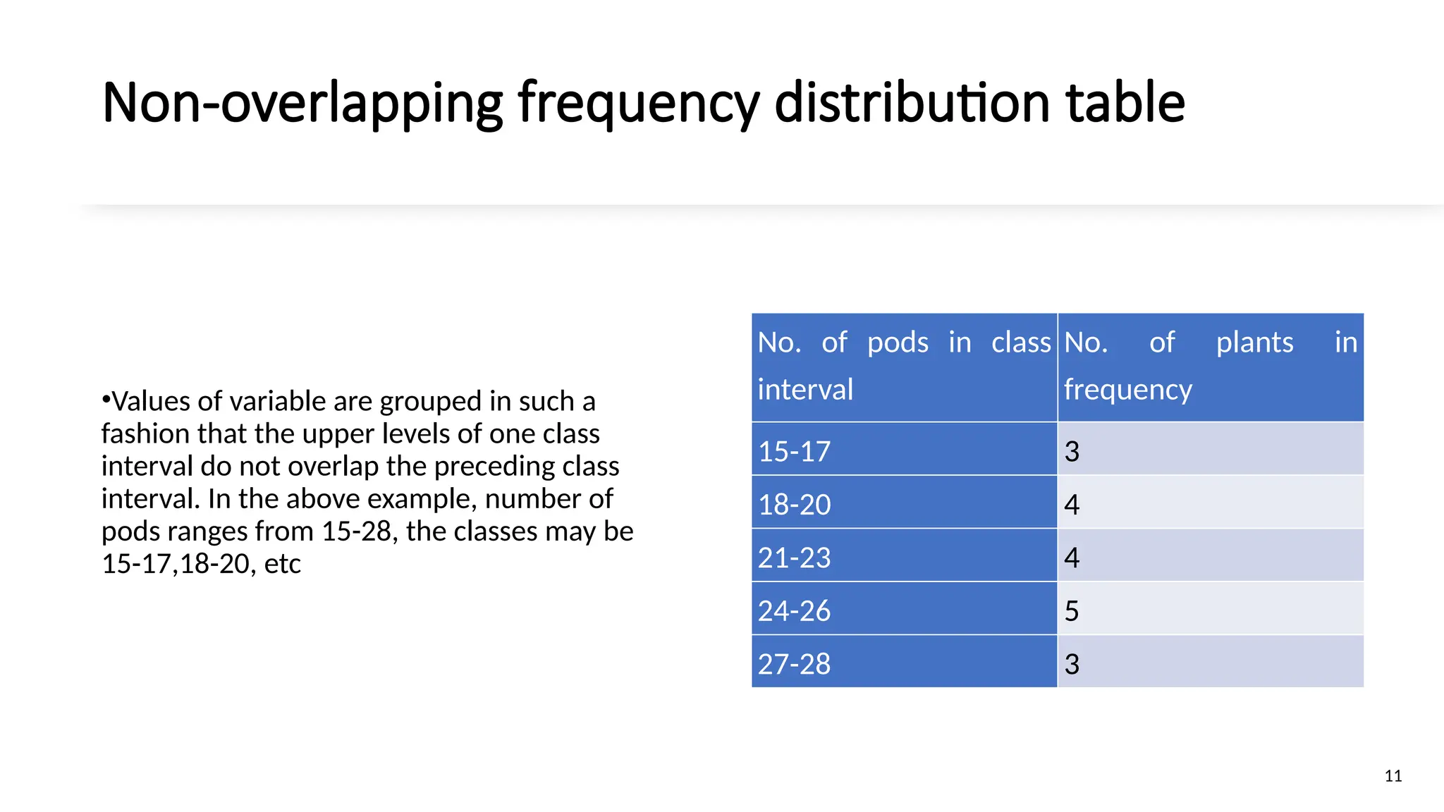
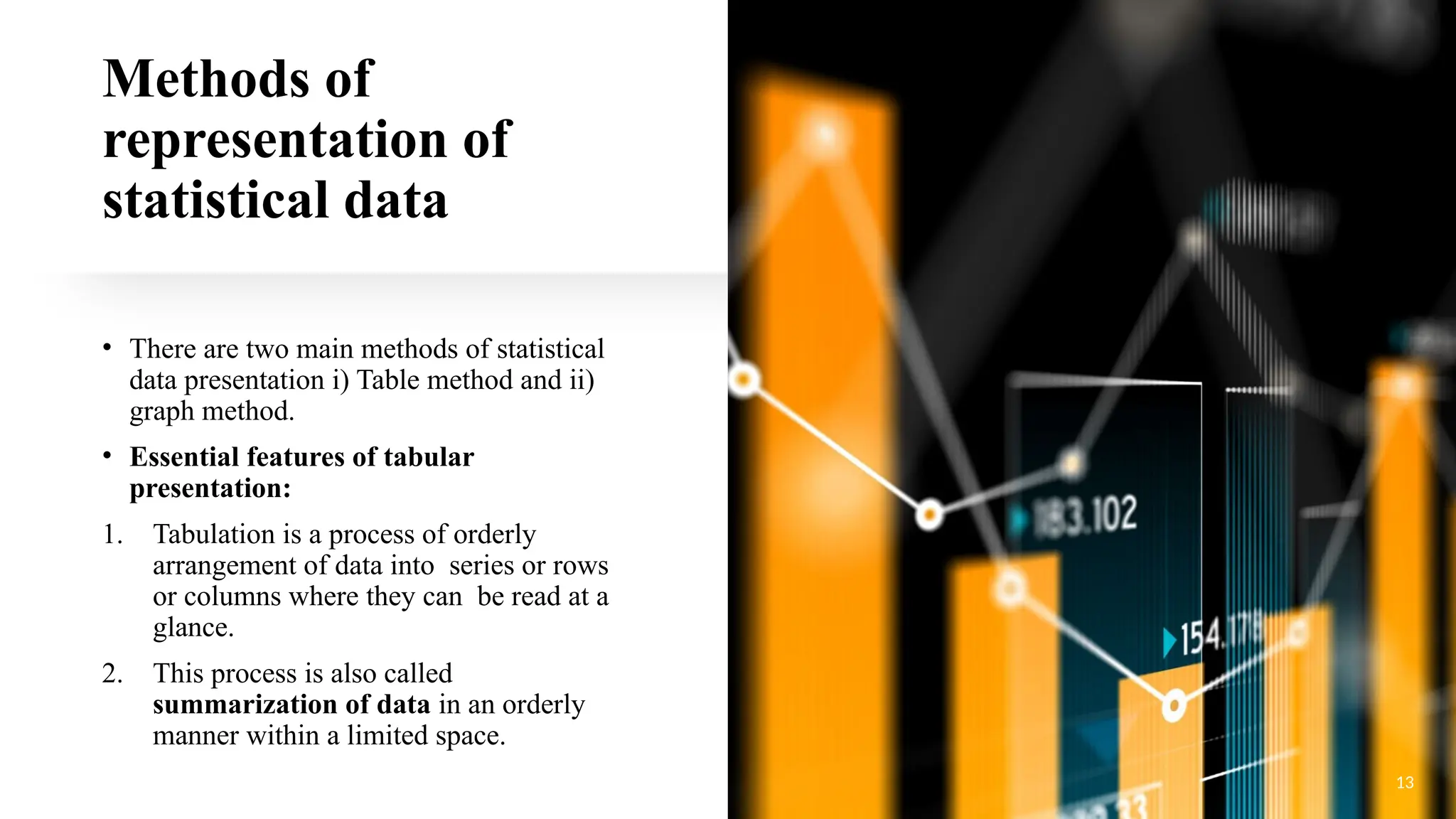
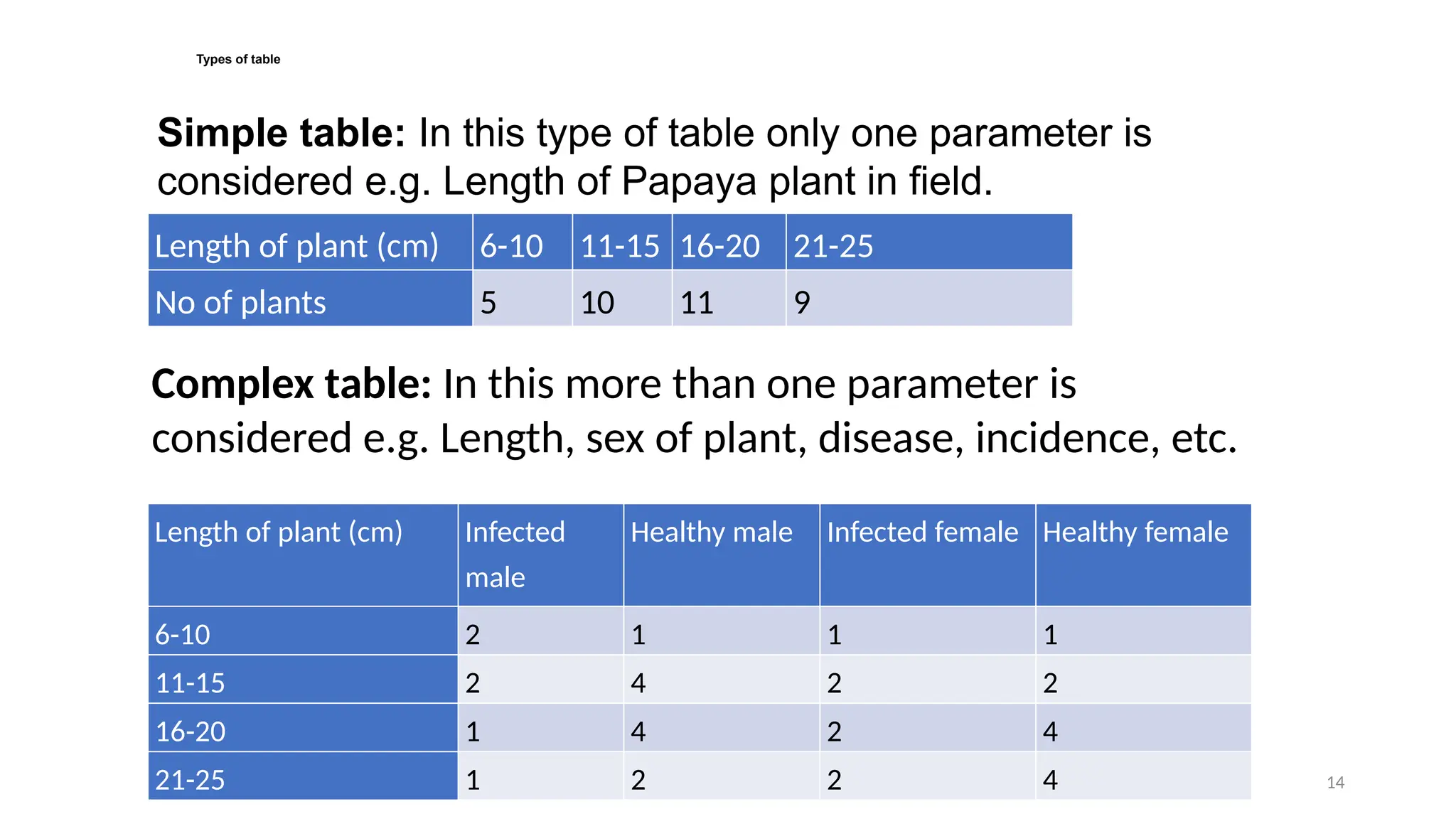
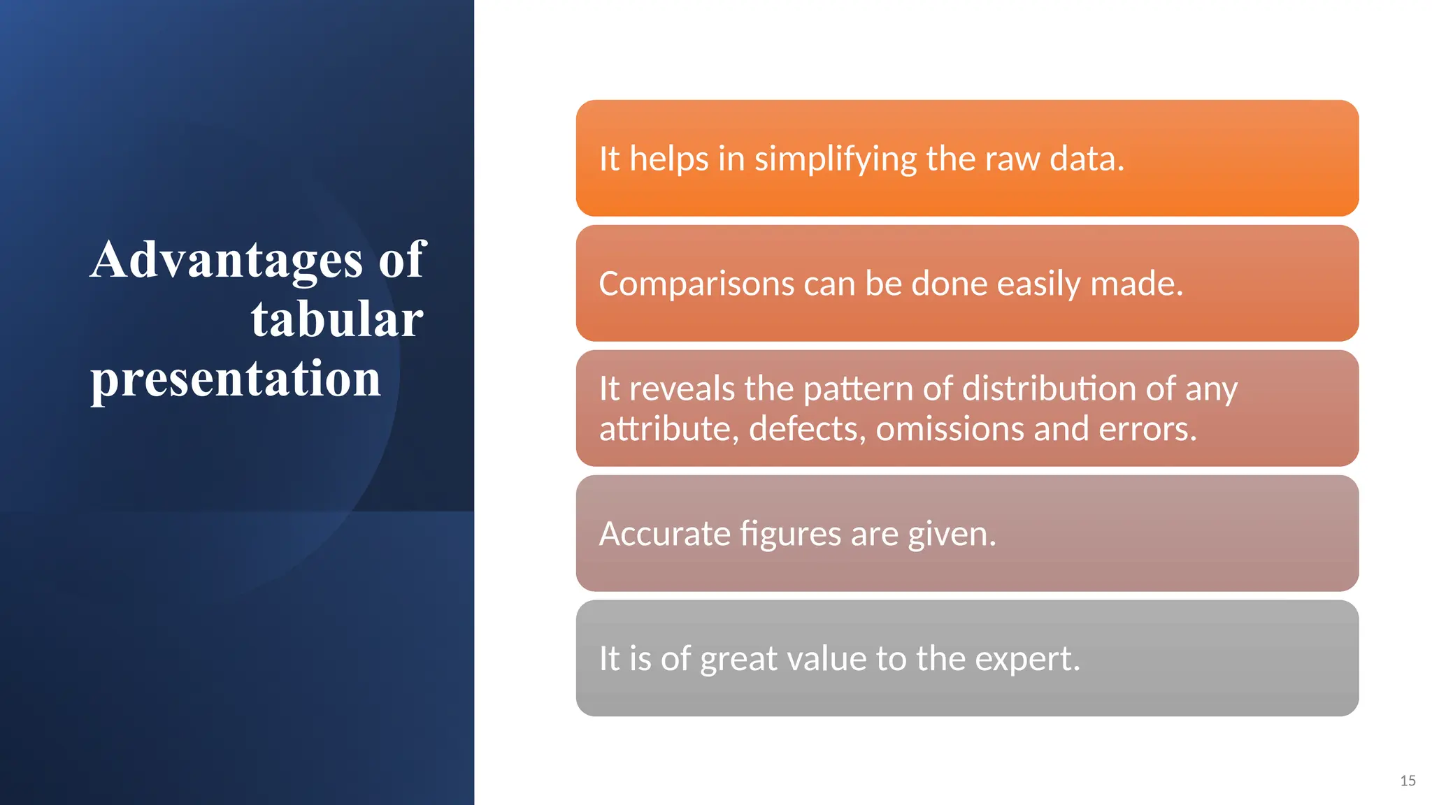
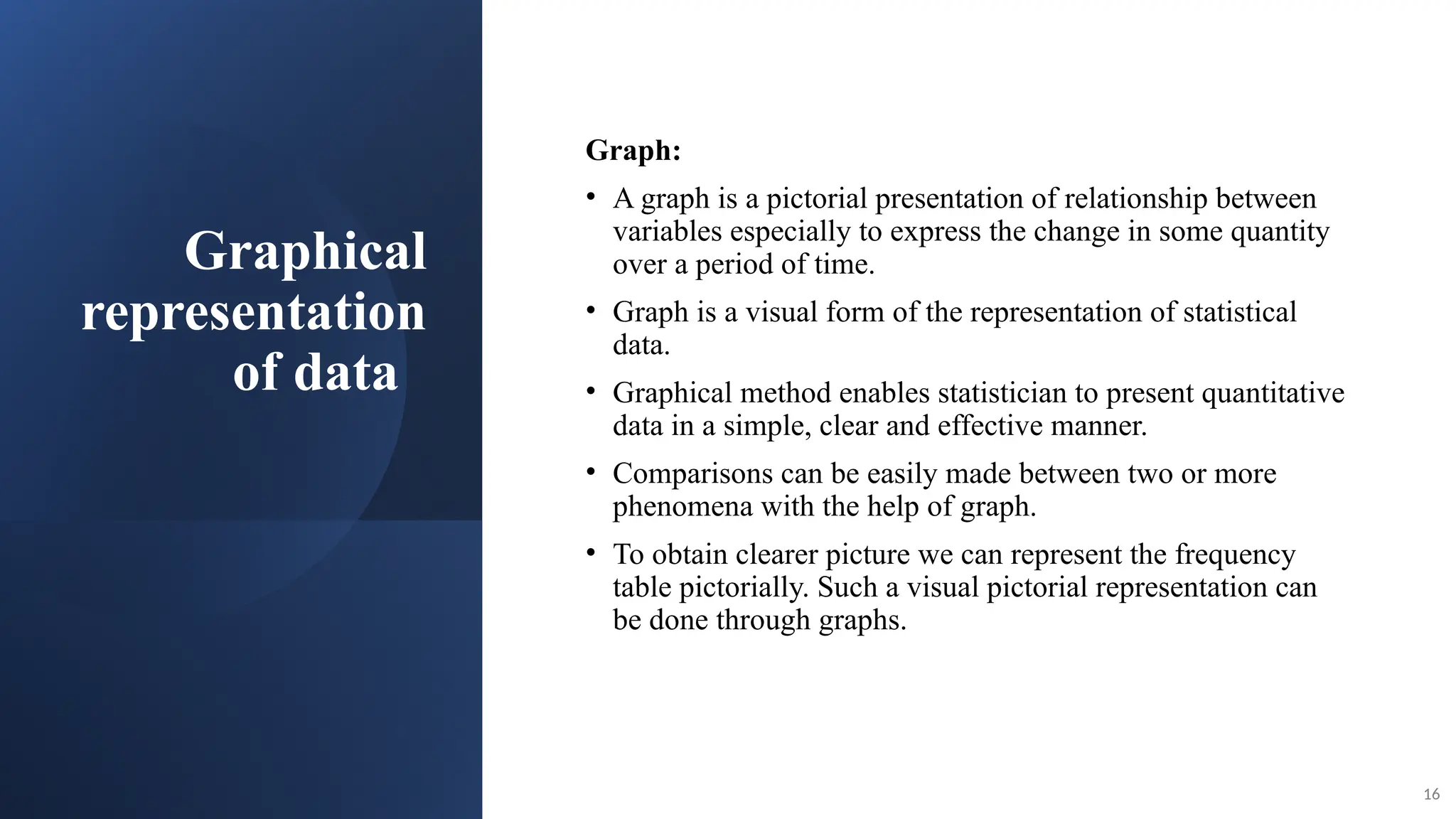
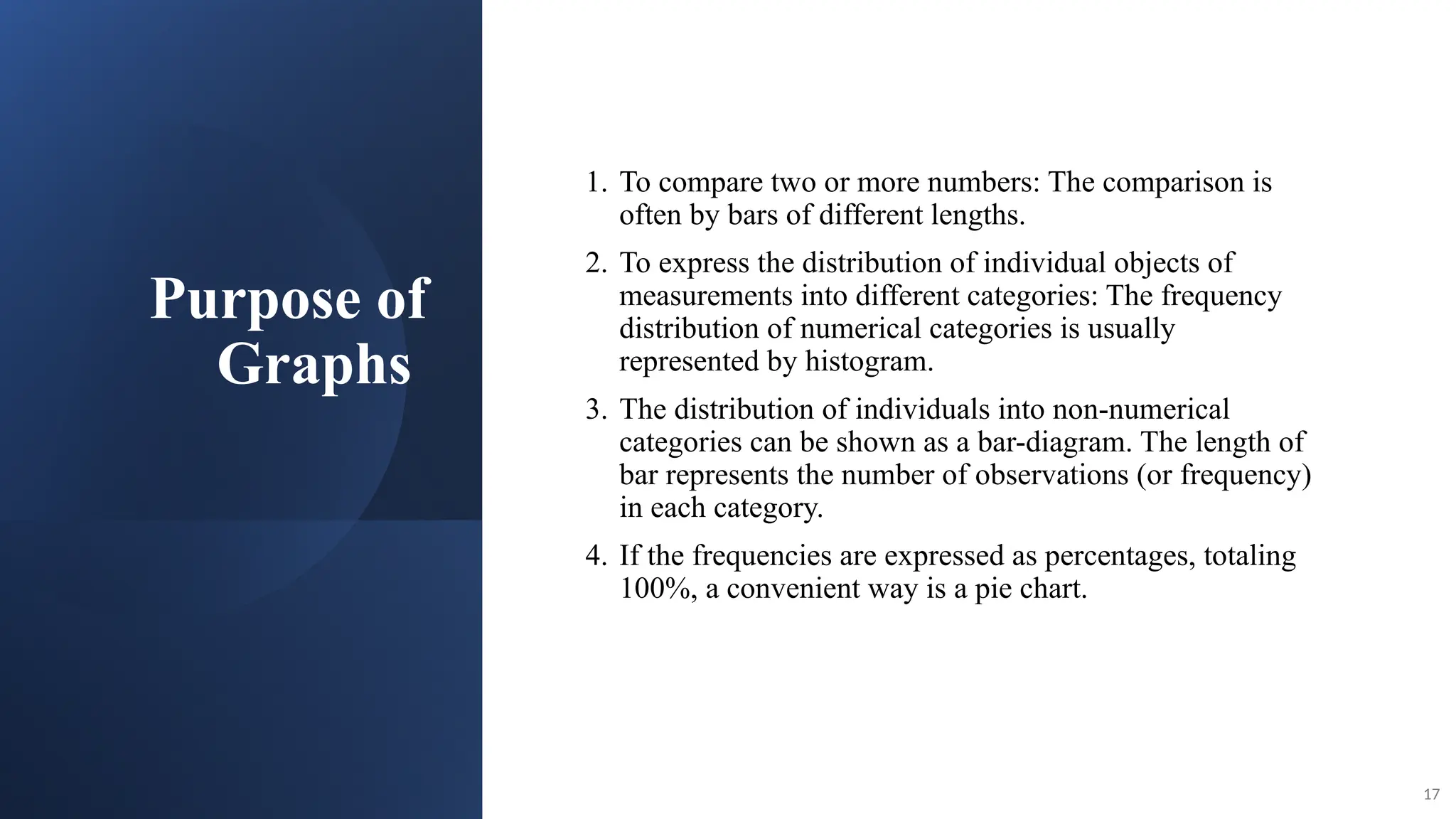
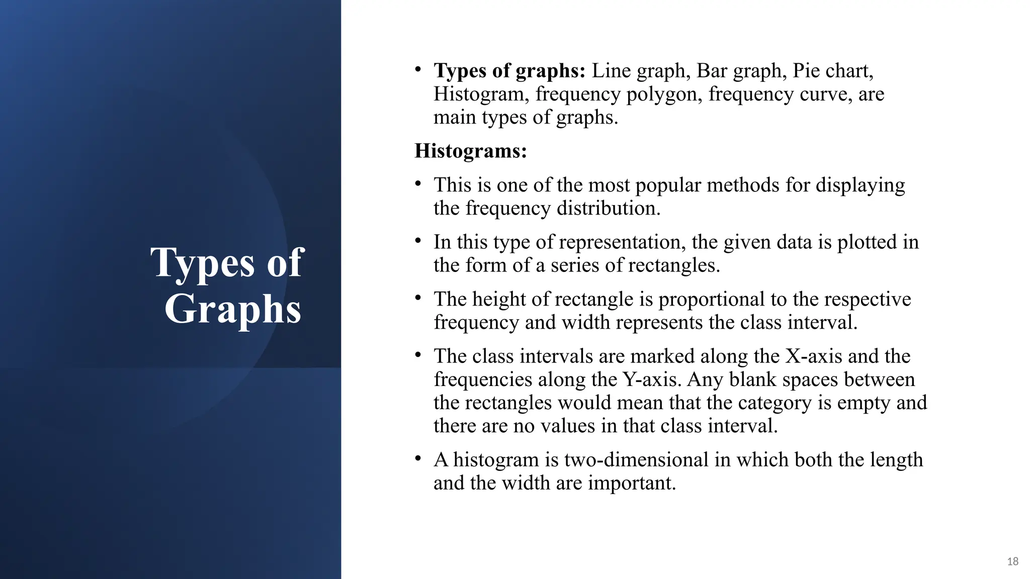
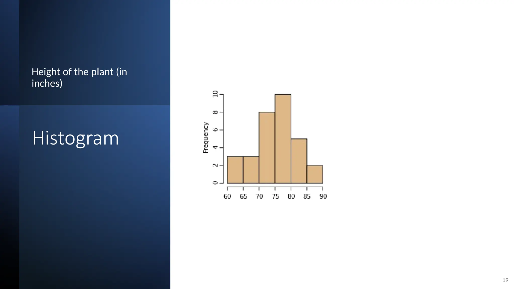
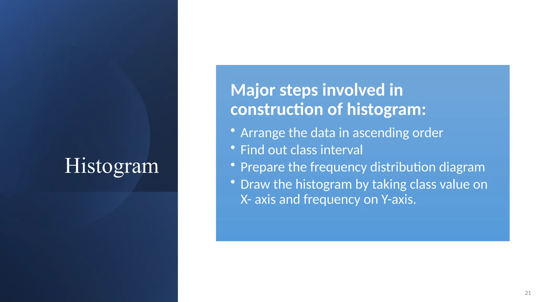
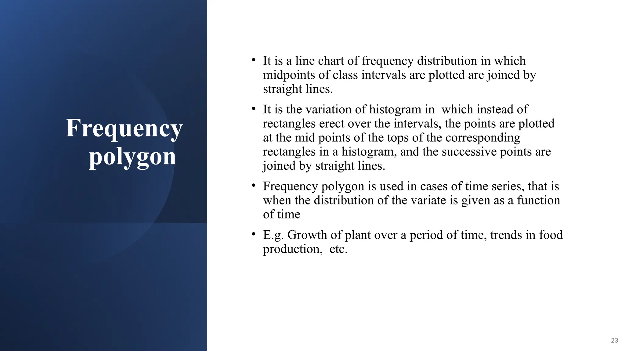
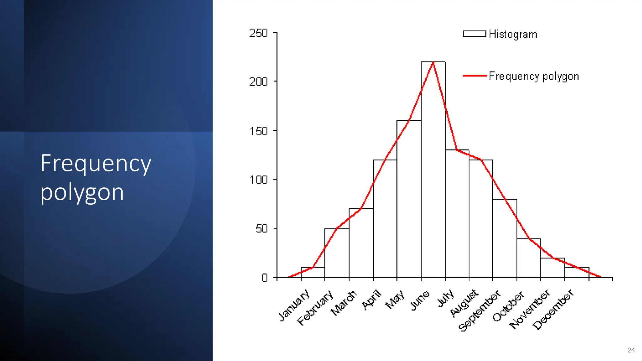
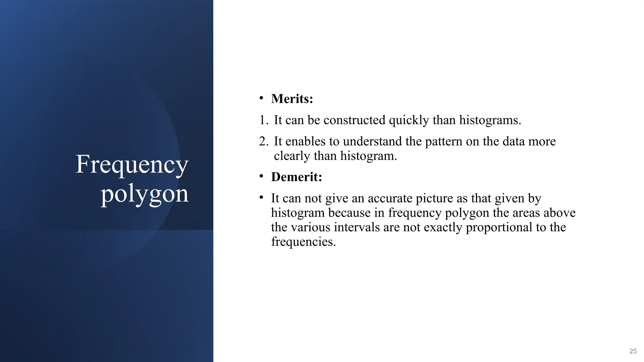
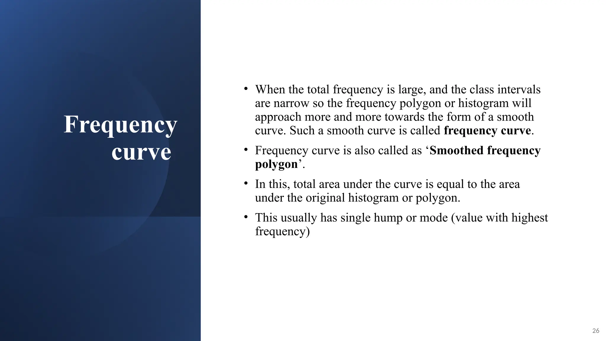
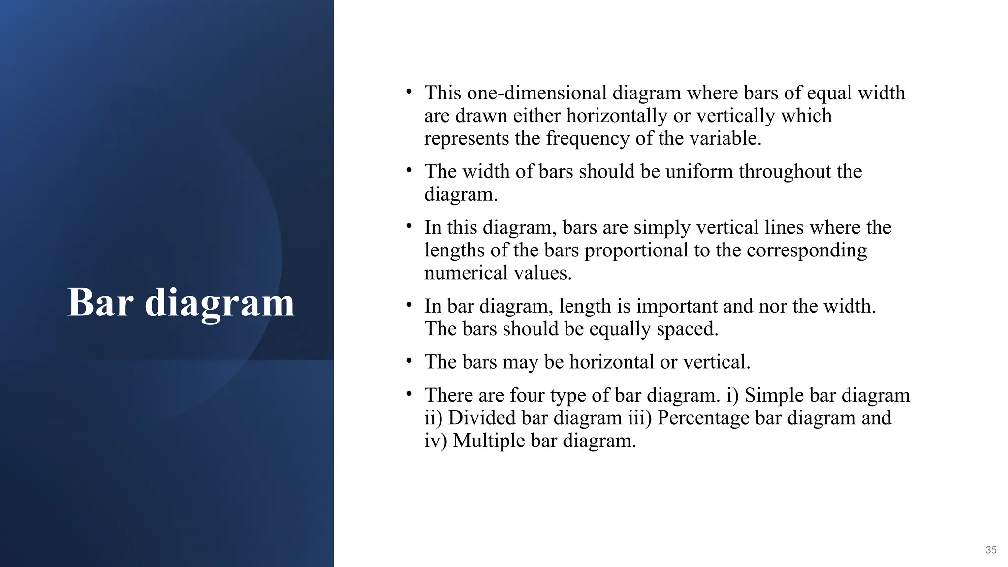
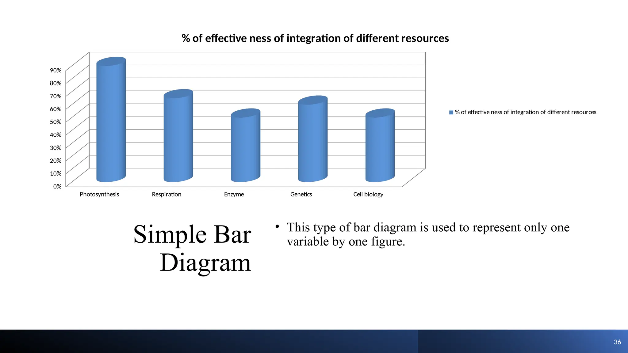
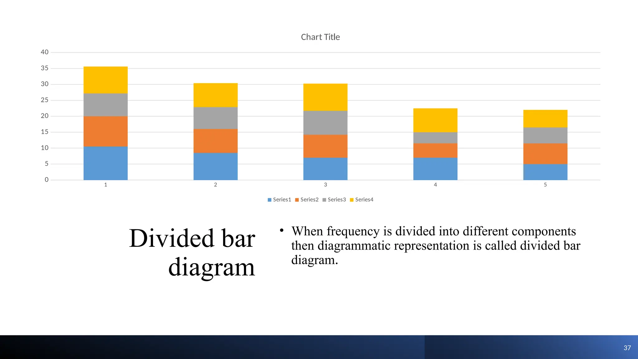
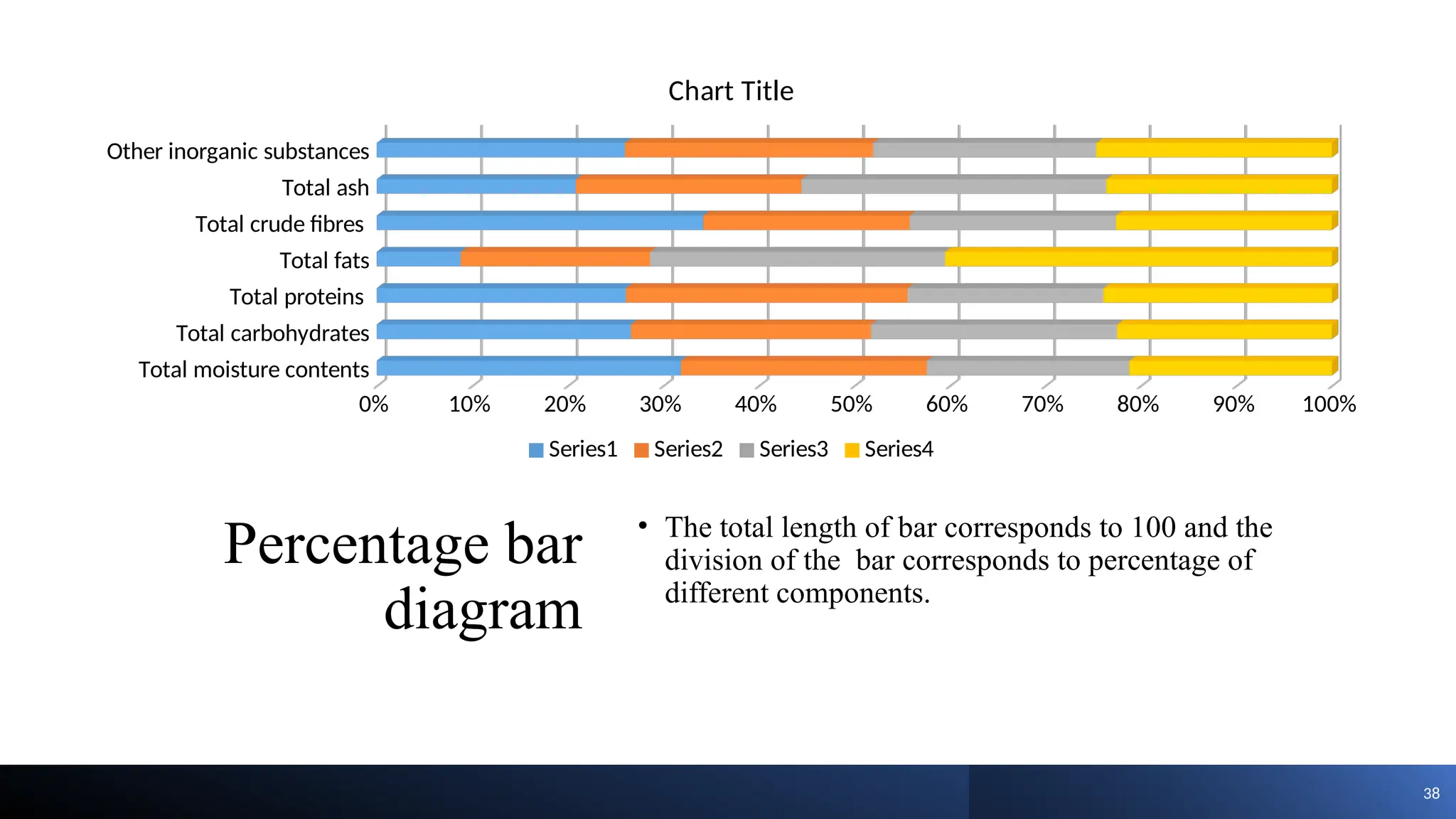
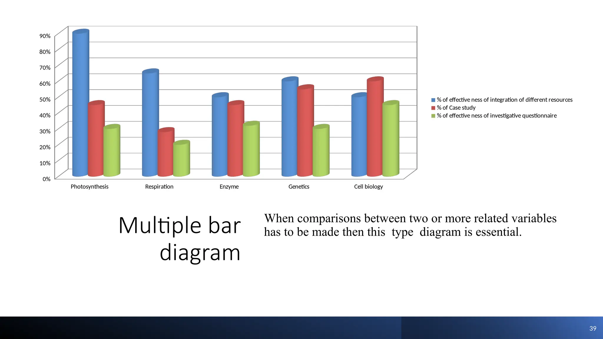
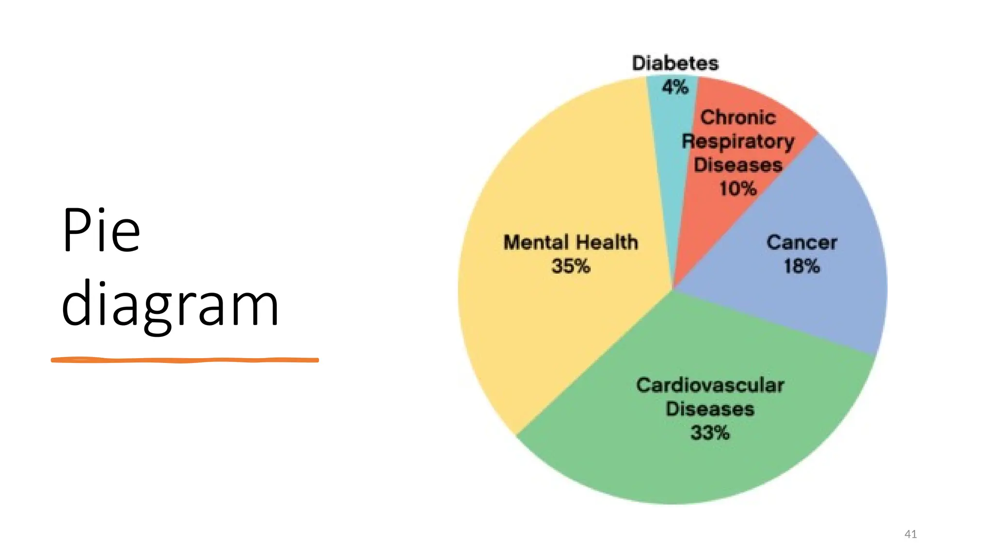
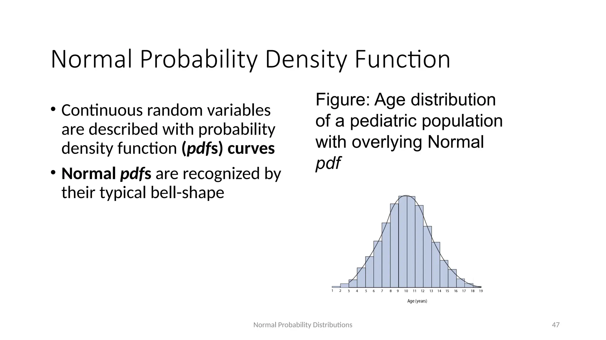
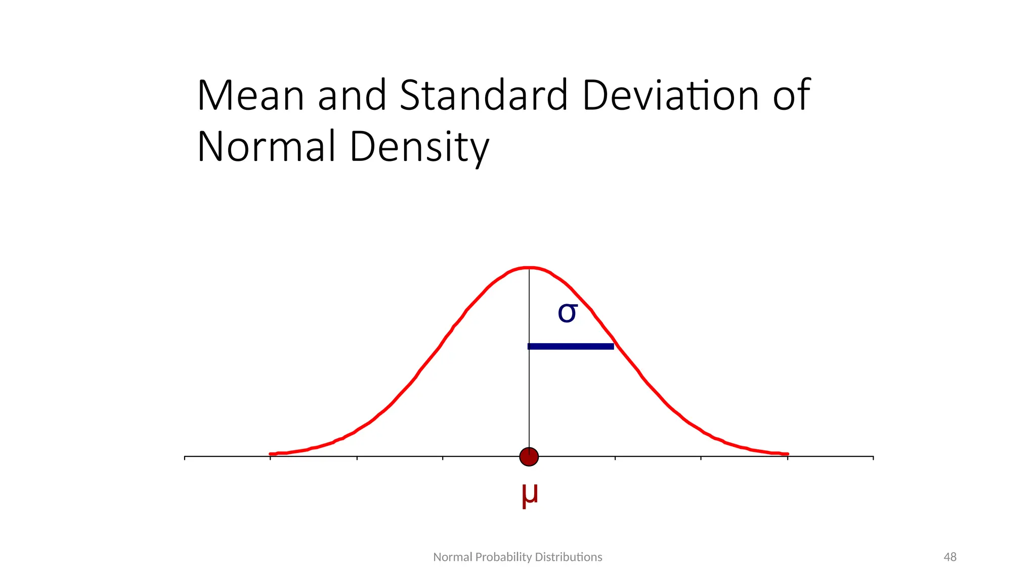
Tabulation and Graphical
Representation of Data
DR PRASANNA MOHAN
PROFESSOR/RESEARCH HEAD
KRUPANIDHI COLLEGE OF PHYSIOTHERAPY
What one thing would you do if you were
invisible?
Collection and representation of
data
• Classification of data: Data is a set of
values of recorded for an event is called
data. Data can be stored and presented
in various ways so as to draw some
inference.
• Data classification:
1. Primary data
2. Secondary data.
3. Qualitative data
4. Quantitative data.
3
Need of data
classification
A data presented without any orderliness does not allow
deriving any inference from it. So it is essential to organize
the data. This is accomplished by summarizing data into a
frequency distribution table.
Main Objectives of data classification:
1. To make a proper use of raw data.
2. To study the data and make comparisons easier.
3. To use the collected material to statistical treatment.
4. To simplify the complexities of raw.
5. To draw the statistical inferences from data.
5. To keep unnecessary information aside.
4
Frequency
distribution
• A frequency distribution or frequency
table is the tabular arrangement of data
by classes together with the
corresponding class frequencies.
• The main purpose of frequency
distribution is to organize the data into a
more compact form without obscuring
essential information contained in the
values.
5
Example of frequency distribution
•Eg. Height of 15 plants measured in
inches is recorded as follows:
•53 48 55 51 50 57 56 54 56
54 53 53 52 53 49.
6
Class Frequency
Relative
frequency
Cumulative
frequency
48-50 2 2/15 2
50-52 2 2/15 4
52-54 5 5/15 9
54-56 3 3/15 12
56-58 3 3/15 15
Construction grouped frequency
distribution table
• Important points to be considered at the time of construction of frequency distribution
table
1. Number of classes:
• The number of classes or range of class interval is an important factor for preparing
frequency table.
• There is no fixed rule for how many classes to be taken. Generally depends on the
observation of available data, minimum 3 classes and maximum 20 classes are formed.
• The size of class interval also depends on the range of data and the number of classes,
it is equal to the difference between the highest and lowest value divided by the
number of classes.
7
Construction grouped frequency
distribution table
Class interval: It depends on the range (The range is the difference in the highest and the
lowest value of the variable) of the data and the number of classes.
Following formula should be used to estimate class interval.
• i = (L –S ) / C
• i = class interval L = largest value S = smallest value C = number of classes
• However for simplicity under root of number of observations is taken.
Class limit: These are the lowest and highest values, which are included in the class e.g.
in the class 10-20, lowest value is 10 and the highest is 20.
8
Construction grouped frequency
distribution table
Mid value or mid point: The central point of a class interval is mid point mid value. It
can be calculated by adding the upper and lower limits of a class and dividing the sum by
2.
• Mid point of a class = (L1 +L2)/ 2
• L1 =lower limit of the class, L2 = upper limit of the class.
• I=H-L/K where
I- interval, H= highest value, L= lowest value K= number of classes
9
Types of frequency distribution tables
There are two types:
• Overlapping frequency distribution table
• Non-overlapping frequency distribution
table
•Overlapping frequency distribution table:
Values of variables are grouped in such a
fashion that the upper limit of one class
interval is represented in next class interval.
•In a table number of pods ranges from 15-25
the classes may be 15-17,17-19, etc.
10
No. of pods in class
interval
No. of plants in
frequency
15-17 3
17-19 4
19-21 4
21-23 5
23-25 3
Non-overlapping frequency distribution table
•Values of variable are grouped in such a
fashion that the upper levels of one class
interval do not overlap the preceding class
interval. In the above example, number of
pods ranges from 15-28, the classes may be
15-17,18-20, etc
11
No. of pods in class
interval
No. of plants in
frequency
15-17 3
18-20 4
21-23 4
24-26 5
27-28 3
Activity
Methods of
representation of
statistical data
• There are two main methods of statistical
data presentation i) Table method and ii)
graph method.
• Essential features of tabular
presentation:
1. Tabulation is a process of orderly
arrangement of data into series or rows
or columns where they can be read at a
glance.
2. This process is also called
summarization of data in an orderly
manner within a limited space.
13
14
Types of table
Length of plant (cm) 6-10 11-15 16-20 21-25
No of plants 5 10 11 9
Length of plant (cm) Infected
male
Healthy male Infected female Healthy female
6-10 2 1 1 1
11-15 2 4 2 2
16-20 1 4 2 4
21-25 1 2 2 4
Simple table: In this type of table only one parameter is
considered e.g. Length of Papaya plant in field.
Complex table: In this more than one parameter is
considered e.g. Length, sex of plant, disease, incidence, etc.
Advantages of
tabular
presentation
15
It helps in simplifying the raw data.
Comparisons can be done easily made.
It reveals the pattern of distribution of any
attribute, defects, omissions and errors.
Accurate figures are given.
It is of great value to the expert.
Graphical
representation
of data
Graph:
• A graph is a pictorial presentation of relationship between
variables especially to express the change in some quantity
over a period of time.
• Graph is a visual form of the representation of statistical
data.
• Graphical method enables statistician to present quantitative
data in a simple, clear and effective manner.
• Comparisons can be easily made between two or more
phenomena with the help of graph.
• To obtain clearer picture we can represent the frequency
table pictorially. Such a visual pictorial representation can
be done through graphs.
16
Purpose of
Graphs
1. To compare two or more numbers: The comparison is
often by bars of different lengths.
2. To express the distribution of individual objects of
measurements into different categories: The frequency
distribution of numerical categories is usually
represented by histogram.
3. The distribution of individuals into non-numerical
categories can be shown as a bar-diagram. The length of
bar represents the number of observations (or frequency)
in each category.
4. If the frequencies are expressed as percentages, totaling
100%, a convenient way is a pie chart.
17
Types of
Graphs
• Types of graphs: Line graph, Bar graph, Pie chart,
Histogram, frequency polygon, frequency curve, are
main types of graphs.
Histograms:
• This is one of the most popular methods for displaying
the frequency distribution.
• In this type of representation, the given data is plotted in
the form of a series of rectangles.
• The height of rectangle is proportional to the respective
frequency and width represents the class interval.
• The class intervals are marked along the X-axis and the
frequencies along the Y-axis. Any blank spaces between
the rectangles would mean that the category is empty and
there are no values in that class interval.
• A histogram is two-dimensional in which both the length
and the width are important.
18
Histogram
Height of the plant (in
inches)
19
Histogram
20
Merits of
histograms:
It gives the idea about the amount of
variability present in the data.
It is useful to find out mode.
Demerits of
histograms:
Histogram can not be drawn for frequency
distribution with open-end class.
Histogram is not a convenient method for
comparisons especially the super-imposed
histograms are usually confusing.
Histogram
21
Major steps involved in
construction of histogram:
• Arrange the data in ascending order
• Find out class interval
• Prepare the frequency distribution diagram
• Draw the histogram by taking class value on
X- axis and frequency on Y-axis.
A histogram is most
commonly used to
represent which
type of data?
A) Categorical data
B) Continuous data
C) Nominal data
D) Ordinal data
Frequency
polygon
• It is a line chart of frequency distribution in which
midpoints of class intervals are plotted are joined by
straight lines.
• It is the variation of histogram in which instead of
rectangles erect over the intervals, the points are plotted
at the mid points of the tops of the corresponding
rectangles in a histogram, and the successive points are
joined by straight lines.
• Frequency polygon is used in cases of time series, that is
when the distribution of the variate is given as a function
of time
• E.g. Growth of plant over a period of time, trends in food
production, etc.
23
Frequency
polygon
24
Frequency
polygon
• Merits:
1. It can be constructed quickly than histograms.
2. It enables to understand the pattern on the data more
clearly than histogram.
• Demerit:
• It can not give an accurate picture as that given by
histogram because in frequency polygon the areas above
the various intervals are not exactly proportional to the
frequencies.
25
Frequency
curve
• When the total frequency is large, and the class intervals
are narrow so the frequency polygon or histogram will
approach more and more towards the form of a smooth
curve. Such a smooth curve is called frequency curve.
• Frequency curve is also called as ‘Smoothed frequency
polygon’.
• In this, total area under the curve is equal to the area
under the original histogram or polygon.
• This usually has single hump or mode (value with highest
frequency)
26
What is a key characteristic of a frequency
polygon?
A) It uses bars to represent data.
B) It connects midpoints of class intervals with straight lines.
C) It represents only categorical data.
D) It is shaped like a curve.
In a smooth frequency polygon, the points
are usually connected by:
A) Straight lines
B) Dotted lines
C) A smooth curve
D) Bars
Scatter or
Dot diagram
• This is the simplest method for confirming whether there
is any relationship between two variables by plotting
values on graph.
• It is nothing but a visual representation of two variables
by points (dots) on a graph.
• In a scatter diagram one variable is taken on the X-axis
and other on the Y-axis and the data is represented in the
form of points.
• It is called as a scatter diagram because it indicates
scatter of various points (variables).
• The scatter diagram gives a general idea about existence
of correlation between two variables and type of
correlation.
• It does not give correct numerical value of the correlation
as given by correlation coefficient.
29
Scatter
diagram
Merits of scatter diagram:
1. It is a simple method to find out the nature of correlation
between two variables.
2. It is not influenced by extreme limits
3. It is easy to understand.
Demerits of Scatter diagram:
4. It doesn’t give correct numerical value of correlation.
5. It is unable to give the exact degree of correlation
between two variables.
6. It is a subjective method.
7. It cannot be applied to qualitative data.
8. Scatter is the first step in finding out the strength of
correlation-ship.
30
Scatter
diagram
31
0.5 1 1.5 2 2.5 3 3.5 4 4.5 5 5.5
0
2
4
6
8
10
12
32
Line diagram
Line diagram:
• It is a simplest type of diagram.
• It is used for presenting the frequencies of discrete variables.
• In this there are two variables under considerations.
• Frequencies are taken on X – axis and independent variables on Y – axis and
the line segments join the points.
Line graph • No of asthma cases
33
What is your favorite breakfast which
most people dislike it?
Bar diagram
• This one-dimensional diagram where bars of equal width
are drawn either horizontally or vertically which
represents the frequency of the variable.
• The width of bars should be uniform throughout the
diagram.
• In this diagram, bars are simply vertical lines where the
lengths of the bars proportional to the corresponding
numerical values.
• In bar diagram, length is important and nor the width.
The bars should be equally spaced.
• The bars may be horizontal or vertical.
• There are four type of bar diagram. i) Simple bar diagram
ii) Divided bar diagram iii) Percentage bar diagram and
iv) Multiple bar diagram.
35
Simple Bar
Diagram
• This type of bar diagram is used to represent only one
variable by one figure.
36
Photosynthesis Respiration Enzyme Genetics Cell biology
0%
10%
20%
30%
40%
50%
60%
70%
80%
90%
% of effective ness of integration of different resources
Divided bar
diagram
• When frequency is divided into different components
then diagrammatic representation is called divided bar
diagram.
37
1 2 3 4 5
0
5
10
15
20
25
30
35
40
Chart Title
Series1 Series2 Series3 Series4
Percentage bar
diagram
• The total length of bar corresponds to 100 and the
division of the bar corresponds to percentage of
different components.
38
Total moisture contents
Total carbohydrates
Total proteins
Total fats
Total crude fibres
Total ash
Other inorganic substances
0% 10% 20% 30% 40% 50% 60% 70% 80% 90% 100%
Chart Title
Series1 Series2 Series3 Series4
Multiple bar
diagram
When comparisons between two or more related variables
has to be made then this type diagram is essential.
39
Photosynthesis Respiration Enzyme Genetics Cell biology
0%
10%
20%
30%
40%
50%
60%
70%
80%
90%
% of effective ness of integration of different resources
% of Case study
% of effective ness of investigative questionnaire
Pie diagram
• This type of diagram enables us to show the partitioning
to a total into its component parts.
• It is in the form of a circle divided by radial lines into
sections (components).
• It is called, as a pie because the entire diagram looks like
a pie and the components resembles slices cut from it.
• The area of each section is proportional to the size of the
figures.
• It is used to present discrete data such as age group, total
expenditure, total area under cultivation for different
crops etc.
40
Pie
diagram
41
Activity
Merits of the
graphic
representation
• It is more attractive representation as compared to
figures.
• It simplifies the numerical complexity.
• It facilitates easy comparison of data.
• It is easy to understand even to the common man.
• Graphs have long lasting impression on the mind.
• It reveals hidden facts, which normally cannot be
detected from tabular presentation.
• Quick conclusions can be drawn.
43
Limitations of
Graphic
representation
• It can not be used for detailed studies but only for
comparative studies. Tables shows the exact figures while
graph shows overall position. The figures are
approximately correct but not exact.
• It can give only a limited amount of information because
it shows approximate values.
• It can not be analyzed further.
• It’s utility to an expert is limited
• A table can be used to give data on three or more
characteristics/parameters but this is not possible in case
of graph.
44
Normal probability
curve
• Normal probability curve is one type of
theoretical distribution that is of immense use
in Statistics.
• The normal distribution is a continuous
probability distribution that is symmetrical on
both sides of the mean.
• It is also called as the normal curve, the
Gaussian curve and the Bell – shaped curve or
Mesokurtic curve.
• It is mainly computed for finding out average
strength of the class, average marks and its
distribution
CHARACTERISTICS
• It is symmetrical about the mean.
The number of cases below the
mean is equal to the number of
cases above the mean. The mean
and median coincide.
• The height of the curve is
maximum at its mean. Hence, the
mean and mode of normal
distribution coincide. Mean ,
median and mode are equal here.
Normal Probability Distributions 47
Normal Probability Density Function
• Continuous random variables
are described with probability
density function (pdfs) curves
• Normal pdfs are recognized by
their typical bell-shape
Figure: Age distribution
of a pediatric population
with overlying Normal
pdf
Normal Probability Distributions 48
Mean and Standard Deviation of
Normal Density
μ
σ
What type of curve is used to represent a
normal distribution?
A) Frequency polygon
B) Cumulative frequency curve
C) Normal probability curve
D) Histogram

UNIT II DESCRIPTIVE STATISTICS TABLE GRAPH.pptx

  • 1.
    Tabulation and Graphical Representationof Data DR PRASANNA MOHAN PROFESSOR/RESEARCH HEAD KRUPANIDHI COLLEGE OF PHYSIOTHERAPY
  • 2.
    What one thingwould you do if you were invisible?
  • 3.
    Collection and representationof data • Classification of data: Data is a set of values of recorded for an event is called data. Data can be stored and presented in various ways so as to draw some inference. • Data classification: 1. Primary data 2. Secondary data. 3. Qualitative data 4. Quantitative data. 3
  • 4.
    Need of data classification Adata presented without any orderliness does not allow deriving any inference from it. So it is essential to organize the data. This is accomplished by summarizing data into a frequency distribution table. Main Objectives of data classification: 1. To make a proper use of raw data. 2. To study the data and make comparisons easier. 3. To use the collected material to statistical treatment. 4. To simplify the complexities of raw. 5. To draw the statistical inferences from data. 5. To keep unnecessary information aside. 4
  • 5.
    Frequency distribution • A frequencydistribution or frequency table is the tabular arrangement of data by classes together with the corresponding class frequencies. • The main purpose of frequency distribution is to organize the data into a more compact form without obscuring essential information contained in the values. 5
  • 6.
    Example of frequencydistribution •Eg. Height of 15 plants measured in inches is recorded as follows: •53 48 55 51 50 57 56 54 56 54 53 53 52 53 49. 6 Class Frequency Relative frequency Cumulative frequency 48-50 2 2/15 2 50-52 2 2/15 4 52-54 5 5/15 9 54-56 3 3/15 12 56-58 3 3/15 15
  • 7.
    Construction grouped frequency distributiontable • Important points to be considered at the time of construction of frequency distribution table 1. Number of classes: • The number of classes or range of class interval is an important factor for preparing frequency table. • There is no fixed rule for how many classes to be taken. Generally depends on the observation of available data, minimum 3 classes and maximum 20 classes are formed. • The size of class interval also depends on the range of data and the number of classes, it is equal to the difference between the highest and lowest value divided by the number of classes. 7
  • 8.
    Construction grouped frequency distributiontable Class interval: It depends on the range (The range is the difference in the highest and the lowest value of the variable) of the data and the number of classes. Following formula should be used to estimate class interval. • i = (L –S ) / C • i = class interval L = largest value S = smallest value C = number of classes • However for simplicity under root of number of observations is taken. Class limit: These are the lowest and highest values, which are included in the class e.g. in the class 10-20, lowest value is 10 and the highest is 20. 8
  • 9.
    Construction grouped frequency distributiontable Mid value or mid point: The central point of a class interval is mid point mid value. It can be calculated by adding the upper and lower limits of a class and dividing the sum by 2. • Mid point of a class = (L1 +L2)/ 2 • L1 =lower limit of the class, L2 = upper limit of the class. • I=H-L/K where I- interval, H= highest value, L= lowest value K= number of classes 9
  • 10.
    Types of frequencydistribution tables There are two types: • Overlapping frequency distribution table • Non-overlapping frequency distribution table •Overlapping frequency distribution table: Values of variables are grouped in such a fashion that the upper limit of one class interval is represented in next class interval. •In a table number of pods ranges from 15-25 the classes may be 15-17,17-19, etc. 10 No. of pods in class interval No. of plants in frequency 15-17 3 17-19 4 19-21 4 21-23 5 23-25 3
  • 11.
    Non-overlapping frequency distributiontable •Values of variable are grouped in such a fashion that the upper levels of one class interval do not overlap the preceding class interval. In the above example, number of pods ranges from 15-28, the classes may be 15-17,18-20, etc 11 No. of pods in class interval No. of plants in frequency 15-17 3 18-20 4 21-23 4 24-26 5 27-28 3
  • 12.
  • 13.
    Methods of representation of statisticaldata • There are two main methods of statistical data presentation i) Table method and ii) graph method. • Essential features of tabular presentation: 1. Tabulation is a process of orderly arrangement of data into series or rows or columns where they can be read at a glance. 2. This process is also called summarization of data in an orderly manner within a limited space. 13
  • 14.
    14 Types of table Lengthof plant (cm) 6-10 11-15 16-20 21-25 No of plants 5 10 11 9 Length of plant (cm) Infected male Healthy male Infected female Healthy female 6-10 2 1 1 1 11-15 2 4 2 2 16-20 1 4 2 4 21-25 1 2 2 4 Simple table: In this type of table only one parameter is considered e.g. Length of Papaya plant in field. Complex table: In this more than one parameter is considered e.g. Length, sex of plant, disease, incidence, etc.
  • 15.
    Advantages of tabular presentation 15 It helpsin simplifying the raw data. Comparisons can be done easily made. It reveals the pattern of distribution of any attribute, defects, omissions and errors. Accurate figures are given. It is of great value to the expert.
  • 16.
    Graphical representation of data Graph: • Agraph is a pictorial presentation of relationship between variables especially to express the change in some quantity over a period of time. • Graph is a visual form of the representation of statistical data. • Graphical method enables statistician to present quantitative data in a simple, clear and effective manner. • Comparisons can be easily made between two or more phenomena with the help of graph. • To obtain clearer picture we can represent the frequency table pictorially. Such a visual pictorial representation can be done through graphs. 16
  • 17.
    Purpose of Graphs 1. Tocompare two or more numbers: The comparison is often by bars of different lengths. 2. To express the distribution of individual objects of measurements into different categories: The frequency distribution of numerical categories is usually represented by histogram. 3. The distribution of individuals into non-numerical categories can be shown as a bar-diagram. The length of bar represents the number of observations (or frequency) in each category. 4. If the frequencies are expressed as percentages, totaling 100%, a convenient way is a pie chart. 17
  • 18.
    Types of Graphs • Typesof graphs: Line graph, Bar graph, Pie chart, Histogram, frequency polygon, frequency curve, are main types of graphs. Histograms: • This is one of the most popular methods for displaying the frequency distribution. • In this type of representation, the given data is plotted in the form of a series of rectangles. • The height of rectangle is proportional to the respective frequency and width represents the class interval. • The class intervals are marked along the X-axis and the frequencies along the Y-axis. Any blank spaces between the rectangles would mean that the category is empty and there are no values in that class interval. • A histogram is two-dimensional in which both the length and the width are important. 18
  • 19.
    Histogram Height of theplant (in inches) 19
  • 20.
    Histogram 20 Merits of histograms: It givesthe idea about the amount of variability present in the data. It is useful to find out mode. Demerits of histograms: Histogram can not be drawn for frequency distribution with open-end class. Histogram is not a convenient method for comparisons especially the super-imposed histograms are usually confusing.
  • 21.
    Histogram 21 Major steps involvedin construction of histogram: • Arrange the data in ascending order • Find out class interval • Prepare the frequency distribution diagram • Draw the histogram by taking class value on X- axis and frequency on Y-axis.
  • 22.
    A histogram ismost commonly used to represent which type of data? A) Categorical data B) Continuous data C) Nominal data D) Ordinal data
  • 23.
    Frequency polygon • It isa line chart of frequency distribution in which midpoints of class intervals are plotted are joined by straight lines. • It is the variation of histogram in which instead of rectangles erect over the intervals, the points are plotted at the mid points of the tops of the corresponding rectangles in a histogram, and the successive points are joined by straight lines. • Frequency polygon is used in cases of time series, that is when the distribution of the variate is given as a function of time • E.g. Growth of plant over a period of time, trends in food production, etc. 23
  • 24.
  • 25.
    Frequency polygon • Merits: 1. Itcan be constructed quickly than histograms. 2. It enables to understand the pattern on the data more clearly than histogram. • Demerit: • It can not give an accurate picture as that given by histogram because in frequency polygon the areas above the various intervals are not exactly proportional to the frequencies. 25
  • 26.
    Frequency curve • When thetotal frequency is large, and the class intervals are narrow so the frequency polygon or histogram will approach more and more towards the form of a smooth curve. Such a smooth curve is called frequency curve. • Frequency curve is also called as ‘Smoothed frequency polygon’. • In this, total area under the curve is equal to the area under the original histogram or polygon. • This usually has single hump or mode (value with highest frequency) 26
  • 27.
    What is akey characteristic of a frequency polygon? A) It uses bars to represent data. B) It connects midpoints of class intervals with straight lines. C) It represents only categorical data. D) It is shaped like a curve.
  • 28.
    In a smoothfrequency polygon, the points are usually connected by: A) Straight lines B) Dotted lines C) A smooth curve D) Bars
  • 29.
    Scatter or Dot diagram •This is the simplest method for confirming whether there is any relationship between two variables by plotting values on graph. • It is nothing but a visual representation of two variables by points (dots) on a graph. • In a scatter diagram one variable is taken on the X-axis and other on the Y-axis and the data is represented in the form of points. • It is called as a scatter diagram because it indicates scatter of various points (variables). • The scatter diagram gives a general idea about existence of correlation between two variables and type of correlation. • It does not give correct numerical value of the correlation as given by correlation coefficient. 29
  • 30.
    Scatter diagram Merits of scatterdiagram: 1. It is a simple method to find out the nature of correlation between two variables. 2. It is not influenced by extreme limits 3. It is easy to understand. Demerits of Scatter diagram: 4. It doesn’t give correct numerical value of correlation. 5. It is unable to give the exact degree of correlation between two variables. 6. It is a subjective method. 7. It cannot be applied to qualitative data. 8. Scatter is the first step in finding out the strength of correlation-ship. 30
  • 31.
    Scatter diagram 31 0.5 1 1.52 2.5 3 3.5 4 4.5 5 5.5 0 2 4 6 8 10 12
  • 32.
    32 Line diagram Line diagram: •It is a simplest type of diagram. • It is used for presenting the frequencies of discrete variables. • In this there are two variables under considerations. • Frequencies are taken on X – axis and independent variables on Y – axis and the line segments join the points.
  • 33.
    Line graph •No of asthma cases 33
  • 34.
    What is yourfavorite breakfast which most people dislike it?
  • 35.
    Bar diagram • Thisone-dimensional diagram where bars of equal width are drawn either horizontally or vertically which represents the frequency of the variable. • The width of bars should be uniform throughout the diagram. • In this diagram, bars are simply vertical lines where the lengths of the bars proportional to the corresponding numerical values. • In bar diagram, length is important and nor the width. The bars should be equally spaced. • The bars may be horizontal or vertical. • There are four type of bar diagram. i) Simple bar diagram ii) Divided bar diagram iii) Percentage bar diagram and iv) Multiple bar diagram. 35
  • 36.
    Simple Bar Diagram • Thistype of bar diagram is used to represent only one variable by one figure. 36 Photosynthesis Respiration Enzyme Genetics Cell biology 0% 10% 20% 30% 40% 50% 60% 70% 80% 90% % of effective ness of integration of different resources % of effective ness of integration of different resources
  • 37.
    Divided bar diagram • Whenfrequency is divided into different components then diagrammatic representation is called divided bar diagram. 37 1 2 3 4 5 0 5 10 15 20 25 30 35 40 Chart Title Series1 Series2 Series3 Series4
  • 38.
    Percentage bar diagram • Thetotal length of bar corresponds to 100 and the division of the bar corresponds to percentage of different components. 38 Total moisture contents Total carbohydrates Total proteins Total fats Total crude fibres Total ash Other inorganic substances 0% 10% 20% 30% 40% 50% 60% 70% 80% 90% 100% Chart Title Series1 Series2 Series3 Series4
  • 39.
    Multiple bar diagram When comparisonsbetween two or more related variables has to be made then this type diagram is essential. 39 Photosynthesis Respiration Enzyme Genetics Cell biology 0% 10% 20% 30% 40% 50% 60% 70% 80% 90% % of effective ness of integration of different resources % of Case study % of effective ness of investigative questionnaire
  • 40.
    Pie diagram • Thistype of diagram enables us to show the partitioning to a total into its component parts. • It is in the form of a circle divided by radial lines into sections (components). • It is called, as a pie because the entire diagram looks like a pie and the components resembles slices cut from it. • The area of each section is proportional to the size of the figures. • It is used to present discrete data such as age group, total expenditure, total area under cultivation for different crops etc. 40
  • 41.
  • 42.
  • 43.
    Merits of the graphic representation •It is more attractive representation as compared to figures. • It simplifies the numerical complexity. • It facilitates easy comparison of data. • It is easy to understand even to the common man. • Graphs have long lasting impression on the mind. • It reveals hidden facts, which normally cannot be detected from tabular presentation. • Quick conclusions can be drawn. 43
  • 44.
    Limitations of Graphic representation • Itcan not be used for detailed studies but only for comparative studies. Tables shows the exact figures while graph shows overall position. The figures are approximately correct but not exact. • It can give only a limited amount of information because it shows approximate values. • It can not be analyzed further. • It’s utility to an expert is limited • A table can be used to give data on three or more characteristics/parameters but this is not possible in case of graph. 44
  • 45.
    Normal probability curve • Normalprobability curve is one type of theoretical distribution that is of immense use in Statistics. • The normal distribution is a continuous probability distribution that is symmetrical on both sides of the mean. • It is also called as the normal curve, the Gaussian curve and the Bell – shaped curve or Mesokurtic curve. • It is mainly computed for finding out average strength of the class, average marks and its distribution
  • 46.
    CHARACTERISTICS • It issymmetrical about the mean. The number of cases below the mean is equal to the number of cases above the mean. The mean and median coincide. • The height of the curve is maximum at its mean. Hence, the mean and mode of normal distribution coincide. Mean , median and mode are equal here.
  • 47.
    Normal Probability Distributions47 Normal Probability Density Function • Continuous random variables are described with probability density function (pdfs) curves • Normal pdfs are recognized by their typical bell-shape Figure: Age distribution of a pediatric population with overlying Normal pdf
  • 48.
    Normal Probability Distributions48 Mean and Standard Deviation of Normal Density μ σ
  • 49.
    What type ofcurve is used to represent a normal distribution? A) Frequency polygon B) Cumulative frequency curve C) Normal probability curve D) Histogram