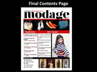
The document describes the construction of a magazine contents page. Key details include:
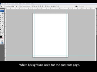
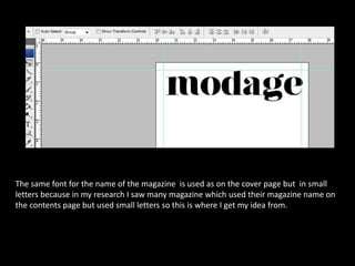
- Using a white background and the same font as the cover page but in smaller letters for the magazine name.
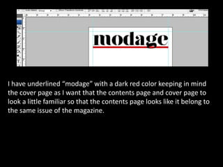
- Underlining the magazine name in dark red to connect the contents and cover pages visually.
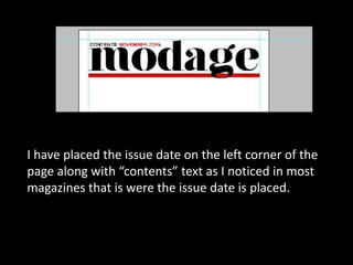
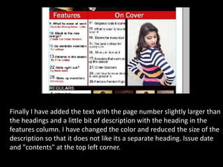
- Placing the issue date and word "contents" in the top left corner as is common.
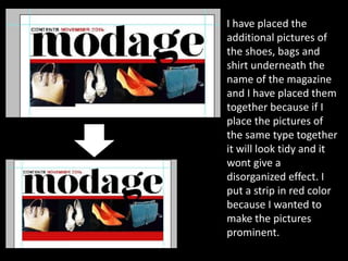
- Grouping and placing related pictures together under the magazine name with a red strip to make them prominent.
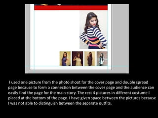
- Including one picture from the cover shoot to connect it to the main story pages.
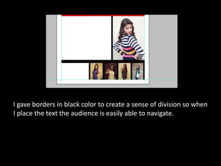
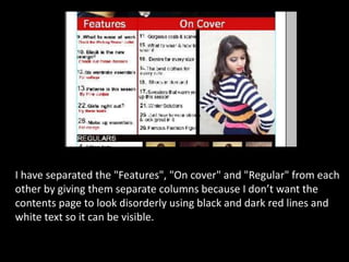
- Adding borders and columns to separate sections like "Features", "On cover", and "Regular" to