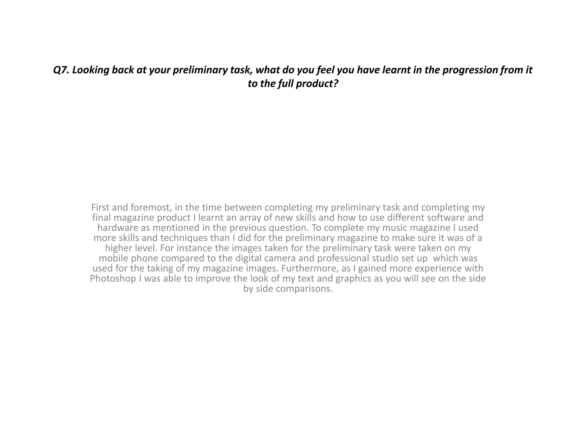
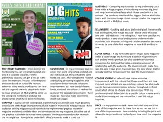
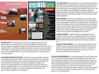
Q7. Looking back at your preliminary task, what do you feel you have learnt in the progression from it
to the full product?
First and foremost, in the time between completing my preliminary task and completing my
final magazine product I learnt an array of new skills and how to use different software and
hardware as mentioned in the previous question. To complete my music magazine I used
more skills and techniques than I did for the preliminary magazine to make sure it was of a
higher level. For instance the images taken for the preliminary task were taken on my
mobile phone compared to the digital camera and professional studio set up which was
used for the taking of my magazine images. Furthermore, as I gained more experience with
Photoshop I was able to improve the look of my text and graphics as you will see on the side
by side comparisons.
MASTHEAD - Comparing my masthead to my preliminary task I
have made a huge progress. I've made my masthead big, bold
and very clear with the effects which I have used which is the
emboss . I've made my masthead the biggest feature which also
ties in with the cover image. it also relates to what the magazine
is about which is R&B/Pop music.
COLOUR SCHEME - I believe I have made a massive
improvement with the colours that I have used then and now.
I've used more vibrant and eye-catching colours. I've also made
sure to have a consistent colour scheme throughout my front
cover which sticks to a house style convention. With my
preliminary task I did not stick to a specific colour scheme which
made it look messy and the colours that I used did not go
together.
COVER LINES – In my preliminary task my
cover lines were very boring and dull and
did not stand out. They all had the same
fonts and sizes. After doing some research
and looking at existing magazines that
used cover lines I've made a massive
improvements as I have used different
fonts, sizes and also colours. I reckon this
is one of the biggest improvements I have
made as I have also made cover lines
short but snappy.
SELLING LINE – Looking back at my preliminary task I never really
had a selling line, this maybe because I didn’t know what was
one until I did research. The selling that I have now used for my
media product is very visual and is placed underneath the
masthead. It is also eye catching and catches attention because it
is says to be one of the first magazine to have R&B and Pop in
one.
COVER IMAGE - A key form is the cover image. Every magazine
needs a cover image and have used it both in my preliminary
task and my media product. I've also used the eye contact
convention for both and this helps as creates some sort of
relationship with the audience. The improvement I made here
was the pose I have given my cover star, the pose shows that he
is ready to strive for success in this case the music industry.
THE TARGET AUDIENCE – From both of the
front covers you can tell what its about and
who it is targeted towards. For the
preliminary task you can get a hint as in the
cover line mentions ‘results’ ‘ofsted reports’
which are based on school life relation.
Where as in my media product you can clear
tell it is targeted towards people who listen
to music which are of R&B and Pop genre as
the selling line mentions it and also the
artists names which have been mentioned.
PRICE - in my preliminary task I never included how much the
price of the magazine was. So there fore as you can see this is
one of the improvements I have made by including the price as it
allows the target audience to clearly see how much the magazine
is.
GRAPHICS – as you can tell looking back at preliminary task I never used much graphics
which is one of the huge improvements I have made in my finished media product. I have
looked at existing magazines and how the have implemented graphics into their
magazine and then I used the ideas and developed it into my magazine. I like the use of
the graphics as I believe it makes some aspects of the magazine stand out for example
the rectangle box I have placed under Nicki Minaj’s name to make it stand out
TITLE/MASTHEAD– Comparing this to my preliminary task there is a
huge difference and improvement. In my preliminary task my title
only said ‘context’ which was very dull and boring but how ever in
my media product contents page I have made title more visual and
clear. I have done this by having white text against light blue
background graphic making it stand out. I've also included my mast
head into my title ‘inside this weeks BIG HITS’ and put the context
subheading below.
PAGE NUMBERS– as you can see looking back at my preliminary
task I have not included any page numbers to direct the audience
to the specific pages. However in my media product I have done so.
I have included page numbers and a small description underneath
the picture and contents about the nature of the article so that the
reader can get a taste of what is in the article and decide weather
they want to read it. Including page numbers is a important
convention as it allows easy navigation for the reader.
ISSUE DATE AND NUMBER– In my media product contents I have
included a issue number and date at the bottom of the contents
page in a red font .they blend with the format of ’contents’ title
with the red background and white font. As you can see in my
preliminary task I have not used either.
COLOUMNS/CONTENTS/PICTURES - One of the conventions that I have used
in my media product which I have not used in my preliminary task is columns.
In my preliminary task the columns, text and pictures were very unorganized
and scattered all over the place and were not margined or aligned. So
therefore in my media product I've made my columns split into 2 which are
photos and editors letter in one column and contents on the other which are
both margined and aligned. I have also included each subheading in the
contents section eg. News , live and feature.
EDITORS LETTER - at the bottom of my media product contents there is an
editor’s letter on the left hand side. This is a very effective convention of a
contents page as it engages the reader with the editor and make it seem as if he is
speaking. Also it I have made it signed so therefore it makes it more personalized.
I have made it very noticeable as I have a white box around it with black writing. I
have not used a editors letter in my preliminary task which is a improvement to
my media product.
TARGET AUDIENCE - From both of the contents pages you can
tell what its about and who it is targeted towards. In my media
product I have mention mainstream artists who are the genre of
R&B and Pop which therefore signifies who the target audience
are.
COLOUR SCHEME/GRAPHICS – In my media product contents I have made
sure to stick with the colour scheme of my magazine front cover the 4
colours have been used which are red, blue, yellow and white. How ever I
have used a black background, this was done to distinguish the difference
of the contents page and front cover. If you look back at my preliminary
task I haven't stuck with the same colours as my front cover which
therefore makes it confusing to the reader weather it is the same magazine
or not. I have also never used any graphics which i have improved and
done so in my media product.

Question 7

  • 1.
    Q7. Looking backat your preliminary task, what do you feel you have learnt in the progression from it to the full product? First and foremost, in the time between completing my preliminary task and completing my final magazine product I learnt an array of new skills and how to use different software and hardware as mentioned in the previous question. To complete my music magazine I used more skills and techniques than I did for the preliminary magazine to make sure it was of a higher level. For instance the images taken for the preliminary task were taken on my mobile phone compared to the digital camera and professional studio set up which was used for the taking of my magazine images. Furthermore, as I gained more experience with Photoshop I was able to improve the look of my text and graphics as you will see on the side by side comparisons.
  • 2.
    MASTHEAD - Comparingmy masthead to my preliminary task I have made a huge progress. I've made my masthead big, bold and very clear with the effects which I have used which is the emboss . I've made my masthead the biggest feature which also ties in with the cover image. it also relates to what the magazine is about which is R&B/Pop music. COLOUR SCHEME - I believe I have made a massive improvement with the colours that I have used then and now. I've used more vibrant and eye-catching colours. I've also made sure to have a consistent colour scheme throughout my front cover which sticks to a house style convention. With my preliminary task I did not stick to a specific colour scheme which made it look messy and the colours that I used did not go together. COVER LINES – In my preliminary task my cover lines were very boring and dull and did not stand out. They all had the same fonts and sizes. After doing some research and looking at existing magazines that used cover lines I've made a massive improvements as I have used different fonts, sizes and also colours. I reckon this is one of the biggest improvements I have made as I have also made cover lines short but snappy. SELLING LINE – Looking back at my preliminary task I never really had a selling line, this maybe because I didn’t know what was one until I did research. The selling that I have now used for my media product is very visual and is placed underneath the masthead. It is also eye catching and catches attention because it is says to be one of the first magazine to have R&B and Pop in one. COVER IMAGE - A key form is the cover image. Every magazine needs a cover image and have used it both in my preliminary task and my media product. I've also used the eye contact convention for both and this helps as creates some sort of relationship with the audience. The improvement I made here was the pose I have given my cover star, the pose shows that he is ready to strive for success in this case the music industry. THE TARGET AUDIENCE – From both of the front covers you can tell what its about and who it is targeted towards. For the preliminary task you can get a hint as in the cover line mentions ‘results’ ‘ofsted reports’ which are based on school life relation. Where as in my media product you can clear tell it is targeted towards people who listen to music which are of R&B and Pop genre as the selling line mentions it and also the artists names which have been mentioned. PRICE - in my preliminary task I never included how much the price of the magazine was. So there fore as you can see this is one of the improvements I have made by including the price as it allows the target audience to clearly see how much the magazine is. GRAPHICS – as you can tell looking back at preliminary task I never used much graphics which is one of the huge improvements I have made in my finished media product. I have looked at existing magazines and how the have implemented graphics into their magazine and then I used the ideas and developed it into my magazine. I like the use of the graphics as I believe it makes some aspects of the magazine stand out for example the rectangle box I have placed under Nicki Minaj’s name to make it stand out
  • 3.
    TITLE/MASTHEAD– Comparing thisto my preliminary task there is a huge difference and improvement. In my preliminary task my title only said ‘context’ which was very dull and boring but how ever in my media product contents page I have made title more visual and clear. I have done this by having white text against light blue background graphic making it stand out. I've also included my mast head into my title ‘inside this weeks BIG HITS’ and put the context subheading below. PAGE NUMBERS– as you can see looking back at my preliminary task I have not included any page numbers to direct the audience to the specific pages. However in my media product I have done so. I have included page numbers and a small description underneath the picture and contents about the nature of the article so that the reader can get a taste of what is in the article and decide weather they want to read it. Including page numbers is a important convention as it allows easy navigation for the reader. ISSUE DATE AND NUMBER– In my media product contents I have included a issue number and date at the bottom of the contents page in a red font .they blend with the format of ’contents’ title with the red background and white font. As you can see in my preliminary task I have not used either. COLOUMNS/CONTENTS/PICTURES - One of the conventions that I have used in my media product which I have not used in my preliminary task is columns. In my preliminary task the columns, text and pictures were very unorganized and scattered all over the place and were not margined or aligned. So therefore in my media product I've made my columns split into 2 which are photos and editors letter in one column and contents on the other which are both margined and aligned. I have also included each subheading in the contents section eg. News , live and feature. EDITORS LETTER - at the bottom of my media product contents there is an editor’s letter on the left hand side. This is a very effective convention of a contents page as it engages the reader with the editor and make it seem as if he is speaking. Also it I have made it signed so therefore it makes it more personalized. I have made it very noticeable as I have a white box around it with black writing. I have not used a editors letter in my preliminary task which is a improvement to my media product. TARGET AUDIENCE - From both of the contents pages you can tell what its about and who it is targeted towards. In my media product I have mention mainstream artists who are the genre of R&B and Pop which therefore signifies who the target audience are. COLOUR SCHEME/GRAPHICS – In my media product contents I have made sure to stick with the colour scheme of my magazine front cover the 4 colours have been used which are red, blue, yellow and white. How ever I have used a black background, this was done to distinguish the difference of the contents page and front cover. If you look back at my preliminary task I haven't stuck with the same colours as my front cover which therefore makes it confusing to the reader weather it is the same magazine or not. I have also never used any graphics which i have improved and done so in my media product.