
Recommended
More Related Content
What's hot
What's hot (20)
Similar to Evaluation Question Seven
Similar to Evaluation Question Seven (20)
More from Matteo Rimini
More from Matteo Rimini (20)
Recently uploaded
Recently uploaded (20)
Evaluation Question Seven
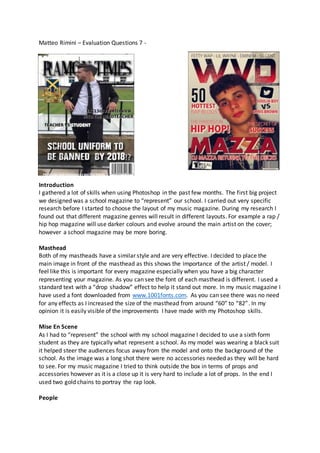
- 1. Matteo Rimini – Evaluation Questions 7 - Introduction I gathered a lot of skills when using Photoshop in the past few months. The first big project we designed was a school magazine to “represent” our school. I carried out very specific research before I started to choose the layout of my music magazine. During my research I found out that different magazine genres will result in different layouts. For example a rap / hip hop magazine will use darker colours and evolve around the main artist on the cover; however a school magazine may be more boring. Masthead Both of my mastheads have a similar style and are very effective. I decided to place the main image in front of the masthead as this shows the importance of the artist / model. I feel like this is important for every magazine especially when you have a big character representing your magazine. As you can see the font of each masthead is different. I used a standard text with a “drop shadow” effect to help it stand out more. In my music magazine I have used a font downloaded from www.1001fonts.com. As you can see there was no need for any effects as I increased the size of the masthead from around “60” to “82”. In my opinion it is easily visible of the improvements I have made with my Photoshop skills. Mise En Scene As I had to “represent” the school with my school magazine I decided to use a sixth form student as they are typically what represent a school. As my model was wearing a black suit it helped steer the audiences focus away from the model and onto the background of the school. As the image was a long shot there were no accessories needed as they will be hard to see. For my music magazine I tried to think outside the box in terms of props and accessories however as it is a close up it is very hard to include a lot of props. In the end I used two gold chains to portray the rap look. People
- 2. 0% of females and males under 21 years of age listen to rap therefore I used a model which is around the age group. This is effective as it relates more to the target group of the magazine. In the other hand however I decided to use a sixth form student wearing a suit as this is seen as responsible and mature. In both magazine there is a little bit of gender dominance as they are both evolved around boys. This may need to be worked on. Title, Font and Style Both titles are the second thing you see when looking at the magazine which is the aim therefore there positioning and size is good. Similar to the masthead I used a regular font however added in a “drop shadow” and I focused on the big names who are shot famous for their magazines such as GQ as they featured a couple artists related to my genre. I therefore used them as a base and used similar layouts, colours etc. to make the genre as close to theirs as possible. First glance we see no similarities between the two however surprisingly this GQ magazine inspired my design of my cover page. If we compare the two we can see that the placements of the cover lines are similar. The GQ magazine is famous for its short but catchy title therefore I tried to duplicate that with my copy. Written Content Finchley Catholic School is aged from 12 – 19 year olds therefore I had to use formal English that was easy to read for all age groups. I made the cover lines and short and catchy for example “TEACHER VS STUDENT”. This gets the attention of both students and teachers as it involves both of them. I included a similar cover line in my music magazine as after getting feedback I found out that the most effective cover line was this. My music magazine was written a little less formal as the target group is for teenagers who are into rap / hip hop music. After researching I discovered that the majority of magazines have three to five cover lines therefore I represented this in my covers. Music Genre and how my magazine portrays it? I think that it is safe to presume that my music genre is portrayed in a very simplistic way. My peers have told me that just from the main image it is clear what genre the magazines are for. This was my aim. The props such as the gold chain helped send this image across. For the school magazine the costume (suit and tie) also helped show that it was for a school magazine.