
Recommended
More Related Content
What's hot
What's hot (19)
Viewers also liked
Similar to Magazine Presentation
Similar to Magazine Presentation (20)
More from meganlsx
More from meganlsx (20)
Recently uploaded
Recently uploaded (20)
Magazine Presentation
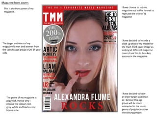
- 1. Magazine front cover: This is the front cover of my magazine. The target audience of my magazine is men and women from the specific age group of 20-34 year olds The genre of my magazine is pop/rock. Hence why I choose the colours red, grey, white and black as my house style. I have choose to set my magazine out in this format to replicate the style of Q magazine I have decided to include a close up shot of my model for the main front cover image as looking at different magazine covers I see this to be a key success in the magazine. I have decided to have an older target audience as I believe this age group will be more interested in the music genre of pop/rock rather than young people.
- 2. Looking at the different magazine front covers below, which image do you feel best suits the layout of the front cover? And why? 1) 2) 3) 4) 5)
- 3. Contents page : I have included the house style of red, white and grey to show the reader that this is a product I have created I have also included the masthead at the top of the page to follow the key conventions of music magazines I have included the website address at the bottom of my magazine as this is seen as key codes and conventions The social media tab at the bottom of the page is important as social media is becoming increasingly popular, with the vast majority of people having access to internet.
- 4. Double page spread: After looking at Q magazine I found their double page spreads to be very effective as the majority of their spreads include a large letter in the background of their text. I decided to use this idea and placed an ‘A’ in the background as the name for my artist is Alexandra Flume. I have chosen to have a black and white image as the main picture for my double page spread to follow the style of Q magazine. I have also included the magazine’s website, issue date and masthead to show readers that this a project I have made.
- 5. Second double page spread: I have included a picture of my model from a photo shoot on location to create a diverse between my work as the majority of my photos displayed in my magazine have been taken inside in one of the Media rooms against a white background. I have also included a small image at the bottom of the page to divide the text up of my article. Initially I wanted the text to be wrapped around the image, however when I tried to do this it wouldn’t work meaning I will need to improve this.