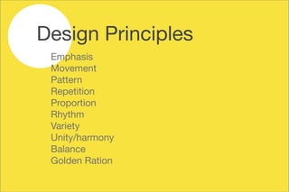
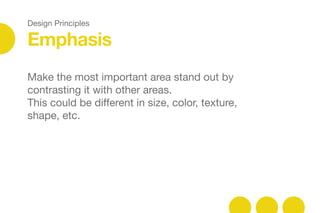
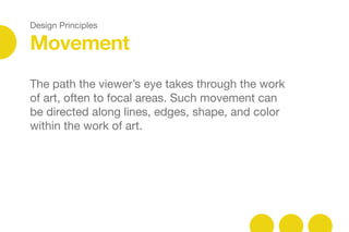
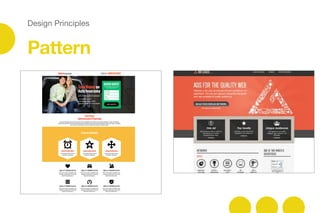
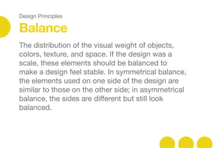
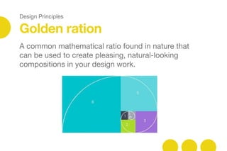
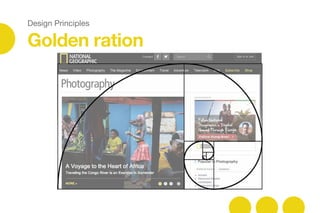
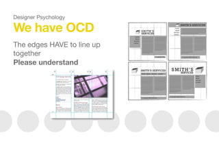
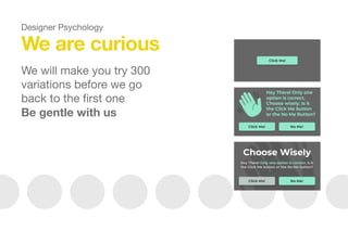
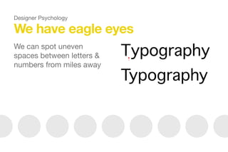
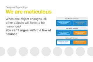
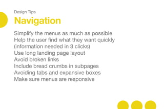
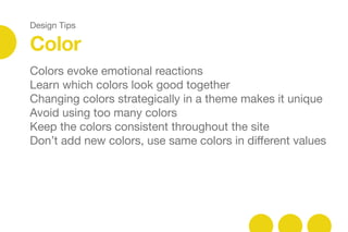
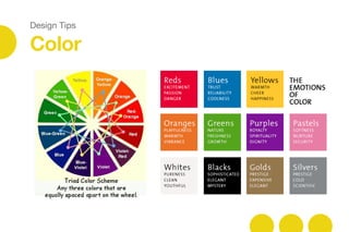
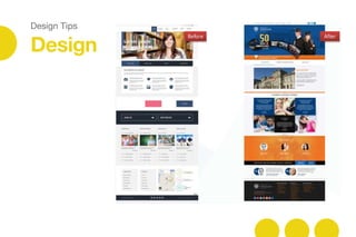
This document provides guidance for developers on understanding designers and design principles. It discusses that design is a process that involves research into the client, target audience, and key messages. It also outlines basic design principles like emphasis, movement, pattern, and balance. The document advises developers to understand designer psychology and traits like perfectionism. It concludes by providing tips for developers to improve designs and keep learning.
1. But it damn sure makes it
look good!
Design may not save the world……
Dear Developer,
xoxo Carole
2. Design in action
Do you know what your marketing is doing?
Dear developer: Design is a process
Research
Dear developer: Design is not random
Design principles
Dear developer: Please understand us…
Designer Psychology
Dear developer: Fake it till you make it
Design Tips
Dear developer: Get inspired
Resources
Dear developer: Keep improving
Embrace change
Contents
10. Design Principles
Emphasis
Make the most important area stand out by
contrasting it with other areas.
This could be different in size, color, texture,
shape, etc.
12. Design Principles
Movement
The path the viewer’s eye takes through the work
of art, often to focal areas. Such movement can
be directed along lines, edges, shape, and color
within the work of art.
16. Design Principles
Repetition
Works with pattern to make the work of art seem
active. The repetition of elements of design
creates unity within the work of art.
18. Design Principles
Proportion
The feeling of unity created when all parts (sizes,
amounts, or number) relate well with each other.
When drawing the human figure, proportion can
refer to the size of the head compared to the rest
of the body.
20. Design Principles
Rhythm
When design elements are used repeatedly to
create a feeling of organized movement.
like music or dancing
variety is essential
22. Design Principles
Variety
The use of several elements of design to hold the
viewer’s attention and to guide the viewer’s eye
through and around the work of art.
26. Design Principles
The distribution of the visual weight of objects,
colors, texture, and space. If the design was a
scale, these elements should be balanced to
make a design feel stable. In symmetrical balance,
the elements used on one side of the design are
similar to those on the other side; in asymmetrical
balance, the sides are different but still look
balanced.
Balance
28. Design Principles
Golden ration
A common mathematical ratio found in nature that
can be used to create pleasing, natural-looking
compositions in your design work.
32. We have our pride
Don’t ask us to copy a design
you’ve seen already
Designer Psychology
33. We are not mind readers
Please clarify the technical limitations
as early as possible
So we don’t turn evil on you
Designer Psychology
34. No, I won’t make the logo bigger!
You have to trust us
(I went to a 4-year university to
study the perfect size of the logo)
Designer Psychology
35. We are backed by science
No, we are not crazy
Design elements influence a user’s emotions and
decisions
Designer Psychology
36. We have OCD
The edges HAVE to line up
together
Please understand
Designer Psychology
37. We are perfectionists
We will spend 6 hours looking
for the one perfect photo
Then spend 6 more hours
editing that photo to death
Be patient with us
Designer Psychology
38. Please optimize images for us
We cannot see an image
being reduced
It’s like taking candy away
from a child
Designer Psychology
39. We are curious
We will make you try 300
variations before we go
back to the first one
Be gentle with us
Designer Psychology
40. We have eagle eyes
We can spot uneven
spaces between letters &
numbers from miles away
Designer Psychology
41. We are meticulous
When one object changes, all
other objects will have to be
rearranged
You can’t argue with the law of
balance
Designer Psychology
42. We are hard on ourselves too
We will keep improving things that already work
And no, it’s not because we like to waste your
time
Designer Psychology
43. We are happy with what we know
We would rather fix the space between letters
than learn to code
Designer Psychology
44. We love what we do
Every project is a chance to create something new
and amazing
We are only interested in making things look good
You will have to make them work
Designer Psychology
45. What we are afraid of
The back-end editor
The fonts on there are
really scary
Designer Psychology
46. What we are afraid of MOST
Databases
Please keep them
away from us
Designer Psychology
47. Designer confession:
We truly appreciation your patience
We love that you have the logic and discipline
needed to be a developer
We understand how difficult it is to deal with us
Designer Psychology
48. Designer secret:
We really admire what you do
We actually think you’re magicians
You make our beloved creations come to life
Designer Psychology
50. Design Tips
Have a plan
Do your research before you start
Structure wireframes first
Study your navigation hierarchy before starting
Keep things clean & simple
51. Design Tips
Navigation
Simplify the menus as much as possible
Help the user find what they want quickly
(information needed in 3 clicks)
Use long landing page layout
Avoid broken links
Include bread crumbs in subpages
Avoiding tabs and expansive boxes
Make sure menus are responsive
52. Design Tips
Color
Colors evoke emotional reactions
Learn which colors look good together
Changing colors strategically in a theme makes it unique
Avoid using too many colors
Keep the colors consistent throughout the site
Don’t add new colors, use same colors in different values
54. Design Tips
Typography
Choose 2 contrasting typefaces
Don’t mix more than 3 typefaces together
Changing fonts in a theme makes it look more
unique
Keep the decorative fonts for headlines only
Use short and catchy headlines
For long texts, choose a font that is easy for the
eye to read
Use more line height on body than headings
56. Design Tips
Images / icons
Images have a big impact on the overall design
Use images that have the same feel
Be consistent with borders and corners
Using too many images close to each other is
tiring for the eye
Use simple icons and don’t add too many
Keep icon styles consistent
58. Design Tips
Design
Maintain consistency in design
Use contrast to differentiate each section
Don’t be afraid of white space
Use more padding around objects
Use visual hierarchy when displaying lots of data
Don’t go overboard with drop shadows, gradients,
or animations
Add fine details, transitions and animations last
Test your page continuously
Include social share and follow buttons