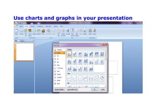
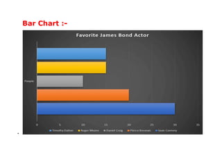
TOPICS :-
 INTRODUCTION TO POWERPOINT
 WORKING WITH CHARTS
 USING CHART IN PRESENTATION
 CHART TYPES
 QUICK REVIEW
Introduction toPowerPoint
 PowerPoint is a program used to create
professional presentations.
 Presentations can include:
•Text
•graphics
•tables
•charts
•audio
• video
• flash animation files
• animated clip art
• movie clips
• links to Web sites
CHARTS :-
Most Popular PPT Charts And Graphs You Can
Use In Your Presentation
o Line Chart
o Bar Chart
o Column Chart
o Pie Chart
Use charts and graphs in your presentation
To create a simple chart from scratch in PowerPoint,
click Insert > Chart and pick the chart you want.
1. In PowerPoint 2007, click the placeholder that you
want to contain the chart.
2. On the Insert tab, in the Illustrations group,
click Chart.
3. In the Insert Chart dialog box, click a chart, and
then click OK.
Office Excel 2007 opens in a split window and
displays sample data on a worksheet.
4. In Excel, to replace the sample data, click a cell on
the worksheet, and then type the data that you
want.
5. When you are finished inputting the data in Excel,
on the File menu, click Close.
Charts Types :-
There are many different types of presentation
charts and graphs you can use in PowerPoint.
Depending on the data you want to analyze and
present in an easy-to-understand format, you may
need to do some digging around to find the best
chart for your specific needs.
 Line Chart

If you want to show a variable’s trend over a period
of time, then you can use a line chart. In the
sample line chart above, we’ve compared the
profits of Stores 1, 2 and 3 over a 4-day period.
the orange line shows an upward trend. On the
other hand, the blue line shows a downward trend.
While the gray line shows no discernible pattern.
 How to make a line graph in PowerPoint?
To make a line graph in your PowerPoint slide,
simply click on Insert > Chart. The Insert
Chart menu will pop-up on your screen. Click
on Line and choose the line chart type you want to
use .Options include the basic line chart, stacked
line chart, 100% stacked line chart, line chart with
markers, stacked line chart with markers, 100%
stacked line chart with markers, and 3-D line chart.

Bar Chart :-

In a bar graph, the bars are horizontally laid out,
and the length of the bar is proportionate to the
value it represents. This means that the longer a
particular bar is, the higher the number/value
associated with it.
To add a bar graph, click on Insert > Chart. In
the Insert Chart menu, select Bar and then click
on the type of bar graph you want to use. Bar
Graph options include clustered bar chart, stacked
bar chart, 100% stacked bar chart, 3-D clustered
bar chart, 3-D stacked bar chart, and 3-D 100%
stacked bar chart.
Column Chart
Column charts are just bar graphs in a vertical
orientation. If we use the same data that we used in
our bar graph example above, then we can simply
change the chart type. To do this, click on the bar
chart to access the Chart Tools menu. Go to
the Design tab, then click on Change Chart Type.
The Change Chart Type menu will then pop-up on
your screen. Click on Column.
Column Chart options include clustered column
chart, stacked column chart, 100% stacked column
chart, 3-D clustered column chart, 3-D stacked
column chart, 3-D 100% stacked column chart, and
3-D column chart.
Pie Chart
Pie charts are relatively easy to create. You simply
need to figure out the percentages or proportions of
each category of data you want to present (these
are the ‘pie slices’ you see in the chart). The large
the ‘pie slice’ the larger the value or percentage for
that particular category. The sum total of all the
percentages should equal to 100%.
Unlike other charts, pie charts aren’t suitable for
presenting large amounts of data. The more
categories of data you have, the more segments or
slices there will be in your pie chart. This means it’s
going to be visually challenging to discern which
segment represents what category.
As you can see in the screenshot, PowerPoint has
automatically calculated the percentage or
proportion for each actor. Sean Connery, of course,
took up the biggest percentage at 33% of votes,
Pierce Brosnan came in second at 22%, Timothy
Dalton and Roger Moore at 17% each, and lastly,
Daniel Craig got 11% of the votes.
By the way, PowerPoint has 5 different pie chart
types you can choose from: regular pie chart, 3-D
pie chart, pie of pie chart, bar of pie chart, and
doughnut pie chart.
Quick Review :-
 PowerPoint is a program used to create
professional presentations.
 Popular charts that are used in PowerPoint are
-
oLine Chart
oBar Chart
oColumn Chart
oPie Chart
 We can modify the chart type as per our
requirement.
ASSIGNMENTS :-
1. What is a table?
2. What is a chart?
3. Name the components of a chart.
4. Fill in the blanks :-
a. Intersection of row and column is called ___
b. We specify number of rows and columns in
the _______ dialog box.
c. “Insert Above” option is present on the
_____ tab.
d. The _______ tool is used to apply different
background colours in a table.
e. ________ are the bars that shows the data
value.
PowerPoint & chart

PowerPoint & chart

  • 2.
    TOPICS :-  INTRODUCTIONTO POWERPOINT  WORKING WITH CHARTS  USING CHART IN PRESENTATION  CHART TYPES  QUICK REVIEW
  • 3.
    Introduction toPowerPoint  PowerPointis a program used to create professional presentations.  Presentations can include: •Text •graphics •tables •charts •audio • video • flash animation files • animated clip art • movie clips • links to Web sites
  • 4.
    CHARTS :- Most PopularPPT Charts And Graphs You Can Use In Your Presentation o Line Chart o Bar Chart o Column Chart o Pie Chart
  • 5.
    Use charts andgraphs in your presentation
  • 6.
    To create asimple chart from scratch in PowerPoint, click Insert > Chart and pick the chart you want. 1. In PowerPoint 2007, click the placeholder that you want to contain the chart. 2. On the Insert tab, in the Illustrations group, click Chart. 3. In the Insert Chart dialog box, click a chart, and then click OK. Office Excel 2007 opens in a split window and displays sample data on a worksheet.
  • 7.
    4. In Excel,to replace the sample data, click a cell on the worksheet, and then type the data that you want. 5. When you are finished inputting the data in Excel, on the File menu, click Close. Charts Types :- There are many different types of presentation charts and graphs you can use in PowerPoint. Depending on the data you want to analyze and present in an easy-to-understand format, you may need to do some digging around to find the best chart for your specific needs.
  • 8.
     Line Chart  Ifyou want to show a variable’s trend over a period of time, then you can use a line chart. In the
  • 9.
    sample line chartabove, we’ve compared the profits of Stores 1, 2 and 3 over a 4-day period. the orange line shows an upward trend. On the other hand, the blue line shows a downward trend. While the gray line shows no discernible pattern.  How to make a line graph in PowerPoint? To make a line graph in your PowerPoint slide, simply click on Insert > Chart. The Insert Chart menu will pop-up on your screen. Click on Line and choose the line chart type you want to use .Options include the basic line chart, stacked line chart, 100% stacked line chart, line chart with markers, stacked line chart with markers, 100%
  • 10.
    stacked line chartwith markers, and 3-D line chart. 
  • 11.
  • 12.
    In a bargraph, the bars are horizontally laid out, and the length of the bar is proportionate to the value it represents. This means that the longer a particular bar is, the higher the number/value associated with it. To add a bar graph, click on Insert > Chart. In the Insert Chart menu, select Bar and then click on the type of bar graph you want to use. Bar Graph options include clustered bar chart, stacked bar chart, 100% stacked bar chart, 3-D clustered bar chart, 3-D stacked bar chart, and 3-D 100% stacked bar chart.
  • 13.
    Column Chart Column chartsare just bar graphs in a vertical orientation. If we use the same data that we used in our bar graph example above, then we can simply change the chart type. To do this, click on the bar chart to access the Chart Tools menu. Go to the Design tab, then click on Change Chart Type.
  • 14.
    The Change ChartType menu will then pop-up on your screen. Click on Column.
  • 15.
    Column Chart optionsinclude clustered column chart, stacked column chart, 100% stacked column chart, 3-D clustered column chart, 3-D stacked column chart, 3-D 100% stacked column chart, and 3-D column chart.
  • 16.
    Pie Chart Pie chartsare relatively easy to create. You simply need to figure out the percentages or proportions of each category of data you want to present (these are the ‘pie slices’ you see in the chart). The large the ‘pie slice’ the larger the value or percentage for that particular category. The sum total of all the percentages should equal to 100%. Unlike other charts, pie charts aren’t suitable for presenting large amounts of data. The more categories of data you have, the more segments or slices there will be in your pie chart. This means it’s
  • 17.
    going to bevisually challenging to discern which segment represents what category.
  • 19.
    As you cansee in the screenshot, PowerPoint has automatically calculated the percentage or proportion for each actor. Sean Connery, of course, took up the biggest percentage at 33% of votes, Pierce Brosnan came in second at 22%, Timothy Dalton and Roger Moore at 17% each, and lastly, Daniel Craig got 11% of the votes. By the way, PowerPoint has 5 different pie chart types you can choose from: regular pie chart, 3-D pie chart, pie of pie chart, bar of pie chart, and doughnut pie chart.
  • 20.
    Quick Review :- PowerPoint is a program used to create professional presentations.  Popular charts that are used in PowerPoint are - oLine Chart oBar Chart oColumn Chart oPie Chart  We can modify the chart type as per our requirement.
  • 21.
    ASSIGNMENTS :- 1. Whatis a table? 2. What is a chart? 3. Name the components of a chart. 4. Fill in the blanks :- a. Intersection of row and column is called ___ b. We specify number of rows and columns in the _______ dialog box. c. “Insert Above” option is present on the _____ tab. d. The _______ tool is used to apply different background colours in a table. e. ________ are the bars that shows the data value.