
Recommended
More Related Content
What's hot
What's hot (20)
Viewers also liked
Viewers also liked (18)
Similar to College Magazine project analysis
Similar to College Magazine project analysis (20)
Recently uploaded
Recently uploaded (20)
College Magazine project analysis
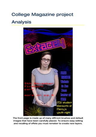
- 1. College Magazine project Analysis The front page is made up of many diffrrent brushes and default images that have been carefully placed. To ensure easy editing and recalling of effets you must remeber to create new layers.
- 2. This magazine has been created to impersanize a club magazine and all the colours carfully interact. This is the same for the back Insert your desired image into photo shop and using the QUICK page. SELECTION TOOL (W) cut around your image. Open a separate work space and set the background to the colour you want. Press ctrl, alt + c to copy the cut out picture to your new work space.
- 3. After copying the photo over into your new workspace just simply move it into the position you want it. Once doing this you just need to press enter to lock it.
- 4. Now for the colour and brushes. Using different brushes you can add different effects and patterns. As this was my first attempt of a magazine so I have not changed any of the lighting or contrast etc
- 5. Using the brushes you can bulk up the front with different patterns and colours.
- 6. Using the text tool create as many text boxes as you need in your desired location. You can change the colour, shape, size and audacity. For the (extacey) text input I used the blending option to add inner and outer shadow an and the gradient option to get the blue and pink effect.
- 7. This contents page has an easy to read and see contents section. Simplicity and complexity sometimes need to interact to give the reader an idea of diversity. The contents page has been based around different but light and noticeable colours.
- 8. New>file>i nternational paper> A4 and name your first layer ( Backgroun d)
- 9. OPEN your picture in Photoshop. Using the quick selection tool cut out the medium close up and copy it onto your new project, but ensure to open a new layer.
- 10. Once you have done this you can now start adding effects and brushes to your project ensuring that you open a new layer for each brush and text input etc. To relate the front cover to the contents page you must use either similar images or similar colours.
- 11. Using the stamp tool you can add small icons such as arrows. I used this to make a connection between the arrow and contents ( sense of moving on) and using the brush tool draw a line from the arrow to the text (CONTENTS)
- 12. Select the line tool on the top menu bar to create a line. This line is to be used for the margin. Ensure you create a new layer for each different brush or effect.
- 13. Once finishing each page, go to FILE>SAVE AS>JPEG and then export. After using different brushes to apply bullets and different splodges you can now add your contents. Making sure that the text has similar colours that relate to the front.
- 14. Front and contents page rough materials
- 17. All other images brushes defaulted in Photoshop CS3 and have been adjusted using the blending option in the program.