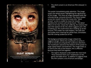
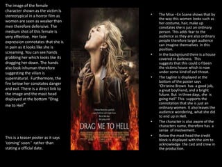
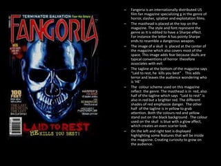
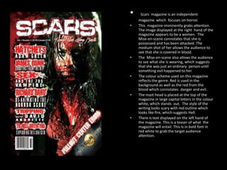
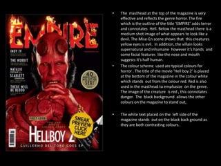
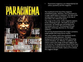
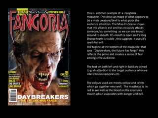
Poster and Magazine analysis
By Leah Meka
POSTERS
Saw

•

The image of a hand that appears to be
cut off immediately grabs attention.
From looking at this poster without
carefully analyzing, it is clear to say that
the genre of this movie is horror. The
image is positioned at the center of the
poster therefore is the center of
attention. The image looks like it is in 3D
this is effective because not only does it
add terror but it also makes it real.
Furthermore, the way the hand is
positioned connotates that the person
was begging or pleading for help, this
person was a victim of a vicious attack.
Blood drops are displayed near the hand
which leads the audience to the title
'Saw' which appears to be written in
blood. The colour scheme on this poster
is very simple but has a lot of meaning.
For instance the white background
connotates after life, this colour is linked
to the image displayed on the poster. The
red blood drops and the title in red
symbolized death and pain. Overall, the
two colours displayed link together, the
red symbolizes death whilst the white
symbolize after death. The font of the
title 'Saw' is written in a creepy way
which also symbolizes evil.
The ring two

•

There is a little girl shown in the center of this
poster, this connotates that there is a child
involved in this horror movie. As you can see, the
child's face is hidden by her hair and her body
language suggests that she is under some kind of
evil spell. From looking at this image, you are
able to identify the genre. Majority of the colour
used on this poster is black, however it is light in
the middle of the poster where the audience can
see the image of the little girl, this specific
lighting has a glow affect and this highlights the
significance of this child. This poster has the
effect of chiaroscuro lighting. This technique is
effective and is popular in Horror movies.
Furthermore, the smaller font displayed on the
poster that says 'The ring' is written in a child like
style. The bigger font that says 'Two' is written
mysteriously which adds fear. The letter 'O'
appears directly behind her head and creates a
ominous ambience. There is not that much text
on this poster therefore it leaves the audience
feeling curious about the movie and intrigued
about what the movie will entail.
The masthead on this poster is placed at the bottom of the poster
in large capital letters in bold font, this emphasizes the title
'SCRE4M' The masthead is written in white which stands out on a
black background because they are contrasting colours. In the title
the number 'A' is misplaced with the number 4 this is because this
is the forth edition to the scream movies. The number and the
letter 'A‘ are quite similar looking, therefore blends with the rest
of the word. Furthermore, From looking at the title you can see
that the letter 4 is in red, this change of colour is used to grab
attention to the audience. The letter 'M‘ in the title is jagged and
very sharp, which symbolizes a knife which is the killer main
weapon to kill victims.
The words "New decade, New rules" are displayed at the top of
the poster in red. These words adds mystery because it doesn't
give anything away however hints that this edition will be
different to the others, therefore grabs the audience attention.
These words are written in red which symbolizes blood, danger,
evil etc., all reflecting the genre of this film. From looking at the
text on this poster, you can see that the masthead is at the
bottom of the page whilst the slogan is at the top. This connotates
that the slogan is more important that the actual masthead.
Furthermore, the poster looks pretty simple however very
effective, the black background connotates death and darkness
which adds terror and also contrasts the white mask which is
displayed at the center of the poster, which is the killer in this
horror movie. The image of this killer has been edited so that the
chin resembles a Sharpe knife, this is the killers main weapon.
Towards the end of the chin there is a bright shine light to
connotate a fresh new knife ready to kill. The image of the mask
has a slight glow it, this allows curiosity as well as terror to grow
amongst the audience.
•

The silent scream is an American film released in
2005.

This poster immediately grabs attention. The image
covers the whole poster highlighting the significance
of this image. The close up image displayed looks like
a female being viciously tortured. The chains locked
across her mouth links to the movie title “Silent
scream” as she is unable to move her mouth,
therefore her screams will not be heard. The detail
effect on her face shows her suffering, for instance her
eyes that appears to be red, which suggests pain. She
is looking up, this could mean she Is looking up at her
torturer. This makes her look helpless. Her pale skin
and visible veins covering her whole face, connotates
that life is being sucked out of her.
The background behind the image is black this
suggests danger. Whilst the masthead is in white in
order to stand out and grab the audiences attention.
The masthead is placed at the bottom of the poster in
large capital letters and bold font. The image leads us
to look at the title at the bottom, this is effective
because they both link together.
•
The tagline displayed underneath the mast head
“Pray someone hears you” emphasizes on the
genre and adds terror. In addition it suggests that
this film contains a lot of torture and danger.
The image of the female
character shown as the victim Is
stereotypical in a horror film as
women are seen as weaker than
men therefore defensive. The
medium shot of this female is
very effective. Her face
expression connotates that she is
in pain as it looks like she is
screaming. You can see hands
grabbing her which looks like its
dragging her down. The hands
also look inhuman therefore
suggesting the vilian is
supernatural. Furthermore, the
fire below her conotates danger
and evil. There is a direct link to
the image and the mast head
displayed at the bottom “Drag
me to Hell”

•

•

•

•

This is a teaser poster as it says
‘coming’ soon ‘ rather than
stating a official date.

•

The Mise –En Scene shows that by
the way this women looks such as
her costume, hair, make up
conotates she is just an ordinary
person. This adds fear to the
audience as they are also ordinary
people therefore target audience
can imagine themselves in this
position.
In the background there is a house
covered in darkness. This
suggests that this could o f been
the victims house which is now
under some kind of evil threat.
The tagline is displayed at the
bottom of the poster says
‘Christine Brown has a good job,
a great boyfriend, and a bright
future. But in three days, she is
going Hell” This supports the
connotation that she is just an
ordinary women. It also leaves the
audience wondering, what she did
to end up in Hell.
The character is also aware of the
characters name, therefore has a
sense of involvement.
Below the mast head the credit
block is displayed with the aim to
acknowledge the cast and crew in
the production.
Magazines
–
–

–

–

–

–

Fangoria is an internationally distributed US
film fan magazine specializing g in the genre of
horror, slasher, splatter and exploitation films.
The masthead is placed at the top on the
magazine. The style and font represent the
genre as It is edited to have a Sharpe effect.
For instance the letter A has pointy Sharpe
ends to resemble a dangerous weapon.
The image of a skull is placed at the center of
the magazine which also covers most of the
space. This image adds fear because skulls are
typical conventions of horror therefore
associates with evil.
The tagline at the bottom of the magazine says
“Laid to rest, he kills you best” . This adds
terror and leaves the audience wondering who
is ‘HE’
The colour scheme used on this magazine
reflect the genre. The masthead is in red, also
half of the tagline which says “Laid to rest” is
also in red but a brighter red. The different
shades of red emphasize danger. The other
half of the tagline is in yellow to grab
attention. Both the colours red and yellow
stand out on the black background . The colour
used on the skull is blue with a glow affect,
which creates an even scarier look.
On the left and right text is displayed
highlighting some features that will be inside
the magazine. Creating curiosity to grow on
the audience.
•
•

•

•

•

•

Scars magazine is an independent
magazine which focuses on horror.
This magazine imminently grabs attention.
The image displayed at the right hand of the
magazine appears to be a women. The
Mise-en-scene connotates that she is
possessed and has been attacked. The
medium shot of her allows the audience to
see that she is covered in blood.
The Mise-en-scene also allows the audience
to see what she is wearing, which suggests
that she was just an ordinary person until
something evil happened to her.
The colour scheme used on this magazine
reflects the genre. Red is used in the
background as well as the red from the
blood which connotates danger and evil.
The mast head is placed at the top of the
magazine in large capital letters in the colour
white, which stands out. The style of the
writing looks scary with red outline which
looks like fire, which suggests Hell.
There is text displayed on the left hand of
the magazine. This is a teaser of what the
magazine will entail. This Is in bold font in
red white to grab the target audience
attention.
•

•

•

The masthead at the top of the magazine is very
effective and reflects the genre horror. The fire
which is the outline of the title ‘EMPIRE’ adds terror
and connotates Hell. Below the masthead there is a
medium shot image of what appears to look like a
devil. The Mise-En scene shows that this creatures
yellow eyes is evil. In addition, the villain looks
supernatural and inhumane however it’s hands and
some facial features like the nose and mouth
suggests it’s half human.
The colour scheme used are typical colours for
horror . The title of the movie ‘Hell boy 2’ is placed
at the bottom of the magazine in the colour white
which stands out from the colour red. Red is also
used in the masthead to emphasize on the genre.
The image of the creature is red , this connotates
danger. The black background allows the other
colours on the magazine to stand out,
The white text placed on the left side of the
magazine stands out on the black back ground as
they are both contrasting colours.
•

Paracinema magazine is an independently full
colour, quarterly cult film magazine.

The masthead at the top of the magazine
immediately grabs attention. This is because it is
in large capital letters in bold font. The style of the
writing looks as if it’s been bitten at the tips of
each letter, this reflects the genre.
The image at the center of the magazine appears
to be a drawing of a girl. She looks as id she is
possessed, her beady eyes and wicked smile
connotates she is evil. The drawing of this girl
adds fear and brings attention to the target
audience.
The writing displayed below the image is aimed to
target people who enjoy horror movies.
The colour yellow used in the masthead stands
out therefore grabs attention. The black
background and white text are both contrasting
colours therefore are effective. In addition, the
colours used in the image of the girl suggests she
is not normal. The beige/yellow colours of her face
connotates she is dead and has no soul. The use of
red on her nose and cheeks looks as if it is blood,
this suggests danger.
This is another example of a Fangforia
magazine. The close up image of what appears to
be a male creature/devil is what grabs the
audience attention. The Mise-En-Scene shows
that this vilian is evil and has viciously attacks
someone/so, something as we can see blood
around t’s mouth. It’s mouth is open so it’s long
Sharpe teeth is visible , this suggests it uses it’s
teeth for evil.
The tagline at the bottom of the magazine that
says “Daybreakers, the future has fangs” this
reflects the genre and creates a sense of fear
amongst the audience.
The text on both left and right in bold are aimed
to grab attention to the target audience who are
interested in vampires etc.
The colours used are mostly yellow and white
which go together very well. The masthead is in
red as we well as the blood on the creatures
mouth which associates with danger and evil.

Leah meka media analysis

  • 1.
    Poster and Magazineanalysis By Leah Meka
  • 2.
  • 3.
    Saw • The image ofa hand that appears to be cut off immediately grabs attention. From looking at this poster without carefully analyzing, it is clear to say that the genre of this movie is horror. The image is positioned at the center of the poster therefore is the center of attention. The image looks like it is in 3D this is effective because not only does it add terror but it also makes it real. Furthermore, the way the hand is positioned connotates that the person was begging or pleading for help, this person was a victim of a vicious attack. Blood drops are displayed near the hand which leads the audience to the title 'Saw' which appears to be written in blood. The colour scheme on this poster is very simple but has a lot of meaning. For instance the white background connotates after life, this colour is linked to the image displayed on the poster. The red blood drops and the title in red symbolized death and pain. Overall, the two colours displayed link together, the red symbolizes death whilst the white symbolize after death. The font of the title 'Saw' is written in a creepy way which also symbolizes evil.
  • 4.
    The ring two • Thereis a little girl shown in the center of this poster, this connotates that there is a child involved in this horror movie. As you can see, the child's face is hidden by her hair and her body language suggests that she is under some kind of evil spell. From looking at this image, you are able to identify the genre. Majority of the colour used on this poster is black, however it is light in the middle of the poster where the audience can see the image of the little girl, this specific lighting has a glow affect and this highlights the significance of this child. This poster has the effect of chiaroscuro lighting. This technique is effective and is popular in Horror movies. Furthermore, the smaller font displayed on the poster that says 'The ring' is written in a child like style. The bigger font that says 'Two' is written mysteriously which adds fear. The letter 'O' appears directly behind her head and creates a ominous ambience. There is not that much text on this poster therefore it leaves the audience feeling curious about the movie and intrigued about what the movie will entail.
  • 5.
    The masthead onthis poster is placed at the bottom of the poster in large capital letters in bold font, this emphasizes the title 'SCRE4M' The masthead is written in white which stands out on a black background because they are contrasting colours. In the title the number 'A' is misplaced with the number 4 this is because this is the forth edition to the scream movies. The number and the letter 'A‘ are quite similar looking, therefore blends with the rest of the word. Furthermore, From looking at the title you can see that the letter 4 is in red, this change of colour is used to grab attention to the audience. The letter 'M‘ in the title is jagged and very sharp, which symbolizes a knife which is the killer main weapon to kill victims. The words "New decade, New rules" are displayed at the top of the poster in red. These words adds mystery because it doesn't give anything away however hints that this edition will be different to the others, therefore grabs the audience attention. These words are written in red which symbolizes blood, danger, evil etc., all reflecting the genre of this film. From looking at the text on this poster, you can see that the masthead is at the bottom of the page whilst the slogan is at the top. This connotates that the slogan is more important that the actual masthead. Furthermore, the poster looks pretty simple however very effective, the black background connotates death and darkness which adds terror and also contrasts the white mask which is displayed at the center of the poster, which is the killer in this horror movie. The image of this killer has been edited so that the chin resembles a Sharpe knife, this is the killers main weapon. Towards the end of the chin there is a bright shine light to connotate a fresh new knife ready to kill. The image of the mask has a slight glow it, this allows curiosity as well as terror to grow amongst the audience.
  • 6.
    • The silent screamis an American film released in 2005. This poster immediately grabs attention. The image covers the whole poster highlighting the significance of this image. The close up image displayed looks like a female being viciously tortured. The chains locked across her mouth links to the movie title “Silent scream” as she is unable to move her mouth, therefore her screams will not be heard. The detail effect on her face shows her suffering, for instance her eyes that appears to be red, which suggests pain. She is looking up, this could mean she Is looking up at her torturer. This makes her look helpless. Her pale skin and visible veins covering her whole face, connotates that life is being sucked out of her. The background behind the image is black this suggests danger. Whilst the masthead is in white in order to stand out and grab the audiences attention. The masthead is placed at the bottom of the poster in large capital letters and bold font. The image leads us to look at the title at the bottom, this is effective because they both link together. • The tagline displayed underneath the mast head “Pray someone hears you” emphasizes on the genre and adds terror. In addition it suggests that this film contains a lot of torture and danger.
  • 7.
    The image ofthe female character shown as the victim Is stereotypical in a horror film as women are seen as weaker than men therefore defensive. The medium shot of this female is very effective. Her face expression connotates that she is in pain as it looks like she is screaming. You can see hands grabbing her which looks like its dragging her down. The hands also look inhuman therefore suggesting the vilian is supernatural. Furthermore, the fire below her conotates danger and evil. There is a direct link to the image and the mast head displayed at the bottom “Drag me to Hell” • • • • This is a teaser poster as it says ‘coming’ soon ‘ rather than stating a official date. • The Mise –En Scene shows that by the way this women looks such as her costume, hair, make up conotates she is just an ordinary person. This adds fear to the audience as they are also ordinary people therefore target audience can imagine themselves in this position. In the background there is a house covered in darkness. This suggests that this could o f been the victims house which is now under some kind of evil threat. The tagline is displayed at the bottom of the poster says ‘Christine Brown has a good job, a great boyfriend, and a bright future. But in three days, she is going Hell” This supports the connotation that she is just an ordinary women. It also leaves the audience wondering, what she did to end up in Hell. The character is also aware of the characters name, therefore has a sense of involvement. Below the mast head the credit block is displayed with the aim to acknowledge the cast and crew in the production.
  • 8.
  • 9.
    – – – – – – Fangoria is aninternationally distributed US film fan magazine specializing g in the genre of horror, slasher, splatter and exploitation films. The masthead is placed at the top on the magazine. The style and font represent the genre as It is edited to have a Sharpe effect. For instance the letter A has pointy Sharpe ends to resemble a dangerous weapon. The image of a skull is placed at the center of the magazine which also covers most of the space. This image adds fear because skulls are typical conventions of horror therefore associates with evil. The tagline at the bottom of the magazine says “Laid to rest, he kills you best” . This adds terror and leaves the audience wondering who is ‘HE’ The colour scheme used on this magazine reflect the genre. The masthead is in red, also half of the tagline which says “Laid to rest” is also in red but a brighter red. The different shades of red emphasize danger. The other half of the tagline is in yellow to grab attention. Both the colours red and yellow stand out on the black background . The colour used on the skull is blue with a glow affect, which creates an even scarier look. On the left and right text is displayed highlighting some features that will be inside the magazine. Creating curiosity to grow on the audience.
  • 10.
    • • • • • • Scars magazine isan independent magazine which focuses on horror. This magazine imminently grabs attention. The image displayed at the right hand of the magazine appears to be a women. The Mise-en-scene connotates that she is possessed and has been attacked. The medium shot of her allows the audience to see that she is covered in blood. The Mise-en-scene also allows the audience to see what she is wearing, which suggests that she was just an ordinary person until something evil happened to her. The colour scheme used on this magazine reflects the genre. Red is used in the background as well as the red from the blood which connotates danger and evil. The mast head is placed at the top of the magazine in large capital letters in the colour white, which stands out. The style of the writing looks scary with red outline which looks like fire, which suggests Hell. There is text displayed on the left hand of the magazine. This is a teaser of what the magazine will entail. This Is in bold font in red white to grab the target audience attention.
  • 11.
    • • • The masthead atthe top of the magazine is very effective and reflects the genre horror. The fire which is the outline of the title ‘EMPIRE’ adds terror and connotates Hell. Below the masthead there is a medium shot image of what appears to look like a devil. The Mise-En scene shows that this creatures yellow eyes is evil. In addition, the villain looks supernatural and inhumane however it’s hands and some facial features like the nose and mouth suggests it’s half human. The colour scheme used are typical colours for horror . The title of the movie ‘Hell boy 2’ is placed at the bottom of the magazine in the colour white which stands out from the colour red. Red is also used in the masthead to emphasize on the genre. The image of the creature is red , this connotates danger. The black background allows the other colours on the magazine to stand out, The white text placed on the left side of the magazine stands out on the black back ground as they are both contrasting colours.
  • 12.
    • Paracinema magazine isan independently full colour, quarterly cult film magazine. The masthead at the top of the magazine immediately grabs attention. This is because it is in large capital letters in bold font. The style of the writing looks as if it’s been bitten at the tips of each letter, this reflects the genre. The image at the center of the magazine appears to be a drawing of a girl. She looks as id she is possessed, her beady eyes and wicked smile connotates she is evil. The drawing of this girl adds fear and brings attention to the target audience. The writing displayed below the image is aimed to target people who enjoy horror movies. The colour yellow used in the masthead stands out therefore grabs attention. The black background and white text are both contrasting colours therefore are effective. In addition, the colours used in the image of the girl suggests she is not normal. The beige/yellow colours of her face connotates she is dead and has no soul. The use of red on her nose and cheeks looks as if it is blood, this suggests danger.
  • 13.
    This is anotherexample of a Fangforia magazine. The close up image of what appears to be a male creature/devil is what grabs the audience attention. The Mise-En-Scene shows that this vilian is evil and has viciously attacks someone/so, something as we can see blood around t’s mouth. It’s mouth is open so it’s long Sharpe teeth is visible , this suggests it uses it’s teeth for evil. The tagline at the bottom of the magazine that says “Daybreakers, the future has fangs” this reflects the genre and creates a sense of fear amongst the audience. The text on both left and right in bold are aimed to grab attention to the target audience who are interested in vampires etc. The colours used are mostly yellow and white which go together very well. The masthead is in red as we well as the blood on the creatures mouth which associates with danger and evil.