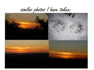
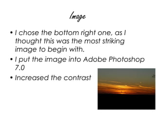
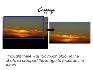
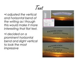
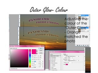
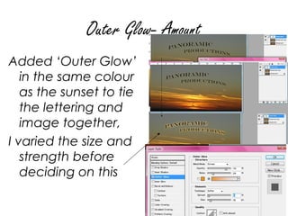
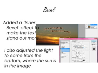
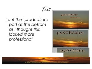
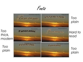
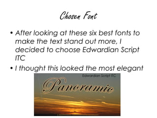
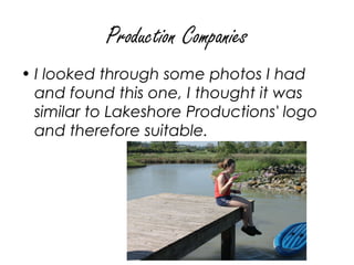
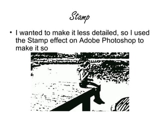
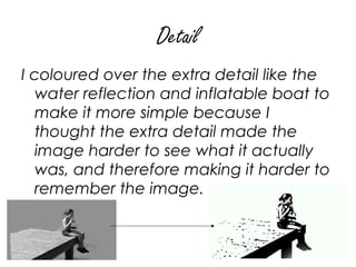
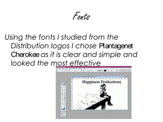
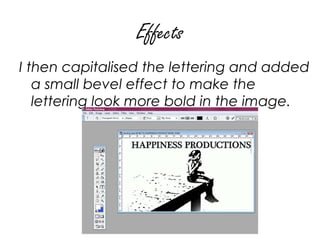
Creating Production and
Distributions companies
Companies
Panoramic Productions was the name of
 the fictional production company I
 used in my AS Coursework, I decided
 to keep the name, but change it to a
 distribution company and improve the
 logo for this project.
Distribution Companies
I noticed from my research that 'big'
   companies like Columbia, 20th
   Century Fox and Paramount which are
   both production and distribution
   companies have 'epic' looking photos
   as their logos.
similar photos I have taken:
Image
• I chose the bottom right one, as I
  thought this was the most striking
  image to begin with.
• I put the image into Adobe Photoshop
  7.0
• Increased the contrast
Cropping


I thought there was too much black in the
photo so cropped the image to focus on the
sunset
Text
•I adjusted the vertical
and horizontal bend of
the writing as I though
this would make it more
interesting that flat text.
•I decided on a
prominent horizontal
bend and slight vertical
to look the most
impressive
Outer Glow- Colour
Outer Glow- Amount
Added ‘Outer Glow’
   in the same colour
   as the sunset to tie
   the lettering and
   image together,
I varied the size and
   strength before
   deciding on this
Bevel
Added a ‘Inner
 Bevel’ effect to
 make the text
 stand out more,

I also adjusted the light
to come from the
bottom, where the sun is
in the image
Text
I put the ‘productions
  part at the bottom
  as I thought this
  looked more
  professional
Fonts
                  Too
                  plain

Too              Hard to
thick,           read
modern

Too
                  Too
plain
                  plain
Chosen Font
• After looking at these six best fonts to
  make the text stand out more, I
  decided to choose Edwardian Script
  ITC
• I thought this looked the most elegant
Production Companies
Naming
For my production company, usually the logo are a lot
  more simple and relaxed, for example Regency
  films logo is simply the 'R' from Regency. I wanted a
  company name that reflects films that are a little bit
  different, interesting, happy and desirable. Some
  ideas were:
• Bubble Pop
• Summer Night
• Midsummer
• Childlike
• Happiness

I thought 'Happiness Productions' was the most
   effective, it gives the audience an insight into how
   the production companies films will make them feel
   and making the films more desirable. 
Production Companies
• I looked through some photos I had
  and found this one, I thought it was
  similar to Lakeshore Productions' logo
  and therefore suitable.
Stamp
• I wanted to make it less detailed, so I used
  the Stamp effect on Adobe Photoshop to
  make it so
Detail
I coloured over the extra detail like the
   water reflection and inflatable boat to
   make it more simple because I
   thought the extra detail made the
   image harder to see what it actually
   was, and therefore making it harder to
   remember the image.
Fonts
Using the fonts I studied from the
 Distribution logos I chose Plantagenet
 Cherokee as it is clear and simple and
 looked the most effective
Effects
I then capitalised the lettering and added
   a small bevel effect to make the
   lettering look more bold in the image.
Colours
I thought of the colours that most
   symbolise happiness to me which are
   pink; baby blue; orange and green.
Final
• After looking at all these colours; I
  chose baby blue as the others seemed
  'harsh' against the black and white
  image.

Creating Production and Distribution Companies

  • 1.
  • 2.
    Companies Panoramic Productions wasthe name of the fictional production company I used in my AS Coursework, I decided to keep the name, but change it to a distribution company and improve the logo for this project.
  • 3.
    Distribution Companies I noticedfrom my research that 'big' companies like Columbia, 20th Century Fox and Paramount which are both production and distribution companies have 'epic' looking photos as their logos.
  • 4.
    similar photos Ihave taken:
  • 5.
    Image • I chosethe bottom right one, as I thought this was the most striking image to begin with. • I put the image into Adobe Photoshop 7.0 • Increased the contrast
  • 6.
    Cropping I thought therewas too much black in the photo so cropped the image to focus on the sunset
  • 7.
    Text •I adjusted thevertical and horizontal bend of the writing as I though this would make it more interesting that flat text. •I decided on a prominent horizontal bend and slight vertical to look the most impressive
  • 8.
  • 9.
    Outer Glow- Amount Added‘Outer Glow’ in the same colour as the sunset to tie the lettering and image together, I varied the size and strength before deciding on this
  • 10.
    Bevel Added a ‘Inner Bevel’ effect to make the text stand out more, I also adjusted the light to come from the bottom, where the sun is in the image
  • 11.
    Text I put the‘productions part at the bottom as I thought this looked more professional
  • 12.
    Fonts Too plain Too Hard to thick, read modern Too Too plain plain
  • 13.
    Chosen Font • Afterlooking at these six best fonts to make the text stand out more, I decided to choose Edwardian Script ITC • I thought this looked the most elegant
  • 14.
  • 15.
    Naming For my productioncompany, usually the logo are a lot more simple and relaxed, for example Regency films logo is simply the 'R' from Regency. I wanted a company name that reflects films that are a little bit different, interesting, happy and desirable. Some ideas were: • Bubble Pop • Summer Night • Midsummer • Childlike • Happiness I thought 'Happiness Productions' was the most effective, it gives the audience an insight into how the production companies films will make them feel and making the films more desirable. 
  • 16.
    Production Companies • Ilooked through some photos I had and found this one, I thought it was similar to Lakeshore Productions' logo and therefore suitable.
  • 17.
    Stamp • I wantedto make it less detailed, so I used the Stamp effect on Adobe Photoshop to make it so
  • 18.
    Detail I coloured overthe extra detail like the water reflection and inflatable boat to make it more simple because I thought the extra detail made the image harder to see what it actually was, and therefore making it harder to remember the image.
  • 19.
    Fonts Using the fontsI studied from the Distribution logos I chose Plantagenet Cherokee as it is clear and simple and looked the most effective
  • 20.
    Effects I then capitalisedthe lettering and added a small bevel effect to make the lettering look more bold in the image.
  • 21.
    Colours I thought ofthe colours that most symbolise happiness to me which are pink; baby blue; orange and green.
  • 22.
    Final • After lookingat all these colours; I chose baby blue as the others seemed 'harsh' against the black and white image.