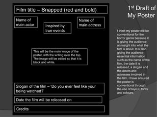
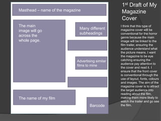
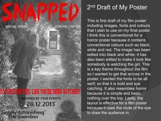
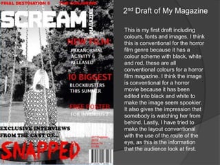
Film title – Snapped (red and bold)
Name of
main actor

Inspired by
true events

Name of
main actress

This will be the main image of the
poster, with the writing over the top.
The image will be edited so that it is
black and white.

Slogan of the film – ‘Do you ever feel like your
being watched?’
Date the film will be released on
Credits

1st Draft of
My Poster
I think my poster will be
conventional for the
horror genre because it
is giving the audience
an insight into what the
film is about. It is also
giving the audience
essential information
such as the name of the
film, the date it is
released, a slogan and
the actors and
actresses involved in
the film. I have ensured
the poster is
conventional through
the use of layout, fonts
and colours.
1st Draft of My
Magazine
Cover

Masthead – name of the magazine

The main
image will go
across the
whole page.

Many different
subheadings

Advertising similar
films to mine

The name of my film
Barcode

I think that this type of
magazine cover will be
conventional for the horror
genre because the main
image will be linked to the
film trailer, ensuring the
audience understand what
the picture means. I want
the magazine to be eye
catching ensuring the
audience pay attention to
the cover and read it. I
ensure that the front cover
is conventional through the
use of layout, fonts, colours
and images. The aim of the
magazine cover is to attract
the target audience into
reading about the film,
making them more likely to
watch the trailer and go see
the film.
2nd Draft of My Poster
This is first draft of my film poster
including images, fonts and colours
that I plan to use on my final poster.
I think this is conventional for a
horror poster because it contains
conventional colours such as black,
white and red. The image has been
edited into black and white; it has
also been edited to make it look like
somebody is watching the girl. This
is a key theme throughout the film
so I wanted to get that across in the
poster. I wanted the fonts to be all
serif, so that it is bold and eye
catching. It also resembles horror
because it is simple and basic
nothing over the top. Lastly, the
layout is effective for a film poster
because it uses the route of the eye
to draw the audience in.
2nd Draft of My Magazine
This is my first draft including
colours, fonts and images. I think
this is conventional for the horror
film genre because it has a
colour scheme with black, white
and red, these are all
conventional colours for a horror
film magazine. I think the image
is conventional for a horror
movie because it has been
edited into black and white to
make the image seem spookier.
It also gives the impression that
somebody is watching her from
behind. Lastly, I have tried to
make the layout conventional
with the use of the route of the
eye, as this is the information
that the audience look at first.

Draft ancillary products

  • 2.
    Film title –Snapped (red and bold) Name of main actor Inspired by true events Name of main actress This will be the main image of the poster, with the writing over the top. The image will be edited so that it is black and white. Slogan of the film – ‘Do you ever feel like your being watched?’ Date the film will be released on Credits 1st Draft of My Poster I think my poster will be conventional for the horror genre because it is giving the audience an insight into what the film is about. It is also giving the audience essential information such as the name of the film, the date it is released, a slogan and the actors and actresses involved in the film. I have ensured the poster is conventional through the use of layout, fonts and colours.
  • 3.
    1st Draft ofMy Magazine Cover Masthead – name of the magazine The main image will go across the whole page. Many different subheadings Advertising similar films to mine The name of my film Barcode I think that this type of magazine cover will be conventional for the horror genre because the main image will be linked to the film trailer, ensuring the audience understand what the picture means. I want the magazine to be eye catching ensuring the audience pay attention to the cover and read it. I ensure that the front cover is conventional through the use of layout, fonts, colours and images. The aim of the magazine cover is to attract the target audience into reading about the film, making them more likely to watch the trailer and go see the film.
  • 4.
    2nd Draft ofMy Poster This is first draft of my film poster including images, fonts and colours that I plan to use on my final poster. I think this is conventional for a horror poster because it contains conventional colours such as black, white and red. The image has been edited into black and white; it has also been edited to make it look like somebody is watching the girl. This is a key theme throughout the film so I wanted to get that across in the poster. I wanted the fonts to be all serif, so that it is bold and eye catching. It also resembles horror because it is simple and basic nothing over the top. Lastly, the layout is effective for a film poster because it uses the route of the eye to draw the audience in.
  • 5.
    2nd Draft ofMy Magazine This is my first draft including colours, fonts and images. I think this is conventional for the horror film genre because it has a colour scheme with black, white and red, these are all conventional colours for a horror film magazine. I think the image is conventional for a horror movie because it has been edited into black and white to make the image seem spookier. It also gives the impression that somebody is watching her from behind. Lastly, I have tried to make the layout conventional with the use of the route of the eye, as this is the information that the audience look at first.