This is my second post about my response to brief for my blog for my A2 level year coursework. My first post was about the types of regional magazine I could do and so this Is about that. I have one more post to put up about this to say what genre I have thought of to do for this coursework.
A short presentation showing the deconstruction and analysis of existing TotalFilm magazines and the overall house style and layout as well as common conventions.
1. Possible ideas for My Magazine
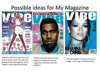
I like this VIBE front cover because I like the how the colours of this
of the colours used. The pink and I like this magazine because the main
magazine emphasise how the image is very large and dominating.
blue go really well together which magazine is aimed at a female
makes it look really professional. audience.
2. I like the layout of this contents page. The I like the main image on this contents I like the colour scheme of this
way that the image is very dominating and page. The way that the model is lay on contents page. The colours
the page numbers are small but we know her back with her legs in the air is very work really well together and
that they are there. The image is also very effective. Also, I like how the word with the image.
effective as it’s as if someone wants his ‘Contents’ is spread across three lines.
heart; they want him to live them. It makes it look quirky.
3. I like how there has been 7
images used to make up this
DPS. This makes it a lot more
interesting for the reader of
the magazine. It also attracts
them to read on to learn
about the photos. It’s also
effective how they are along
the top of the page.
I like how the image is very dominating in this
image and how it is a close up shot. This makes
the reader feel included in the article.
The layout of this DPS makes it look
really professional and formal . The
images are laid out very formally.
4. VIBE
The website for VIBE magazine is vibe.com.
Vibe Media/Access Network in the leading company of Vibe
magazine, VibVixen.com, Wibe,com, Uptown magazine, UptownMagazine.com. Vibe reaches
over 19 million consumers per month through their different forms of media.
Ron Burkle’s The Yupcaipa Companies, InterMedia Partners and Magic Johnson Enterprises
announced in January 2012 that they merged their Vibe and Uptown Business with the Blackbook
Media Business and The Access Network Company.
Vibe’s recent statistics showed that in in 2007 the circulation was 800,000.
Quincy Jones Launched the magazine in 1993 in partnership with Time inc.
The publication had been called Volume before co-founding editor, Scott Poulson-Bryant gave it
the name VIBE.