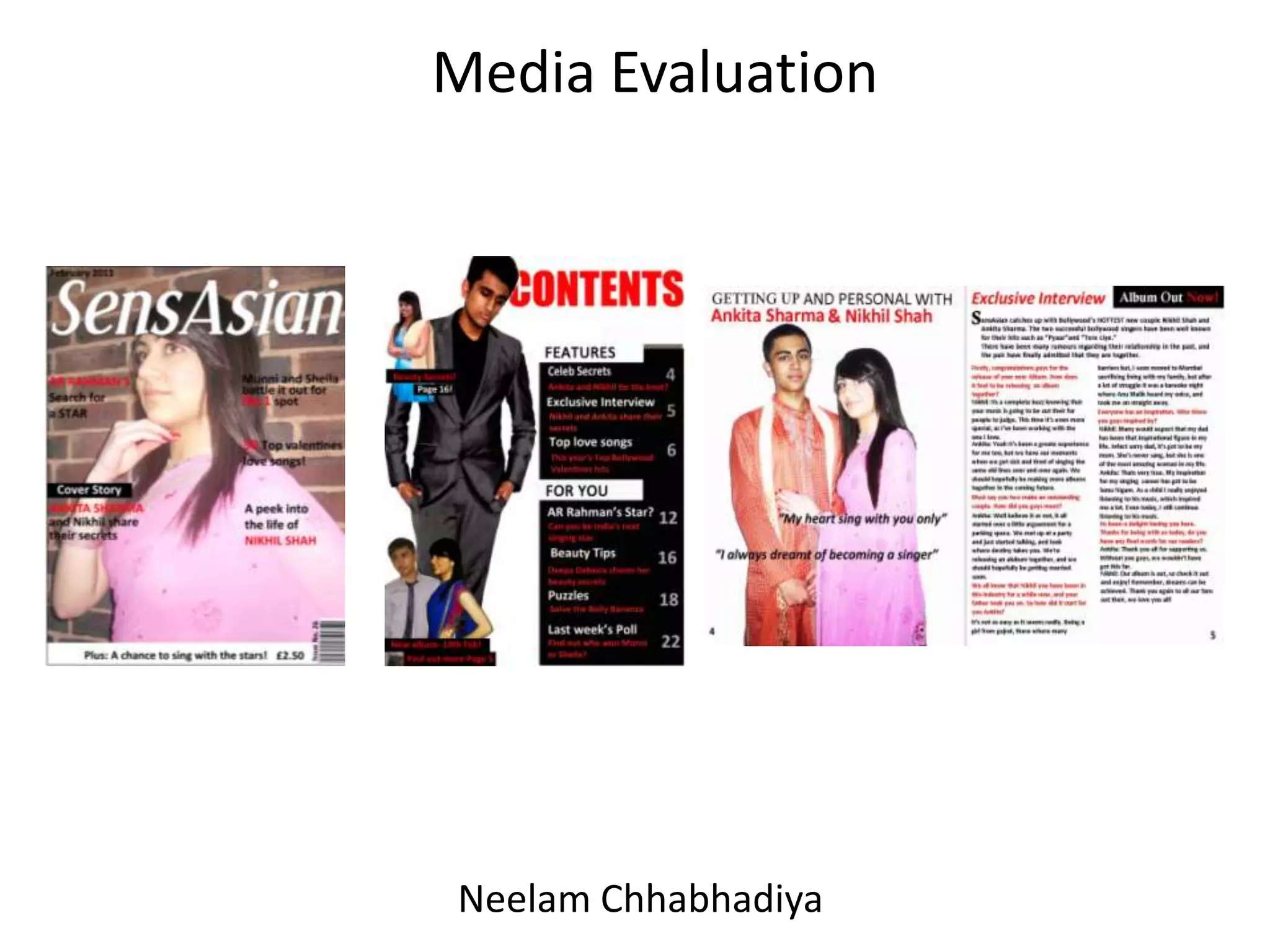
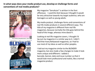
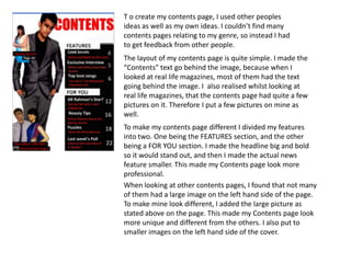
Media Evaluation NeelamChhabhadiya
In what ways does your media product use, develop or challenge forms and conventions of real media products? My magazine “SensAsian” is written in the font effloresce.   I used this font because I thought it would be very attractive towards my target audience, who are teenagers as well as young adults.  My media product, challenges forms and conventions of real life media products in several different ways. The title of my magazine is different from real life magazines, because normally the title goes behind the head of the image, whereas mine doesn’t.Looking at real life magazine covers, I thought I’d lay out my magazine in a similar way to it. I didn’t find that many Bollywood magazines, so I had to use most of my ideas as well as other peoples. I laid out my magazine similar to the BLENDER magazine, but also made a few changes to make it look more unique and different. I added a barcode, banner, date and issue number so that it would look more professional and realist, like a normal magazine product.
T o create my contents page, I used other peoples ideas as well as my own ideas. I couldn’t find many contents pages relating to my genre, so instead I had to get feedback from other people. The layout of my contents page is quite simple. I made the “Contents” text go behind the image, because when I looked at real life magazines, most of them had the text going behind the image. I  also realised whilst looking at real life magazines, that the contents page had quite a few pictures on it. Therefore I put a few pictures on mine as well. To make my contents page different I divided my features into two. One being the FEATURES section, and the other being a FOR YOU section. I made the headline big and bold so it would stand out, and then I made the actual news feature smaller. This made my Contents page look more professional.When looking at other contents pages, I found that not many of them had a large image on the left hand side of the page. To make mine look different, I added the large picture as stated above on the page. This made my Contents page look more unique and different from the others. I also put to smaller images on the left hand side of the cover.
On the other page I included a brief introduction, and then a interview which took up the rest of the page. I also had a small advertisement which, advertised the release of a new album. On my double page spread I included a large image of a couple, which took up the entire page on the left hand side. I did this, because looking at other double page spreads showed large images, which usually happened to be only one image. Most of them also had quotes relating to what their magazine was about, so I also added to quotes which related to my genre. I put the two quotes going across the image.
How does your media product represent particular social groups?My media product Is aimed at teenagers and young adults, both genders but mostly females. The main colour scheme throughout my magazine is red, white and black which shows that my magazine is aimed at both genders. However, the image on the cover, consists of a girl in a pink saree which would appeal to females. I think my target audience is good, because the magazine itself looks like the type of magazine that teenagers and young adults would read. However, the model on the cover is a teenage girl herself.  My target audience are those who have a great interest in Bollywood music and those who have an interest in Bollywood fashion/trends.The model is dressed in a pink saree, which links back to the target audience as women. Women care a lot about their looks and the way they dress. Looking at this image would attract them, because the clothing and trend will have a major impact of them. However, it would also attract the opposite sex, because seeing a beautiful looking girl would get their attention and make them want to read more about them.
This is a medium shot. I used this image, because when I looked through Bollywood music magazines I realised that the images on the cover was mostly taken as a medium shot. This image is a full shot. I used this image, because I thought It looked very professional, and would attract my target audience. I chose this image because when I took it, I thought that it came out  really nice  without even having to edit it that much. I also thought it would be a good image for my chosen genre. This is a medium shot. I chose this image, because I thought it would fit in really well with the cover story.
What kind of media institution might you distribute your media product and why?I would distribute my media product to through the media institution B4U and Zing which are well known Bollywood music channel. This channel is very popular in the UK, and around the world. This would help me portray my media product, to my genre through a media institution that they are familiar with.
How did you attract/ address your audience?To attract and address my target audience, I used many appealing headings. My main headline says, Ankita Sharma Bollywood’s new singer reveals her valentine”. This would attract my intended audience, because it would make them want to know more about it. Underneath the magazine cover is a banner which attracts my audience, as many people’s dreams would actually be to sing with the stars. The main thing on my page would be the image which would attract my audience. Many would see a beautiful girl wearing a nicely decorated saree, and think “WOW”, without even reading what’s on the cover. There are so many people out in the real world who love singing and want to become singers. The headline “AR RAHMAN’S search for a STAR” will attract them. Those who are passionate about singing or enjoy listening to Bollywood music are the type of people who would buy this magazine.
What have you learnt about technologies from the process of constructing this product?At first, I thought I'd never be able to create a proper magazine. The reason being, because I didn’t know how to use Photoshop, which is the main technology needed in order to create a proper magazine. In order to create my magazine I had to learn how to use Photoshop, which took me quite a while to get hang of. For me to be able to learn how to use it, I got the help of my friends and then played around with it at home. Using the camera to take the pictures wasn’t so bad, because I already knew how to use the camera so it wasn’t so difficult. The camera had a large memory card, and allowed me to take a lot of pictures. However, I couldn’t find a really good quality camera so I had to use mine but it wasn’t really that bad quality. I did a few draft on publisher, which wasn’t difficult at all because I've used it before. I think I did really well with my first drafts even when I did it on Photoshop, especially when I've never used Photoshop before. Photoshop enabled me to make my magazine look even more professional. Overall I really enjoyed constructing my product and found it very challenging, especially when I had to learn how to use Photoshop.
Looking back at your preliminary task, what do you feel you have learnt in the progression from it to the full product?From looking back at my preliminary task, I feel that I have learnt quite a lot, whilst creating my actual product. I have realised that the quality of publisher and Photoshop is completely different to each other.When I first created my Negus magazine I noticed that their were a few things I couldn’t do for example the title coming from behind the image. By comparing my product and the Negus magazine, I have learnt that their is a lot more you can do on Photoshop than on publisher. Not only have I learnt how to use Photoshop, but I have also learnt how to create a good standard product in very high quality. I also learnt, that their is a lot of technology that needs to be used in order to create a good quality magazine.NEGUS NEWS   NEGUS NEWS   Plumstead Manor celebrate its Best Ever GCSE and              A-Level Results once AGAIN!To see results go to page 4!September 2010

Evaluation

  • 1.
  • 2.
    In what waysdoes your media product use, develop or challenge forms and conventions of real media products? My magazine “SensAsian” is written in the font effloresce. I used this font because I thought it would be very attractive towards my target audience, who are teenagers as well as young adults. My media product, challenges forms and conventions of real life media products in several different ways. The title of my magazine is different from real life magazines, because normally the title goes behind the head of the image, whereas mine doesn’t.Looking at real life magazine covers, I thought I’d lay out my magazine in a similar way to it. I didn’t find that many Bollywood magazines, so I had to use most of my ideas as well as other peoples. I laid out my magazine similar to the BLENDER magazine, but also made a few changes to make it look more unique and different. I added a barcode, banner, date and issue number so that it would look more professional and realist, like a normal magazine product.
  • 3.
    T o createmy contents page, I used other peoples ideas as well as my own ideas. I couldn’t find many contents pages relating to my genre, so instead I had to get feedback from other people. The layout of my contents page is quite simple. I made the “Contents” text go behind the image, because when I looked at real life magazines, most of them had the text going behind the image. I also realised whilst looking at real life magazines, that the contents page had quite a few pictures on it. Therefore I put a few pictures on mine as well. To make my contents page different I divided my features into two. One being the FEATURES section, and the other being a FOR YOU section. I made the headline big and bold so it would stand out, and then I made the actual news feature smaller. This made my Contents page look more professional.When looking at other contents pages, I found that not many of them had a large image on the left hand side of the page. To make mine look different, I added the large picture as stated above on the page. This made my Contents page look more unique and different from the others. I also put to smaller images on the left hand side of the cover.
  • 4.
    On the otherpage I included a brief introduction, and then a interview which took up the rest of the page. I also had a small advertisement which, advertised the release of a new album. On my double page spread I included a large image of a couple, which took up the entire page on the left hand side. I did this, because looking at other double page spreads showed large images, which usually happened to be only one image. Most of them also had quotes relating to what their magazine was about, so I also added to quotes which related to my genre. I put the two quotes going across the image.
  • 5.
    How does yourmedia product represent particular social groups?My media product Is aimed at teenagers and young adults, both genders but mostly females. The main colour scheme throughout my magazine is red, white and black which shows that my magazine is aimed at both genders. However, the image on the cover, consists of a girl in a pink saree which would appeal to females. I think my target audience is good, because the magazine itself looks like the type of magazine that teenagers and young adults would read. However, the model on the cover is a teenage girl herself. My target audience are those who have a great interest in Bollywood music and those who have an interest in Bollywood fashion/trends.The model is dressed in a pink saree, which links back to the target audience as women. Women care a lot about their looks and the way they dress. Looking at this image would attract them, because the clothing and trend will have a major impact of them. However, it would also attract the opposite sex, because seeing a beautiful looking girl would get their attention and make them want to read more about them.
  • 6.
    This is amedium shot. I used this image, because when I looked through Bollywood music magazines I realised that the images on the cover was mostly taken as a medium shot. This image is a full shot. I used this image, because I thought It looked very professional, and would attract my target audience. I chose this image because when I took it, I thought that it came out really nice without even having to edit it that much. I also thought it would be a good image for my chosen genre. This is a medium shot. I chose this image, because I thought it would fit in really well with the cover story.
  • 7.
    What kind ofmedia institution might you distribute your media product and why?I would distribute my media product to through the media institution B4U and Zing which are well known Bollywood music channel. This channel is very popular in the UK, and around the world. This would help me portray my media product, to my genre through a media institution that they are familiar with.
  • 8.
    How did youattract/ address your audience?To attract and address my target audience, I used many appealing headings. My main headline says, Ankita Sharma Bollywood’s new singer reveals her valentine”. This would attract my intended audience, because it would make them want to know more about it. Underneath the magazine cover is a banner which attracts my audience, as many people’s dreams would actually be to sing with the stars. The main thing on my page would be the image which would attract my audience. Many would see a beautiful girl wearing a nicely decorated saree, and think “WOW”, without even reading what’s on the cover. There are so many people out in the real world who love singing and want to become singers. The headline “AR RAHMAN’S search for a STAR” will attract them. Those who are passionate about singing or enjoy listening to Bollywood music are the type of people who would buy this magazine.
  • 9.
    What have youlearnt about technologies from the process of constructing this product?At first, I thought I'd never be able to create a proper magazine. The reason being, because I didn’t know how to use Photoshop, which is the main technology needed in order to create a proper magazine. In order to create my magazine I had to learn how to use Photoshop, which took me quite a while to get hang of. For me to be able to learn how to use it, I got the help of my friends and then played around with it at home. Using the camera to take the pictures wasn’t so bad, because I already knew how to use the camera so it wasn’t so difficult. The camera had a large memory card, and allowed me to take a lot of pictures. However, I couldn’t find a really good quality camera so I had to use mine but it wasn’t really that bad quality. I did a few draft on publisher, which wasn’t difficult at all because I've used it before. I think I did really well with my first drafts even when I did it on Photoshop, especially when I've never used Photoshop before. Photoshop enabled me to make my magazine look even more professional. Overall I really enjoyed constructing my product and found it very challenging, especially when I had to learn how to use Photoshop.
  • 10.
    Looking back atyour preliminary task, what do you feel you have learnt in the progression from it to the full product?From looking back at my preliminary task, I feel that I have learnt quite a lot, whilst creating my actual product. I have realised that the quality of publisher and Photoshop is completely different to each other.When I first created my Negus magazine I noticed that their were a few things I couldn’t do for example the title coming from behind the image. By comparing my product and the Negus magazine, I have learnt that their is a lot more you can do on Photoshop than on publisher. Not only have I learnt how to use Photoshop, but I have also learnt how to create a good standard product in very high quality. I also learnt, that their is a lot of technology that needs to be used in order to create a good quality magazine.NEGUS NEWS NEGUS NEWS Plumstead Manor celebrate its Best Ever GCSE and A-Level Results once AGAIN!To see results go to page 4!September 2010