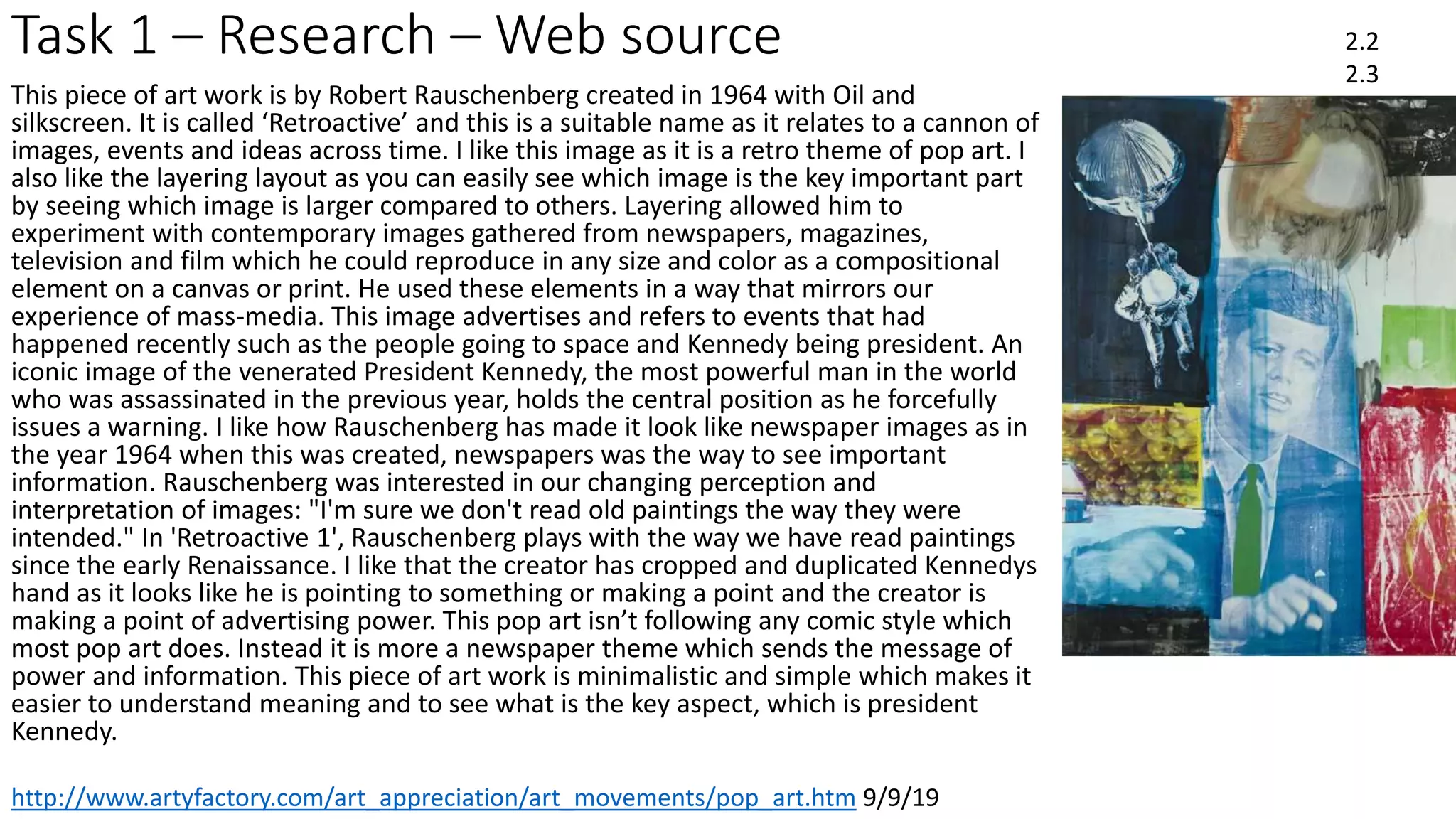
Induction Project
September 2019
CERTA L2 Developing Study Skills
Task 1 - Research
• Put photo/scan of your notes from art movements intro here and
delete this guidance
2.4
Task 1 – Research – Web source
https://www.tate.org.uk/art/art-terms/p/pop-art 9/9/19
2.2
2.3
Pop art emerged in the mid to late 1950s and reached its peak in the 1960s. The aim of it was to revolt against the dominant approaches
to art and culture and traditional views of what art should be. By creating paintings or sculptures of mass culture objects and media stars,
the Pop art movement aimed to blur the boundaries between "high" art and "low" culture. The concept that there is no hierarchy of
culture and that art may borrow from any source has been one of the most influential characteristics of Pop art. The majority of the pop
artists had started their career in commercial art. Having that as their background helped to train there visual vocabulary to express their
thoughts and intentions. The image in the corner is a pop art image created by Roy Lichenstein in 1973. This image was called the ‘artists
studio No.1’ also known as ‘Look Mickey’. This is an interesting image as Roy has made it in the comic book theme. The use of black
outlines , bold colors and benday dots made it into the comic style. This image shows of the the traditional artwork ‘look mickey’ and used
this to layer into his work to make it more art deco and a little bit De Stijl which he uses as inspiration. I like this particular image as the
lines on the floor and the benday dots make it stand out and look more comic which also make it look more interesting and aesthetically
pleasing which is the aim of pop art, to revolt against traditional views od what art should be like. I also think that pop art is a unique type
of art work as this image isn’t like lots of other images. The use of bright colors makes the
art work stand out well. This artwork in particular is abstract as he has used colors to make
art work on the wall stand out. For example using a bright color on the wall and then layering
a less colorful image. Lichtenstein remarked, "It was hard to get a painting that was
despicable enough so that no one would hang it.......everybody was hanging everything. It was
almost acceptable to hang a dripping paint rag, everybody was accustomed to this. The one
thing everyone hated was commercial art; apparently they didn't hate that enough, either.”
His aim was to be more unique to divide traditional artwork to the pop art work. Finally he
involved the use of speech bubbles to divide writing to make it stand out more. But in the
bubble style helps to make it in the comic theme.
https://www.theartstory.org/movement/pop-art/ 9/9/19
http://www.artyfactory.com/art_appreciation/art_movements/pop_art.htm 12/9/19
Task 1 – Research – Web source 2.2
2.3
http://www.artyfactory.com/art_appreciation/art_movements/pop_art.htm 9/9/19
This piece of art work is by Robert Rauschenberg created in 1964 with Oil and
silkscreen. It is called ‘Retroactive’ and this is a suitable name as it relates to a cannon of
images, events and ideas across time. I like this image as it is a retro theme of pop art. I
also like the layering layout as you can easily see which image is the key important part
by seeing which image is larger compared to others. Layering allowed him to
experiment with contemporary images gathered from newspapers, magazines,
television and film which he could reproduce in any size and color as a compositional
element on a canvas or print. He used these elements in a way that mirrors our
experience of mass-media. This image advertises and refers to events that had
happened recently such as the people going to space and Kennedy being president. An
iconic image of the venerated President Kennedy, the most powerful man in the world
who was assassinated in the previous year, holds the central position as he forcefully
issues a warning. I like how Rauschenberg has made it look like newspaper images as in
the year 1964 when this was created, newspapers was the way to see important
information. Rauschenberg was interested in our changing perception and
interpretation of images: "I'm sure we don't read old paintings the way they were
intended." In 'Retroactive 1', Rauschenberg plays with the way we have read paintings
since the early Renaissance. I like that the creator has cropped and duplicated Kennedys
hand as it looks like he is pointing to something or making a point and the creator is
making a point of advertising power. This pop art isn’t following any comic style which
most pop art does. Instead it is more a newspaper theme which sends the message of
power and information. This piece of art work is minimalistic and simple which makes it
easier to understand meaning and to see what is the key aspect, which is president
Kennedy.
Task 2a – Idea Generation [individual]
I have added the images in the slide before as these are some of the best ones pieces of art work to show the key points of
pop art that I like. Firstly on the left of the images there is the Mickey art work which I really like. The main reason I like this is
because it uses a lot of bold colors which make it look more cartoon and comic. The artist has also used benday dots which
adds to making it look more comic book themed. In the top right hand corner of the slide I have added a image of benday
dots. This will be a big part and inspiration to my final product as I like the idea of benday dots and think that it easily
recognizable to be a pop art image. It also follows the aim to be different to normal art work and being more unique. The
two images of Iron-Man and Einstein as the Joker are similar in the sense that they have used two normal images of
characters and added and used different colors to make it into a different image. I like that the artist if the Iron-Man image
has used colors to make the left side darker than the right using the iconic colors of the iron man suit. This makes it look a
little cartoon without making it look too comic book style. While with the image of Einstein as the Joker, the creator has used
bold and strong colors to edit the iconic image to make him into a new character, also using benday dots to make it look
more pop art and make it in a comic book styling while making it more detailed and using the benday dots as shadowing.
Next I have added an image which is just full of bold and strong colors with a benday effect layered over the top. This is
because on my final product I will be wanting to use lots of strong colors to make it look more cartoony while using the
benday dots to make it into the comic strip theme. I decided that I like the ‘POP’ image that is in the style of a comic book
fight scene. This is involving of the large amounts of bright and bold colors while using the iconic benday effect. This kind of
artwork is also a sound bubble which I like as it sections off the writing from the rest of the image. Finally, my favorite art
work is the Spider-Man piece. The main thing that I like is the bold shades of color and that it looks like a vintage comic book
image. The use of the speech bubble separates the text from the rest of the artwork which helps with the comic book theme.
I also like that every thing on the artwork has been outlined in black. I like this as it makes the artwork pop out more and
makes it look more comic book styled. Finally the use of benday dots make it look cartoon and comic book.
Task 2b – Action Plan/Schedule
Session Activity Who is responsible
1 Research Me and Sam
2 Idea generation Me
3 Planning Me
4 Production Me
5 Evaluation Me
6
7
3.1
Task 2b – Action Plan/Schedule
3.1
• Add notes here on how you stuck to your plan/had to change your
plan and why
• I stuck to this plan by at the start of every lesson and every new step
of the project I looked at the plan to see what I was having to do next.
This allowed me to refresh what I needed to do. I didn’t change the
plan at all as I was successful to stick to it.
Task 2c – Planning
3.2
Task 2c – Planning
3.2
Task 4 – Production/Final Products
3.2
3.4
https://benlevel3year1.blogspot.com/
Task 5 – Evaluation – Problem Solving
• Describe three problems you faced in your project and how you solved
these
• 1- when making the batman image I struggled to correctly get the pixels of
the skin. I fixed this by zooming in to analyse them better and easier.
• 2- when making the final image I had struggle selecting the specific area
that I wanted to add a texture to so that I could change how it looked, to
fix this I used different tools to highlight and layer the texture to the area.
• 3- with the title I had to draw it then scan it in. I had problem drawing the
title correctly in a way that I liked and looked good. I fixed this by drawing
the title and then edited it when I put it on.
3.3
Task 5 – Evaluation – Active Engagement
Active engagement is engaging in the product by contributing lots of
ideas. I did this in my project by using the research I collected to use
different techniques to improve my work and make it a lot better.
1.2a
Task 5 – Evaluation
Accessing and storing information
• Explain where the books/resources are for your area in the LC
• In the LRC there is a media and technology section on the second
floor which has lots of book that I used.
• Explain how to take a book/resource out of the LC
• When you have the chosen book you want, take it to the librarians
and show the college card so that you can log it out.
2.1
Task 5 – Evaluation
Accessing and storing information
• Explain where to store electronic information on the college
network
• You can store it too a pen drive, college files, one drive or you could
save the work to the desktop of the computer.
• Explain where you upload work when it is completed
• When completed you can upload it to slide share then use the link on
that to be able to upload it to blogger.
2.1
Task 6 - How do you learn best?
• Explain some of the ways you think you learn best [refer to the VAK
questionnaire results in tutorial]:
• I learn best both visually and auditory. I think that when I make mind
maps its easier for me to learn as I can easily see what I have done
and all my idea. But I prefer to get information via listening as I can
understand it easier and quicker.
1.1
Task 6 - How do you learn best?
• What makes it hard for you to study?
• I get easily distracted via noise and see what other people are doing. I
also find a lot of writing hard to process and find it hard to learn form
it. I also tend to procrastinate a lot.
• What strategies do you think would benefit your studies?
• I find that listening to music normally helps me as it blocks everything
out so I can focus more.
1.1

Pop art

  • 1.
    Induction Project September 2019 CERTAL2 Developing Study Skills
  • 2.
    Task 1 -Research • Put photo/scan of your notes from art movements intro here and delete this guidance 2.4
  • 3.
    Task 1 –Research – Web source https://www.tate.org.uk/art/art-terms/p/pop-art 9/9/19 2.2 2.3 Pop art emerged in the mid to late 1950s and reached its peak in the 1960s. The aim of it was to revolt against the dominant approaches to art and culture and traditional views of what art should be. By creating paintings or sculptures of mass culture objects and media stars, the Pop art movement aimed to blur the boundaries between "high" art and "low" culture. The concept that there is no hierarchy of culture and that art may borrow from any source has been one of the most influential characteristics of Pop art. The majority of the pop artists had started their career in commercial art. Having that as their background helped to train there visual vocabulary to express their thoughts and intentions. The image in the corner is a pop art image created by Roy Lichenstein in 1973. This image was called the ‘artists studio No.1’ also known as ‘Look Mickey’. This is an interesting image as Roy has made it in the comic book theme. The use of black outlines , bold colors and benday dots made it into the comic style. This image shows of the the traditional artwork ‘look mickey’ and used this to layer into his work to make it more art deco and a little bit De Stijl which he uses as inspiration. I like this particular image as the lines on the floor and the benday dots make it stand out and look more comic which also make it look more interesting and aesthetically pleasing which is the aim of pop art, to revolt against traditional views od what art should be like. I also think that pop art is a unique type of art work as this image isn’t like lots of other images. The use of bright colors makes the art work stand out well. This artwork in particular is abstract as he has used colors to make art work on the wall stand out. For example using a bright color on the wall and then layering a less colorful image. Lichtenstein remarked, "It was hard to get a painting that was despicable enough so that no one would hang it.......everybody was hanging everything. It was almost acceptable to hang a dripping paint rag, everybody was accustomed to this. The one thing everyone hated was commercial art; apparently they didn't hate that enough, either.” His aim was to be more unique to divide traditional artwork to the pop art work. Finally he involved the use of speech bubbles to divide writing to make it stand out more. But in the bubble style helps to make it in the comic theme. https://www.theartstory.org/movement/pop-art/ 9/9/19 http://www.artyfactory.com/art_appreciation/art_movements/pop_art.htm 12/9/19
  • 4.
    Task 1 –Research – Web source 2.2 2.3 http://www.artyfactory.com/art_appreciation/art_movements/pop_art.htm 9/9/19 This piece of art work is by Robert Rauschenberg created in 1964 with Oil and silkscreen. It is called ‘Retroactive’ and this is a suitable name as it relates to a cannon of images, events and ideas across time. I like this image as it is a retro theme of pop art. I also like the layering layout as you can easily see which image is the key important part by seeing which image is larger compared to others. Layering allowed him to experiment with contemporary images gathered from newspapers, magazines, television and film which he could reproduce in any size and color as a compositional element on a canvas or print. He used these elements in a way that mirrors our experience of mass-media. This image advertises and refers to events that had happened recently such as the people going to space and Kennedy being president. An iconic image of the venerated President Kennedy, the most powerful man in the world who was assassinated in the previous year, holds the central position as he forcefully issues a warning. I like how Rauschenberg has made it look like newspaper images as in the year 1964 when this was created, newspapers was the way to see important information. Rauschenberg was interested in our changing perception and interpretation of images: "I'm sure we don't read old paintings the way they were intended." In 'Retroactive 1', Rauschenberg plays with the way we have read paintings since the early Renaissance. I like that the creator has cropped and duplicated Kennedys hand as it looks like he is pointing to something or making a point and the creator is making a point of advertising power. This pop art isn’t following any comic style which most pop art does. Instead it is more a newspaper theme which sends the message of power and information. This piece of art work is minimalistic and simple which makes it easier to understand meaning and to see what is the key aspect, which is president Kennedy.
  • 5.
    Task 2a –Idea Generation [individual]
  • 6.
    Task 2a –Idea Generation [individual] I have added the images in the slide before as these are some of the best ones pieces of art work to show the key points of pop art that I like. Firstly on the left of the images there is the Mickey art work which I really like. The main reason I like this is because it uses a lot of bold colors which make it look more cartoon and comic. The artist has also used benday dots which adds to making it look more comic book themed. In the top right hand corner of the slide I have added a image of benday dots. This will be a big part and inspiration to my final product as I like the idea of benday dots and think that it easily recognizable to be a pop art image. It also follows the aim to be different to normal art work and being more unique. The two images of Iron-Man and Einstein as the Joker are similar in the sense that they have used two normal images of characters and added and used different colors to make it into a different image. I like that the artist if the Iron-Man image has used colors to make the left side darker than the right using the iconic colors of the iron man suit. This makes it look a little cartoon without making it look too comic book style. While with the image of Einstein as the Joker, the creator has used bold and strong colors to edit the iconic image to make him into a new character, also using benday dots to make it look more pop art and make it in a comic book styling while making it more detailed and using the benday dots as shadowing. Next I have added an image which is just full of bold and strong colors with a benday effect layered over the top. This is because on my final product I will be wanting to use lots of strong colors to make it look more cartoony while using the benday dots to make it into the comic strip theme. I decided that I like the ‘POP’ image that is in the style of a comic book fight scene. This is involving of the large amounts of bright and bold colors while using the iconic benday effect. This kind of artwork is also a sound bubble which I like as it sections off the writing from the rest of the image. Finally, my favorite art work is the Spider-Man piece. The main thing that I like is the bold shades of color and that it looks like a vintage comic book image. The use of the speech bubble separates the text from the rest of the artwork which helps with the comic book theme. I also like that every thing on the artwork has been outlined in black. I like this as it makes the artwork pop out more and makes it look more comic book styled. Finally the use of benday dots make it look cartoon and comic book.
  • 7.
    Task 2b –Action Plan/Schedule Session Activity Who is responsible 1 Research Me and Sam 2 Idea generation Me 3 Planning Me 4 Production Me 5 Evaluation Me 6 7 3.1
  • 8.
    Task 2b –Action Plan/Schedule 3.1 • Add notes here on how you stuck to your plan/had to change your plan and why • I stuck to this plan by at the start of every lesson and every new step of the project I looked at the plan to see what I was having to do next. This allowed me to refresh what I needed to do. I didn’t change the plan at all as I was successful to stick to it.
  • 9.
    Task 2c –Planning 3.2
  • 10.
    Task 2c –Planning 3.2
  • 11.
    Task 4 –Production/Final Products 3.2 3.4 https://benlevel3year1.blogspot.com/
  • 12.
    Task 5 –Evaluation – Problem Solving • Describe three problems you faced in your project and how you solved these • 1- when making the batman image I struggled to correctly get the pixels of the skin. I fixed this by zooming in to analyse them better and easier. • 2- when making the final image I had struggle selecting the specific area that I wanted to add a texture to so that I could change how it looked, to fix this I used different tools to highlight and layer the texture to the area. • 3- with the title I had to draw it then scan it in. I had problem drawing the title correctly in a way that I liked and looked good. I fixed this by drawing the title and then edited it when I put it on. 3.3
  • 13.
    Task 5 –Evaluation – Active Engagement Active engagement is engaging in the product by contributing lots of ideas. I did this in my project by using the research I collected to use different techniques to improve my work and make it a lot better. 1.2a
  • 14.
    Task 5 –Evaluation Accessing and storing information • Explain where the books/resources are for your area in the LC • In the LRC there is a media and technology section on the second floor which has lots of book that I used. • Explain how to take a book/resource out of the LC • When you have the chosen book you want, take it to the librarians and show the college card so that you can log it out. 2.1
  • 15.
    Task 5 –Evaluation Accessing and storing information • Explain where to store electronic information on the college network • You can store it too a pen drive, college files, one drive or you could save the work to the desktop of the computer. • Explain where you upload work when it is completed • When completed you can upload it to slide share then use the link on that to be able to upload it to blogger. 2.1
  • 16.
    Task 6 -How do you learn best? • Explain some of the ways you think you learn best [refer to the VAK questionnaire results in tutorial]: • I learn best both visually and auditory. I think that when I make mind maps its easier for me to learn as I can easily see what I have done and all my idea. But I prefer to get information via listening as I can understand it easier and quicker. 1.1
  • 17.
    Task 6 -How do you learn best? • What makes it hard for you to study? • I get easily distracted via noise and see what other people are doing. I also find a lot of writing hard to process and find it hard to learn form it. I also tend to procrastinate a lot. • What strategies do you think would benefit your studies? • I find that listening to music normally helps me as it blocks everything out so I can focus more. 1.1