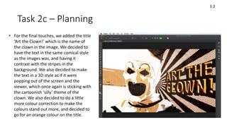
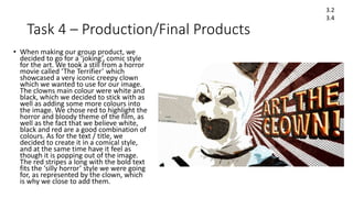
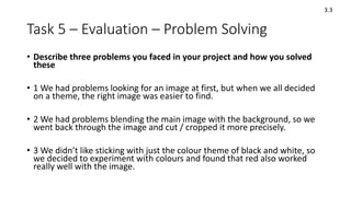
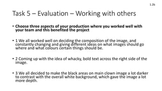
Induction Project
September 2019
CERTA L2 Developing Study Skills
Task 1 - Research 2.4
Task 1 – Research – Web source
• Pop Art
• Pop art is an art movement that emerged in the 1950s.
• It flourished in the 1960s in America and Britain, drawing inspiration from pop and
commercial culture.
• Lots of different countries and cultures contributed to the art style during the 60s and
70s.
• Popular, designed for mas audiences, low cost, mass produced, aimed at youth.
• Early pop art in Britain was fuelled by American pop culture, and was more academic in
its approach.
• The Independent Group is regarded as the precursor to British Pop Art movement.
• Pop art is considered to portray real life entertainment and the things people saw
around them every day, which is why they turned to Hollywood movies for their
imagery.
Title/Weblink/Date accessed: https://www.tate.org.uk/art/art-terms/p/pop-art
2.2
2.3
Task 1 – Research – Web source
• Pop Art
• It coincided with the globalization of pop music and youth culture, personified
by Elvis and the Beatles.
• Pop Art was brash, young and fun and hostile to the artistic establishment.
• It included different styles of painting and sculpture from various countries.
• All the countries had an interest in mass media, mass production and mass
culture.
• Some young British artists in the 1950s, viewed the seductive imagery of
American popular culture and its consumerist lifestyle with a romantic sense of
irony and a little bit of envy.
• Pop art became the mode of expression in search for change.
• Its language was adapted from dada collages and assemblages.
2.2
2.3
Title/Weblink/Date accessed: http://www.artyfactory.com/art_appreciation/art_movements/pop_art.htm
Task 1 – Research – Web source
• Pop Art coincided with the globalization of Pop Music and youth culture.
• Pop Art included different styles of painting and sculpture but all had a common interest in
mass-media, mass-production and mass-culture.
• Although Pop Art started in Britain, it is essentially an American movement.
• Pop art was strongly influence by the ideas of the Dada movement.
• Pop Art in America was a reaction against Abstract Expressionism.
• The art of Jasper Johns and Robert Rauschenberg is seen as a bridge between Abstract
Expressionism and Pop Art.
• The artist who personifies Pop Art more than any other is Andy Warhol.
• Warhol's paintings of Marilyn Monroe are the most famous icons of Pop Art.
• Roy Lichtenstein developed an instantly recognizable style of Pop Art inspired by the
American comic strip.
• Claes Oldenburg was the greatest sculptor of the Pop Art movement, creating many large
scale public works.
2.2
2.3
Title/Weblink/Date accessed: http://www.artyfactory.com/art_appreciation/art_movements/pop_art.htm
Task 1 – Research – Book source
• Warhol by David Bourdon
• Flowers (series) 1970 Silkscreen ink on paper.
• Andy Warhol ‘Flowers” series originally debuted in 1964 as a
set of paintings. Rather than incorporating images from pop
culture and mass media.
• Symbolism, importance, historical
• Warhol reproduced the well-known imagery as a portfolio of
ten screen prints on paper called the Warhol Flowers
screenprint series.
• The flowers are flat in the painting to seem childlike and no
longer a realistic representation of nature.
• Each print always varies in colours.
• Warhol only printed on 48 and 24-inch canvases.
Book title/Author + Library location: Warhol by David Bourdon / Book Code: 75913war
2.2
2.3
Task 1 – Research – Book source
• Self-Portrait, Three Quarter Profile 1967.
• Self-Portrait is an acrylic paint and screenprint work on canvas by
the American artist Andy Warhol. It is a large portrait of Warhol
and employs an arresting colour scheme in which the artist’s vivid
red head floats against an empty black background.
• Warhol made Self-Portrait in his studio at 22 in New York.
• The artist’s neck, shoulders and torso have been excluded from
the portrait, focussing the attention on his face, expression and
hair.
• He was established in the public eye as the most famous Pop
artist which reflects in his Self-Portrait.
• A lot of the imagery in his Self-Portrait work has been
exaggerated to look more abstract.
2.2
2.3
Book title/Author + Library location: Warhol by David Bourdon / Book Code: 75913war
Task 2a – Idea Generation [individual]
Ideas for
Individual
art
Dark / black
background theme.
Only one main image
in the center.
Pop icons /
popular movie
stills.
The use of
colours to convey
emotion.
Pop art style
(with little dots)
Famous characters
and actors to create
iconism.
Thriller styled films,
violent and popular.
Hollywood
Movies.
Cartoonish
effect.
Task 2a – Idea Generation [individual]
Pulp Fiction Pop Art Details
I decided to go for a basic image, which
was a still image taken from a very popular
Hollywood movie. Overall black and white
connotations which is typically the colour
scheme of an everyday suit which is what
the characters are wearing, along with a
mix of a deep red in the characters faces
to highlight how angry the two appear to
be and how threatening they look, giving
them a sense of dominance towards who
they’re pointing their guns at.
I chose to add a particular cartoonish
effect which makes the characters almost
look rather distorted, having different
parts of their bodies blend into the black
background and highlighting the more
prominent bright colours on their bodies
such as the white shirts.
Joker Pop Art Details
• Black / dark
connotations.
• Shadows
• Darkness blended
into the
characters.
• Colour to highlight
the emotions /
personalities of the
characters.
• Iconic imagery
from popular films.
• Key image takes p
the center frame
of the image.
• Image stands out.
‘All Smiles’
‘Say What Again!”
Task 2a – Idea Generation [group]
Task 2b – Action Plan/Schedule
Session Activity Who is responsibile
1 Finding appropriate main image. Luke / George / James
2 Finding background images. Luke / George / James
3 Giving image cartoonish features. Luke
4 Adding different colours and textures. Luke / George
5 Adding text to the image. Luke / George
6 Refining the image. George / James
7 Adding textures / features to the text. Luke
3.1
Task 2b – Action Plan/Schedule
3.1
• Look online for an appropriate image that we want to use for our
picture, look at genres: action, adventure, slapstick, horror.
• Once we have found the picture, proceed to add and change the style of
it in Photoshop by making it look cartoonish.
• Change brightness, colour, background and other features like dark
areas on the photo (increase or decrease levels).
• Next, add textures to give the image more of a personality, add textures
appropriate for the theme of the picture.
• Colour correction, experiment with colours to find out which ones work
together and the ones that don’t.
• Add the ‘Pop Art’ dots to stylise the image.
• Create a bold title / text that fits the theme of the picture, possibly
onomatopoeia to give the image more of a ‘comical’ style.
Task 2c – Planning
• Firstly, we began by adding the image onto
Photoshop and removing areas of the
background that we didn’t want in the image.
Then we began to add and experiment with
different filters, until we chose the ‘cutout’
filter, which gave the image a cartoonish look.
The colours felt very bland once we added the
filter, so we decided to change them.
• After the filter, we then started to experiment
with changing the colours using hue and
saturation, as well as playing around with
curves and levels, making the image appear a
lot darker and brightening up the more white
areas of the image so it would be better
blended into the background.
3.2
Task 2c – Planning
3.2
• After experimenting with the colours, we then
added a spiral ‘sunburst’ background, as we
thought it would fit the theme of a creepy
clown, because clowns have stripes on their
costumes. We also decided to add the Pop Art
styed dots over the image, and then added a
few dirty textures to the stripes.
• Next, we added some dirty textures to the
clown image, to make it blend with the
background. After we added the textures, we
decided to change the colours once again, this
time to a deep blood-like red, as we thought it
fit the creepy theme better.
Task 2c – Planning
3.2
• For the final touches, we added the title
‘Art the Clown!’ which is the name of
the clown in the image. We decided to
have the text in the same comical style
as the images was, and having it
contrast with the stripes in the
background. We also decided to make
the text in a 3D style as if it were
popping out of the screen and the
viewer, which once again is sticking with
the cartoonish ‘silly’ theme of the
clown. We also decided to do a little
more colour correction to make the
colours stand out more, and decided to
go for an orange colour on the title.
Task 4 – Production/Final Products
• When making our group product, we
decided to go for a ‘joking’, comic style
for the art. We took a still from a horror
movie called ‘The Terrifier’ which
showcased a very iconic creepy clown
which we wanted to use for our image.
The clowns main colour were white and
black, which we decided to stick with as
well as adding some more colours into
the image. We chose red to highlight the
horror and bloody theme of the film, as
well as the fact that we believe white,
black and red are a good combination of
colours. As for the text / title, we
decided to create it in a comical style,
and at the same time have it feel as
though it is popping out of the image.
The red stripes a long with the bold text
fits the ‘silly horror’ style we were going
for, as represented by the clown, which
is why we close to add them.
3.2
3.4
Task 5 – Evaluation – Problem Solving
• Describe three problems you faced in your project and how you solved
these
• 1 We had problems looking for an image at first, but when we all decided
on a theme, the right image was easier to find.
• 2 We had problems blending the main image with the background, so we
went back through the image and cut / cropped it more precisely.
• 3 We didn’t like sticking with just the colour theme of black and white, so
we decided to experiment with colours and found that red also worked
really well with the image.
3.3
Task 5 – Evaluation – Working with others
• Choose three aspects of your production where you worked well with
your team and this benefited the project
• 1 We all worked well on deciding the composition of the image, and
constantly changing and giving different ideas on what images should go
where and what colours certain things should be.
• 2 Coming up with the idea of whacky, bold text across the right side of the
image.
• 3 We all decided to make the black areas on main clown image a lot darker
to contrast with the overall white background, which gave the image a lot
more depth.
1.2b
Task 5 – Evaluation - Feedback
• Discuss the feedback you received from your tutor during the project
and how you used this to improve the project
• Adding text to the image / onomatopoeia to give the artwork more
personalisation and to make it fit the genre of pop art more.
• Adding a whole different selection of colours to make the image stand
out and look more appealing. Also taking images from pop culture
and adapting them into your work.
3.5
Task 5 – Evaluation – Active Engagement
• Define active engagement in your studies and briefly explain how you
used it in this project
• Active Engagement: Engaging in the project and coming up with
different ideas to help with that project.
• One way in which I engaged was editing the photo on Photoshop. We
all chose the image together but I added the textures and text, as well
as editing other small details such as the colours and background
images.
1.2a
Task 5 – Evaluation
Accessing and storing information
• Explain where the books/resources are for your area in the LC
• The Library on the 2nd floor.
• Explain how to take a book/resource out of the LC
• Find the book that you need and take it to the front desk, they will
note that you have taken a book and give you a return date. They do
this by scanning your student ID. Then return it once you have
finished using it of return it on the return date that was given to you.
2.1
Task 5 – Evaluation
Accessing and storing information
• Explain where to store electronic information on the college
network
• You can store your data on the One Drive, which allows you to access
your work on different computers. Emailing it to yourself is also a
good method of storing your work, as you can easily access it and find
it. Another good place is the ‘Your User Area’ on the York College
website.
• Explain where you upload work when it is completed
• Once you have finished your work, you email it to yourself and your
tutor, and then upload the work to your blog on Blogger.
2.1
Task 6 - How do you learn best?
• Explain some of the ways you think you learn best [refer to the VAK
questionnaire results in tutorial]:
• Making own notes
• Reciting things you want to remember
• I believe I personally learn best by taking my own notes written in ways I
can understand instead of writing down what other people write. I find it
easier to put things into my own words / writing because it makes more
sense to me. I also work well individually, where I am left to focus on my
work by myself, as I find it very easy to concentrate working like that, but I
still ask for help if I am stuck on some work.
1.1
Task 6 - How do you learn best?
• What makes it hard for you to study?
• Not making good notes
• Having a cluttered or messy workspace
• Zoning out when trying to concentrate
• What strategies do you think would benefit your studies?
• Trying to concentrate and not get distracted when doing my work.
Sometimes when I am stuck on something I wait a while before asking
for help, which is something I think I need to try to stop doing as it is
wasting time.
1.1

Cmp induction project 2019 student fom

  • 1.
    Induction Project September 2019 CERTAL2 Developing Study Skills
  • 2.
    Task 1 -Research 2.4
  • 3.
    Task 1 –Research – Web source • Pop Art • Pop art is an art movement that emerged in the 1950s. • It flourished in the 1960s in America and Britain, drawing inspiration from pop and commercial culture. • Lots of different countries and cultures contributed to the art style during the 60s and 70s. • Popular, designed for mas audiences, low cost, mass produced, aimed at youth. • Early pop art in Britain was fuelled by American pop culture, and was more academic in its approach. • The Independent Group is regarded as the precursor to British Pop Art movement. • Pop art is considered to portray real life entertainment and the things people saw around them every day, which is why they turned to Hollywood movies for their imagery. Title/Weblink/Date accessed: https://www.tate.org.uk/art/art-terms/p/pop-art 2.2 2.3
  • 4.
    Task 1 –Research – Web source • Pop Art • It coincided with the globalization of pop music and youth culture, personified by Elvis and the Beatles. • Pop Art was brash, young and fun and hostile to the artistic establishment. • It included different styles of painting and sculpture from various countries. • All the countries had an interest in mass media, mass production and mass culture. • Some young British artists in the 1950s, viewed the seductive imagery of American popular culture and its consumerist lifestyle with a romantic sense of irony and a little bit of envy. • Pop art became the mode of expression in search for change. • Its language was adapted from dada collages and assemblages. 2.2 2.3 Title/Weblink/Date accessed: http://www.artyfactory.com/art_appreciation/art_movements/pop_art.htm
  • 5.
    Task 1 –Research – Web source • Pop Art coincided with the globalization of Pop Music and youth culture. • Pop Art included different styles of painting and sculpture but all had a common interest in mass-media, mass-production and mass-culture. • Although Pop Art started in Britain, it is essentially an American movement. • Pop art was strongly influence by the ideas of the Dada movement. • Pop Art in America was a reaction against Abstract Expressionism. • The art of Jasper Johns and Robert Rauschenberg is seen as a bridge between Abstract Expressionism and Pop Art. • The artist who personifies Pop Art more than any other is Andy Warhol. • Warhol's paintings of Marilyn Monroe are the most famous icons of Pop Art. • Roy Lichtenstein developed an instantly recognizable style of Pop Art inspired by the American comic strip. • Claes Oldenburg was the greatest sculptor of the Pop Art movement, creating many large scale public works. 2.2 2.3 Title/Weblink/Date accessed: http://www.artyfactory.com/art_appreciation/art_movements/pop_art.htm
  • 6.
    Task 1 –Research – Book source • Warhol by David Bourdon • Flowers (series) 1970 Silkscreen ink on paper. • Andy Warhol ‘Flowers” series originally debuted in 1964 as a set of paintings. Rather than incorporating images from pop culture and mass media. • Symbolism, importance, historical • Warhol reproduced the well-known imagery as a portfolio of ten screen prints on paper called the Warhol Flowers screenprint series. • The flowers are flat in the painting to seem childlike and no longer a realistic representation of nature. • Each print always varies in colours. • Warhol only printed on 48 and 24-inch canvases. Book title/Author + Library location: Warhol by David Bourdon / Book Code: 75913war 2.2 2.3
  • 7.
    Task 1 –Research – Book source • Self-Portrait, Three Quarter Profile 1967. • Self-Portrait is an acrylic paint and screenprint work on canvas by the American artist Andy Warhol. It is a large portrait of Warhol and employs an arresting colour scheme in which the artist’s vivid red head floats against an empty black background. • Warhol made Self-Portrait in his studio at 22 in New York. • The artist’s neck, shoulders and torso have been excluded from the portrait, focussing the attention on his face, expression and hair. • He was established in the public eye as the most famous Pop artist which reflects in his Self-Portrait. • A lot of the imagery in his Self-Portrait work has been exaggerated to look more abstract. 2.2 2.3 Book title/Author + Library location: Warhol by David Bourdon / Book Code: 75913war
  • 8.
    Task 2a –Idea Generation [individual] Ideas for Individual art Dark / black background theme. Only one main image in the center. Pop icons / popular movie stills. The use of colours to convey emotion. Pop art style (with little dots) Famous characters and actors to create iconism. Thriller styled films, violent and popular. Hollywood Movies. Cartoonish effect.
  • 9.
    Task 2a –Idea Generation [individual] Pulp Fiction Pop Art Details I decided to go for a basic image, which was a still image taken from a very popular Hollywood movie. Overall black and white connotations which is typically the colour scheme of an everyday suit which is what the characters are wearing, along with a mix of a deep red in the characters faces to highlight how angry the two appear to be and how threatening they look, giving them a sense of dominance towards who they’re pointing their guns at. I chose to add a particular cartoonish effect which makes the characters almost look rather distorted, having different parts of their bodies blend into the black background and highlighting the more prominent bright colours on their bodies such as the white shirts. Joker Pop Art Details • Black / dark connotations. • Shadows • Darkness blended into the characters. • Colour to highlight the emotions / personalities of the characters. • Iconic imagery from popular films. • Key image takes p the center frame of the image. • Image stands out. ‘All Smiles’ ‘Say What Again!”
  • 10.
    Task 2a –Idea Generation [group]
  • 11.
    Task 2b –Action Plan/Schedule Session Activity Who is responsibile 1 Finding appropriate main image. Luke / George / James 2 Finding background images. Luke / George / James 3 Giving image cartoonish features. Luke 4 Adding different colours and textures. Luke / George 5 Adding text to the image. Luke / George 6 Refining the image. George / James 7 Adding textures / features to the text. Luke 3.1
  • 12.
    Task 2b –Action Plan/Schedule 3.1 • Look online for an appropriate image that we want to use for our picture, look at genres: action, adventure, slapstick, horror. • Once we have found the picture, proceed to add and change the style of it in Photoshop by making it look cartoonish. • Change brightness, colour, background and other features like dark areas on the photo (increase or decrease levels). • Next, add textures to give the image more of a personality, add textures appropriate for the theme of the picture. • Colour correction, experiment with colours to find out which ones work together and the ones that don’t. • Add the ‘Pop Art’ dots to stylise the image. • Create a bold title / text that fits the theme of the picture, possibly onomatopoeia to give the image more of a ‘comical’ style.
  • 13.
    Task 2c –Planning • Firstly, we began by adding the image onto Photoshop and removing areas of the background that we didn’t want in the image. Then we began to add and experiment with different filters, until we chose the ‘cutout’ filter, which gave the image a cartoonish look. The colours felt very bland once we added the filter, so we decided to change them. • After the filter, we then started to experiment with changing the colours using hue and saturation, as well as playing around with curves and levels, making the image appear a lot darker and brightening up the more white areas of the image so it would be better blended into the background. 3.2
  • 14.
    Task 2c –Planning 3.2 • After experimenting with the colours, we then added a spiral ‘sunburst’ background, as we thought it would fit the theme of a creepy clown, because clowns have stripes on their costumes. We also decided to add the Pop Art styed dots over the image, and then added a few dirty textures to the stripes. • Next, we added some dirty textures to the clown image, to make it blend with the background. After we added the textures, we decided to change the colours once again, this time to a deep blood-like red, as we thought it fit the creepy theme better.
  • 15.
    Task 2c –Planning 3.2 • For the final touches, we added the title ‘Art the Clown!’ which is the name of the clown in the image. We decided to have the text in the same comical style as the images was, and having it contrast with the stripes in the background. We also decided to make the text in a 3D style as if it were popping out of the screen and the viewer, which once again is sticking with the cartoonish ‘silly’ theme of the clown. We also decided to do a little more colour correction to make the colours stand out more, and decided to go for an orange colour on the title.
  • 16.
    Task 4 –Production/Final Products • When making our group product, we decided to go for a ‘joking’, comic style for the art. We took a still from a horror movie called ‘The Terrifier’ which showcased a very iconic creepy clown which we wanted to use for our image. The clowns main colour were white and black, which we decided to stick with as well as adding some more colours into the image. We chose red to highlight the horror and bloody theme of the film, as well as the fact that we believe white, black and red are a good combination of colours. As for the text / title, we decided to create it in a comical style, and at the same time have it feel as though it is popping out of the image. The red stripes a long with the bold text fits the ‘silly horror’ style we were going for, as represented by the clown, which is why we close to add them. 3.2 3.4
  • 17.
    Task 5 –Evaluation – Problem Solving • Describe three problems you faced in your project and how you solved these • 1 We had problems looking for an image at first, but when we all decided on a theme, the right image was easier to find. • 2 We had problems blending the main image with the background, so we went back through the image and cut / cropped it more precisely. • 3 We didn’t like sticking with just the colour theme of black and white, so we decided to experiment with colours and found that red also worked really well with the image. 3.3
  • 18.
    Task 5 –Evaluation – Working with others • Choose three aspects of your production where you worked well with your team and this benefited the project • 1 We all worked well on deciding the composition of the image, and constantly changing and giving different ideas on what images should go where and what colours certain things should be. • 2 Coming up with the idea of whacky, bold text across the right side of the image. • 3 We all decided to make the black areas on main clown image a lot darker to contrast with the overall white background, which gave the image a lot more depth. 1.2b
  • 19.
    Task 5 –Evaluation - Feedback • Discuss the feedback you received from your tutor during the project and how you used this to improve the project • Adding text to the image / onomatopoeia to give the artwork more personalisation and to make it fit the genre of pop art more. • Adding a whole different selection of colours to make the image stand out and look more appealing. Also taking images from pop culture and adapting them into your work. 3.5
  • 20.
    Task 5 –Evaluation – Active Engagement • Define active engagement in your studies and briefly explain how you used it in this project • Active Engagement: Engaging in the project and coming up with different ideas to help with that project. • One way in which I engaged was editing the photo on Photoshop. We all chose the image together but I added the textures and text, as well as editing other small details such as the colours and background images. 1.2a
  • 21.
    Task 5 –Evaluation Accessing and storing information • Explain where the books/resources are for your area in the LC • The Library on the 2nd floor. • Explain how to take a book/resource out of the LC • Find the book that you need and take it to the front desk, they will note that you have taken a book and give you a return date. They do this by scanning your student ID. Then return it once you have finished using it of return it on the return date that was given to you. 2.1
  • 22.
    Task 5 –Evaluation Accessing and storing information • Explain where to store electronic information on the college network • You can store your data on the One Drive, which allows you to access your work on different computers. Emailing it to yourself is also a good method of storing your work, as you can easily access it and find it. Another good place is the ‘Your User Area’ on the York College website. • Explain where you upload work when it is completed • Once you have finished your work, you email it to yourself and your tutor, and then upload the work to your blog on Blogger. 2.1
  • 23.
    Task 6 -How do you learn best? • Explain some of the ways you think you learn best [refer to the VAK questionnaire results in tutorial]: • Making own notes • Reciting things you want to remember • I believe I personally learn best by taking my own notes written in ways I can understand instead of writing down what other people write. I find it easier to put things into my own words / writing because it makes more sense to me. I also work well individually, where I am left to focus on my work by myself, as I find it very easy to concentrate working like that, but I still ask for help if I am stuck on some work. 1.1
  • 24.
    Task 6 -How do you learn best? • What makes it hard for you to study? • Not making good notes • Having a cluttered or messy workspace • Zoning out when trying to concentrate • What strategies do you think would benefit your studies? • Trying to concentrate and not get distracted when doing my work. Sometimes when I am stuck on something I wait a while before asking for help, which is something I think I need to try to stop doing as it is wasting time. 1.1