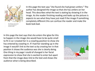
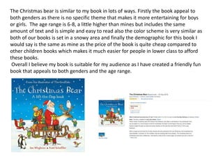
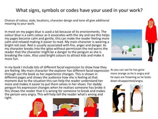
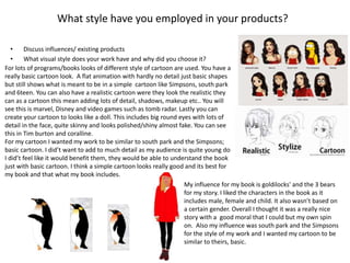
Graphic Narrative
Evaluation
Does your final product reflect your
original intentions?
• Compare your planning/digital flat plans/ storyboards to your final product
At the beginning of my planning I talked about how I wanted my background, characters and
text to all look like. I planned this using mood bored. After I finished my book I can strongly say
my work reflects my planning. For my main character the women, I wanted her to look quite
basic, red and black clothing to give her an explorer look. In the planning I used blonde hairs,
blue eyes, red coats and black trousers. For my finished character she has most of those features
so I have very closely stuck to my planning expect for her eyes. They changed to brown to stand
out more as the background was also blue.
For my penguin I planned them to be very simple cartoons with little detail but when it to
making them I realised my penguin look very similar to other cartoon penguins and I wanted
mine to be different so I started to add detail to them so they look original.
For my text I planned to make it look like crayon written so I would appeal to my target audience more but when
choosing the font of Photoshop there was not much that was similar to my planning so I went to the closest test
possible and chose a simple standard text, something quite big so it was easy to read as my target audience is 3-7. So
for my text I tried to stick to my planning but as lack of text I had to change.
After my planning I created digital flat plans to create little scenes that I would want my final scene to look like.
In my flat plans I drew out each scene that I thought would look the best after this I went on to Photoshop and used
images of the internet to give me an idea of what it would look like after I had finished. When creating my final images I
stuck to my plan and I believe I have stuck to my plan as my pages reflect my planning.
My first page I planned a kitchen with the main penguin to be cooking fish.
In my first final page I stuck to the plan and created a kitchen and created
a penguin that stood in the center coking fish for his family. I am really
happy with my first page as it went to plan and I had no worry's about
making it. I believe it has came out better than expected.
For my second page I decided to plan an outside setting using igloos and snow hills
with bright blue sky's. This would make it look very colorful and bring the page to life
and its more appealing to children using bright colors to attract there attention. For my
final second page it reassembled the planning but for one change. I added tress in as I
felt it was not looking realistic. This made my page more interesting and real.
For the next 8 of my images I used my planning to create the pages and they turned
out how I wanted them and planned them. The planning helped my decided what I
wanted in my pages and help my create the look I wanted.
How well have you constructed your images?
For my second image I wanted to add a sea to the picture
but I wanted it to look blended in so it looked more realistic.
As the sea isn't just one color it fades into different blues I
used the gradient tool to create a more realistic sea and it
merges to color together making it look like the color is
gradually changing into another shade. I also used the blur tool. This was to blur the top of the sea to the snow so it
looked like the sea was going on to the snow as a tide would. Overall I am pleased with the techniques I used for my page
as it made the sea look more realistic .
In my 4th page I started to use textures to make my page more interesting. In this
page I decided to create my back wall to look like the inside of an igloo but I could
not do this effect just using shapes. I used the clipping mask tool to create this
effect. I copied a image off Google of ice blocks and pasted in onto my page were I
resized it so it was bigger than my wall and use the clipping mask tool that puts that
image over the background, then I turned down the opacity till I got the color I
wanted and when I felt like it blended in. After this I still felt like the effect I was
looking for was not completed so I when on to filter and and filter gallery and used
the effect cutout this made the background look more cartoon that fitted with the
book nicely.
In this image I have created 3 beds for each of the penguins. Each bed is a
different size to show which bed belongs to who but I felt like this was not
enough to describe to the child who's is who's. I decided to use a colour
scheme. My dads I used blue and that is associated with boys. Pink for the
mum and yellow for the child and that is a neutral colour that s normally
used for young children. I have used this in the page where there have
there own chairs.
How well have you used text to anchor your images
• You should talk about the combination of words, images and text.
In this image the writer has talked about who the fox is upset and writes “she
cried so hard”. This tell the reader that the character is upset but to show this
they have to make sure the image is represents the text. In this page you can see
the fox crying as water is shooting out of her eyes this shows the writer has
combined the text and image to show the fox's emotions. But the writer has gone
on to say “that mamma let her stay home”. This is not shown in the image as we
can’t see the mamma letting her stay home this could have been improved using
a speech bubble to show the mum choice.
In one of my pages I have used the text to anchor my image as I have
created my page to show the what the text is stating. I have written “the
explorer said sorry” To show this in my image I used a speech bubble that
showed her saying sorry to the penguin as she ran off. I also wrote “And ran
away not to be seen again.” I created a women in a running position to
show the audience that she is running away and also created footsteps
behind her to show she had run off and left a trail . This will not confuse the
audience as the image relates to the text. One thing I could improve is
maybe I could of added another page showing the penguin have never seen
her since to clear up she was not seen again but overall I think my pages
text does anchor to my images and makes sense throughout the book not
confusing anyone.
In this page the text says “she found she had grown antlers.” The
author has designed the image so that she has antlers on her
head. This describes what the text is stating by showing it in the
image. As the reader finishing reading and looks up the picture is
expects to see what they have just read if the image if something
completely different this can confuse the reader and make the
book look bad.
In this page the text says that she enters the igloo for this
to happen in the image she would have to be quite small
to fit in so I created her in a crawling position to show she
has entered by crawling in. If I had her standing up in the
image it would’t link to the text so by creating her in that
position it shows the audience was she is clearly doing.
One thing in my page I could of changed is her facial
expression to show that she is excited to enter but apart
from that the image does link to the text and shows the
audience what is being described.
Is your product suitable for your audience?
• Reference your proposal
• Give an audience profile and describe suitability in reference to content
In my proposal I decided I wanted my audience to be age is 3-7 as I planned my pages to include
pictures and minimal text. In my proposal there was no specific gender for my book as the book
would not focus on something more appealing to certain genders it would involve both things that
each gender can enjoy. I planned my book to be suited for people in lower/middle class as the
booked would be cheap and appeal more to them as they would comfortably be able to afford it.
After I created my book some things have changed since my proposal. I believe the age for my
book is suitable for 4-7 as I have added more text as planned and I believe any person below the
age of 3 might find it difficult to read it. I would defiantly say my book Is suitable for children ages
4-7 and there is no rude language or scenes, the book is friendly and colorful and would entertain
that age range. The booked is suitable of both genders as there is no parts that aim more to a
certain gender, boy and girl both can enjoy. The book is full with lots of different colors that can
please each gender. The book does not involve gender discrimination and would not offend any
person because of there gender. My product is suitable for lower/middle class as it is quite a
simple book that teaches the wrongs about stealing/using people processions with permission but
the book does appeal to any class that wants to teach there kids between right and wrong as this
will help teach kids how to act and treat people.
The Christmas bear is similar to my book in lots of ways. Firstly the book appeal to
both genders as there is no specific theme that makes it more entertaining for boys
or girls. The age range is 6-8, a little higher than mines but includes the same
amount of text and is simple and easy to read also the color scheme is very similar as
both of our books is set in a snowy area and finally the demographic for this book I
would say is the same as mine as the price of the book is quite cheap compared to
other children books which makes it much easier for people in lower class to afford
these books.
Overall I believe my book is suitable for my audience as I have created a friendly fun
book that appeals to both genders and the age range.
What do you like/dislike about the techniques you have
used?• Reference specific tools you used with images
My favourite technique that I used through my production is the rotoscoping. I really like this technique as it helped me
create my characters and background for my pages, the main parts. This technique lets you go round picture and select
the parts you want. This allows you to create the same picture but using solid colours to eventually you have made the
full picture using colour and other techniques such as gradient tool, stroke and many more that you can find by clicking
on the selected part the layer style. To use this technique you have to use the polygonal lasso tool and click round the
area you want to select, when you have done this then right click then chose layer via copy. This creates of copy of the
selected area were you can then double click the copy that bring up layers style and chose what ever effect you think
will look best. This helped me create my characters as I could paste a copy of a real life penguin from the internet and
go round to get a realistic shape. I could then edit it to make it look cartoon by using basic shapes and colours. This
technique is really useful to create the base for your pages as it can be quite hard to create something's completely
from scratch. Overall I really like this technique but there are some parts to that I dislike or find difficult. For example
when you are going round the area you want to select you have to be really careful and steady because you don’t want
it to look rough round the edges, this requires a lot of time that you might not have and if you go to fast round the
edges the polygonal lasso tool can connect the lines up before you have selected the whole picture this can make you
start again or have to carefully fix it.
Here I have used
rotoscoping to get the
outline of my penguin. I
have also gone onto
layer style I added
gradient tool to create
yellow color the fades
into the white this
makes the penguin more
realistic.
After using rotoscoping to get the
outline of my penguin I can start to add
my own detail e.g. the face. I can do
this using shapes to create the mouth
and the eyes.
Another technique I liked is the texture effect. This technique allows you to add texture to your picture that makes it look
more realistic or more understandable. For this technique to need to find a picture of the texture you want to add for
example wood. Then you would paste it to Photoshop and re size it so it is bigger than the image you want to add texture
to. Before you create this effect you have to make sure the paste picture layer is above the original image. Then you right
click the layer and click create clipping mask, this will then place the texture over the image. If the texture is to strong you
can turn down the opacity to fit your page. I like this technique as I can add different texture to my book that allows it to
look more realistic and also helps the viewer understand what the objects are meant to be. It makes my page more
interesting than just having a brown rectangle as a tree trunk you can add a wood texture to it looks better and more real.
Overall it really help bring the page to life and together as you can clearly see what everything is and the kids can relate to
it more as the recognize the images. One thing I dislike about this technique It can make it look too realistic and not
cartoon enough. For this technique I feel like you have to use it carefully for the right objects. For example this technique
would not work for a fireplace as it feel it would make it look to real and you would not be able to get that cartoon effect.
You have to make sure you do not use it too much as it can start to make your book not look as animated as you might
like.
For this page I used the
texture technique for my
walls and floors. I used it
because having a solid
color made it look boring
and does’t show what the
room is and by adding
texture I was able to create
an igloo effect using ice
blocks and adding a a filter
form the filter gallery to
help in fit in with the other
cartoon objects.
Here I did not use the texture tool and I feel it
wouldn't’t look as good and ruin the cartoon look. I
wanted to create something more creative so I used the
horoscope to outlines brick that then I filled in different
color to give it rustic look and I think this look was a lot
better without using the texture technique.
What do you like/dislike about how your final product looks?
In my second page there are certain things that stands out to me that I like. The first thing is the characters, the
penguins. The first penguin I have created to have his arm out at the mummy penguin. I like this because it shows the
penguin is interacting with the other penguin and as he is speaking to her it shows who he is speaking to also. The
body language helps tell the story and what's happening. It also creates difference between the penguin so they do
not all look the same.
the baby penguin on his belly with his arms down as this shows he is sliding down the hill into the water for swim
just like the story is talking about, showing the text anchor the images. Also makes him different from the other
penguins as he is not just standing, it makes the page more fun and interesting.
Finally I really like the water I have created. With the faded effect it makes it look realistic and the gradient effect
helps it give it a flow. At first it was just a solid blue block but I changed it to make it look more real and improve the
quality of my page.
There was only thing I wasn’t so happy with but I went back and improved it apart from that there is nothing else I
am unhappy with.
Here I have there is the previous sea I had created as you can see it
does not have much detail it is just one colour. I have changed is now to
have a gradient look as hits makes it more realistic as the sea isn't just
one colour also used the faded tool to make it fade into the snow. Now
I really like my sea in the page and I am glad I changed it as it makes
my page quality a lot better.
In my page 9 I am really happy with the character facial expressions. The women
facial expressions show she is shocked a her hands are by her face with her mouth
wide open and the penguins shows he angry with his eyes looking cross. This
helps tell the story as the reader can tell what the character are feeling and what
is happening in the story as well as the text.
I also like the picture frames I have including in pages 8 and 9 because this makes
the place look more like a home with lots of memories of them on the wall. It also
shows them as a family which makes the story more friendly and warming.
The windows in my pages I like very much as it helps shows what the weather is
like through out the pages as the time goes on. It shows the audience that it goes
from morning to night as the stars come out. I am glad I have added this to my
story as it makes it more real and also more exciting with different settings
outside.
In his page there are only a couple things I am not to happy with. The bed I would
of liked to be more 3D so the women looks likes she is sitting on top of the duvet
but as the matrass in one block it looks like she is sat on 1 solid rectangle object.
Also In the window behind I am not happy with the neatness of the snow I would
of like that to be more neat like the rest of it.
The last thing I dislike about my final product is the penguins eyes. They look like
they are looking at the reader but I would of liked them better if they were
looking at the women as that who he is speaking to.
Why did you include the content you used?
• Images, fonts, effects, colours
In my book I included lots of colour but blue and pink were the ones that stood out the
most/most used. I chose these 2 colours for objects as they are both completely
different colours that boys and girls colour enjoy. No colour is used more used this is so
the book is one sided to boys or girls. In my 8th page the beds or 3 different colours. For
the daddy penguin the colour is blue because blue is more associated to boys so this
will make it clear that it’s the dads bed and pink for the women's as usually girls like
pink more. For the kids I used a yellow as yellow is normally used for young kids as its
quite natural and not overwhelming.
For the font I chose something quite simple, Courier New. This font was perfect as It
was quite bold but not to much were you could not understand what it said. I wanted it
to be quite simple so it would be easy for the young children to read. I chose the colour
pink so it would stand out in front of lots of colour as it quite a bright colour this would
also make it easier for the kids to read as it bright against everything else.
The images I chose were based around the goldilocks and the 3 bears. My main
character The explorer was a female. I chose this because the main character in
goldilocks was also a female. I chose penguins because I think they are friendly animals
that young kids like, there not scary so they would’t frighten the children. I chose the
setting to be snowy because I believe snow is quite magical setting as you see it near
Christmas. As it is snowy you can read the book near Christmas but as it has nothing to
do with Santa so can also read any other time in the year.
I did’t use effects much for my book but I did use it in my 4th page. I went onto filter gallery a chose the
cutout effect this gave the back wall soft edges and less detail with white shadows. I chose this because
it gave it a cartoon effect. I originally use texture to change it bit felt like it did’t fit in as it looked to real
so therefore I gave it this cutout effect that I believed made it look a lot better.
Here is the original before I added the
effect. The wall looks plain and boring,
it also does’t look much lime a cartoon
object so it did not really fit in with the
page but after I used the effect it
made it look a lot better and more like
an igloo then a brick wall. Overall
made the room look better as it was
quite a main part.
What signs, symbols or codes have your used in your work?
Choices of colour, style, locations, character design and tone all give additional
meaning to your work.
In most on my pages blue is used a lot because of its environments. The
colour blue is a calm colour as it associates with the sky and sea this helps
my pages become calm and gentle, this can make the reader feeling more
calm and relaxed making it easier to read. My main character is wearing a
bright red coat. Red is usually associated with fire, anger and danger. As
my character breaks into the igloo without permission the red warns the
reader that the character might be a danger to the penguin as she is
breaking the rules. Also used bright colours to attract kids and make it
more fun.
In my book I include lots of different facial expression to show how they
are feeling. My main character the explorer has different facial expression
through out the book as her experience changes. This is shown in
different pages and shows the audience how she is feeling at that
moment due to the situation this can help the reader understand her
more and makes it easier to put them selves in her shoes. For daddy
penguin his expression changes when he realises someone has broke it
this shows the reader that it is wrong for someone to break and makes
the person very angry. This will help tell the reader what's wrong and
right.
As you can see he has gone
more orange as he is angry and
he eyes are frowning as he looks
down disappointed/angry.
Audience Responses
Cultural competence:
Media texts require us to have a certain level of cultural understanding to
be able to interpret them.
At a basic level, this could mean being able to read the language that a
magazine is written in.
At a deeper level, it means being able to interpret signs and symbols that
we use a visual shorthand to communicate ideas.
We recognise these signs in our own culture but find it harder to
understand when looking at others.
We create and attach meaning to signs and symbols in many different
forms.
16Creative Media Production 2012
Audience Responses
Cultural competence:
What is this?
This is a Norwegian Pine tree, covered in
snow and with a red ribbon on.
Our cultural understanding allows us to
interpret its meaning.
To us, in British society, it means
Christmas, presents and family.
This is because we share a cultural
knowledge.
17Creative Media Production 2012
Audience Responses
Cultural competence:
There are many other signs and symbols
that we attach meaning to.
A leather jacket can imply rebellion.
A sports car can imply wealth and power.
A cross can represent religion.
18Creative Media Production 2012
Audience Responses
Cultural competence:
Visual representations of everyday objects are often the same the world
over. A car appears as a car, no matter what country it appears in.
What that car means however, can be very different depending on your
cultural background.
19Creative Media Production 2012
What representations can be found in your work?
• How are men, women or children shown in your work? Does your work feature different ages, races, social
groups or religions? Does a lack of any variety of character types create its own representation?
In my book There is one man, two females and one child. The man is daddy
penguin this is shown in the book through the text as he is described cooking. The
women penguin is not spoken about in the text and neither is the child but you
are able to tell which one is which by there height difference. The child is the
smallest because he is young, the mummy is medium height and the dad is the
tallest because men are normally taller. I wanted to women, male, and child so
the child reading this can relate as they will likely have a mum and dad. The child
gender is not specified this is because it did not need to be, this will allow the
children to pick what ever gender they want the baby penguin to be.
I could say there is a variety of different ages as there is a child and there parents showing an age gap but it is
not stated but the reader will be able to figure it out thought the pictures.
The second women is the explorer I didn't’t chose a man because as this is based around goldilocks I wanted
to keep the same style. Men are usually associated more with crime so by choosing a women is keeps away
from the stereotype.
My book does not include any religions as it is based around animals and doesn't’t involve anything to do
with religion. I felt like it was best not so then everyone would be able to relate and understand the book
then adding a religion to base round could offend other religions as there is not in and that other kids that
aren't religious would’t be able to enjoy it as much as they might not understand it.
What style have you employed in your products?
• Discuss influences/ existing products
• What visual style does your work have and why did you choose it?
For lots of programs/books looks of different style of cartoon are used. You have a
really basic cartoon look. A flat animation with hardly no detail just basic shapes
but still shows what is meant to be in a simple cartoon like Simpsons, south park
and 6teen. You can also have a realistic cartoon were they look the realistic they
can as a cartoon this mean adding lots of detail, shadows, makeup etc.. You will
see this is marvel, Disney and video games such as tomb radar. Lastly you can
create your cartoon to looks like a doll. This includes big round eyes with lots of
detail in the face, quite skinny and looks polished/shiny almost fake. You can see
this in Tim burton and coralline.
For my cartoon I wanted my work to be similar to south park and the Simpsons;
basic cartoon. I did’t want to add to much detail as my audience is quite young do
I did’t feel like it would benefit them, they would be able to understand the book
just with basic cartoon. I think a simple cartoon looks really good and its best for
my book and that what my book includes.
My influence for my book is goldilocks' and the 3 bears
for my story. I liked the characters in the book as it
includes male, female and child. It also wasn’t based on
a certain gender. Overall I thought it was a really nice
story with a good moral that I could but my own spin
on. Also my influence was south park and the Simpsons
for the style of my work and I wanted my cartoon to be
similar to theirs, basic.
What were the strengths and weaknesses of the pre-production
and planning
• How did the planning and research help
• How well did you manage your time
• Reference specific examples
I started off my planning by researching other children's books. This really help me understand
what I needed in my own book and what morals I should include. By researching 3 books this
helped me to decided to base mine around goldilocks and the 3 bears. This is when I started to
plan my book by creating mind maps and story bored to generate ideas. Creating a mind map
helped me explore different ideas and the biggest strength of a mind map is that it help you
take notes and makes it easy to organize ideas. Creating different mood boreds got me to start
brainstorming about there appearance and what I would like my book to look like. This is a
strength as when it came to production I already new what image I wanted for my book and
made it easier for when creating them. In my planning booklet I planned out what I would do
each day. This is a real strength as it kept my work organized and in order. I would stick to the
plan and that would tell me what to each day this helped me stay relaxed and calm through
the production. I disadvantage of the planning is sometimes there would be to much to do in
one day therefore I would I have to move it for the next day, this did effect my time
management.
My time management was overall good. I did finish my book on time but there were some days
where I would be behind time and have to catch up another day but I found time and by the
end everything was finished to the best quality it could be. Overall everything went to plan but
only because I had made a plan to help guide me through the process.
Historical and cultural context
• How does your work compare to what has come before? What other
similar products have existed in the past? What current products exist?
I have based my story on goldilocks and the three bears. “Goldilocks and
the three bears” is about a girl that break into someone’s home and eats
there porridge, sits on their chairs and lays on there beds till she is caught
and she runs away. The story was not always like this in 1837 the author
Robert Southey published the original version. In his story It was very
similar to the one kids read now but instead of there being a girl called
goldilocks it was an old women that broke into their home and was
described in very negative ways and she did not have a name. As the year
went on in 1903 an adaptation to the book was taken place by William
Wallace Denslow and the old women was changed to a girl as many other
book use old lady's as there villains and in 1904 was given the name
goldilocks. Currently it is about a girl that does wrong by using the bears
stuff and the moral of the story is to not enter someone house without
permission. In my book I also did an adaptation and changes the
characters and backgrounds. In my book instead of bears they are
penguins and the women is much older rather then a kid and is an
explorer in the south pole. They live in a igloo instead of a house and eat
fish instead of porridge. After all of them changes the moral and script of
the story is still the same. It still has the same story that teaches kids the
not to enter someone's house with permission.
Old version
Current version
My version
Peer Feedback
• Summarise peer feedback and discuss
• Techniques, The fireplace is simplistic but detailed enough. The glow effect makes it look more
realistic to a fire.
• Improved work is a lot better as the sea look more real with the gradient effect.
• In the windows the weather changes this makes the scene more life like and as if you are looking out
of the window.
• The colour of text is bad because pink is usually associated to girls and boys might not like it.
• Penguins look too similar. Cannot tell them apart.
• No religion included, this does not teach kids about religious morals. I feel like kids should explore
different religious even if they are not religious.
– Responses you agree with
I agree with the comment on the fireplace because I believe it looks a lot better as it makes it look more
cartoon. The glow effect I agree that it is really effectible as it does create a fire glow that makes the
scene look more real. I also agreed with the penguin comment. I do believe there are too similar but
penguins are very similar in real life and are hard to tell apart, that is why I have used different colours
and sizes to create a difference.
– Responses you disagree with
A disagree with the religion comment as I believe it should not involve religion and its should not be
pressured on kids to young, some kids might not understand religion and this could confuse them if I
included it into my book and also leave other kids out that have different religion to the one in the book.
By not including religion in my book everyone can enjoy it.
I also do not agree with the colour comment as pink is a good colour for the text as my book if filled with
blue and white and pink stands out against the colour so it makes it easier for the kids to read. I will not
be changing anything to by book as I believe it is finished to it best quality.

Evalutaion

  • 1.
  • 2.
    Does your finalproduct reflect your original intentions? • Compare your planning/digital flat plans/ storyboards to your final product At the beginning of my planning I talked about how I wanted my background, characters and text to all look like. I planned this using mood bored. After I finished my book I can strongly say my work reflects my planning. For my main character the women, I wanted her to look quite basic, red and black clothing to give her an explorer look. In the planning I used blonde hairs, blue eyes, red coats and black trousers. For my finished character she has most of those features so I have very closely stuck to my planning expect for her eyes. They changed to brown to stand out more as the background was also blue. For my penguin I planned them to be very simple cartoons with little detail but when it to making them I realised my penguin look very similar to other cartoon penguins and I wanted mine to be different so I started to add detail to them so they look original. For my text I planned to make it look like crayon written so I would appeal to my target audience more but when choosing the font of Photoshop there was not much that was similar to my planning so I went to the closest test possible and chose a simple standard text, something quite big so it was easy to read as my target audience is 3-7. So for my text I tried to stick to my planning but as lack of text I had to change.
  • 3.
    After my planningI created digital flat plans to create little scenes that I would want my final scene to look like. In my flat plans I drew out each scene that I thought would look the best after this I went on to Photoshop and used images of the internet to give me an idea of what it would look like after I had finished. When creating my final images I stuck to my plan and I believe I have stuck to my plan as my pages reflect my planning. My first page I planned a kitchen with the main penguin to be cooking fish. In my first final page I stuck to the plan and created a kitchen and created a penguin that stood in the center coking fish for his family. I am really happy with my first page as it went to plan and I had no worry's about making it. I believe it has came out better than expected. For my second page I decided to plan an outside setting using igloos and snow hills with bright blue sky's. This would make it look very colorful and bring the page to life and its more appealing to children using bright colors to attract there attention. For my final second page it reassembled the planning but for one change. I added tress in as I felt it was not looking realistic. This made my page more interesting and real. For the next 8 of my images I used my planning to create the pages and they turned out how I wanted them and planned them. The planning helped my decided what I wanted in my pages and help my create the look I wanted.
  • 4.
    How well haveyou constructed your images? For my second image I wanted to add a sea to the picture but I wanted it to look blended in so it looked more realistic. As the sea isn't just one color it fades into different blues I used the gradient tool to create a more realistic sea and it merges to color together making it look like the color is gradually changing into another shade. I also used the blur tool. This was to blur the top of the sea to the snow so it looked like the sea was going on to the snow as a tide would. Overall I am pleased with the techniques I used for my page as it made the sea look more realistic . In my 4th page I started to use textures to make my page more interesting. In this page I decided to create my back wall to look like the inside of an igloo but I could not do this effect just using shapes. I used the clipping mask tool to create this effect. I copied a image off Google of ice blocks and pasted in onto my page were I resized it so it was bigger than my wall and use the clipping mask tool that puts that image over the background, then I turned down the opacity till I got the color I wanted and when I felt like it blended in. After this I still felt like the effect I was looking for was not completed so I when on to filter and and filter gallery and used the effect cutout this made the background look more cartoon that fitted with the book nicely. In this image I have created 3 beds for each of the penguins. Each bed is a different size to show which bed belongs to who but I felt like this was not enough to describe to the child who's is who's. I decided to use a colour scheme. My dads I used blue and that is associated with boys. Pink for the mum and yellow for the child and that is a neutral colour that s normally used for young children. I have used this in the page where there have there own chairs.
  • 5.
    How well haveyou used text to anchor your images • You should talk about the combination of words, images and text. In this image the writer has talked about who the fox is upset and writes “she cried so hard”. This tell the reader that the character is upset but to show this they have to make sure the image is represents the text. In this page you can see the fox crying as water is shooting out of her eyes this shows the writer has combined the text and image to show the fox's emotions. But the writer has gone on to say “that mamma let her stay home”. This is not shown in the image as we can’t see the mamma letting her stay home this could have been improved using a speech bubble to show the mum choice. In one of my pages I have used the text to anchor my image as I have created my page to show the what the text is stating. I have written “the explorer said sorry” To show this in my image I used a speech bubble that showed her saying sorry to the penguin as she ran off. I also wrote “And ran away not to be seen again.” I created a women in a running position to show the audience that she is running away and also created footsteps behind her to show she had run off and left a trail . This will not confuse the audience as the image relates to the text. One thing I could improve is maybe I could of added another page showing the penguin have never seen her since to clear up she was not seen again but overall I think my pages text does anchor to my images and makes sense throughout the book not confusing anyone.
  • 6.
    In this pagethe text says “she found she had grown antlers.” The author has designed the image so that she has antlers on her head. This describes what the text is stating by showing it in the image. As the reader finishing reading and looks up the picture is expects to see what they have just read if the image if something completely different this can confuse the reader and make the book look bad. In this page the text says that she enters the igloo for this to happen in the image she would have to be quite small to fit in so I created her in a crawling position to show she has entered by crawling in. If I had her standing up in the image it would’t link to the text so by creating her in that position it shows the audience was she is clearly doing. One thing in my page I could of changed is her facial expression to show that she is excited to enter but apart from that the image does link to the text and shows the audience what is being described.
  • 7.
    Is your productsuitable for your audience? • Reference your proposal • Give an audience profile and describe suitability in reference to content In my proposal I decided I wanted my audience to be age is 3-7 as I planned my pages to include pictures and minimal text. In my proposal there was no specific gender for my book as the book would not focus on something more appealing to certain genders it would involve both things that each gender can enjoy. I planned my book to be suited for people in lower/middle class as the booked would be cheap and appeal more to them as they would comfortably be able to afford it. After I created my book some things have changed since my proposal. I believe the age for my book is suitable for 4-7 as I have added more text as planned and I believe any person below the age of 3 might find it difficult to read it. I would defiantly say my book Is suitable for children ages 4-7 and there is no rude language or scenes, the book is friendly and colorful and would entertain that age range. The booked is suitable of both genders as there is no parts that aim more to a certain gender, boy and girl both can enjoy. The book is full with lots of different colors that can please each gender. The book does not involve gender discrimination and would not offend any person because of there gender. My product is suitable for lower/middle class as it is quite a simple book that teaches the wrongs about stealing/using people processions with permission but the book does appeal to any class that wants to teach there kids between right and wrong as this will help teach kids how to act and treat people.
  • 8.
    The Christmas bearis similar to my book in lots of ways. Firstly the book appeal to both genders as there is no specific theme that makes it more entertaining for boys or girls. The age range is 6-8, a little higher than mines but includes the same amount of text and is simple and easy to read also the color scheme is very similar as both of our books is set in a snowy area and finally the demographic for this book I would say is the same as mine as the price of the book is quite cheap compared to other children books which makes it much easier for people in lower class to afford these books. Overall I believe my book is suitable for my audience as I have created a friendly fun book that appeals to both genders and the age range.
  • 9.
    What do youlike/dislike about the techniques you have used?• Reference specific tools you used with images My favourite technique that I used through my production is the rotoscoping. I really like this technique as it helped me create my characters and background for my pages, the main parts. This technique lets you go round picture and select the parts you want. This allows you to create the same picture but using solid colours to eventually you have made the full picture using colour and other techniques such as gradient tool, stroke and many more that you can find by clicking on the selected part the layer style. To use this technique you have to use the polygonal lasso tool and click round the area you want to select, when you have done this then right click then chose layer via copy. This creates of copy of the selected area were you can then double click the copy that bring up layers style and chose what ever effect you think will look best. This helped me create my characters as I could paste a copy of a real life penguin from the internet and go round to get a realistic shape. I could then edit it to make it look cartoon by using basic shapes and colours. This technique is really useful to create the base for your pages as it can be quite hard to create something's completely from scratch. Overall I really like this technique but there are some parts to that I dislike or find difficult. For example when you are going round the area you want to select you have to be really careful and steady because you don’t want it to look rough round the edges, this requires a lot of time that you might not have and if you go to fast round the edges the polygonal lasso tool can connect the lines up before you have selected the whole picture this can make you start again or have to carefully fix it. Here I have used rotoscoping to get the outline of my penguin. I have also gone onto layer style I added gradient tool to create yellow color the fades into the white this makes the penguin more realistic. After using rotoscoping to get the outline of my penguin I can start to add my own detail e.g. the face. I can do this using shapes to create the mouth and the eyes.
  • 10.
    Another technique Iliked is the texture effect. This technique allows you to add texture to your picture that makes it look more realistic or more understandable. For this technique to need to find a picture of the texture you want to add for example wood. Then you would paste it to Photoshop and re size it so it is bigger than the image you want to add texture to. Before you create this effect you have to make sure the paste picture layer is above the original image. Then you right click the layer and click create clipping mask, this will then place the texture over the image. If the texture is to strong you can turn down the opacity to fit your page. I like this technique as I can add different texture to my book that allows it to look more realistic and also helps the viewer understand what the objects are meant to be. It makes my page more interesting than just having a brown rectangle as a tree trunk you can add a wood texture to it looks better and more real. Overall it really help bring the page to life and together as you can clearly see what everything is and the kids can relate to it more as the recognize the images. One thing I dislike about this technique It can make it look too realistic and not cartoon enough. For this technique I feel like you have to use it carefully for the right objects. For example this technique would not work for a fireplace as it feel it would make it look to real and you would not be able to get that cartoon effect. You have to make sure you do not use it too much as it can start to make your book not look as animated as you might like. For this page I used the texture technique for my walls and floors. I used it because having a solid color made it look boring and does’t show what the room is and by adding texture I was able to create an igloo effect using ice blocks and adding a a filter form the filter gallery to help in fit in with the other cartoon objects. Here I did not use the texture tool and I feel it wouldn't’t look as good and ruin the cartoon look. I wanted to create something more creative so I used the horoscope to outlines brick that then I filled in different color to give it rustic look and I think this look was a lot better without using the texture technique.
  • 11.
    What do youlike/dislike about how your final product looks? In my second page there are certain things that stands out to me that I like. The first thing is the characters, the penguins. The first penguin I have created to have his arm out at the mummy penguin. I like this because it shows the penguin is interacting with the other penguin and as he is speaking to her it shows who he is speaking to also. The body language helps tell the story and what's happening. It also creates difference between the penguin so they do not all look the same. the baby penguin on his belly with his arms down as this shows he is sliding down the hill into the water for swim just like the story is talking about, showing the text anchor the images. Also makes him different from the other penguins as he is not just standing, it makes the page more fun and interesting. Finally I really like the water I have created. With the faded effect it makes it look realistic and the gradient effect helps it give it a flow. At first it was just a solid blue block but I changed it to make it look more real and improve the quality of my page. There was only thing I wasn’t so happy with but I went back and improved it apart from that there is nothing else I am unhappy with. Here I have there is the previous sea I had created as you can see it does not have much detail it is just one colour. I have changed is now to have a gradient look as hits makes it more realistic as the sea isn't just one colour also used the faded tool to make it fade into the snow. Now I really like my sea in the page and I am glad I changed it as it makes my page quality a lot better.
  • 12.
    In my page9 I am really happy with the character facial expressions. The women facial expressions show she is shocked a her hands are by her face with her mouth wide open and the penguins shows he angry with his eyes looking cross. This helps tell the story as the reader can tell what the character are feeling and what is happening in the story as well as the text. I also like the picture frames I have including in pages 8 and 9 because this makes the place look more like a home with lots of memories of them on the wall. It also shows them as a family which makes the story more friendly and warming. The windows in my pages I like very much as it helps shows what the weather is like through out the pages as the time goes on. It shows the audience that it goes from morning to night as the stars come out. I am glad I have added this to my story as it makes it more real and also more exciting with different settings outside. In his page there are only a couple things I am not to happy with. The bed I would of liked to be more 3D so the women looks likes she is sitting on top of the duvet but as the matrass in one block it looks like she is sat on 1 solid rectangle object. Also In the window behind I am not happy with the neatness of the snow I would of like that to be more neat like the rest of it. The last thing I dislike about my final product is the penguins eyes. They look like they are looking at the reader but I would of liked them better if they were looking at the women as that who he is speaking to.
  • 13.
    Why did youinclude the content you used? • Images, fonts, effects, colours In my book I included lots of colour but blue and pink were the ones that stood out the most/most used. I chose these 2 colours for objects as they are both completely different colours that boys and girls colour enjoy. No colour is used more used this is so the book is one sided to boys or girls. In my 8th page the beds or 3 different colours. For the daddy penguin the colour is blue because blue is more associated to boys so this will make it clear that it’s the dads bed and pink for the women's as usually girls like pink more. For the kids I used a yellow as yellow is normally used for young kids as its quite natural and not overwhelming. For the font I chose something quite simple, Courier New. This font was perfect as It was quite bold but not to much were you could not understand what it said. I wanted it to be quite simple so it would be easy for the young children to read. I chose the colour pink so it would stand out in front of lots of colour as it quite a bright colour this would also make it easier for the kids to read as it bright against everything else. The images I chose were based around the goldilocks and the 3 bears. My main character The explorer was a female. I chose this because the main character in goldilocks was also a female. I chose penguins because I think they are friendly animals that young kids like, there not scary so they would’t frighten the children. I chose the setting to be snowy because I believe snow is quite magical setting as you see it near Christmas. As it is snowy you can read the book near Christmas but as it has nothing to do with Santa so can also read any other time in the year.
  • 14.
    I did’t useeffects much for my book but I did use it in my 4th page. I went onto filter gallery a chose the cutout effect this gave the back wall soft edges and less detail with white shadows. I chose this because it gave it a cartoon effect. I originally use texture to change it bit felt like it did’t fit in as it looked to real so therefore I gave it this cutout effect that I believed made it look a lot better. Here is the original before I added the effect. The wall looks plain and boring, it also does’t look much lime a cartoon object so it did not really fit in with the page but after I used the effect it made it look a lot better and more like an igloo then a brick wall. Overall made the room look better as it was quite a main part.
  • 15.
    What signs, symbolsor codes have your used in your work? Choices of colour, style, locations, character design and tone all give additional meaning to your work. In most on my pages blue is used a lot because of its environments. The colour blue is a calm colour as it associates with the sky and sea this helps my pages become calm and gentle, this can make the reader feeling more calm and relaxed making it easier to read. My main character is wearing a bright red coat. Red is usually associated with fire, anger and danger. As my character breaks into the igloo without permission the red warns the reader that the character might be a danger to the penguin as she is breaking the rules. Also used bright colours to attract kids and make it more fun. In my book I include lots of different facial expression to show how they are feeling. My main character the explorer has different facial expression through out the book as her experience changes. This is shown in different pages and shows the audience how she is feeling at that moment due to the situation this can help the reader understand her more and makes it easier to put them selves in her shoes. For daddy penguin his expression changes when he realises someone has broke it this shows the reader that it is wrong for someone to break and makes the person very angry. This will help tell the reader what's wrong and right. As you can see he has gone more orange as he is angry and he eyes are frowning as he looks down disappointed/angry.
  • 16.
    Audience Responses Cultural competence: Mediatexts require us to have a certain level of cultural understanding to be able to interpret them. At a basic level, this could mean being able to read the language that a magazine is written in. At a deeper level, it means being able to interpret signs and symbols that we use a visual shorthand to communicate ideas. We recognise these signs in our own culture but find it harder to understand when looking at others. We create and attach meaning to signs and symbols in many different forms. 16Creative Media Production 2012
  • 17.
    Audience Responses Cultural competence: Whatis this? This is a Norwegian Pine tree, covered in snow and with a red ribbon on. Our cultural understanding allows us to interpret its meaning. To us, in British society, it means Christmas, presents and family. This is because we share a cultural knowledge. 17Creative Media Production 2012
  • 18.
    Audience Responses Cultural competence: Thereare many other signs and symbols that we attach meaning to. A leather jacket can imply rebellion. A sports car can imply wealth and power. A cross can represent religion. 18Creative Media Production 2012
  • 19.
    Audience Responses Cultural competence: Visualrepresentations of everyday objects are often the same the world over. A car appears as a car, no matter what country it appears in. What that car means however, can be very different depending on your cultural background. 19Creative Media Production 2012
  • 20.
    What representations canbe found in your work? • How are men, women or children shown in your work? Does your work feature different ages, races, social groups or religions? Does a lack of any variety of character types create its own representation? In my book There is one man, two females and one child. The man is daddy penguin this is shown in the book through the text as he is described cooking. The women penguin is not spoken about in the text and neither is the child but you are able to tell which one is which by there height difference. The child is the smallest because he is young, the mummy is medium height and the dad is the tallest because men are normally taller. I wanted to women, male, and child so the child reading this can relate as they will likely have a mum and dad. The child gender is not specified this is because it did not need to be, this will allow the children to pick what ever gender they want the baby penguin to be. I could say there is a variety of different ages as there is a child and there parents showing an age gap but it is not stated but the reader will be able to figure it out thought the pictures. The second women is the explorer I didn't’t chose a man because as this is based around goldilocks I wanted to keep the same style. Men are usually associated more with crime so by choosing a women is keeps away from the stereotype. My book does not include any religions as it is based around animals and doesn't’t involve anything to do with religion. I felt like it was best not so then everyone would be able to relate and understand the book then adding a religion to base round could offend other religions as there is not in and that other kids that aren't religious would’t be able to enjoy it as much as they might not understand it.
  • 21.
    What style haveyou employed in your products? • Discuss influences/ existing products • What visual style does your work have and why did you choose it? For lots of programs/books looks of different style of cartoon are used. You have a really basic cartoon look. A flat animation with hardly no detail just basic shapes but still shows what is meant to be in a simple cartoon like Simpsons, south park and 6teen. You can also have a realistic cartoon were they look the realistic they can as a cartoon this mean adding lots of detail, shadows, makeup etc.. You will see this is marvel, Disney and video games such as tomb radar. Lastly you can create your cartoon to looks like a doll. This includes big round eyes with lots of detail in the face, quite skinny and looks polished/shiny almost fake. You can see this in Tim burton and coralline. For my cartoon I wanted my work to be similar to south park and the Simpsons; basic cartoon. I did’t want to add to much detail as my audience is quite young do I did’t feel like it would benefit them, they would be able to understand the book just with basic cartoon. I think a simple cartoon looks really good and its best for my book and that what my book includes. My influence for my book is goldilocks' and the 3 bears for my story. I liked the characters in the book as it includes male, female and child. It also wasn’t based on a certain gender. Overall I thought it was a really nice story with a good moral that I could but my own spin on. Also my influence was south park and the Simpsons for the style of my work and I wanted my cartoon to be similar to theirs, basic.
  • 22.
    What were thestrengths and weaknesses of the pre-production and planning • How did the planning and research help • How well did you manage your time • Reference specific examples I started off my planning by researching other children's books. This really help me understand what I needed in my own book and what morals I should include. By researching 3 books this helped me to decided to base mine around goldilocks and the 3 bears. This is when I started to plan my book by creating mind maps and story bored to generate ideas. Creating a mind map helped me explore different ideas and the biggest strength of a mind map is that it help you take notes and makes it easy to organize ideas. Creating different mood boreds got me to start brainstorming about there appearance and what I would like my book to look like. This is a strength as when it came to production I already new what image I wanted for my book and made it easier for when creating them. In my planning booklet I planned out what I would do each day. This is a real strength as it kept my work organized and in order. I would stick to the plan and that would tell me what to each day this helped me stay relaxed and calm through the production. I disadvantage of the planning is sometimes there would be to much to do in one day therefore I would I have to move it for the next day, this did effect my time management. My time management was overall good. I did finish my book on time but there were some days where I would be behind time and have to catch up another day but I found time and by the end everything was finished to the best quality it could be. Overall everything went to plan but only because I had made a plan to help guide me through the process.
  • 23.
    Historical and culturalcontext • How does your work compare to what has come before? What other similar products have existed in the past? What current products exist? I have based my story on goldilocks and the three bears. “Goldilocks and the three bears” is about a girl that break into someone’s home and eats there porridge, sits on their chairs and lays on there beds till she is caught and she runs away. The story was not always like this in 1837 the author Robert Southey published the original version. In his story It was very similar to the one kids read now but instead of there being a girl called goldilocks it was an old women that broke into their home and was described in very negative ways and she did not have a name. As the year went on in 1903 an adaptation to the book was taken place by William Wallace Denslow and the old women was changed to a girl as many other book use old lady's as there villains and in 1904 was given the name goldilocks. Currently it is about a girl that does wrong by using the bears stuff and the moral of the story is to not enter someone house without permission. In my book I also did an adaptation and changes the characters and backgrounds. In my book instead of bears they are penguins and the women is much older rather then a kid and is an explorer in the south pole. They live in a igloo instead of a house and eat fish instead of porridge. After all of them changes the moral and script of the story is still the same. It still has the same story that teaches kids the not to enter someone's house with permission. Old version Current version My version
  • 24.
    Peer Feedback • Summarisepeer feedback and discuss • Techniques, The fireplace is simplistic but detailed enough. The glow effect makes it look more realistic to a fire. • Improved work is a lot better as the sea look more real with the gradient effect. • In the windows the weather changes this makes the scene more life like and as if you are looking out of the window. • The colour of text is bad because pink is usually associated to girls and boys might not like it. • Penguins look too similar. Cannot tell them apart. • No religion included, this does not teach kids about religious morals. I feel like kids should explore different religious even if they are not religious. – Responses you agree with I agree with the comment on the fireplace because I believe it looks a lot better as it makes it look more cartoon. The glow effect I agree that it is really effectible as it does create a fire glow that makes the scene look more real. I also agreed with the penguin comment. I do believe there are too similar but penguins are very similar in real life and are hard to tell apart, that is why I have used different colours and sizes to create a difference. – Responses you disagree with A disagree with the religion comment as I believe it should not involve religion and its should not be pressured on kids to young, some kids might not understand religion and this could confuse them if I included it into my book and also leave other kids out that have different religion to the one in the book. By not including religion in my book everyone can enjoy it. I also do not agree with the colour comment as pink is a good colour for the text as my book if filled with blue and white and pink stands out against the colour so it makes it easier for the kids to read. I will not be changing anything to by book as I believe it is finished to it best quality.