Downloaded 117 times


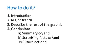
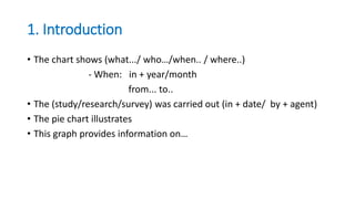
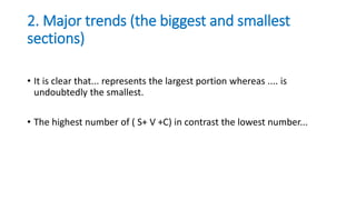
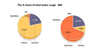
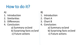
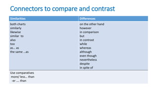


This document provides guidance on how to describe and analyze pie charts. It recommends including an introduction stating what the chart shows, followed by an analysis of major trends in the largest and smallest sections. Details of other sections should then be described using common phrases about proportions and percentages. The conclusion should provide an overall summary and note any surprising facts, and potentially suggest future actions based on the results. The document also offers templates for comparing two pie charts, suggesting introducing and then separately analyzing each chart before concluding with a summary of similarities and differences using comparative connectors.