Download as PDF, PPTX


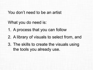


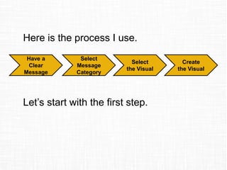

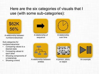

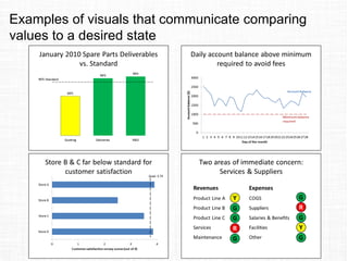
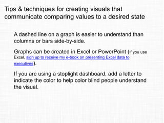
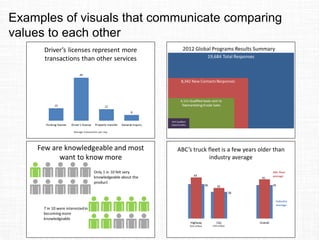


The document discusses the challenges business professionals face when creating effective presentations and offers a process to select and create visuals without needing a design background. It outlines six categories of visuals and provides tips and techniques for effectively communicating messages through various visual formats. The author, Dave Paradi, emphasizes clarity and simplicity in presentation design, sharing his expertise as a recognized presentation expert.


