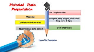
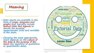
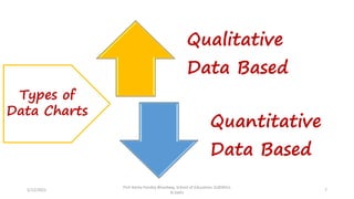
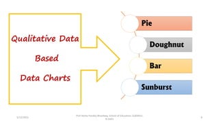
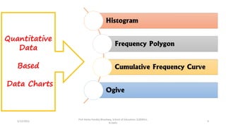
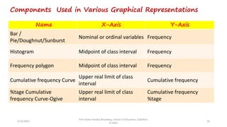
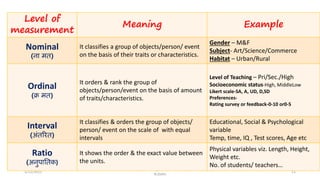
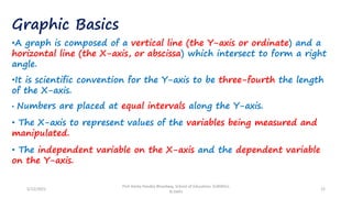
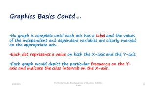
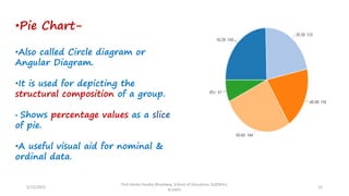
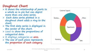
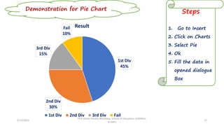
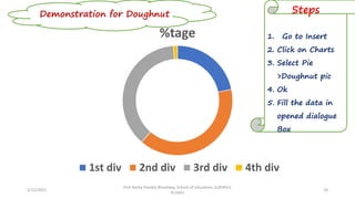
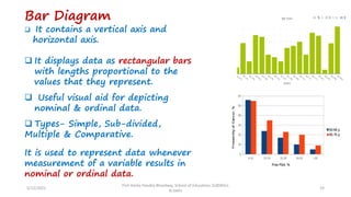
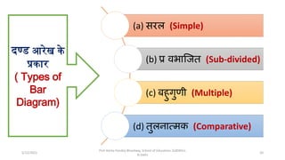
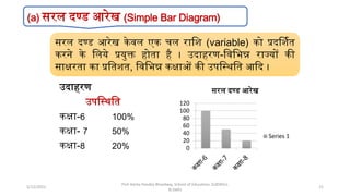
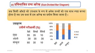
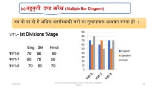
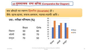
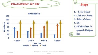
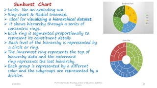
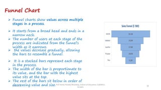
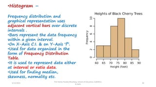
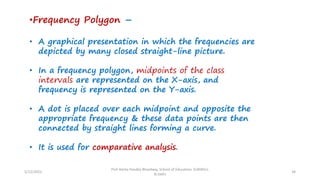
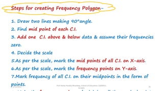
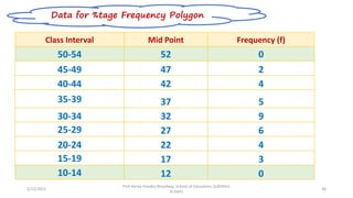
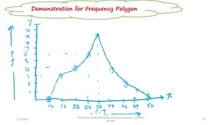
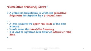
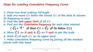
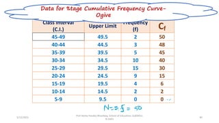
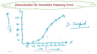
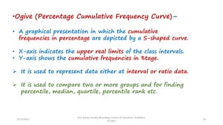
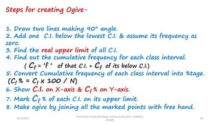
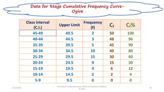
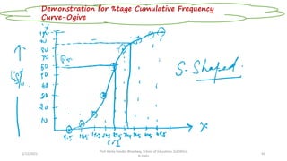
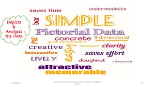
SlideShare a Scribd company logo
1 of 48
Pictorial Data
Presentation
Enhancing
Research Based Skills
One Week Online National FDP
Dated-12th May,2022
Organized
by
Teaching Learning Centre,
SLBSNSU (Central University), N.Delhi
Prof. Amita Pandey Bhardwaj
Director, Teaching Learning Centre under PMMMNMTT Scheme,
MoE, GOI
Shri Lal Bahadur Shastri National Sanskrit University, N. Delhi
9th -13thMay,2022
Histogram, Freq. Polygon, Cumulative
Freq. curve & Ogive
Demonstration
Pictorial Data
Presentation
Meaning
Qualitative Data Based
Add Contents Title
Add Contents Title
Focus of the Presentation.
Quantitative data based
Pie, Doughnut &Bar
Simple Attractively
Memorable
Quickly
Comparable Lively
Concrete
Clarity
Understandable
5/12/2022
Prof Amita Pandey Bhardwaj, School of Education, SLBSNSU,
N.Delhi
3
❖ Pictorial is defined as something
illustrated or expressed in pictures.
❖ A chart is a graphical representation for data
visualization in which the data is represented
by symbols such as bars in a bar chart, lines in
a line chart, or slices in a pie chart.
❖ visual representation
❖ A pictorial chart is a visual representation
of data that uses bars, lines, circle& icons.
What does it
Means?
5/12/2022
Prof Amita Pandey Bhardwaj, School of Education, SLBSNSU,
N.Delhi
4
➢ Tabular and graphical
representation of data are a vital
component in analyzing and
understanding large quantities of
numerical data and the relationship
between data points.
➢ Data visualization is one of the most
fundamental approaches to data
analysis providing an intuitive and
universal means to visualize,
abstract and share complex data
patterns.
5/12/2022
Prof Amita Pandey Bhardwaj, School of Education, SLBSNSU,
N.Delhi
5
• Data charts are available in the
form of maps, diagrams and
graphs that typically include
textual titles and legends to
denote the purpose,
measurement units and variables
of the chart.
• Choosing the most appropriate
chart depends on the nature of
the data & the purpose of the
chart (for depiction of qualitative
or quantitative data).
5/12/2022
Prof Amita Pandey Bhardwaj, School of Education, SLBSNSU,
N.Delhi 6
Meaning
5/12/2022
Prof Amita Pandey Bhardwaj, School of Education, SLBSNSU,
N.Delhi
7
Qualitative
Data Based
Quantitative
Data Based
Types of
Data Charts
5/12/2022
Prof Amita Pandey Bhardwaj, School of Education, SLBSNSU,
N.Delhi
8
Pie
Doughnut
Bar
Sunburst
Qualitative Data
Based
Data Charts
5/12/2022
Prof Amita Pandey Bhardwaj, School of Education, SLBSNSU,
N.Delhi
9
Histogram
Frequency Polygon
Cumulative Frequency Curve
Ogive
Quantitative
Data
Based
Data Charts
Components Used in Various Graphical Representations
5/12/2022
Prof Amita Pandey Bhardwaj, School of Education, SLBSNSU,
N.Delhi
10
Name X-Axis Y-Axis
Bar /
Pie/Doughnut/Sunburst
Nominal or ordinal variables Frequency
Histogram Midpoint of class interval Frequency
Frequency polygon Midpoint of class interval Frequency
Cumulative frequency Curve
Upper real limit of class
interval
Cumulative frequency
%tage Cumulative
frequency Curve-Ogive
Upper real limit of class
interval
Cumulative frequency
%tage
5/12/2022
Prof Amita Pandey Bhardwaj, School of Education, SLBSNSU,
N.Delhi
11
Level of
measurement
Meaning Example
Nominal
(नामित)
It classifies a group of objects/person/ event
on the basis of their traits or characteristics.
Gender – M&F
Subject- Art/Science/Commerce
Habitat – Urban/Rural
Ordinal
(क्रमित)
It orders & rank the group of
objects/person/event on the basis of amount
of traits/characteristics.
Level of Teaching – Pri/Sec./High
Socioeconomic status-High, MiddleLow
Likert scale-SA, A, UD, D,SD
Preferences-
Rating survey or feedback-0-10 or0-5
Interval
(अंतरित)
It classifies & orders the group of objects/
person/ event on the scale of with equal
intervals
Educational, Social & Psychological
variable
Temp, time, IQ , Test scores, Age etc
Ratio
(अनुपाततक)
It shows the order & the exact value between
the units.
Physical variables viz. Length, Height,
Weight etc.
No. of students/ teachers…
Graphic Basics
•A graph is composed of a vertical line (the Y-axis or ordinate) and a
horizontal line (the X-axis, or abscissa) which intersect to form a right
angle.
•It is scientific convention for the Y-axis to be three-fourth the length
of the X-axis.
• Numbers are placed at equal intervals along the Y-axis.
• The X-axis to represent values of the variables being measured and
manipulated.
• The independent variable on the X-axis and the dependent variable
on the Y-axis.
5/12/2022
Prof Amita Pandey Bhardwaj, School of Education, SLBSNSU,
N.Delhi
12
Graphics Basics Contd….
•No graph is complete until each axis has a label and the values
of the independent and dependent variables are clearly marked
on the appropriate axis.
•Each dot represents a value on both the X-axis and the Y-axis.
•Each graph would depict the particular frequency on the Y-
axis and indicate the class intervals on the X-axis.
5/12/2022
Prof Amita Pandey Bhardwaj, School of Education, SLBSNSU,
N.Delhi
13
5/12/2022
Prof Amita Pandey Bhardwaj, School of Education, SLBSNSU,
N.Delhi
14
Qualitative Data
Based
Data Charts
•Pie Chart-
•Also called Circle diagram or
Angular Diagram.
•It is used for depicting the
structural composition of a group.
• Shows percentage values as a slice
of pie.
•A useful visual aid for nominal &
ordinal data.
5/12/2022
Prof Amita Pandey Bhardwaj, School of Education, SLBSNSU,
N.Delhi
15
Doughnut Chart
➢ It shows the relationship of parts to
a whole as in pie but can depict
more than one data series.
➢ Each data series plotted in a
doughnut chart adds a ring to the
chart.
➢ The first data series is displayed in
the center of the chart.
➢ Used to show the proportions of
categorical data.
➢ It displays categories as arcs.
➢ The size of each piece represents
the proportion of each category.
5/12/2022
Prof Amita Pandey Bhardwaj, School of Education, SLBSNSU,
N.Delhi
16
5/12/2022
Prof Amita Pandey Bhardwaj, School of Education, SLBSNSU,
N.Delhi
17
Demonstration for Pie Chart
1st Div
45%
2nd Div
30%
3rd Div
15%
Fail
10%
Result
1st Div 2nd Div 3rd Div Fail
Steps
1. Go to Insert
2. Click on Charts
3. Select Pie
4. Ok
5. Fill the data in
opened dialogue
Box
5/12/2022
Prof Amita Pandey Bhardwaj, School of Education, SLBSNSU,
N.Delhi
18
Demonstration for Doughnut Steps
1. Go to Insert
2. Click on Charts
3. Select Pie
>Doughnut pic
4. Ok
5. Fill the data in
opened dialogue
Box
%tage
1st div 2nd div 3rd div 4th div
Bar Diagram
❑ It contains a vertical axis and
horizontal axis.
❑ It displays data as rectangular bars
with lengths proportional to the
values that they represent.
❑ Useful visual aid for depicting
nominal & ordinal data.
❑ Types- Simple, Sub-divided,
Multiple & Comparative.
It is used to represent data whenever
measurement of a variable results in
nominal or ordinal data.
5/12/2022
Prof Amita Pandey Bhardwaj, School of Education, SLBSNSU,
N.Delhi
19
(a) सरल (Simple)
(b) प्रविभाजित (Sub-divided)
(c) बहुगुणी (Multiple)
(d) तुलनात्मक (Comparative)
दण्ड आरेख के
प्रकार
( Types of
Bar
Diagram)
Prof Amita Pandey Bhardwaj, School of Education, SLBSNSU,
N.Delhi
20
5/12/2022
उदाहरण
उपस्थिस्ि
कक्षा-6 100%
कक्षा- 7 50%
कक्षा-8 20% 0
20
40
60
80
100
120
सरल दण्ड आरेख
Series 1
सरल दण्ड आरेख केवल एक चल रास्ि (variable) को प्रदर्ििि
करने के स्लये प्रयुक्त होिा है । उदाहरण-स्वस्िन्न राज्यों की
साक्षरिा का प्रस्ििि, स्वस्िन्न कक्षाओं की उपस्थिस्ि आदद ।
(a) सरल दण्ड आरेख (Simple Bar Diagram)
Prof Amita Pandey Bhardwaj, School of Education, SLBSNSU,
N.Delhi
21
5/12/2022
उदाहरण
उत्तीणि परीक्षािी (%)
Ist IInd IIIrd
हहिंदी 55 35 10
अिंग्रेजी 30 35 35
सिंथकृि 60 30 10
0%
20%
40%
60%
80%
100%
IIIrd
IInd
Ist
जब दकसी आँकड़े को उपिाग के रूप में अनेक िथ्यों को एक साि थपष्ट करना
होिा है िब उस दिा में इस आरेख का प्रयोग दकया जािा है ।
(b) प्रस्विास्जि दण्ड आरेख (Sub-Divided Bar Diagram)
Prof Amita Pandey Bhardwaj, School of Education, SLBSNSU,
N.Delhi
22
5/12/2022
उदा.- Ist Divisions %tage
Eng Skt Hindi
कक्षा-6 70 60 80
कक्षा-7 80 70 50
कक्षा-8 70 50 70
0
10
20
30
40
50
60
70
80
90
English
Sanskrit
Hindi
जब दो या दो से अस्िक अिंिसिम्बन्िी चरों का िुलनात्मक अध्ययन करना हो ।
(c) बहुगुणी दण्ड आरेख (Multiple Bar Diagram)
Prof Amita Pandey Bhardwaj, School of Education, SLBSNSU,
N.Delhi
23
5/12/2022
उदा.- परीक्षा पररणाम (%)
Boys Girls
स्वज्ञान 50 80
अिंग्रेजी 60 70
सिंथकृि 70 50 0
10
20
30
40
50
60
70
80
90
Boys
Girls
जब आँकड़ो का थवरूप स्िचरीय (bivariate) हो ।
जैसे- छात्र-छात्रा, सफल-असफल, लड़का-लड़की आदद ।
(d) िुलनात्मक दण्ड आरेख (Comparative Bar Diagram)
Prof Amita Pandey Bhardwaj, School of Education, SLBSNSU,
N.Delhi
24
5/12/2022
5/12/2022
Prof Amita Pandey Bhardwaj, School of Education, SLBSNSU,
N.Delhi
25
Gender Class 6 Class 7 Class 8 Class 9
Boys 60% 70% 30% 90%
Girls 80% 50% 70% 60%
Data for Bar diagram
5/12/2022
Prof Amita Pandey Bhardwaj, School of Education, SLBSNSU,
N.Delhi
26
Demonstration for Bar Steps
1. Go to Insert
2. Click on Charts
3. Select Column
4. Ok
5. Fill the data in
opened dialogue
Box
0
20
40
60
80
100
120
Class-6 Class-7 Class-8 Class-9
Attendance
Axis Title
Attendance
Male Female Total
5/12/2022
Prof Amita Pandey Bhardwaj, School of Education, SLBSNSU,
N.Delhi
27
➢Looks like an exploding sun
➢Ring chart & Radial treemap.
➢ Ideal for visualizing a hierarchical dataset.
➢ It shows hierarchy through a series of
concentric rings.
➢Each ring is segmented proportionally to
represent its constituent details.
➢ Each level of the hierarchy is represented by
a circle or ring.
➢The innermost ring represents the top of
hierarchy data and the outermost
ring represents the last hierarchy.
➢Each group is represented by a different
color and the subgroups are represented by a
division.
Sunburst Chart
Funnel Chart
5/12/2022
Prof Amita Pandey Bhardwaj, School of Education, SLBSNSU,
N.Delhi
28
➢ It is a stacked bars represent each stage
in the process.
➢ The width of the bar is proportionate to
its value, and the bar with the highest
value sits at the top.
➢ The rest of the bars sit below in order of
decreasing value and size.
➢ Funnel charts show values across multiple
stages in a process.
➢ the values decrease gradually, allowing
the bars to resemble a funnel.
➢ It starts from a broad head and ends in a
narrow neck.
➢ The number of users at each stage of the
process are indicated from the funnel’s
width as it narrows.
5/12/2022
Prof Amita Pandey Bhardwaj, School of Education, SLBSNSU,
N.Delhi
29
Quantitative Data
Based
Data Charts
•Histogram –
Frequency distribution and
graphical representation uses
adjacent vertical bars over discrete
intervals .
•Bars represent the data frequency
within a given interval.
•On X-Axis C.I. & on Y-Axis ‘f’’.
•Used for data organized in the
form of Frequency Distribution
Table.
•It is used to represent data either
at interval or ratio data.
•Used for finding median,
skewness, normality etc.
5/12/2022
Prof Amita Pandey Bhardwaj, School of Education, SLBSNSU,
N.Delhi
30
Steps for creating Histogram-
1. Draw two lines making 90°.
2. Show class interval on X-axis and frequency on Y-axis.
3. Decide the scale for X-axis & Y-axis.
4.As per the scale, mark points on X & Y-axis on equal
distance.
5. Find out real lower & higher limits of class interval.
6. Draw the bars as per the frequency of each class
interval on its real lower & upper limits.
5/12/2022
Prof Amita Pandey Bhardwaj, School of Education, SLBSNSU,
N.Delhi
31
5/12/2022
Prof Amita Pandey Bhardwaj, School of Education, SLBSNSU,
N.Delhi
32
Class Interval Lower Limit Upper Limit Frequency (f)
45-49 44.5 49.5 2
40-44 39.5 44.5 4
35-39 34.5 39.5 5
30-34 29.5 34.5 9
25-29 24.5 29.5 6
20-24 19.5 24.5 4
15-19 14.5 19.5 3
Data for Histogram
5/12/2022
Prof Amita Pandey Bhardwaj, School of Education, SLBSNSU,
N.Delhi
33
Demonstration for Histogram
•Frequency Polygon –
• A graphical presentation in which the frequencies are
depicted by many closed straight-line picture.
• In a frequency polygon, midpoints of the class
intervals are represented on the X-axis, and
frequency is represented on the Y-axis.
• A dot is placed over each midpoint and opposite the
appropriate frequency & these data points are then
connected by straight lines forming a curve.
• It is used for comparative analysis.
5/12/2022
Prof Amita Pandey Bhardwaj, School of Education, SLBSNSU,
N.Delhi
34
Steps for creating Frequency Polygon-
1. Draw two lines making 90°angle.
2. Find mid point of each C.I.
3. Add one C.I. above & below data & assume their frequencies
zero.
4. Decide the scale
5.As per the scale, mark the mid points of all C.I. on X-axis.
6.As per the scale, mark the frequency points on Y-axis.
7.Mark frequency of all C.I. on their midpoints in the form of
points.
5/12/2022
Prof Amita Pandey Bhardwaj, School of Education, SLBSNSU,
N.Delhi
35
5/12/2022
Prof Amita Pandey Bhardwaj, School of Education, SLBSNSU,
N.Delhi
36
Class Interval Mid Point Frequency (f)
50-54 52 0
45-49 47 2
40-44 42 4
35-39 37 5
30-34 32 9
25-29 27 6
20-24 22 4
15-19 17 3
10-14 12 0
Data for %tage Frequency Polygon
5/12/2022
Prof Amita Pandey Bhardwaj, School of Education, SLBSNSU,
N.Delhi
37
Demonstration for Frequency Polygon
•Cumulative Frequency Curve–
➢ A graphical presentation in which the cumulative
frequencies are depicted by a S-shaped curve.
• .
• X-axis indicates the upper real limits of the class
intervals.
• Y-axis shows the cumulative frequency
• It is used to represent data either at interval or ratio
data.
•
5/12/2022
Prof Amita Pandey Bhardwaj, School of Education, SLBSNSU,
N.Delhi
38
Steps for creating Cumulative Frequency Curve-
1. Draw two lines making 90°angle.
2. Add one more C.I. below the lowest C.I. of the data & assume
its frequency as zero.
3. Find the real upper limit of all C.I.
4. Find out the Cumulative frequency for each class interval.
( Cf = ‘f ‘ of that C.I. + Cf of its below C.I.)
5. Show C.I. on X-axis & Cf on Y-axis as per the scale.
6. Mark Cf of each C.I. on its upper limit
7. Make cumulative frequency curve by joining all the marked
points with free hand.
5/12/2022
Prof Amita Pandey Bhardwaj, School of Education, SLBSNSU,
N.Delhi
39
5/12/2022
Prof Amita Pandey Bhardwaj, School of Education, SLBSNSU,
N.Delhi
40
Class interval
(C.I.)
Upper Limit
Frequency
(f) Cf
45-49 49.5 2 50
40-44 44.5 3 48
35-39 39.5 5 45
30-34 34.5 10 40
25-29 29.5 15 30
20-24 24.5 9 15
15-19 19.5 4 6
10-14 14.5 2 2
5-9 9.5 0 0
Data for %tage Cumulative Frequency Curve-
Ogive
5/12/2022
Prof Amita Pandey Bhardwaj, School of Education, SLBSNSU,
N.Delhi
41
Demonstration for Cumulative Frequency Curve
•Ogive (Percentage Cumulative Frequency Curve)–
• A graphical presentation in which the cumulative
frequencies in percentage are depicted by a S-shaped curve.
• X-axis indicates the upper real limits of the class intervals.
• Y-axis shows the cumulative frequencies in %tage.
➢ It is used to represent data either at interval or ratio data.
➢ It is used to compare two or more groups and for finding
percentile, median, quartile, percentile rank etc.
5/12/2022
Prof Amita Pandey Bhardwaj, School of Education, SLBSNSU,
N.Delhi
42
Steps for creating Ogive-
1. Draw two lines making 90° angle.
2. Add one C.I. below the lowest C.I. & assume its frequency as
zero.
3. Find the real upper limit of all C.I.
4. Find out the cumulative frequency for each class interval.
( Cf = ‘f ‘ of that C.I. + Cf of its below C.I.)
5. Convert Cumulative frequency of each class interval into %tage.
(Cf % = Cf x 100 / N)
6. Show C.I. on X-axis & Cf % on Y-axis.
7. Mark Cf % of each C.I. on its upper limit.
8. Make ogive by joining all the marked points with free hand.
5/12/2022
Prof Amita Pandey Bhardwaj, School of Education, SLBSNSU,
N.Delhi
43
5/12/2022
Prof Amita Pandey Bhardwaj, School of Education, SLBSNSU,
N.Delhi
44
Class interval
(C.I.)
Upper Limit
Frequency
(f) Cf Cf%
45-49 49.5 2 50 100
40-44 44.5 3 48 96
35-39 39.5 5 45 90
30-34 34.5 10 40 80
25-29 29.5 15 30 60
20-24 24.5 9 15 30
15-19 19.5 4 6 12
10-14 14.5 2 2 4
5-9 9.5 0 0 0
Data for %tage Cumulative Frequency Curve-
Ogive
5/12/2022
Prof Amita Pandey Bhardwaj, School of Education, SLBSNSU,
N.Delhi
45
Demonstration for %tage Cumulative Frequency
Curve-Ogive
MS- Word
MS-PPT
MS-Excel
Insert
Charts
5/12/2022
Prof Amita Pandey Bhardwaj, School of Education, SLBSNSU,
N.Delhi
46
5/12/2022
Prof Amita Pandey Bhardwaj, School of Education, SLBSNSU,
N.Delhi
47
Depicts
&
Analyses
the Data
5/12/2022
Prof Amita Pandey Bhardwaj, School of Education, SLBSNSU,
N.Delhi
48
Lets us try & practice

More Related Content

What's hot

Introduction to statistics
Introduction to statisticsIntroduction to statistics
Introduction to statistics
akbhanj
 
2.3 Histogram/Frequency Polygon/Ogives
2.3 Histogram/Frequency Polygon/Ogives2.3 Histogram/Frequency Polygon/Ogives
2.3 Histogram/Frequency Polygon/Ogives
mlong24
 
Histograms and polygons
Histograms and polygonsHistograms and polygons
Histograms and polygons
shivang1999
 

What's hot (20)

Introduction to statistics
Introduction to statisticsIntroduction to statistics
Introduction to statistics
 
Frequency Polygon
Frequency PolygonFrequency Polygon
Frequency Polygon
 
Frequency curve
Frequency curveFrequency curve
Frequency curve
 
Measure of skewness
Measure of skewnessMeasure of skewness
Measure of skewness
 
Standard deviation
Standard deviationStandard deviation
Standard deviation
 
Histogram
HistogramHistogram
Histogram
 
Partial Correlation, Multiple Correlation And Multiple Regression Analysis
Partial Correlation, Multiple Correlation And Multiple Regression AnalysisPartial Correlation, Multiple Correlation And Multiple Regression Analysis
Partial Correlation, Multiple Correlation And Multiple Regression Analysis
 
Presentation of data ppt
Presentation of data pptPresentation of data ppt
Presentation of data ppt
 
STATISTICS
STATISTICSSTATISTICS
STATISTICS
 
Editing in Research Methodology
Editing in Research MethodologyEditing in Research Methodology
Editing in Research Methodology
 
Standard deviation
Standard deviationStandard deviation
Standard deviation
 
Basics stat ppt-types of data
Basics stat ppt-types of dataBasics stat ppt-types of data
Basics stat ppt-types of data
 
2.3 Histogram/Frequency Polygon/Ogives
2.3 Histogram/Frequency Polygon/Ogives2.3 Histogram/Frequency Polygon/Ogives
2.3 Histogram/Frequency Polygon/Ogives
 
Applications of central tendency
Applications of central tendencyApplications of central tendency
Applications of central tendency
 
Histograms and polygons
Histograms and polygonsHistograms and polygons
Histograms and polygons
 
Histogram
HistogramHistogram
Histogram
 
Types of data and graphical representation
Types of data and graphical representationTypes of data and graphical representation
Types of data and graphical representation
 
Spss
SpssSpss
Spss
 
Diagrammatic presentation of data
Diagrammatic presentation of dataDiagrammatic presentation of data
Diagrammatic presentation of data
 
Arithmetic mean
Arithmetic meanArithmetic mean
Arithmetic mean
 

Similar to Pictorial Data Presentation

State and Directions of Learning Analytics Adoption (Second edition)
State and Directions of Learning Analytics Adoption (Second edition)State and Directions of Learning Analytics Adoption (Second edition)
State and Directions of Learning Analytics Adoption (Second edition)
Dragan Gasevic
 
Identifying the Key Factors of Training Technical School and College Teachers...
Identifying the Key Factors of Training Technical School and College Teachers...Identifying the Key Factors of Training Technical School and College Teachers...
Identifying the Key Factors of Training Technical School and College Teachers...
ijtsrd
 
AR_BERF 7 Completed_Gemslee R. PAsion, Dominick C. Sugalen, Anthony P. Aquino...
AR_BERF 7 Completed_Gemslee R. PAsion, Dominick C. Sugalen, Anthony P. Aquino...AR_BERF 7 Completed_Gemslee R. PAsion, Dominick C. Sugalen, Anthony P. Aquino...
AR_BERF 7 Completed_Gemslee R. PAsion, Dominick C. Sugalen, Anthony P. Aquino...
trojan03
 

Similar to Pictorial Data Presentation (20)

Image e-resource development
Image e-resource  developmentImage e-resource  development
Image e-resource development
 
Intelligent system for sTudent placement
Intelligent system for sTudent placementIntelligent system for sTudent placement
Intelligent system for sTudent placement
 
Student Performance Data Mining Project Report
Student Performance Data Mining Project ReportStudent Performance Data Mining Project Report
Student Performance Data Mining Project Report
 
Sreedevi p.s
Sreedevi p.s Sreedevi p.s
Sreedevi p.s
 
Construction of Achievement Test
Construction of Achievement TestConstruction of Achievement Test
Construction of Achievement Test
 
विचलनशीलता के मान
विचलनशीलता के मानविचलनशीलता के मान
विचलनशीलता के मान
 
Making effective power point presentations
Making effective power point presentationsMaking effective power point presentations
Making effective power point presentations
 
केंद्रवर्ती मान
केंद्रवर्ती मानकेंद्रवर्ती मान
केंद्रवर्ती मान
 
State and Directions of Learning Analytics Adoption (Second edition)
State and Directions of Learning Analytics Adoption (Second edition)State and Directions of Learning Analytics Adoption (Second edition)
State and Directions of Learning Analytics Adoption (Second edition)
 
Choice based credit system
Choice based credit systemChoice based credit system
Choice based credit system
 
2017 Classroom Analytics
2017 Classroom Analytics2017 Classroom Analytics
2017 Classroom Analytics
 
Sreedevi p.s on Micro Teaching
Sreedevi p.s on Micro TeachingSreedevi p.s on Micro Teaching
Sreedevi p.s on Micro Teaching
 
Types of Graphs and Charts.pptx
Types of Graphs and Charts.pptxTypes of Graphs and Charts.pptx
Types of Graphs and Charts.pptx
 
Identifying the Key Factors of Training Technical School and College Teachers...
Identifying the Key Factors of Training Technical School and College Teachers...Identifying the Key Factors of Training Technical School and College Teachers...
Identifying the Key Factors of Training Technical School and College Teachers...
 
Chapter 02 NCC STAT
Chapter 02 NCC STATChapter 02 NCC STAT
Chapter 02 NCC STAT
 
Dragan Gašević - WESST - Learning Analytics Data Policy and Adoption Strate...
Dragan Gašević - WESST - Learning Analytics Data Policy and Adoption Strate...Dragan Gašević - WESST - Learning Analytics Data Policy and Adoption Strate...
Dragan Gašević - WESST - Learning Analytics Data Policy and Adoption Strate...
 
IRJET- Using Data Mining to Predict Students Performance
IRJET-  	  Using Data Mining to Predict Students PerformanceIRJET-  	  Using Data Mining to Predict Students Performance
IRJET- Using Data Mining to Predict Students Performance
 
AR_BERF 7 Completed_Gemslee R. PAsion, Dominick C. Sugalen, Anthony P. Aquino...
AR_BERF 7 Completed_Gemslee R. PAsion, Dominick C. Sugalen, Anthony P. Aquino...AR_BERF 7 Completed_Gemslee R. PAsion, Dominick C. Sugalen, Anthony P. Aquino...
AR_BERF 7 Completed_Gemslee R. PAsion, Dominick C. Sugalen, Anthony P. Aquino...
 
Seminario eMadrid/SHEILA sobre "Analítica del Aprendizaje". ¿Cómo llegamos al...
Seminario eMadrid/SHEILA sobre "Analítica del Aprendizaje". ¿Cómo llegamos al...Seminario eMadrid/SHEILA sobre "Analítica del Aprendizaje". ¿Cómo llegamos al...
Seminario eMadrid/SHEILA sobre "Analítica del Aprendizaje". ¿Cómo llegamos al...
 
National e lecture series nep 2020 vocational education
National e lecture series  nep 2020 vocational educationNational e lecture series  nep 2020 vocational education
National e lecture series nep 2020 vocational education
 

More from Amita Bhardwaj

More from Amita Bhardwaj (10)

Instructional Objectives & Blooms Taxonomy
Instructional Objectives & Blooms TaxonomyInstructional Objectives & Blooms Taxonomy
Instructional Objectives & Blooms Taxonomy
 
Writing of Instructional Objectives
Writing of Instructional ObjectivesWriting of Instructional Objectives
Writing of Instructional Objectives
 
Responsible Innovation & NEP 2020
Responsible Innovation & NEP 2020 Responsible Innovation & NEP 2020
Responsible Innovation & NEP 2020
 
NEP-2020: An Overview
NEP-2020: An OverviewNEP-2020: An Overview
NEP-2020: An Overview
 
Google Forms ppt
Google Forms ppt  Google Forms ppt
Google Forms ppt
 
सहसम्बन्ध
सहसम्बन्धसहसम्बन्ध
सहसम्बन्ध
 
ICT
ICT ICT
ICT
 
Item Analysis
Item AnalysisItem Analysis
Item Analysis
 
Sanskrit Curriculum in the Context of NEP 2020
Sanskrit Curriculum in the Context of NEP 2020Sanskrit Curriculum in the Context of NEP 2020
Sanskrit Curriculum in the Context of NEP 2020
 
National Education Policy 2020: An Overview
National Education Policy 2020: An OverviewNational Education Policy 2020: An Overview
National Education Policy 2020: An Overview
 

Recently uploaded

1029-Danh muc Sach Giao Khoa khoi 6.pdf
1029-Danh muc Sach Giao Khoa khoi  6.pdf1029-Danh muc Sach Giao Khoa khoi  6.pdf
1029-Danh muc Sach Giao Khoa khoi 6.pdf
QucHHunhnh
 
Beyond the EU: DORA and NIS 2 Directive's Global Impact
Beyond the EU: DORA and NIS 2 Directive's Global ImpactBeyond the EU: DORA and NIS 2 Directive's Global Impact
Beyond the EU: DORA and NIS 2 Directive's Global Impact
PECB
 
The basics of sentences session 3pptx.pptx
The basics of sentences session 3pptx.pptxThe basics of sentences session 3pptx.pptx
The basics of sentences session 3pptx.pptx
heathfieldcps1
 
Russian Escort Service in Delhi 11k Hotel Foreigner Russian Call Girls in Delhi
Russian Escort Service in Delhi 11k Hotel Foreigner Russian Call Girls in DelhiRussian Escort Service in Delhi 11k Hotel Foreigner Russian Call Girls in Delhi
Russian Escort Service in Delhi 11k Hotel Foreigner Russian Call Girls in Delhi
kauryashika82
 

Recently uploaded (20)

INDIA QUIZ 2024 RLAC DELHI UNIVERSITY.pptx
INDIA QUIZ 2024 RLAC DELHI UNIVERSITY.pptxINDIA QUIZ 2024 RLAC DELHI UNIVERSITY.pptx
INDIA QUIZ 2024 RLAC DELHI UNIVERSITY.pptx
 
1029-Danh muc Sach Giao Khoa khoi 6.pdf
1029-Danh muc Sach Giao Khoa khoi  6.pdf1029-Danh muc Sach Giao Khoa khoi  6.pdf
1029-Danh muc Sach Giao Khoa khoi 6.pdf
 
Mixin Classes in Odoo 17 How to Extend Models Using Mixin Classes
Mixin Classes in Odoo 17  How to Extend Models Using Mixin ClassesMixin Classes in Odoo 17  How to Extend Models Using Mixin Classes
Mixin Classes in Odoo 17 How to Extend Models Using Mixin Classes
 
ComPTIA Overview | Comptia Security+ Book SY0-701
ComPTIA Overview | Comptia Security+ Book SY0-701ComPTIA Overview | Comptia Security+ Book SY0-701
ComPTIA Overview | Comptia Security+ Book SY0-701
 
Beyond the EU: DORA and NIS 2 Directive's Global Impact
Beyond the EU: DORA and NIS 2 Directive's Global ImpactBeyond the EU: DORA and NIS 2 Directive's Global Impact
Beyond the EU: DORA and NIS 2 Directive's Global Impact
 
Z Score,T Score, Percential Rank and Box Plot Graph
Z Score,T Score, Percential Rank and Box Plot GraphZ Score,T Score, Percential Rank and Box Plot Graph
Z Score,T Score, Percential Rank and Box Plot Graph
 
TỔNG ÔN TẬP THI VÀO LỚP 10 MÔN TIẾNG ANH NĂM HỌC 2023 - 2024 CÓ ĐÁP ÁN (NGỮ Â...
TỔNG ÔN TẬP THI VÀO LỚP 10 MÔN TIẾNG ANH NĂM HỌC 2023 - 2024 CÓ ĐÁP ÁN (NGỮ Â...TỔNG ÔN TẬP THI VÀO LỚP 10 MÔN TIẾNG ANH NĂM HỌC 2023 - 2024 CÓ ĐÁP ÁN (NGỮ Â...
TỔNG ÔN TẬP THI VÀO LỚP 10 MÔN TIẾNG ANH NĂM HỌC 2023 - 2024 CÓ ĐÁP ÁN (NGỮ Â...
 
Energy Resources. ( B. Pharmacy, 1st Year, Sem-II) Natural Resources
Energy Resources. ( B. Pharmacy, 1st Year, Sem-II) Natural ResourcesEnergy Resources. ( B. Pharmacy, 1st Year, Sem-II) Natural Resources
Energy Resources. ( B. Pharmacy, 1st Year, Sem-II) Natural Resources
 
ICT role in 21st century education and it's challenges.
ICT role in 21st century education and it's challenges.ICT role in 21st century education and it's challenges.
ICT role in 21st century education and it's challenges.
 
Nutritional Needs Presentation - HLTH 104
Nutritional Needs Presentation - HLTH 104Nutritional Needs Presentation - HLTH 104
Nutritional Needs Presentation - HLTH 104
 
The basics of sentences session 3pptx.pptx
The basics of sentences session 3pptx.pptxThe basics of sentences session 3pptx.pptx
The basics of sentences session 3pptx.pptx
 
2024-NATIONAL-LEARNING-CAMP-AND-OTHER.pptx
2024-NATIONAL-LEARNING-CAMP-AND-OTHER.pptx2024-NATIONAL-LEARNING-CAMP-AND-OTHER.pptx
2024-NATIONAL-LEARNING-CAMP-AND-OTHER.pptx
 
Advanced Views - Calendar View in Odoo 17
Advanced Views - Calendar View in Odoo 17Advanced Views - Calendar View in Odoo 17
Advanced Views - Calendar View in Odoo 17
 
Russian Escort Service in Delhi 11k Hotel Foreigner Russian Call Girls in Delhi
Russian Escort Service in Delhi 11k Hotel Foreigner Russian Call Girls in DelhiRussian Escort Service in Delhi 11k Hotel Foreigner Russian Call Girls in Delhi
Russian Escort Service in Delhi 11k Hotel Foreigner Russian Call Girls in Delhi
 
Presentation by Andreas Schleicher Tackling the School Absenteeism Crisis 30 ...
Presentation by Andreas Schleicher Tackling the School Absenteeism Crisis 30 ...Presentation by Andreas Schleicher Tackling the School Absenteeism Crisis 30 ...
Presentation by Andreas Schleicher Tackling the School Absenteeism Crisis 30 ...
 
Measures of Dispersion and Variability: Range, QD, AD and SD
Measures of Dispersion and Variability: Range, QD, AD and SDMeasures of Dispersion and Variability: Range, QD, AD and SD
Measures of Dispersion and Variability: Range, QD, AD and SD
 
Sociology 101 Demonstration of Learning Exhibit
Sociology 101 Demonstration of Learning ExhibitSociology 101 Demonstration of Learning Exhibit
Sociology 101 Demonstration of Learning Exhibit
 
Application orientated numerical on hev.ppt
Application orientated numerical on hev.pptApplication orientated numerical on hev.ppt
Application orientated numerical on hev.ppt
 
Holdier Curriculum Vitae (April 2024).pdf
Holdier Curriculum Vitae (April 2024).pdfHoldier Curriculum Vitae (April 2024).pdf
Holdier Curriculum Vitae (April 2024).pdf
 
Web & Social Media Analytics Previous Year Question Paper.pdf
Web & Social Media Analytics Previous Year Question Paper.pdfWeb & Social Media Analytics Previous Year Question Paper.pdf
Web & Social Media Analytics Previous Year Question Paper.pdf
 

Pictorial Data Presentation

  • 1. Pictorial Data Presentation Enhancing Research Based Skills One Week Online National FDP Dated-12th May,2022 Organized by Teaching Learning Centre, SLBSNSU (Central University), N.Delhi Prof. Amita Pandey Bhardwaj Director, Teaching Learning Centre under PMMMNMTT Scheme, MoE, GOI Shri Lal Bahadur Shastri National Sanskrit University, N. Delhi 9th -13thMay,2022
  • 2. Histogram, Freq. Polygon, Cumulative Freq. curve & Ogive Demonstration Pictorial Data Presentation Meaning Qualitative Data Based Add Contents Title Add Contents Title Focus of the Presentation. Quantitative data based Pie, Doughnut &Bar
  • 4. ❖ Pictorial is defined as something illustrated or expressed in pictures. ❖ A chart is a graphical representation for data visualization in which the data is represented by symbols such as bars in a bar chart, lines in a line chart, or slices in a pie chart. ❖ visual representation ❖ A pictorial chart is a visual representation of data that uses bars, lines, circle& icons. What does it Means? 5/12/2022 Prof Amita Pandey Bhardwaj, School of Education, SLBSNSU, N.Delhi 4
  • 5. ➢ Tabular and graphical representation of data are a vital component in analyzing and understanding large quantities of numerical data and the relationship between data points. ➢ Data visualization is one of the most fundamental approaches to data analysis providing an intuitive and universal means to visualize, abstract and share complex data patterns. 5/12/2022 Prof Amita Pandey Bhardwaj, School of Education, SLBSNSU, N.Delhi 5
  • 6. • Data charts are available in the form of maps, diagrams and graphs that typically include textual titles and legends to denote the purpose, measurement units and variables of the chart. • Choosing the most appropriate chart depends on the nature of the data & the purpose of the chart (for depiction of qualitative or quantitative data). 5/12/2022 Prof Amita Pandey Bhardwaj, School of Education, SLBSNSU, N.Delhi 6 Meaning
  • 7. 5/12/2022 Prof Amita Pandey Bhardwaj, School of Education, SLBSNSU, N.Delhi 7 Qualitative Data Based Quantitative Data Based Types of Data Charts
  • 8. 5/12/2022 Prof Amita Pandey Bhardwaj, School of Education, SLBSNSU, N.Delhi 8 Pie Doughnut Bar Sunburst Qualitative Data Based Data Charts
  • 9. 5/12/2022 Prof Amita Pandey Bhardwaj, School of Education, SLBSNSU, N.Delhi 9 Histogram Frequency Polygon Cumulative Frequency Curve Ogive Quantitative Data Based Data Charts
  • 10. Components Used in Various Graphical Representations 5/12/2022 Prof Amita Pandey Bhardwaj, School of Education, SLBSNSU, N.Delhi 10 Name X-Axis Y-Axis Bar / Pie/Doughnut/Sunburst Nominal or ordinal variables Frequency Histogram Midpoint of class interval Frequency Frequency polygon Midpoint of class interval Frequency Cumulative frequency Curve Upper real limit of class interval Cumulative frequency %tage Cumulative frequency Curve-Ogive Upper real limit of class interval Cumulative frequency %tage
  • 11. 5/12/2022 Prof Amita Pandey Bhardwaj, School of Education, SLBSNSU, N.Delhi 11 Level of measurement Meaning Example Nominal (नामित) It classifies a group of objects/person/ event on the basis of their traits or characteristics. Gender – M&F Subject- Art/Science/Commerce Habitat – Urban/Rural Ordinal (क्रमित) It orders & rank the group of objects/person/event on the basis of amount of traits/characteristics. Level of Teaching – Pri/Sec./High Socioeconomic status-High, MiddleLow Likert scale-SA, A, UD, D,SD Preferences- Rating survey or feedback-0-10 or0-5 Interval (अंतरित) It classifies & orders the group of objects/ person/ event on the scale of with equal intervals Educational, Social & Psychological variable Temp, time, IQ , Test scores, Age etc Ratio (अनुपाततक) It shows the order & the exact value between the units. Physical variables viz. Length, Height, Weight etc. No. of students/ teachers…
  • 12. Graphic Basics •A graph is composed of a vertical line (the Y-axis or ordinate) and a horizontal line (the X-axis, or abscissa) which intersect to form a right angle. •It is scientific convention for the Y-axis to be three-fourth the length of the X-axis. • Numbers are placed at equal intervals along the Y-axis. • The X-axis to represent values of the variables being measured and manipulated. • The independent variable on the X-axis and the dependent variable on the Y-axis. 5/12/2022 Prof Amita Pandey Bhardwaj, School of Education, SLBSNSU, N.Delhi 12
  • 13. Graphics Basics Contd…. •No graph is complete until each axis has a label and the values of the independent and dependent variables are clearly marked on the appropriate axis. •Each dot represents a value on both the X-axis and the Y-axis. •Each graph would depict the particular frequency on the Y- axis and indicate the class intervals on the X-axis. 5/12/2022 Prof Amita Pandey Bhardwaj, School of Education, SLBSNSU, N.Delhi 13
  • 14. 5/12/2022 Prof Amita Pandey Bhardwaj, School of Education, SLBSNSU, N.Delhi 14 Qualitative Data Based Data Charts
  • 15. •Pie Chart- •Also called Circle diagram or Angular Diagram. •It is used for depicting the structural composition of a group. • Shows percentage values as a slice of pie. •A useful visual aid for nominal & ordinal data. 5/12/2022 Prof Amita Pandey Bhardwaj, School of Education, SLBSNSU, N.Delhi 15
  • 16. Doughnut Chart ➢ It shows the relationship of parts to a whole as in pie but can depict more than one data series. ➢ Each data series plotted in a doughnut chart adds a ring to the chart. ➢ The first data series is displayed in the center of the chart. ➢ Used to show the proportions of categorical data. ➢ It displays categories as arcs. ➢ The size of each piece represents the proportion of each category. 5/12/2022 Prof Amita Pandey Bhardwaj, School of Education, SLBSNSU, N.Delhi 16
  • 17. 5/12/2022 Prof Amita Pandey Bhardwaj, School of Education, SLBSNSU, N.Delhi 17 Demonstration for Pie Chart 1st Div 45% 2nd Div 30% 3rd Div 15% Fail 10% Result 1st Div 2nd Div 3rd Div Fail Steps 1. Go to Insert 2. Click on Charts 3. Select Pie 4. Ok 5. Fill the data in opened dialogue Box
  • 18. 5/12/2022 Prof Amita Pandey Bhardwaj, School of Education, SLBSNSU, N.Delhi 18 Demonstration for Doughnut Steps 1. Go to Insert 2. Click on Charts 3. Select Pie >Doughnut pic 4. Ok 5. Fill the data in opened dialogue Box %tage 1st div 2nd div 3rd div 4th div
  • 19. Bar Diagram ❑ It contains a vertical axis and horizontal axis. ❑ It displays data as rectangular bars with lengths proportional to the values that they represent. ❑ Useful visual aid for depicting nominal & ordinal data. ❑ Types- Simple, Sub-divided, Multiple & Comparative. It is used to represent data whenever measurement of a variable results in nominal or ordinal data. 5/12/2022 Prof Amita Pandey Bhardwaj, School of Education, SLBSNSU, N.Delhi 19
  • 20. (a) सरल (Simple) (b) प्रविभाजित (Sub-divided) (c) बहुगुणी (Multiple) (d) तुलनात्मक (Comparative) दण्ड आरेख के प्रकार ( Types of Bar Diagram) Prof Amita Pandey Bhardwaj, School of Education, SLBSNSU, N.Delhi 20 5/12/2022
  • 21. उदाहरण उपस्थिस्ि कक्षा-6 100% कक्षा- 7 50% कक्षा-8 20% 0 20 40 60 80 100 120 सरल दण्ड आरेख Series 1 सरल दण्ड आरेख केवल एक चल रास्ि (variable) को प्रदर्ििि करने के स्लये प्रयुक्त होिा है । उदाहरण-स्वस्िन्न राज्यों की साक्षरिा का प्रस्ििि, स्वस्िन्न कक्षाओं की उपस्थिस्ि आदद । (a) सरल दण्ड आरेख (Simple Bar Diagram) Prof Amita Pandey Bhardwaj, School of Education, SLBSNSU, N.Delhi 21 5/12/2022
  • 22. उदाहरण उत्तीणि परीक्षािी (%) Ist IInd IIIrd हहिंदी 55 35 10 अिंग्रेजी 30 35 35 सिंथकृि 60 30 10 0% 20% 40% 60% 80% 100% IIIrd IInd Ist जब दकसी आँकड़े को उपिाग के रूप में अनेक िथ्यों को एक साि थपष्ट करना होिा है िब उस दिा में इस आरेख का प्रयोग दकया जािा है । (b) प्रस्विास्जि दण्ड आरेख (Sub-Divided Bar Diagram) Prof Amita Pandey Bhardwaj, School of Education, SLBSNSU, N.Delhi 22 5/12/2022
  • 23. उदा.- Ist Divisions %tage Eng Skt Hindi कक्षा-6 70 60 80 कक्षा-7 80 70 50 कक्षा-8 70 50 70 0 10 20 30 40 50 60 70 80 90 English Sanskrit Hindi जब दो या दो से अस्िक अिंिसिम्बन्िी चरों का िुलनात्मक अध्ययन करना हो । (c) बहुगुणी दण्ड आरेख (Multiple Bar Diagram) Prof Amita Pandey Bhardwaj, School of Education, SLBSNSU, N.Delhi 23 5/12/2022
  • 24. उदा.- परीक्षा पररणाम (%) Boys Girls स्वज्ञान 50 80 अिंग्रेजी 60 70 सिंथकृि 70 50 0 10 20 30 40 50 60 70 80 90 Boys Girls जब आँकड़ो का थवरूप स्िचरीय (bivariate) हो । जैसे- छात्र-छात्रा, सफल-असफल, लड़का-लड़की आदद । (d) िुलनात्मक दण्ड आरेख (Comparative Bar Diagram) Prof Amita Pandey Bhardwaj, School of Education, SLBSNSU, N.Delhi 24 5/12/2022
  • 25. 5/12/2022 Prof Amita Pandey Bhardwaj, School of Education, SLBSNSU, N.Delhi 25 Gender Class 6 Class 7 Class 8 Class 9 Boys 60% 70% 30% 90% Girls 80% 50% 70% 60% Data for Bar diagram
  • 26. 5/12/2022 Prof Amita Pandey Bhardwaj, School of Education, SLBSNSU, N.Delhi 26 Demonstration for Bar Steps 1. Go to Insert 2. Click on Charts 3. Select Column 4. Ok 5. Fill the data in opened dialogue Box 0 20 40 60 80 100 120 Class-6 Class-7 Class-8 Class-9 Attendance Axis Title Attendance Male Female Total
  • 27. 5/12/2022 Prof Amita Pandey Bhardwaj, School of Education, SLBSNSU, N.Delhi 27 ➢Looks like an exploding sun ➢Ring chart & Radial treemap. ➢ Ideal for visualizing a hierarchical dataset. ➢ It shows hierarchy through a series of concentric rings. ➢Each ring is segmented proportionally to represent its constituent details. ➢ Each level of the hierarchy is represented by a circle or ring. ➢The innermost ring represents the top of hierarchy data and the outermost ring represents the last hierarchy. ➢Each group is represented by a different color and the subgroups are represented by a division. Sunburst Chart
  • 28. Funnel Chart 5/12/2022 Prof Amita Pandey Bhardwaj, School of Education, SLBSNSU, N.Delhi 28 ➢ It is a stacked bars represent each stage in the process. ➢ The width of the bar is proportionate to its value, and the bar with the highest value sits at the top. ➢ The rest of the bars sit below in order of decreasing value and size. ➢ Funnel charts show values across multiple stages in a process. ➢ the values decrease gradually, allowing the bars to resemble a funnel. ➢ It starts from a broad head and ends in a narrow neck. ➢ The number of users at each stage of the process are indicated from the funnel’s width as it narrows.
  • 29. 5/12/2022 Prof Amita Pandey Bhardwaj, School of Education, SLBSNSU, N.Delhi 29 Quantitative Data Based Data Charts
  • 30. •Histogram – Frequency distribution and graphical representation uses adjacent vertical bars over discrete intervals . •Bars represent the data frequency within a given interval. •On X-Axis C.I. & on Y-Axis ‘f’’. •Used for data organized in the form of Frequency Distribution Table. •It is used to represent data either at interval or ratio data. •Used for finding median, skewness, normality etc. 5/12/2022 Prof Amita Pandey Bhardwaj, School of Education, SLBSNSU, N.Delhi 30
  • 31. Steps for creating Histogram- 1. Draw two lines making 90°. 2. Show class interval on X-axis and frequency on Y-axis. 3. Decide the scale for X-axis & Y-axis. 4.As per the scale, mark points on X & Y-axis on equal distance. 5. Find out real lower & higher limits of class interval. 6. Draw the bars as per the frequency of each class interval on its real lower & upper limits. 5/12/2022 Prof Amita Pandey Bhardwaj, School of Education, SLBSNSU, N.Delhi 31
  • 32. 5/12/2022 Prof Amita Pandey Bhardwaj, School of Education, SLBSNSU, N.Delhi 32 Class Interval Lower Limit Upper Limit Frequency (f) 45-49 44.5 49.5 2 40-44 39.5 44.5 4 35-39 34.5 39.5 5 30-34 29.5 34.5 9 25-29 24.5 29.5 6 20-24 19.5 24.5 4 15-19 14.5 19.5 3 Data for Histogram
  • 33. 5/12/2022 Prof Amita Pandey Bhardwaj, School of Education, SLBSNSU, N.Delhi 33 Demonstration for Histogram
  • 34. •Frequency Polygon – • A graphical presentation in which the frequencies are depicted by many closed straight-line picture. • In a frequency polygon, midpoints of the class intervals are represented on the X-axis, and frequency is represented on the Y-axis. • A dot is placed over each midpoint and opposite the appropriate frequency & these data points are then connected by straight lines forming a curve. • It is used for comparative analysis. 5/12/2022 Prof Amita Pandey Bhardwaj, School of Education, SLBSNSU, N.Delhi 34
  • 35. Steps for creating Frequency Polygon- 1. Draw two lines making 90°angle. 2. Find mid point of each C.I. 3. Add one C.I. above & below data & assume their frequencies zero. 4. Decide the scale 5.As per the scale, mark the mid points of all C.I. on X-axis. 6.As per the scale, mark the frequency points on Y-axis. 7.Mark frequency of all C.I. on their midpoints in the form of points. 5/12/2022 Prof Amita Pandey Bhardwaj, School of Education, SLBSNSU, N.Delhi 35
  • 36. 5/12/2022 Prof Amita Pandey Bhardwaj, School of Education, SLBSNSU, N.Delhi 36 Class Interval Mid Point Frequency (f) 50-54 52 0 45-49 47 2 40-44 42 4 35-39 37 5 30-34 32 9 25-29 27 6 20-24 22 4 15-19 17 3 10-14 12 0 Data for %tage Frequency Polygon
  • 37. 5/12/2022 Prof Amita Pandey Bhardwaj, School of Education, SLBSNSU, N.Delhi 37 Demonstration for Frequency Polygon
  • 38. •Cumulative Frequency Curve– ➢ A graphical presentation in which the cumulative frequencies are depicted by a S-shaped curve. • . • X-axis indicates the upper real limits of the class intervals. • Y-axis shows the cumulative frequency • It is used to represent data either at interval or ratio data. • 5/12/2022 Prof Amita Pandey Bhardwaj, School of Education, SLBSNSU, N.Delhi 38
  • 39. Steps for creating Cumulative Frequency Curve- 1. Draw two lines making 90°angle. 2. Add one more C.I. below the lowest C.I. of the data & assume its frequency as zero. 3. Find the real upper limit of all C.I. 4. Find out the Cumulative frequency for each class interval. ( Cf = ‘f ‘ of that C.I. + Cf of its below C.I.) 5. Show C.I. on X-axis & Cf on Y-axis as per the scale. 6. Mark Cf of each C.I. on its upper limit 7. Make cumulative frequency curve by joining all the marked points with free hand. 5/12/2022 Prof Amita Pandey Bhardwaj, School of Education, SLBSNSU, N.Delhi 39
  • 40. 5/12/2022 Prof Amita Pandey Bhardwaj, School of Education, SLBSNSU, N.Delhi 40 Class interval (C.I.) Upper Limit Frequency (f) Cf 45-49 49.5 2 50 40-44 44.5 3 48 35-39 39.5 5 45 30-34 34.5 10 40 25-29 29.5 15 30 20-24 24.5 9 15 15-19 19.5 4 6 10-14 14.5 2 2 5-9 9.5 0 0 Data for %tage Cumulative Frequency Curve- Ogive
  • 41. 5/12/2022 Prof Amita Pandey Bhardwaj, School of Education, SLBSNSU, N.Delhi 41 Demonstration for Cumulative Frequency Curve
  • 42. •Ogive (Percentage Cumulative Frequency Curve)– • A graphical presentation in which the cumulative frequencies in percentage are depicted by a S-shaped curve. • X-axis indicates the upper real limits of the class intervals. • Y-axis shows the cumulative frequencies in %tage. ➢ It is used to represent data either at interval or ratio data. ➢ It is used to compare two or more groups and for finding percentile, median, quartile, percentile rank etc. 5/12/2022 Prof Amita Pandey Bhardwaj, School of Education, SLBSNSU, N.Delhi 42
  • 43. Steps for creating Ogive- 1. Draw two lines making 90° angle. 2. Add one C.I. below the lowest C.I. & assume its frequency as zero. 3. Find the real upper limit of all C.I. 4. Find out the cumulative frequency for each class interval. ( Cf = ‘f ‘ of that C.I. + Cf of its below C.I.) 5. Convert Cumulative frequency of each class interval into %tage. (Cf % = Cf x 100 / N) 6. Show C.I. on X-axis & Cf % on Y-axis. 7. Mark Cf % of each C.I. on its upper limit. 8. Make ogive by joining all the marked points with free hand. 5/12/2022 Prof Amita Pandey Bhardwaj, School of Education, SLBSNSU, N.Delhi 43
  • 44. 5/12/2022 Prof Amita Pandey Bhardwaj, School of Education, SLBSNSU, N.Delhi 44 Class interval (C.I.) Upper Limit Frequency (f) Cf Cf% 45-49 49.5 2 50 100 40-44 44.5 3 48 96 35-39 39.5 5 45 90 30-34 34.5 10 40 80 25-29 29.5 15 30 60 20-24 24.5 9 15 30 15-19 19.5 4 6 12 10-14 14.5 2 2 4 5-9 9.5 0 0 0 Data for %tage Cumulative Frequency Curve- Ogive
  • 45. 5/12/2022 Prof Amita Pandey Bhardwaj, School of Education, SLBSNSU, N.Delhi 45 Demonstration for %tage Cumulative Frequency Curve-Ogive
  • 46. MS- Word MS-PPT MS-Excel Insert Charts 5/12/2022 Prof Amita Pandey Bhardwaj, School of Education, SLBSNSU, N.Delhi 46
  • 47. 5/12/2022 Prof Amita Pandey Bhardwaj, School of Education, SLBSNSU, N.Delhi 47 Depicts & Analyses the Data
  • 48. 5/12/2022 Prof Amita Pandey Bhardwaj, School of Education, SLBSNSU, N.Delhi 48 Lets us try & practice