Photoshop is unlike other common software interfaces which emulate virtual typewriters or graphing paper. Photoshop creates an artist's virtual studio/darkroom. When you open the program you see a toolbox on the left with tools you will use to manipulate your images, and on the right, a white square which is your "canvas" or work area. The gray area surrounding the canvas is not part of your image, but only defines its edges.
Photoshop is unlike other common software interfaces which emulate virtual typewriters or graphing paper. Photoshop creates an artist's virtual studio/darkroom. When you open the program you see a toolbox on the left with tools you will use to manipulate your images, and on the right, a white square which is your "canvas" or work area. The gray area surrounding the canvas is not part of your image, but only defines its edges.
10 photoshop techniques for visualization
Visit https://newinformation.com.ng
This Photoshop technique is great for every beginner.
Copyright to the respective owner.
10 photoshop techniques for visualization
Visit https://newinformation.com.ng
This Photoshop technique is great for every beginner.
Copyright to the respective owner.
The ultimate VA NINJA will show you how prezi is done. There's a lot of cool tools around this presentation software that can really make your business sparkle. Click on the slide so I could show you how it's done!
How to Create Simple Manipulation Using Lighting EffectsKinga Howard
The lighting effects can be used for enhancing any image. The following easier tips and tricks can help the learners to know the way of manipulating any image using lighting effects.
https://bit.ly/BabeSideDoll4u Babeside is a company that specializes in creating handcrafted reborn dolls. These dolls are designed to be incredibly lifelike, with realistic skin tones and hair, and they have become increasingly popular among collectors and those who use them for therapeutic purposes. At Babeside, we believe that our reborn dolls can provide comfort and healing to anyone who needs it.
The Healing Power of Babeside's Handcrafted Creations
Our reborn dolls are more than just beautiful pieces of art - they can also help alleviate stress, anxiety, depression, and other mental health conditions. Studies have shown that holding or cuddling a soft object like a stuffed animal or a reborn doll can release oxytocin, which is often referred to as the "love hormone." This hormone helps us feel calm and relaxed, reducing feelings of stress and anxiety.
In addition to their physical benefits, reborn dolls can also offer emotional support. For many people, having something to care for and nurture can bring a sense of purpose and fulfillment. Reborn dolls can also serve as a reminder of happy memories or loved ones who have passed away.
Welcome to the Program Your Destiny course. In this course, we will be learning the technology of personal transformation, neuroassociative conditioning (NAC) as pioneered by Tony Robbins. NAC is used to deprogram negative neuroassociations that are causing approach avoidance and instead reprogram yourself with positive neuroassociations that lead to being approach automatic. In doing so, you change your destiny, moving towards unlocking the hypersocial self within, the true self free from fear and operating from a place of personal power and love.
Program Your Destiny eBook - Destiny University.pdf
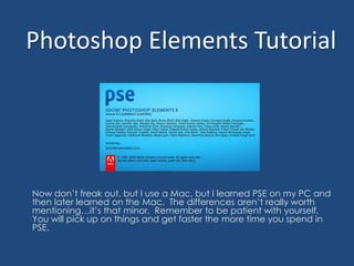
Photoshop Elements Tutorial
1. Photoshop Elements Tutorial Now don’t freak out, but I use a Mac, but I learned PSE on my PC and then later learned on the Mac. The differences aren’t really worth mentioning…it’s that minor. Remember to be patient with yourself. You will pick up on things and get faster the more time you spend in PSE.
2. I am going to assume that your PSE is already installed and let’s jump in. First you are going to open your PSE.
3. This is the screen that will show up (or something similar…depending on the version you own). From here you can make a couple of selections, but I always start from scratch because my photos and scrapbook images are already on my computer.
4. This is the screen that will appear, and I want you to understand all the bullet points that I marked.
5. Width and Height: This is the size that you want your document to be. To the right, you will see a scroll bar that lets you choose between pixels, inches, etc. I usually keep in it pixel. 800 pixels is about 8 inches, so it’s pretty basic. For this project, I will show you how to do a 12x12 page. Resolution: This lets you choose how high a quality you want your image. The higher the resolution and the size of your image, the more memory it will consume. Color Mode: This is choosing between color or black and white. I ALWAYS select color because I can still make my images black and white if I want to during the project. Background Contents: This is where you can choose a solid background or a transparent background. For instance, if I wanted to make a circle shaped picture to put on my blog, I would choose transparent so that the circle wouldn’t have a white box around it. In order to do this you’d need to save your completed file as a gif instead of a jpeg. I am doing a simple scrapbook page, so I will choose a white background.
6. Now you can see my 12x12 white background. This object is floating on my screen, but I prefer to make mine fit into the window. So click on the bar of your image…
7. …and drag it up until your screen is surrounded with the blue line.
8. This item is now inside instead of floating. And now I want to introduce you to your screen. In the top left corner you will see where we drug your item. Along the left side from top to bottom, is your Tool Bar. This is where you can erase, crop, paint, and a slew of other things. Bottom left corner is your Project Bin. When you add other elements and images, they will be listed here so you can find what you are looking for. Top right is you Effects. From here you can add shadows and filters to you images. And in your bottom right is your Layers. This shows that your white image is the background image. Any other elements you add on top of this layer will be listed here.
9. Now let’s make some magic. You can go file open if you want, but I just minimize my screen and get the images myself. That’s my system, but you need to find what’s easiest for you.
10. To save time, I put all the files I would need onto a disc, but the concept is the same. You need to find and select the images that you want for your project. Because mine were all in one spot, I just selected all of them.
11. Right click, scroll down to Open With, and select Photoshop Elements. On my PC I was able to drag the images straight into my PSE. You may want to try that.
12. Now all of the items I need are in my PSE. Note: all the images were floating just like before. I went through and added them all into the screen just like I did with our white background. Now you can see all the images listed at the top of your screen by name and in your Project Bin by image. You can double click on any of the images and it will take you to that image.
13. I’m going to start with adding a background to my project. I like this one. So you need to double click on the image until it fills your screen. These images come large, but I already know that I want it to be a 12x12, so we are going to resize it. Click on Image, Resize, then Image Size.
14. This is what will appear. Originally the pixel count was 3600x3600, so I change it to 1200x1200 and clicked OK. Notice below, in the red circle, that I have all three checked. This will keep that image in proportion. Some images may be something like 51x175, if all three of these are checked no matter what size you change it to, the proportions will be the same.
15. Now the image will appear smaller, but it still is 12x12. In your toolbar, click on the rectangle dotted box. Click above the corner of the image and drag all the way down until the entire image has a “crawling ants line”. This mean that the image has been selected.
17. You are going to want to paste this onto your blank 12x12 project, so double click on your white background. Then click Edit and Paste.
18. The image is them pasted onto your project. If you look in your Layers, at the bottom right corner, you will see that this is now Layer 1. You can no longer see the white image because you have a layer covering it.
19. Now, here’s one of the best things about PSE. With paper, it is what it is, but with digital…you can alter your images. I thought this paper was a little too yellowy. I wanted to lighten it up. To do this, click on Enhance, Adjust Color, and Color Variations.
20. This is what will appear. At the bottom left, you have an Amount slider. This measures how much change you are making. You see that you can increase or decrease your red, green, and blue and you can lighten or darken your image. For this I increased my blue and then lightened the image. You have a Before and After window that shows you the results. Click OK, when done.
21. If you don’t like it you can always click, Edit and Undo, but I love how this turned out. You can see the difference from the original image. I just wanted my paper to look at little bit more like the color of the surf.
22. Now let’s add another layer. We’re going to do the same thing we did before. I want to resize this image as well. Again, click on Image, Resize, and Image Size.
24. We need to select the image, by clicking on the dotted rectangle and click and dragging over the image.
25. Click, Edit and Copy. Then double click on your project, which is now the light cream image.
26. Edit and Paste. Keep in mind that you can always do your keyboard shortcuts (e.g. Ctrl V).
27. Once it’s pasted it will fill the whole screen. Then you move it into position. Note: Whichever Layer number is selected is the one you are working with. So in order to move the blue paper, in your Layers, click on the blue paper. You will then be able to click on it and move it where you want to. If you are having problems, click on the top arrow tool in your toolbar, then try to move it. Also, I went and changed the color of the blue paper to make it more blue by selecting the Enhance, Adjust Color, and Color Variations again.
28. Now to the pictures. So I double clicked on this image. I want this photo to be big. I would rather resize it after it’s on the page. So get your select tool. Click, drag, and then Edit, Copy.
29. Double click on your project and Edit, Paste. This image is obviously too big.
30. When you click on the image, you will see 8 small squares around that particular image. Click on a corner and drag to the desired size. You will then see an image with a green checkmark and a red circle with a line through it. When you are happy with the size, click the green checkmark.
31. I want to add a little dimension to this, so I am going to add a shadow. In the top right you will see Effects. There is a scrollbox that has Bevels, Complex, Drop Shadows, etc. Scroll down to Drop Shadows.
32. You can now see all the shadow effects PSE has. I prefer the bottom right because it looks the most natural. So click on the one you want, then click Apply. Make sure that you are working on the picture. If you are click on the blue paper, the shadow will appear there. But now you can see a shadow behind the picture.
33. If you aren’t completely with the size, distance, or opacity, you can edit that by double clicking on the small “fx” on that layer. You can then tinker with the the sliders until you get the desired look. There is even a Lighting Angle where you can change the direction the light is coming from. Click OK when you are done.
34. Now I want to add my three other pictures. I want all of these to be square. This particular image, I want to crop to a square, but also crop it around my oldest son. To do this, click on the crop tool on the Tool Bar. Then up in the top left, you can see where you can customize the size. I chose a 4x4in. Then I click and drag until I get the space I want. Then click the green checkmark.
35. Now that the image is the shape that I want, I’m going to copy and and paste the item into the project.
36. Where is it? This will happen sometimes because when you are working with your project you will click on different layers. The image will be pasted by wherever you were working last, but this is an easy fix. In your Layers, click on the picture and drag over the layers you want.
37. You can see in my Layers, that I moved it to the top, making it the front layer. I want to resize the object. Click on the picture, you will see the 8 squares, click on a corner and drag. Click the green checkmark when done.
38. I moved my image down into the position I wanted.
39. I want to add another Image Effect. This time scroll down to Inner Glows. Again, I like the most subtle for this and selected the far right in the middle row. Click Apply.
40. Again, if you want to customize the effect, click on the “fx” you can change the size, opacity, and a few other things.
41. Now, I want to angle my image. Click on the image, see the 8 squares that surround the image, go to the corner, and wait for a curved arrow. Here you can click and drag to the desired angle.
42. I’m only going to show you one more photo cropping to save time. Double click on the next image you want to do. Click on your crop tool.
43. Click and drag over your image. I wanted this one square as well, so I still want the 4x4in ratio.
44. Now, if you have a crop box and you love the size, but hate the placement, you can simply move it. Just be sure not to click the green checkmark until you are happy with the placement. I moved mine down. You do this by clicking in the anywhere within your crop box and dragging it where you want. Then click the green checkmark.
45. Now you can Copy and Paste it into your project. Remember how to do this?
46. So skipping ahead, I now have all my pictures in. I put in the Inner Glows and angled them the way I wanted. Now I want to add text. In your Tool Bar, click on the text tool. Then click anywhere on the project you want your text and a curser will appear. In the top right, you can select your font style, size, color, and a few others. When you are don’t typing, click on the arrow tool in order to move it around. Click on the text tool again if you ever need to fix it, but if you miss your text on accident, you will end up creating a new text box.
47. Now that I have my text, I want to add an Outer Glow. Go to Effects, scroll down to Outer Glows.
48. I picked subtle again, but I want to play with this one. So after I apply, I click on ther “fx”. I want to change the color of the glow. To do this, double click on the color swatch.
49. This is what will appear. I want to make my color white. So I clicked on the circle and dragged it to the white corner.
50. You can now see that the circle is in the corner. You can also see the before and after color. Click OK.
51. Then it will bring you back to this screen. The color swatch is now white. Be sure to click OK or the new changes will not be applied.
52. Now that I have my background pages, my photos, and my title finished, it’s time to add some elements.
53. Let’s start with the ribbon. I knew when I saw this that I wanted it to fill the project from end to end, but I also know that I didn’t want the ribbon being too fat. I wanted to proportions to be the same, so I decided that I was going to need to of these at half the size. First I needed to make it smaller.
54. I could have made it a 600 width, which would be exactly half, but I would rather work with it when I see everything together. So I decided to make it 1100, just to make it small enough to work with, but large enough to shrink to the size I want.
56. Paste into you project. Too green for my taste. Better change the color again.
57. Beautiful. Now I want to make it a little smaller. Click on your image and click and drag to desired size.
58. Now that I have the size and color that I want, I can duplicate it. In your Layers, right click on the ribbon and then Duplicate Layer.
59. This is what will appear. All it is doing is giving this new layer a name, so click OK.
60. You won’t be able to see the new layer on your project because it will be on top of your old one, but you will be able to see it in your Layers. Click on the ribbon and drag it where you want to.
61. I’m not much for uniform. In order to make this ribbon look a little different, I’m going to rotate it, but not by hand. I want to do a perfect 180 flip. Click on Image, Rotate. You will see that there are too different sections of selections. The top layer with the 90 Left, 90 Right, 180, Custom, Flip Horizontal, and Flip Vertical is for the entire document. I only want to flip the ribbon layer, so you must do this from the second section. I also love the horizontal and vertical flips because it’s like doing a mirror image…can come in really handy!
62. You can now see the differences in the ribbons. Now I want to move the ribbon. Click on the image and move it into position.
63. Now, I want to move the ribbons behind the picture. To do this, click on the picture in your Layers and drag it to the top. It’s faster to move the one picture instead of the two ribbons.
64. Originally, this would’ve been it, but I wanted a little something in this corner. So we’re on our last element.
65. I wasn’t sure what size I wanted, so I just copy and pasted it into the project so I could play around with it.
66. Yep. Too big. So I clicked on it and resized it.
67. I felt that the image needed a little something, so I added some glow.
68. I added the same Outer Glow. I wanted it to have the same look as the text, so I clicked on the “fx” and made the the color, size, and opacity that same. When done, I moved it where I wanted it.
69. Now the layer. It’s easier to move one, so I take the flourish and drag it below the ribbons.
72. This is what will appear. This is just like saving anything. You name it, pick the location you are saving it to, and the file type. I always save it as a jpeg first. Go down to the scroll, and scroll down to JPEG.
74. This will appear. This just gives you options for saving. I never change anything, because I already chose my size and resolution for a reason. This project is already the way I want it, so click OK.
75. File and Save As, again. The reason you want to save a Photoshop (psd) version is because psd means you are saving the project, not just the image. If you click on your finished jpg project, all it is is a picture, nothing more. A psd, you can move your elements. If you had a misspelled word, you can go back and fix it. Otherwise, you would have to start all over again. I always save a Photoshop file…it’s just a good idea. Make sure the format says Photoshop, but also check to make sure that your file has a psd at the end of your title. If you don’t see the psd at the end of the title, that means you need to scroll down to Photoshop and select it. Click Save.