This document provides instructions for performing various tasks in a spreadsheet program, including entering data, performing calculations with formulas, formatting cells and sheets, inserting charts and graphs, and printing options. Key points covered include entering numbers and text, inserting and deleting rows and columns, using basic math formulas like addition and subtraction, copying and filling formulas, creating a sine graph with an XY chart, customizing the chart appearance, and setting headers and footers for printing. The document provides step-by-step guidance for completing common spreadsheet tasks.
These are MS Excel Tips and tricks you might not know, which will advance your skills in using Excel, also these tips and tricks are the main Job exams questions
These are MS Excel Tips and tricks you might not know, which will advance your skills in using Excel, also these tips and tricks are the main Job exams questions
A detailed description of what if analysis, Text To Column and Data Validation Options of Data Tab. I also linked excel file with this presentation but it doesn't support excel file,so excel file can't be uploaded.
You can enter data into Calc in several ways: using the keyboard, the mouse [dragging and dropping], the Fill tool, and selection lists. Calc also provides the ability to enter information into multiple sheets of the same document at the same time.
After entering data, you can format and display it in various ways.
Formatting data
Creating a chart
Formatting 3D charts
Formatting the chart elements
Gallery of chart types
PAGE 1Using Microsoft Excel 2010 for Selected Tasks(Thr.docxalfred4lewis58146
PAGE
1
Using Microsoft Excel 2010 for Selected Tasks
(Throughout this document, a set of data refers to observations of just one variable.)
(1) To portray as a bar chart a given frequency, relative frequency, or percentage distribution of a set of qualitative data, one may:
With the categories in one column and the counts or proportions or percentages in another:
1. Select (by clicking-and-dragging) the counts or proportions or percentages.
2. Choose (from upper menu) Insert, then Column (for vertical bars) or Bar (for horizontal bars), then the first pictured sub-type.
3. Right-click on a blank spot in the chart area, choose Select Data…, choose (right of center) Edit, enter the location of the categories, click OK, and click OK.
4. Choose (from upper menu) Layout, then Axis Titles to enter appropriate labels for the horizontal and vertical axes, then Chart Title to enter an appropriate title.
5. If you wish the counts or proportions or percentages to be shown on the bars: Choose (from menu) Data Labels, then your preferred position.
(2)To portray as a pie chart a given frequency, relative frequency, or percentage distribution, one may:
With the categories or numeric classes in one column and the counts or proportions or percentages in another:
1. Select (by clicking-and-dragging) the counts or proportions or percentages.
2. Choose (from upper menu) Insert, then Pie, then the first pictured sub-type.
3. Right-click on a blank spot in the chart area, choose Select Data…, choose (right of center) Edit, enter the location of the categories or numeric classes, click OK, and click OK.
4. (a) Choose (from upper menu) Layout, then Data Labels, then More Data Label Options (which will by default cause each “Value”--i.e, each count or proportion or percentage selected in step 1.--to appear on or near a pie slice); (b) if you wish each category or numeric class to appear on or near a pie slice, select Category name, then your preferred position; (c) click on Close; and (d) if the legend box is now superfluous, delete it.
5. Choose (from menu) Chart Title to enter an appropriate title.
(3) Counting the number of cells (within some range of cells) satisfying a particular condition:
Examples:
· To count how many of the cells A1 through A100 contain the word Agree, one may enter in some blank cell =COUNTIF(A1:A100, “Agree”) Note: In lieu of typing in “Agree”, one may click on a cell containing the word Agree.
· To count how many of the cells A1 through A100 contain the number 89, one may enter in some blank cell =COUNTIF(A1:A100, 89) Note: In lieu of typing in 89, one may click on a cell containing the number 89.
· To count how many of the cells A1 through A100 contain a number in the interval 10 to under 20, enter in some blank cell =COUNTIF(A1:A100,”<20”)-COUNTIF(A1:A100,”<10”)
· Note: Each relative address A1:A100 above may be replaced by the absolute address $A$1:$A$100. In lieu of typing in the absolute address $A$1:$A$100, .
For sales data analysis, by creating data breakdowns and filters (example by region, product, salesperson, etc). Objective of Easy Pivot is to provide alternative, easier to understand Pivot Table.
Procedural Guide on how to Build a Basic Spreadsheet.
Free to distribute, but do not alter.
Any steps omitted in this procedure, the Author may not be held liable.
Instructions for Submissions thorugh G- Classroom.pptxJheel Barad
This presentation provides a briefing on how to upload submissions and documents in Google Classroom. It was prepared as part of an orientation for new Sainik School in-service teacher trainees. As a training officer, my goal is to ensure that you are comfortable and proficient with this essential tool for managing assignments and fostering student engagement.
Unit 8 - Information and Communication Technology (Paper I).pdfThiyagu K
This slides describes the basic concepts of ICT, basics of Email, Emerging Technology and Digital Initiatives in Education. This presentations aligns with the UGC Paper I syllabus.
How to Split Bills in the Odoo 17 POS ModuleCeline George
Bills have a main role in point of sale procedure. It will help to track sales, handling payments and giving receipts to customers. Bill splitting also has an important role in POS. For example, If some friends come together for dinner and if they want to divide the bill then it is possible by POS bill splitting. This slide will show how to split bills in odoo 17 POS.
Operation “Blue Star” is the only event in the history of Independent India where the state went into war with its own people. Even after about 40 years it is not clear if it was culmination of states anger over people of the region, a political game of power or start of dictatorial chapter in the democratic setup.
The people of Punjab felt alienated from main stream due to denial of their just demands during a long democratic struggle since independence. As it happen all over the word, it led to militant struggle with great loss of lives of military, police and civilian personnel. Killing of Indira Gandhi and massacre of innocent Sikhs in Delhi and other India cities was also associated with this movement.
Model Attribute Check Company Auto PropertyCeline George
In Odoo, the multi-company feature allows you to manage multiple companies within a single Odoo database instance. Each company can have its own configurations while still sharing common resources such as products, customers, and suppliers.
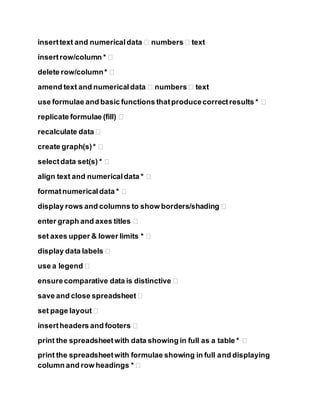
1. inserttext and numericaldata � numbers� text
insertrow/column * �
delete row/column* �
amend text and numericaldata � numbers� text
use formulae and basic functions thatproducecorrectresults * �
replicate formulae (fill) �
recalculate data �
create graph(s)* �
selectdata set(s) * �
align text and numericaldata * �
formatnumericaldata * �
display rows and columns to show borders/shading �
enter graph and axes titles �
set axes upper & lower limits * �
display data labels �
use a legend �
ensurecomparative data is distinctive �
save and close spreadsheet �
set page layout �
insertheaders and footers �
print the spreadsheetwith data showing in full as a table * �
print the spreadsheetwith formulae showing in full and displaying
column and row headings * �
3. Entering data using the keyboard
Most data entry in Calc can be accomplished using the keyboard.
Entering numbers
Click in the cell and type in the number using the number keys on
either the main keyboard or the numeric keypad.
To enter a negative number, either type a minus (–) sign in front of it or
enclose it in parentheses (brackets), like this: (1234).
By default, numbers are right-aligned and negative numbers have a
leading minus symbol.
Entering text
Click in the cell and type the text. Text is left-aligned by default.
Entering numbers as text
If a number is entered in the format 01481,Calc will drop the leading
0. (Exception:see Tip below.) To preserve the leading zero, for example
for telephone area codes,type an apostrophe before the number, like
this: '01481.
The data is now regarded as text by Calc. Formulas and functions will
treat the entry like any other text entry, which typically results in it
being a zero in a formula, and being ignored in a function.
Working with columns and rows
Inserting columns and rows
Columns and rows can be inserted individually or in groups, Single
column or row
Using the Insertmenu:
1) Selectthe column or rows where you want the new column or row
inserted.
2) Selecteither Insert> Columns or Insert> Rows.
Using the mouse:
1) Selectthe column or rows where you want the new column or row
inserted.
2) Right-click the header.
3) SelectInsertRows or InsertColumns.
Multiple columns or rows
Multiple columns or rows can be inserted at once rather than inserting
them one at a time.
4. 1) Highlight the required number of columns or rows by holding
down the left mouse button on the first one and then dragging
across the required number of identifiers.
2) Proceed as forinserting a single column or row above.
Deleting columns and rows
Columns and rows can be deleted individually or in groups.
Single column or row
A single column or row can only be deleted by using the mouse:
1) Selectthe column or row to be deleted.
2) Right-click on the column or row header.
3) SelectDelete Columns or Delete Rows from the pop-up menu.
Multiple columns or rows
Multiple columns or rows can be deleted at once rather than deleting
them one at a time.
1) Highlight the required number of columns or rows by holding
down the left mouse button on the first one and then dragging
across the required number of identifiers.
2) Proceed as fordeleting a single column or row above.
Addition
The + sign is used for addition. To enter the + sign, press the Shift key and the +, ,key.
1. Click on A6.
2. Type the number 10, then press Enter. ("10" appears in "A6" and the active cell is "A7".)
3. Type the number 5, then press Enter. ("5" appears in "A7" and the active cell is "A8".)
4. Type =A6+A7 (Or click the “Function”, , icon. The “=” appears in “A8'. The “Function”,
, icon changes to the “Accept”, , icon. Then type "A6+A7".).
5. Press Enter (or click the “Accept”, , icon). The answer, 15, appears in A8.
Sum (Calculate TheTotalOf A Column)
1. In A1, type 5, press Enter.
2. In A2, type 5, press Enter,
3. In A3, type 5, press Enter,
4. In A4, type 5, press Enter
5. 5. In A5, type 5, press Enter.
6. Click In A6, the last cell in the column of numbers you want to add. ("A6" has a
heavy dark border and is the "Active Cell." )
7. Click on the Sum, Σ, ("Σ" is the mathematics symbol for sum.) icon on the Formula
Toolbar just left of the Input Line The Function, , icon changes to the Accept, , icon.
8. Click the Accept, , icon (green check mark) or press Enter. The formula,
=SUM(A1:A5), appears in the A6 cell.
9. Press Enter. The sum, 25, will appear in A6. A7 becomes the active cell.
Cell Range
In the section above, the SUM function appears as =SUM(A1:A5). The A1:A5 in the
parenthesis is called a Cell Range. It is shorthand for "from A1 to A5".
Subtraction
The - sign is used for subtraction. To enter the – sign, press the key.
1. Click on A8. To clear cell A8, press the Delete key. (The “Delete Contents”
window appears.) Check the Delete all box and click OK.
2. Type =A6-A7 (Or click the “Function”, , icon. The “=” appears in “A8" The “Function”,
, icon changes to the “Accept”, , icon. Then type "A6-A7".).
3. Press Enter (Or click the “Accept”, , icon.) The answer, 20, appears in A8.
Multiplication
The star ,*, sign is used for multiplication. To enter the * sign, press the Shift key and the
number 8 key.
1. Click on A8. To clear cell A8, press the Delete key. (The “Delete Contents”
window appears.) Check the Delete all box and click OK.
2. Type =A6*A7 (Or click the “Function”, , icon. The “=” appears in “A8”. The
“Function”, , icon changes to the “Accept”, , icon. Then type "A6*A7").
3. Press Enter (Or click the “Accept”, , icon.) The answer, 125, appears in A8.
Division
The slash, /, sign is used for division. To enter the slash, /, sign, press the key [? And /].
1. Click on A8. To clear cell A8, press the Delete key. (The “Delete Contents”
window appears.) Check the Delete all box and click OK.
6. 2. Type =A6/A7 (Or click the “Function”, , icon. The “=” appears in “A8'. The “Function”,
, icon changes to the “Accept”, , icon. Then type "A6/A7".).
3. Press Enter (Or click the “Accept”, , icon.) The answer, 5, appears in A8.
Average
1. Click on A7, type =Average(A1:A6), press Enter. (8.33 appears in A7 and 3 now
appears in A8)
Enter Formulas
When you type in formulas, the order of operations must be correct. The correct order
is: exponentiation, multiplication, division, addition, then subtraction. Let's pretend we
want to perform a calculation using the equation:
1. Click on B1.
2. Type 2 in B1 and press Tab. (Cell C1 becomes active)
3. Type 4 in C1 and press Tab. (Cell D1 becomes active)
4. In D1 type the formula =B1+10/C1 + 20. (Or click the “Function” icon which
changes to the “Accept”, , icon. Type "B1+10/C1+20").
5. Press Enter (Or click the “Accept”, , icon. The answer, 24.5, appears in D1.)
The answer is wrong, it should be 1, using x = 20 and y = 10, but we got 41 for an
answer! Why? Because Calc interpreted the equation as:
20 + (10/10) + 20
which equals 41. If you use formulas with equations in the numerator and denominator, you need
to use parenthesis () to force the spreadsheet to calculate them properly. Make the following
changes:
1. Click on C1.
2. Click on the Input Line.
3. Edit the formula to read =(A1+10)/(B1+20). (Click just before the A, then Press
the ( key [Shift-9]. Click after the 0 in 10, then press the ) key [Shift-0]. Click just
before the B, then Press the ( key [Shift-9]. Click after the 0 in 20, then press the
) key [Shift-0]).
4. Click the Accept, , icon (green check mark.) The correct answer, 1, appears in
C1.
Copy Formulas
7. You can copy a formula so that the formula itself is copied OR that the answer to the formula is
copied.
Copy The Formula Itself
1. Select (click on) the cell(s) that is to be copied.
2. Right-click, then click Copy. (The material is copied to the clipboard)
3. Select (click on) the cell where the material is to appear.
4. Right-click, then click Paste.
Copy The Answer of a Formula
1. Select (click on) the cell(s) that has a formula.
2. Right-click, then click Copy. (The material is copied to the clipboard)
3. Select (click on) the cell where the material is to appear.
4. Right-click, then click Paste Special. (The “Paste Special” window appears)
5. Remove the check mark at Paste all.
6. Remove the check mark at Formulas and add a check mark at Numbers. Click OK.
Exponentiation
The number 102 is written as 10^2. To enter the ^ sign, press the Shift key and the
number 6, , key.
1. Click on A9.
2. Type =A6^A7 (Or click the “Function”, , icon. The “=” appears in "A9". The
“Function”, , icon changes to the “Accept”, , icon. Then type "A6^A7".).
3. Press Enter (Or click the “Accept”, , icon.) The answer, 100000, appears in A8.
Data Relationship
The first thing you need is data that shows a relationship. Examples include mathematical
functions, stock market prices over time, rainfall over time, statistical divisions of a population,
or divisions of an income that make up a budget. Since math is something that anyone can
duplicate, we'll use the sine function:
1. Go to the bottom of your workbook and click on Sheet2.
2. Type X in A1.
8. 3. Type Sine(X) in B1.
4. Enter 0 in A2. (That's a zero. Click anywhere on the Spreadsheet to unselect
“A2” after entering the “0”.)
5. Select A2. (Click on A2 again to select it.) Drag-copy A2 down until you see the tool
tip number read 90. (Put the cursor over the box at the bottom right corner of
"A2". When you see a , click on it and drag it down until you see the tool tip
number read 90 then release the click. The numbers will increase by 1 for every
line you drag over.) (The number 90 will be in cell A92)
6. Go back to the top and Select B2. (Ctrl+up arrow is a quick way to move up.)
7. Enter =SIN(A2).
8. Click on the bottom right corner of the B2 cell. (The "B2" cell contents change from the
formula "=SIN(A2)" into a "0".) Drag-copy the formula all the way down to the 90 in the
A column.
Don't worry if you don't know what the numbers mean; we aren't concerned with that. The order
of the columns matters. Spreadsheet programs typically assume that the column on the left is the
variable that is plotted on the horizontal (x) axis of the chart, and the column on the right is the
variable that is plotted on the vertical (y) axis.
Insert Chart
1. Select columns A and B.
2. Click the Insert Chart, , icon on the Function Toolbar. (The pointer changes to.
Click anywhere on the spreadsheet. Or Click Insert > Chart... The "AutoFormat
Chart" window appears.)
3. Select -New Sheet- from the drop-down box labeled Chart results in
worksheet.
9. 4. Click Next>>>.
5. Select XY Chart. (Hold the cursor over the icons to find it.)
6. Click Next>>>.
7. Select Lines Only and check the X axis and Y axis grid line boxes. ("Y" may
already be checked. Don't uncheck it.)
10. 8. Click Next>>>.
9. Give the chart a title, My First Chart, in the box that has Main Title in it.
(Replace text.)
10. Click the X axis and Y axis check boxes.
11. Type X for X axis title, and Sine(x) for Y axis title. (Replace existing text.)
12. Click Create.
13. Look at the worksheet tabs at the bottom.
14. Click on the last tab. (Probably labeled Sheet4.)
15. Use the little boxes on the corners to resize the chart by clicking on them and
dragging them until you like the proportions.
Appearance Of Chart
Charts created by spreadsheet programs are unappealing most of the time. You have to mess with
the format of the chart elements to make them look better.
The first thing I notice is a jagged plot line. That is appropriate for some data, but the sine
function is a smooth function, so make the following changes:
1. Double-click somewhere on the chart if you see green boxes or no boxes.
2. Click Format > Chart Type...
3. Select Cubic Spline, , from the Variants box at the bottom.
11. 4. Click OK.
That's better, but it could still use some improvement. Try:
1. Click Format > Chart Wall.
2. Click the Area tab. In the dialog box below Fill, click the and select None. Click OK.
3. Place the cursor over the data plot line and double-click. (The smooth Purple line.)
4. Click the Line tab. In the Color dialog box, change the color to Sea Blue.
5. In the Width dialog box, change the width to .02. (Click the repeatedly or
highlight the number in the dialog box and type ”.02”.) Click OK.
6. Select Format > Grid > All Axis Grids...
7. Change the Color to Gray 40%. (You have to scroll down the palette.) Click OK.
8. The chart still seems busy. Select Format > Axis > X Axis. Click the Scale tab.
9. Clear the Maximum check box and replace 90 with 45. Click OK.
10. Change the main title text to Sine Function by double-clicking on it and editing it.
11. When you are done, click somewhere else on the chart to accept the changes.
12. Click on a worksheet cell. Click Format > Sheet > Rename. (The “Rename
Sheet” window appears.) Rename the sheet, Sine Graph.
13. Save your work. (Click “File > Save”.)
Page Preview Toolbar
The Page Preview Toolbar allows you to see what Calc is going to print.
1. Bring up the Checking worksheet. (Use the at the bottom left of your spreadsheet.)
2. Click File > Page Preview. (The Page Preview toolbar appears.)
1. If you look on the left end of the Page Preview Toolbar (the third toolbar), you will see
four book icons with arrows. These let you view each page that would go to the printer.
The Previous Page icon is first book icon.
The Next Page icon is the second book icon.
The First Page icon is the third book icon.
The Last Page icon is the fourth book icon.
2. Click on the other icons on the Page Preview Toolbar to see their functions.
12. 3. Click Close Preview.
Headers And Footers
When printed, all pages will have a Header and a Footer on them. The header shows the name of
the sheet. The footer shows the page number. All the pages have them. Here's how you can turn
them off or edit them:
1. Click Page Format on the toolbar. (The "Page Style: Default" window appears.
2. Click the Header tab.
You can turn them off by unchecking the Header check box. You can also format the margins
and spacing.
To edit the header, click Edit... (The "Header (Page Style: Default)" window appears.)
Headers and Footers are broken into three sections. You can use one of the auto-format buttons
below the three boxes or type your own header.
1. Click Cancel. (The "Header (Page Style: Default)" window closes.)
2. Uncheck the Header box. Look through the other tabs.
3. Click OK. (The "Page Style: Default" window closes.)
The same procedures apply to the footer, so I won't elaborate on that. The Sheet tab gives you
the capability to control the way Calc determines the page order and what features to print or
scale. The remaining tabs are self-explanatory.
Note: Removing the header and footer will change the chart size, so you may have to resize it.
Print Ranges
What if you don't want to print the whole worksheet? I'm glad you asked! Calc gives you the
ability to define print ranges.
1. Bring up the Checking worksheet.
2. Select A1:G25. (Click "A1". Drag copy to "G1".)
3. Click Format > Print Ranges > Define.
4. Open the Page Preview again.
Now you only have one page. Unfortunately, there is not an equivalent for charts. The only way
you can print a chart only is:
1. Click File > Print...
13. 2. Click the Pages radio button on the bottom left.
3. Type in the page number of the worksheet the chart is on.