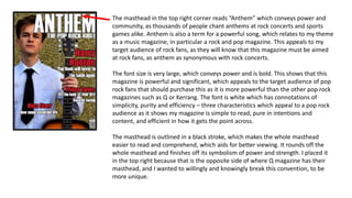
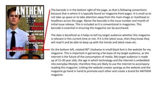
2. The masthead in the top right corner reads “Anthem” which conveys power and
community, as thousands of people chant anthems at rock concerts and sports
games alike. Anthem is also a term for a powerful song, which relates to my theme
as a music magazine, in particular a rock and pop magazine. This appeals to my
target audience of rock fans, as they will know that this magazine must be aimed
at rock fans, as anthem as synonymous with rock concerts.
The font size is very large, which conveys power and is bold. This shows that this
magazine is powerful and significant, which appeals to the target audience of pop
rock fans that should purchase this as it is more powerful than the other pop rock
magazines such as Q or Kerrang. The font is white which has connotations of
simplicity, purity and efficiency – three characteristics which appeal to a pop rock
audience as it shows my magazine is simple to read, pure in intentions and
content, and efficient in how it gets the point across.
The masthead is outlined in a black stroke, which makes the whole masthead
easier to read and comprehend, which aids for better viewing. It rounds off the
whole masthead and finishes off its symbolism of power and strength. I placed it
in the top right because that is the opposite side of where Q magazine has their
masthead, and I wanted to willingly and knowingly break this convention, to be
more unique.
3. I wrote “The Pop Rock Bible” beneath the masthead to directly and informally tell
the audience that this magazine is about pop rock. This will attract my target
audience that wants to read a magazine about pop rock music. I used the term
“Bible” as an all-encompassing term to describe how powerful this magazine is, it
son biblical, religious levels. It conveys that it is so powerful it can be compared to
a holy book. In this case, it is evidently the holy book of pop rock, which will
appeal to the target audience as they want everything to do with pop and rock.
4. The background picture is of a model, in this case the fictional pop rock star
“Harry Hooton”. It is a medium long shot, showing his head to his waist. He is
holding a guitar in his left hand, which appeals to my audience which likes pop
rock, and therefore would also like guitars (rock music is revolved around the use
of guitars – The Beatles, The Rolling Stones etc.) .
He is wearing a shirt and tie which appeals to the audience I am aiming my
magazine at, because they like pop rock music, and this outfit was worn often by
artists such as the beatles in the 1960’s. However, having a young artist wear this
outfit appeals to the age demographic of 15-30 years old as it shows this outfit is
timeless and can be worn by any age in any time period. The model is young and
successful which is efficient on this front page, as the 15-30 year old target
audience are at an impressionable age in their life, when they will have dreams
and aspirations of being successful like this artist.
He is on a rocky, rough background to convey grit and determination, on how his
rise to success hasn’t been easy. The grit and rough aspects are also used here to
characterise the rock theme of the magazine, which is typically rebellious and
outlandish, hence why I opted for this background and not a cleaner, somewhat
smoother one.
5. The articles strewn around the page are used to show what will appear later in the
magazine, to draw in potential readers from my target audience. The top part of
each headline is the name of the act, in bright red lettering. Red, black and white
is therefore the obvious colour palette for my magazine. Red has connotations of
power, passion and love, which works for my magazine as it shows the editors and
readers alike are passionate in their love for this powerful magazine.
The piece below each name is a brief summary of what the article entails, in order
to give more information to the audience in the hopes they will read it. This is in
white to counteract the red and reinforce the colour scheme.
The “Harry Hooton” headline is the largest on this front page because he is the
main story of the magazine, therefore his name is the largest to show it is
correlated to the main image, or the CVI (centre of visual interest).
6. The barcode is in the bottom right of the page, as that is following conventions
because that is where it is typically found on magazine front pages. It is small as to
not take up space or to take attention away from the main image or masthead or
headlines across the page. Above the barcode is the issue number and month of
initial issue release. This is included as it is conventional in magazines. This
barcode is essential in ensuring the magazine can be purchased.
The date is beneficial as it helps to tell my target audience whether this magazine
is relevant in this current time or not. If it is the latest issue, then they know they
will read it and be able to keep up with the trends and latest news etc.
On the bottom left, rotated 90* clockwise in small black font is the website for my
magazine. This is important in garnering a fan base of my target audience, as the
internet is the future of the consumption of media. My target audience is made
up of 15-30 year olds, the age in which technology and the internet is embedded
into everyday lifestyle, therefore they are likely to use the internet to accompany
reading this magazine. Linking the website creates synergy as the website and the
magazine go hand in hand to promote each other and create a brand for ANTHEM
magazine.