COLOUR                                                                       COVERLINES

This cover conforms to the three colour palette rule, featuring a            The main cover line is of the name of the featured band
matte yellow, black and white. These colours vary on all text which          „ARTIC MONKEYS‟ which is reinforced by the over lines
give a sudden contrast to each other so that each cover line can be          which delve further into the topic of their interview such
clearly distinguished between one another. This is also strategically        as: „INCREDIBLE NEW ALBUM!‟ These exclamatory
important because of their clashing tones it will be able to stand out       sentences portray that there is something to „shout‟
against other neutral or complimentary palette magazines on                  about and emphasise the appeal to their target audience
shelves. Interestingly these colours are not gender stereotyped              as they make it appear exclusive. The magazine also use
which contrasts with the male dominance in the context of the cover
                                                                             the personal pronoun „we‟ and colloquialism „oh my god‟
lines etc. The blue sky background enables the chosen palette to
                                                                             to make the reader feel involved and it is also language
stand out against it as well as give a positive, bright feel to the cover.
                                                                             that they can relate to from their own person idiolect.
                                                                             The cover lines at the bottom rule of thirds are all
                                                                             juxtaposition. Therefore the reader can be lured by the
                                                                             cover lines as they all have a similar relation being
                                                                             musical reviews.

AUDIENCE                                                                                                 FONTS
                                                                                                         The main font „ARTIC
Specifically in the case of                                                                              MONKEYS‟ is a tall font which
this cover, this would                                                                                   covers the majority of the
appeal primarily to a male                                                                               central third of the cover.
audience. This is firstly due                                                                            Capitals are functioned with all
to several males appearing                                                                               fonts on the cover to convey
on the central image on the                                                                              that it is „loud‟ and that all of it
cover which they will be                                                                                 is of significant importance. In
able to relate to. The cover                                                                             contrast the only
lines also feature all male                                                                              unemboldened font
orientated bands/topics                                                                                  „revolutionise the music
therefore appealing to                                                                                   industry‟ stands out in contrast
them. The dramatic                                                                                       to the other fonts which are
contrast between the bright                                                                              strong and emboldened. The
blue and yellow imitates a                                                                               bold, thick and wide font used
strong theme which would                                                                                 at the top and bottom thirds of
appeal to a strong and bold                                                                              the cover suggest a
male. The secondary female                                                                               commanding and vigorous
audience would be enticed                                                                                voice speaking to the reader.
by the opposite sex or
subject topics, mainly being
of regular readership                                                                                    SPACING & OTHER
interested in the magazine‟s                                                                             COMMENT
                                                                                                         NME is published by Time Inc., a
genre which is indie.
                                                                                                         subsidiary of Time Warner, it is
                                                                                                         distributed as a weekly magazine. It
MAIN IMAGE                                                                                               is critically known for showing
                                                                                                         “indie” music and does not focus on
The main image composes                                                                                  any other music genre. It circulates
of 4 males who feature in a                                                                              around 33,000 a week but has been
                                                             BY SIAN LYNES
popular indie band which                                                                                 in decline. It did once focus on a
                                                                                                         wide variety of music genres but
correlates with the
                                       THE MASTHEAD                                                      has since constructed a preference
magazine‟s genre. The low
                                                                                                         to “indie” music. On this cover, like
angle of the camera                                                                                      many others, not a lot of spacing is
                                       The logo of the magazine does not cover the entire
suggests dominance and                                                                                   left which allows more information
could also connotates their            masthead which in this case plays on the spiral
                                                                                                         to feature on the cover lines. This
strong popularly. From the             magazine model. This therefore attracts the reader‟s eye          also suggests an authoritative and a
first forward male with his            across the entire page and will entice them if attracted          more powerful cover which will
arms folded we can already             by the cover lines. This short logo also allows cover lines       make a bigger impact upon the
                                                                                                         reader‟s eye. However this may put
assume that he is the lead             to feature above and at the side if space is available like       off some readers as it shows a
singer and of main interest            in this image. The banner information such as price and           cluttering of information causing
within the band. This man              date is positioned vertically against the logo which              the reader being incapable to digest
also covers the masthead                                                                                 it. The audience age is aimed at a
                                       allows the central image to cover the logo and take up
which reinforces his                                                                                     younger audience from 16 to a
                                       more space. With the logo in capitals and abbreviated
importance in comparison                                                                                 mature audience to 21, but
to his peers. This close               (New Musical Express) connotates that it is a trendy              ultimately it depends on music
positioning of all the                 magazine. A pull quote is used next to the logo enables           interest which the magazine
                                       the topic of the cover line to be emphasised and will             specifies. In comparison to other
persons relates with the
                                                                                                         magazines on the market, its
close kerning of text and              draw the reader into buying it. This look would appeals           specific “indie” genres is very
the close positioning of the           mostly to a male audience as it is very cluttered with            limiting and risky in terms of
cover lines.                           information which they prefer.                                    commercial expansion.

NME: Magazine Cover Analysis

  • 1.
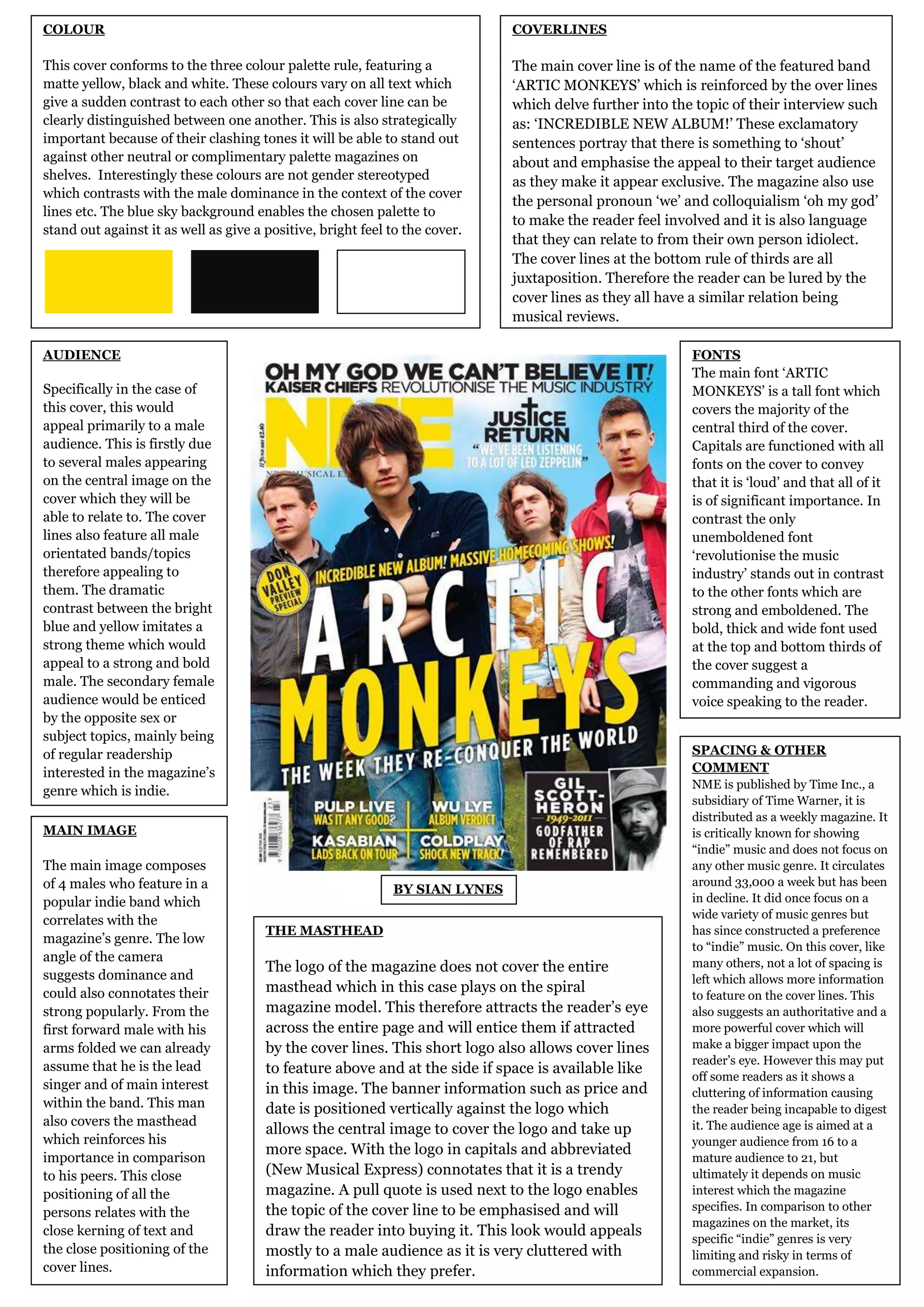
    COLOUR COVERLINES This cover conforms to the three colour palette rule, featuring a The main cover line is of the name of the featured band matte yellow, black and white. These colours vary on all text which „ARTIC MONKEYS‟ which is reinforced by the over lines give a sudden contrast to each other so that each cover line can be which delve further into the topic of their interview such clearly distinguished between one another. This is also strategically as: „INCREDIBLE NEW ALBUM!‟ These exclamatory important because of their clashing tones it will be able to stand out sentences portray that there is something to „shout‟ against other neutral or complimentary palette magazines on about and emphasise the appeal to their target audience shelves. Interestingly these colours are not gender stereotyped as they make it appear exclusive. The magazine also use which contrasts with the male dominance in the context of the cover the personal pronoun „we‟ and colloquialism „oh my god‟ lines etc. The blue sky background enables the chosen palette to to make the reader feel involved and it is also language stand out against it as well as give a positive, bright feel to the cover. that they can relate to from their own person idiolect. The cover lines at the bottom rule of thirds are all juxtaposition. Therefore the reader can be lured by the cover lines as they all have a similar relation being musical reviews. AUDIENCE FONTS The main font „ARTIC Specifically in the case of MONKEYS‟ is a tall font which this cover, this would covers the majority of the appeal primarily to a male central third of the cover. audience. This is firstly due Capitals are functioned with all to several males appearing fonts on the cover to convey on the central image on the that it is „loud‟ and that all of it cover which they will be is of significant importance. In able to relate to. The cover contrast the only lines also feature all male unemboldened font orientated bands/topics „revolutionise the music therefore appealing to industry‟ stands out in contrast them. The dramatic to the other fonts which are contrast between the bright strong and emboldened. The blue and yellow imitates a bold, thick and wide font used strong theme which would at the top and bottom thirds of appeal to a strong and bold the cover suggest a male. The secondary female commanding and vigorous audience would be enticed voice speaking to the reader. by the opposite sex or subject topics, mainly being of regular readership SPACING & OTHER interested in the magazine‟s COMMENT NME is published by Time Inc., a genre which is indie. subsidiary of Time Warner, it is distributed as a weekly magazine. It MAIN IMAGE is critically known for showing “indie” music and does not focus on The main image composes any other music genre. It circulates of 4 males who feature in a around 33,000 a week but has been BY SIAN LYNES popular indie band which in decline. It did once focus on a wide variety of music genres but correlates with the THE MASTHEAD has since constructed a preference magazine‟s genre. The low to “indie” music. On this cover, like angle of the camera many others, not a lot of spacing is The logo of the magazine does not cover the entire suggests dominance and left which allows more information could also connotates their masthead which in this case plays on the spiral to feature on the cover lines. This strong popularly. From the magazine model. This therefore attracts the reader‟s eye also suggests an authoritative and a first forward male with his across the entire page and will entice them if attracted more powerful cover which will arms folded we can already by the cover lines. This short logo also allows cover lines make a bigger impact upon the reader‟s eye. However this may put assume that he is the lead to feature above and at the side if space is available like off some readers as it shows a singer and of main interest in this image. The banner information such as price and cluttering of information causing within the band. This man date is positioned vertically against the logo which the reader being incapable to digest also covers the masthead it. The audience age is aimed at a allows the central image to cover the logo and take up which reinforces his younger audience from 16 to a more space. With the logo in capitals and abbreviated importance in comparison mature audience to 21, but to his peers. This close (New Musical Express) connotates that it is a trendy ultimately it depends on music positioning of all the magazine. A pull quote is used next to the logo enables interest which the magazine the topic of the cover line to be emphasised and will specifies. In comparison to other persons relates with the magazines on the market, its close kerning of text and draw the reader into buying it. This look would appeals specific “indie” genres is very the close positioning of the mostly to a male audience as it is very cluttered with limiting and risky in terms of cover lines. information which they prefer. commercial expansion.