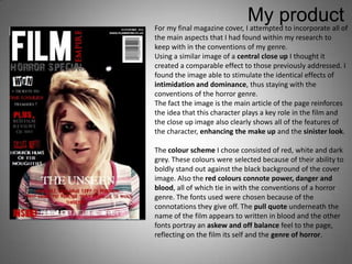
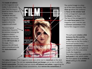
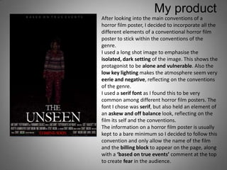
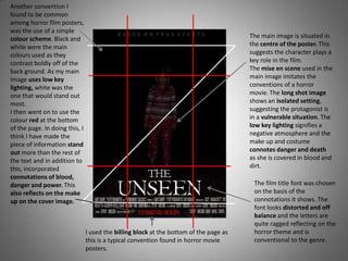
ANCILLARY PRODUCTS.

      Chloe Mason
The main aspect I found
                        within my research was that
                                                         Existing products
                        the main images of the
                        magazine cover for a horror
                        film was normally a central
                        close up of the face of the
                        main character or villain.
                        I found this to be extremely
                        effective as it creates a very
                        intimidating and dominant
                        look to the front cover.

The colour scheme of this front
                                                            Another main aspect of the
cover uses one main colour of
                                                            front covers is the
red. The colour red connotes
                                                            composition of the cover
power and danger, both aspects
                                                            lines. I found that the most
of the horror genre. This is
                                                            common side of the page to
similar to the colour scheme I
                                                            hold to the cover lines was
have chosen because the white
                                                            the left side. This is because
contrasts boldly on the dark
                                                            conventionally the left side is
background and the red stands
                                                            the dominant side of the
out brightly to the target
                                                            page.
audience.
My product
For my final magazine cover, I attempted to incorporate all of
the main aspects that I had found within my research to
keep with in the conventions of my genre.
Using a similar image of a central close up I thought it
created a comparable effect to those previously addressed. I
found the image able to stimulate the identical effects of
intimidation and dominance, thus staying with the
conventions of the horror genre.
The fact the image is the main article of the page reinforces
the idea that this character plays a key role in the film and
the close up image also clearly shows all of the features of
the character, enhancing the make up and the sinister look.

The colour scheme I chose consisted of red, white and dark
grey. These colours were selected because of their ability to
boldly stand out against the black background of the cover
image. Also the red colours connote power, danger and
blood, all of which tie in with the conventions of a horror
genre. The fonts used were chosen because of the
connotations they give off. The pull quote underneath the
name of the film appears to written in blood and the other
fonts portray an askew and off balance feel to the page,
reflecting on the film its self and the genre of horror.
The mode of address
on the magazine cover                                                                 The central image is a close
makes it dramatically                                                                 up of the main character. The
clear that the issue is                                                               close up allows the audience
based on horror films as                                                              to focus on the sinister look
it clearly states                                                                     in the protagonist’s eyes and
“HORROR SPECIAL”.                                                                     the blood on her face.
Also, the name of the                                                                 The face of the protagonist is
magazine instantly                                                                    the main focus point of the
explains what the                                                                     magazine cover, and this was
magazine will entail.                                                                 a common convention of the
                                                                                      horror film magazine covers.
The most typical
convention I found to
be common among the
magazine covers I                                                                       The pull quote creates a link
looked at was that the                                                                  between the film and the
cover lines were based                                                                  magazine cover as it uses the
on the left hand side of                                                                similar lexis to the film trailer. I
the page, this is                                                                       found pull quotes to be a
because the left hand                                                                   common convention of horror
side is considered to be                                                                magazine covers, as it gives an
the more dominant                                                                       insight to the film and article
side.                                                                                   inside the magazine.
                                                                                        The colour of the font used on the
                                                                                        pull quote is red, which makes
                                                                                        the font appear to be written in
The colour scheme of the magazine cover uses white text to stand out on the dark        blood adding to the sinister
back ground image. The red text connotes blood and danger and so ties in with the       effect.
horror conventions. The texts used are mainly off balance and askew, suggesting the
events of the film will reflect these connotations, that mirrors the conventions of
The one thing that I found to
                           be the most predominant
                                                              Existing products
                           aspect of the posters I looked
                           at was that the film title was
                           most commonly situated at
                           the bottom of the page. This
                           means that the line of sight
                           will guarantee that the film
                           title will be the final piece of
                           information that the target
                           audience will read.

Another aspect I found to
reoccur on the horror film
posters is the use of long shots.                             Another fixation I found to be
The use of a long shot helps to                               common among horror film posters
show the setting, which is                                    is the use of serif fonts. I believe
often isolated reflected on the                               that the projections look like they
main characters vulnerability.                                are trying to escape from the word
The use of a long shot here                                   itself as if it has some form of
emphasises the protagonist                                    life, reflecting on the genre of
being unaware of the villain                                  horror.
behind her and to show she is
alone with them.
My product
After looking into the main conventions of a
horror film poster, I decided to incorporate all the
different elements of a conventional horror film
poster to stick within the conventions of the
genre.
I used a long shot image to emphasise the
isolated, dark setting of the image. This shows the
protagonist to be alone and vulnerable. Also the
low key lighting makes the atmosphere seem very
eerie and negative, reflecting on the conventions
of the genre.
I used a serif font as I found this to be very
common among different horror film posters. The
font I chose was serif, but also held an element of
an askew and off balance look, reflecting on the
film its self and the conventions.
The information on a horror film poster is usually
kept to a bare minimum so I decided to follow this
convention and only allow the name of the film
and the billing block to appear on the page, along
with a ‘based on true events’ comment at the top
to create fear in the audience.
Another convention I
found to be common
among horror film posters,
was the use of a simple
colour scheme. Black and                                                                The main image is situated in
white were the main                                                                     the centre of the poster. This
colours used as they                                                                    suggests the character plays a
contrast boldly off of the                                                              key role in the film.
back ground. As my main                                                                 The mise en scene used in the
image uses low key                                                                      main image imitates the
lighting, white was the                                                                 conventions of a horror
one that would stand out                                                                movie. The long shot image
most.                                                                                   shows an isolated setting,
I then went on to use the                                                               suggesting the protagonist is
colour red at the bottom                                                                in a vulnerable situation. The
of the page. In doing this, I                                                           low key lighting signifies a
think I have made the                                                                   negative atmosphere and the
piece of information stand                                                              make up and costume
out more than the rest of                                                               connotes danger and death
the text and in addition to                                                             as she is covered in blood and
this, incorporated                                                                      dirt.
connotations of blood,
danger and power. This                                                                   The film title font was chosen
also reflects on the make                                                                on the basis of the
up on the cover image.                                                                   connotations it shows. The
                                                                                         font looks distorted and off
                                                                                         balance and the letters are
                                                                                         quite ragged reflecting on the
                                I used the billing block at the bottom of the page as    horror theme and is
                                this is a typical convention found in horror movie       conventional to the genre.
                                posters.

ancillary evaluation

  • 1.
  • 2.
    The main aspectI found within my research was that Existing products the main images of the magazine cover for a horror film was normally a central close up of the face of the main character or villain. I found this to be extremely effective as it creates a very intimidating and dominant look to the front cover. The colour scheme of this front Another main aspect of the cover uses one main colour of front covers is the red. The colour red connotes composition of the cover power and danger, both aspects lines. I found that the most of the horror genre. This is common side of the page to similar to the colour scheme I hold to the cover lines was have chosen because the white the left side. This is because contrasts boldly on the dark conventionally the left side is background and the red stands the dominant side of the out brightly to the target page. audience.
  • 3.
    My product For myfinal magazine cover, I attempted to incorporate all of the main aspects that I had found within my research to keep with in the conventions of my genre. Using a similar image of a central close up I thought it created a comparable effect to those previously addressed. I found the image able to stimulate the identical effects of intimidation and dominance, thus staying with the conventions of the horror genre. The fact the image is the main article of the page reinforces the idea that this character plays a key role in the film and the close up image also clearly shows all of the features of the character, enhancing the make up and the sinister look. The colour scheme I chose consisted of red, white and dark grey. These colours were selected because of their ability to boldly stand out against the black background of the cover image. Also the red colours connote power, danger and blood, all of which tie in with the conventions of a horror genre. The fonts used were chosen because of the connotations they give off. The pull quote underneath the name of the film appears to written in blood and the other fonts portray an askew and off balance feel to the page, reflecting on the film its self and the genre of horror.
  • 4.
    The mode ofaddress on the magazine cover The central image is a close makes it dramatically up of the main character. The clear that the issue is close up allows the audience based on horror films as to focus on the sinister look it clearly states in the protagonist’s eyes and “HORROR SPECIAL”. the blood on her face. Also, the name of the The face of the protagonist is magazine instantly the main focus point of the explains what the magazine cover, and this was magazine will entail. a common convention of the horror film magazine covers. The most typical convention I found to be common among the magazine covers I The pull quote creates a link looked at was that the between the film and the cover lines were based magazine cover as it uses the on the left hand side of similar lexis to the film trailer. I the page, this is found pull quotes to be a because the left hand common convention of horror side is considered to be magazine covers, as it gives an the more dominant insight to the film and article side. inside the magazine. The colour of the font used on the pull quote is red, which makes the font appear to be written in The colour scheme of the magazine cover uses white text to stand out on the dark blood adding to the sinister back ground image. The red text connotes blood and danger and so ties in with the effect. horror conventions. The texts used are mainly off balance and askew, suggesting the events of the film will reflect these connotations, that mirrors the conventions of
  • 5.
    The one thingthat I found to be the most predominant Existing products aspect of the posters I looked at was that the film title was most commonly situated at the bottom of the page. This means that the line of sight will guarantee that the film title will be the final piece of information that the target audience will read. Another aspect I found to reoccur on the horror film posters is the use of long shots. Another fixation I found to be The use of a long shot helps to common among horror film posters show the setting, which is is the use of serif fonts. I believe often isolated reflected on the that the projections look like they main characters vulnerability. are trying to escape from the word The use of a long shot here itself as if it has some form of emphasises the protagonist life, reflecting on the genre of being unaware of the villain horror. behind her and to show she is alone with them.
  • 6.
    My product After lookinginto the main conventions of a horror film poster, I decided to incorporate all the different elements of a conventional horror film poster to stick within the conventions of the genre. I used a long shot image to emphasise the isolated, dark setting of the image. This shows the protagonist to be alone and vulnerable. Also the low key lighting makes the atmosphere seem very eerie and negative, reflecting on the conventions of the genre. I used a serif font as I found this to be very common among different horror film posters. The font I chose was serif, but also held an element of an askew and off balance look, reflecting on the film its self and the conventions. The information on a horror film poster is usually kept to a bare minimum so I decided to follow this convention and only allow the name of the film and the billing block to appear on the page, along with a ‘based on true events’ comment at the top to create fear in the audience.
  • 7.
    Another convention I foundto be common among horror film posters, was the use of a simple colour scheme. Black and The main image is situated in white were the main the centre of the poster. This colours used as they suggests the character plays a contrast boldly off of the key role in the film. back ground. As my main The mise en scene used in the image uses low key main image imitates the lighting, white was the conventions of a horror one that would stand out movie. The long shot image most. shows an isolated setting, I then went on to use the suggesting the protagonist is colour red at the bottom in a vulnerable situation. The of the page. In doing this, I low key lighting signifies a think I have made the negative atmosphere and the piece of information stand make up and costume out more than the rest of connotes danger and death the text and in addition to as she is covered in blood and this, incorporated dirt. connotations of blood, danger and power. This The film title font was chosen also reflects on the make on the basis of the up on the cover image. connotations it shows. The font looks distorted and off balance and the letters are quite ragged reflecting on the I used the billing block at the bottom of the page as horror theme and is this is a typical convention found in horror movie conventional to the genre. posters.