SlideShare a Scribd company logo
1 of 7
Q2: HOW EFFECTIVE IS
THE COMBINATION OF
YOUR MAIN PRODUCT
AND ANCILLARY
TEXTS? Ancillary texts:
Website and Digipak
UNDERSTANDING
WHY ALL THREE
PRODUCTS ARE
IMPORTANT
The digipak is mainly a product for purchase. Allowing audiences to own the music
and play it at their own leisure. However, it can offer exclusive images to those who
purchase it. It also creates a memorable image for the song/album which can be used as
a recognisable feature to the artists career. It can hold a wider purpose in presenting a
wider message or concept, for example, the cover of a lot of Young Fathers work uses
political phases or images with that have a personal connection with the band members
and thus connecting them to their cultural identity.
The website is an important source of information, essentially linking all the products
together in one place. It provides information about tours, music, videos, bts, social
media, merchandise, contact and a background to the artist all in one place. Here you
can explore everything to do with the artist.
The three products work together to market our artist and promote her music across
multiple platforms, increasing her profile as a music artist. From my research into real
media products, I have understood that artists cannot just rely on a music video but
need multiple avenues as a successful marketing tool. We use synergy to have a larger
impact on our audience, as by having more than one product our target audience is able
to explore Barde further as an artist. They can discover more about her and the music,
making it more than just a song but a wider concept that helps people identify
themselves through music artists and what they stand for.
Not only do our products link to each other through multiple visual elements, but
through the website, we are able to connect fans with Barde's social media where they
can understand her on a more personal level. This is something we added as many
other websites, such as Kodaline, Selena Gomez and Adele had social media links so
Young Fathers
visuals
Kodaline and Adele’s social media links
Barde’s social media
links
C O L O U R F O N T+Colour and font is an important aspect of how
effective our product and ancillary texts are in
combination. We decided early on that green and
pink would be our main colour scheme, with
either black or white to provide contrast. This can
be seen on the website and digipak.
Furthermore, contrast is added through the shades of green and pink being opposite on the colour wheel. Together, these bring connotations of nature and femininity,
making the audience associate Barde with being real and honest. We also used green based on Barde’s eye colour to tie in colour elements on the digipak cover.
When the website loads, you are presented with the pink colour on the Lightbox, instantly combining the website and digipak together, as well as giving this real and
honest impression of Barde immediately. Then, we can see that the title text is green and written information is pink, further effectively linking the products together
through colour and font. In addition, there are some more details that link the colour of the digipak and website, for example, when the mouse hovers over the pages it
highlights green, where we have linked even the smallest of details to each of our products through colour. Examples of these are below.
Linking colour to the music video it isn’t as effective, however the use of font across all the products remains constant in linking them together. We decided not to use the
‘Futura’ font
used on a re-
designed album
cover, inspired
by 60s vinyl.
This font can be seen on our digipak, in the music video, on merchandise and on aspects of the website, such as the tour poster. Creating
even more unison between our products. This font, along with the colour, makes for a really memorable part of Barde’s brand and when
used in all products becomes a motif throughout all her work. It definitely helps to give off the 60s vinyl vibe, which makes Barde appear
quite retro, but focused on the times when music was simpler and not consumed by the mainstream. This part of her personality is also
another way in which we effectively connected all the products.
VISUALS
Our use of creative and unique visuals that relate to Barde also show how effective our combination of products
are. As the genre of music is alternative rap, its sound is quite fast and to compliment this we created strong
visuals that were both chaotic but aesthetically appealing.
The digipak uses these visuals in the inside images. We decided to place them on the
inside where they become revealed as you open the digipak. This is like an insight into
Barde’s brain and personality as she distorts images of herself to show her creative
output. The image behind the CD also shows her handwriting from initial lyric
writing. Inspiration from this came from MØ and Lorde. By having these lyrics
written loosely and roughly across the page the audience is given an insight into the
production process of writing the songs. Handwriting is also quite personal to an
individual, bringing more elements of Barde’s own life into her music. These lyrics
can also link to the lyrics in the video, which are seen throughout.
Furthermore, the visuals from the digipak link to the video
collectively in multiple ways. To the right is a screenshot taken
from the video displaying the images layered on top of the green
screen background. There are multiple things for the audience to
engage with, the images themselves , the boxes appearing in time
with the music and the spinning box. There is also younger Barde
who is behind Barde doing actions. All of these create exciting
visuals that keeps you watching. It also creates a unified image
for Barde as being visually exciting as the fast pace editing gives
you a lot to see, which also goes along with the fast pace music.
On the website, we have a more simplistic approach so it is easy to navigate and use. However, it still works
collectively with our other products. The website uses colour mostly to connect it to the other products, but we
have also used the Instagram to create strong visuals. We decided to make the Instagram have a lot of aesthetic
shots and messages that Barde likes. For example, the photo through the holes on the wall, photos of art
exhibitions and motivational words. These both add and link to the visuals of the video and digipak as they
present Barde as an exciting artist, interested in the way things look. However, the website could be more
effective in linking to the other product as it is simplistic, although it was intentionally simple so people can
navigate it. The website uses double layered text, which is the same font as the digipak, but just makes it stand
out visually from the black background, similar to how the music video layers different clips.
PERSONALITY
AND APPEARANCE
through fashion, Barde's appearance and more. Fashion helps you to express and
identify yourself and we made sure every time we did any filming or photography
we planned out each outfit to suit Barde, as well as her younger version. Another
way we display her personality is through her social media, which can be seen on the
website.
Barde has both a relaxed but also dressed-up style to
express herself. In the music video, both her and
younger Barde wore multiple outfits (pictured above).
We wanted younger Barde to have dungarees which
are associated with someone younger and patterned
tops. For Barde herself, we wanted her to have a
casual top, graphic t-shirt and a smarter blouse. This
is because we wanted to represent her as both
‘normal’ but having a comical side through the
graphic shirts. We see this comical side of her again
on the digipak (left) where we put
all the images from the photoshoot
on this one panel. We did not
delete any of the ‘bad’ photos but
instead left them to show Barde is
not afraid of being herself.
There are also some images where the magnifying
glass distorts her face in funny ways, adding to her
comical side.
Across the products, this helps to build up a
collective image of Barde through her personality
traits and appearance both being consistent. It is
important for a music artist, especially a new one to
make themselves memorable through these
consistent characteristics as to be recognised by
multiple audiences, not just their target audience.
During research and planning, appearance is something we
paid close attention to across both the main product and
ancillary texts, which has been really effective. Barde has
minimal makeup, Her hair is normally loosely tied up and she
wears quite a bit of jewellery made out of reusable materials
like wood and string, giving her this natural and urban
appearance, similar to that of the music genre. This is shown
in the photoshoots of Barde above, which are also featured in
the digipak.
This can be seen on the website through the Instagram (left) as
a lot of the artwork and photos are free/rough, such as the
graffiti. Collectively, these are effective in representing Barde
as care-free, full of life, natural and urban across multiple
platforms that contribute to the way in which the audience
deconstructs her as an artist.
SYMBOLS: THE MAGNIFYING GLASS
One of the main motifs and symbols throughout our main product and ancillary texts is the use of the magnifying glass. It represents what society hides from us, wher
The idea behind the symbol came from the Coldplay video ‘Violet Hill’ and is an intertextual reference. In the video the magnifying glass is used to amplify the mout
(Right) Our video compared
to Coldplay’s ‘Violet Hill’
Together, I think that our products
are really effective in their
combination, as well as suiting
each product individually. For
example, we adapted the website to
make it simpler, made the digipak
more personal to create an
emotional connection with the
audience and made the music video
aesthetically chaotic to match the
music pace. We have maintained
the same image and style for Barde
throughout, linking each product to
each other through clear visuals and
even small details like font and
colour. Each product reminds our
audience of the other, where they
are able to recognise Barde through
symbols she associates with and
uses as a form of expression. We
have not only created an effective
combination but a wider brand for
Barde that establishes her as an
artist and markets her beyond her
own target audience.
HOW EFFECTIVE IS THE COMBINATION?

More Related Content

What's hot (18)

Media Conclusions
Media ConclusionsMedia Conclusions
Media Conclusions
 
Final Question 2
Final Question 2Final Question 2
Final Question 2
 
Question 2
Question 2Question 2
Question 2
 
Ancillary
Ancillary Ancillary
Ancillary
 
Question 2
Question 2Question 2
Question 2
 
Evaluation Q2
Evaluation Q2Evaluation Q2
Evaluation Q2
 
Ancillary Texts
Ancillary TextsAncillary Texts
Ancillary Texts
 
Question 2
Question 2Question 2
Question 2
 
Question 1
Question 1Question 1
Question 1
 
Constructing our digipak
Constructing our digipakConstructing our digipak
Constructing our digipak
 
Question two evaluation
Question two evaluationQuestion two evaluation
Question two evaluation
 
Media evaluation question 1 part 2
Media evaluation question 1 part 2Media evaluation question 1 part 2
Media evaluation question 1 part 2
 
How effective is the combination of your main product and acillary texts
How effective is the combination of your main product and acillary textsHow effective is the combination of your main product and acillary texts
How effective is the combination of your main product and acillary texts
 
Evaluation question 2
Evaluation question 2Evaluation question 2
Evaluation question 2
 
Media script Catherine
Media script CatherineMedia script Catherine
Media script Catherine
 
Conventions
ConventionsConventions
Conventions
 
How effective is the combination of your main product and ancillary tasks?
How effective is the combination of your main product and ancillary tasks? How effective is the combination of your main product and ancillary tasks?
How effective is the combination of your main product and ancillary tasks?
 
Question 2
Question 2Question 2
Question 2
 

Similar to Q2

Evaluation 2 & 4
Evaluation 2 & 4Evaluation 2 & 4
Evaluation 2 & 4
paperchain
 
Question 2 - Media Evaluation
Question 2 - Media EvaluationQuestion 2 - Media Evaluation
Question 2 - Media Evaluation
webb999
 
Evaluation q2
Evaluation   q2Evaluation   q2
Evaluation q2
Brownh1A2
 
Evaluation q2
Evaluation   q2Evaluation   q2
Evaluation q2
Brownh1A2
 
2. How effective is the combination of your main product and ancillary texts?
2. How effective is the combination of your main product and ancillary texts?2. How effective is the combination of your main product and ancillary texts?
2. How effective is the combination of your main product and ancillary texts?
ceylanakbas
 
Evaluation question 2
Evaluation question 2Evaluation question 2
Evaluation question 2
aimeesquibb
 
A2 Media Studies Evaluation
A2 Media Studies EvaluationA2 Media Studies Evaluation
A2 Media Studies Evaluation
Naomi Troon
 
Evaluation question 2
Evaluation question 2Evaluation question 2
Evaluation question 2
aimeesquibb
 
Q2. How effective is the combination of your main products and ancillary tasks?
Q2. How effective is the combination of your main products and ancillary tasks?Q2. How effective is the combination of your main products and ancillary tasks?
Q2. How effective is the combination of your main products and ancillary tasks?
taylorbarnes
 
Q2. How effective is the combination of your main products and ancillary tasks?
Q2. How effective is the combination of your main products and ancillary tasks?Q2. How effective is the combination of your main products and ancillary tasks?
Q2. How effective is the combination of your main products and ancillary tasks?
taylorbarnes
 
Media evaluation 1
Media evaluation 1Media evaluation 1
Media evaluation 1
04lovellh
 
Media evaluation 1
Media evaluation 1Media evaluation 1
Media evaluation 1
04lovellh
 

Similar to Q2 (20)

Evaluation 2
Evaluation 2Evaluation 2
Evaluation 2
 
Evaluation 2 & 4
Evaluation 2 & 4Evaluation 2 & 4
Evaluation 2 & 4
 
Evaluation Q2
Evaluation Q2Evaluation Q2
Evaluation Q2
 
Question 2 - Media Evaluation
Question 2 - Media EvaluationQuestion 2 - Media Evaluation
Question 2 - Media Evaluation
 
Evaluation 2
Evaluation 2Evaluation 2
Evaluation 2
 
Q2
Q2Q2
Q2
 
Evaluation q2
Evaluation   q2Evaluation   q2
Evaluation q2
 
Evaluation q2
Evaluation   q2Evaluation   q2
Evaluation q2
 
Question 2
Question 2Question 2
Question 2
 
2. How effective is the combination of your main product and ancillary texts?
2. How effective is the combination of your main product and ancillary texts?2. How effective is the combination of your main product and ancillary texts?
2. How effective is the combination of your main product and ancillary texts?
 
A2 Media Studies: Evaluation - Main Product and Ancillary Texts
A2 Media Studies: Evaluation - Main Product and Ancillary TextsA2 Media Studies: Evaluation - Main Product and Ancillary Texts
A2 Media Studies: Evaluation - Main Product and Ancillary Texts
 
Evaluation question 2
Evaluation question 2Evaluation question 2
Evaluation question 2
 
Evaluation 2
Evaluation 2Evaluation 2
Evaluation 2
 
A2 Media Studies Evaluation
A2 Media Studies EvaluationA2 Media Studies Evaluation
A2 Media Studies Evaluation
 
Evaluation question 2
Evaluation question 2Evaluation question 2
Evaluation question 2
 
Risk assessment
Risk assessmentRisk assessment
Risk assessment
 
Q2. How effective is the combination of your main products and ancillary tasks?
Q2. How effective is the combination of your main products and ancillary tasks?Q2. How effective is the combination of your main products and ancillary tasks?
Q2. How effective is the combination of your main products and ancillary tasks?
 
Q2. How effective is the combination of your main products and ancillary tasks?
Q2. How effective is the combination of your main products and ancillary tasks?Q2. How effective is the combination of your main products and ancillary tasks?
Q2. How effective is the combination of your main products and ancillary tasks?
 
Media evaluation 1
Media evaluation 1Media evaluation 1
Media evaluation 1
 
Media evaluation 1
Media evaluation 1Media evaluation 1
Media evaluation 1
 

Recently uploaded

Making and Justifying Mathematical Decisions.pdf
Making and Justifying Mathematical Decisions.pdfMaking and Justifying Mathematical Decisions.pdf
Making and Justifying Mathematical Decisions.pdf
Chris Hunter
 
Seal of Good Local Governance (SGLG) 2024Final.pptx
Seal of Good Local Governance (SGLG) 2024Final.pptxSeal of Good Local Governance (SGLG) 2024Final.pptx
Seal of Good Local Governance (SGLG) 2024Final.pptx
negromaestrong
 

Recently uploaded (20)

Sociology 101 Demonstration of Learning Exhibit
Sociology 101 Demonstration of Learning ExhibitSociology 101 Demonstration of Learning Exhibit
Sociology 101 Demonstration of Learning Exhibit
 
Class 11th Physics NEET formula sheet pdf
Class 11th Physics NEET formula sheet pdfClass 11th Physics NEET formula sheet pdf
Class 11th Physics NEET formula sheet pdf
 
Ecological Succession. ( ECOSYSTEM, B. Pharmacy, 1st Year, Sem-II, Environmen...
Ecological Succession. ( ECOSYSTEM, B. Pharmacy, 1st Year, Sem-II, Environmen...Ecological Succession. ( ECOSYSTEM, B. Pharmacy, 1st Year, Sem-II, Environmen...
Ecological Succession. ( ECOSYSTEM, B. Pharmacy, 1st Year, Sem-II, Environmen...
 
Explore beautiful and ugly buildings. Mathematics helps us create beautiful d...
Explore beautiful and ugly buildings. Mathematics helps us create beautiful d...Explore beautiful and ugly buildings. Mathematics helps us create beautiful d...
Explore beautiful and ugly buildings. Mathematics helps us create beautiful d...
 
Z Score,T Score, Percential Rank and Box Plot Graph
Z Score,T Score, Percential Rank and Box Plot GraphZ Score,T Score, Percential Rank and Box Plot Graph
Z Score,T Score, Percential Rank and Box Plot Graph
 
TỔNG ÔN TẬP THI VÀO LỚP 10 MÔN TIẾNG ANH NĂM HỌC 2023 - 2024 CÓ ĐÁP ÁN (NGỮ Â...
TỔNG ÔN TẬP THI VÀO LỚP 10 MÔN TIẾNG ANH NĂM HỌC 2023 - 2024 CÓ ĐÁP ÁN (NGỮ Â...TỔNG ÔN TẬP THI VÀO LỚP 10 MÔN TIẾNG ANH NĂM HỌC 2023 - 2024 CÓ ĐÁP ÁN (NGỮ Â...
TỔNG ÔN TẬP THI VÀO LỚP 10 MÔN TIẾNG ANH NĂM HỌC 2023 - 2024 CÓ ĐÁP ÁN (NGỮ Â...
 
ICT Role in 21st Century Education & its Challenges.pptx
ICT Role in 21st Century Education & its Challenges.pptxICT Role in 21st Century Education & its Challenges.pptx
ICT Role in 21st Century Education & its Challenges.pptx
 
PROCESS RECORDING FORMAT.docx
PROCESS      RECORDING        FORMAT.docxPROCESS      RECORDING        FORMAT.docx
PROCESS RECORDING FORMAT.docx
 
Introduction to Nonprofit Accounting: The Basics
Introduction to Nonprofit Accounting: The BasicsIntroduction to Nonprofit Accounting: The Basics
Introduction to Nonprofit Accounting: The Basics
 
2024-NATIONAL-LEARNING-CAMP-AND-OTHER.pptx
2024-NATIONAL-LEARNING-CAMP-AND-OTHER.pptx2024-NATIONAL-LEARNING-CAMP-AND-OTHER.pptx
2024-NATIONAL-LEARNING-CAMP-AND-OTHER.pptx
 
ICT role in 21st century education and it's challenges.
ICT role in 21st century education and it's challenges.ICT role in 21st century education and it's challenges.
ICT role in 21st century education and it's challenges.
 
How to Give a Domain for a Field in Odoo 17
How to Give a Domain for a Field in Odoo 17How to Give a Domain for a Field in Odoo 17
How to Give a Domain for a Field in Odoo 17
 
Holdier Curriculum Vitae (April 2024).pdf
Holdier Curriculum Vitae (April 2024).pdfHoldier Curriculum Vitae (April 2024).pdf
Holdier Curriculum Vitae (April 2024).pdf
 
Role Of Transgenic Animal In Target Validation-1.pptx
Role Of Transgenic Animal In Target Validation-1.pptxRole Of Transgenic Animal In Target Validation-1.pptx
Role Of Transgenic Animal In Target Validation-1.pptx
 
Unit-IV- Pharma. Marketing Channels.pptx
Unit-IV- Pharma. Marketing Channels.pptxUnit-IV- Pharma. Marketing Channels.pptx
Unit-IV- Pharma. Marketing Channels.pptx
 
Making and Justifying Mathematical Decisions.pdf
Making and Justifying Mathematical Decisions.pdfMaking and Justifying Mathematical Decisions.pdf
Making and Justifying Mathematical Decisions.pdf
 
Mehran University Newsletter Vol-X, Issue-I, 2024
Mehran University Newsletter Vol-X, Issue-I, 2024Mehran University Newsletter Vol-X, Issue-I, 2024
Mehran University Newsletter Vol-X, Issue-I, 2024
 
Unit-IV; Professional Sales Representative (PSR).pptx
Unit-IV; Professional Sales Representative (PSR).pptxUnit-IV; Professional Sales Representative (PSR).pptx
Unit-IV; Professional Sales Representative (PSR).pptx
 
Seal of Good Local Governance (SGLG) 2024Final.pptx
Seal of Good Local Governance (SGLG) 2024Final.pptxSeal of Good Local Governance (SGLG) 2024Final.pptx
Seal of Good Local Governance (SGLG) 2024Final.pptx
 
Nutritional Needs Presentation - HLTH 104
Nutritional Needs Presentation - HLTH 104Nutritional Needs Presentation - HLTH 104
Nutritional Needs Presentation - HLTH 104
 

Q2

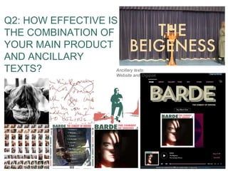
  • 1. Q2: HOW EFFECTIVE IS THE COMBINATION OF YOUR MAIN PRODUCT AND ANCILLARY TEXTS? Ancillary texts: Website and Digipak
  • 2. UNDERSTANDING WHY ALL THREE PRODUCTS ARE IMPORTANT The digipak is mainly a product for purchase. Allowing audiences to own the music and play it at their own leisure. However, it can offer exclusive images to those who purchase it. It also creates a memorable image for the song/album which can be used as a recognisable feature to the artists career. It can hold a wider purpose in presenting a wider message or concept, for example, the cover of a lot of Young Fathers work uses political phases or images with that have a personal connection with the band members and thus connecting them to their cultural identity. The website is an important source of information, essentially linking all the products together in one place. It provides information about tours, music, videos, bts, social media, merchandise, contact and a background to the artist all in one place. Here you can explore everything to do with the artist. The three products work together to market our artist and promote her music across multiple platforms, increasing her profile as a music artist. From my research into real media products, I have understood that artists cannot just rely on a music video but need multiple avenues as a successful marketing tool. We use synergy to have a larger impact on our audience, as by having more than one product our target audience is able to explore Barde further as an artist. They can discover more about her and the music, making it more than just a song but a wider concept that helps people identify themselves through music artists and what they stand for. Not only do our products link to each other through multiple visual elements, but through the website, we are able to connect fans with Barde's social media where they can understand her on a more personal level. This is something we added as many other websites, such as Kodaline, Selena Gomez and Adele had social media links so Young Fathers visuals Kodaline and Adele’s social media links Barde’s social media links
  • 3. C O L O U R F O N T+Colour and font is an important aspect of how effective our product and ancillary texts are in combination. We decided early on that green and pink would be our main colour scheme, with either black or white to provide contrast. This can be seen on the website and digipak. Furthermore, contrast is added through the shades of green and pink being opposite on the colour wheel. Together, these bring connotations of nature and femininity, making the audience associate Barde with being real and honest. We also used green based on Barde’s eye colour to tie in colour elements on the digipak cover. When the website loads, you are presented with the pink colour on the Lightbox, instantly combining the website and digipak together, as well as giving this real and honest impression of Barde immediately. Then, we can see that the title text is green and written information is pink, further effectively linking the products together through colour and font. In addition, there are some more details that link the colour of the digipak and website, for example, when the mouse hovers over the pages it highlights green, where we have linked even the smallest of details to each of our products through colour. Examples of these are below. Linking colour to the music video it isn’t as effective, however the use of font across all the products remains constant in linking them together. We decided not to use the ‘Futura’ font used on a re- designed album cover, inspired by 60s vinyl. This font can be seen on our digipak, in the music video, on merchandise and on aspects of the website, such as the tour poster. Creating even more unison between our products. This font, along with the colour, makes for a really memorable part of Barde’s brand and when used in all products becomes a motif throughout all her work. It definitely helps to give off the 60s vinyl vibe, which makes Barde appear quite retro, but focused on the times when music was simpler and not consumed by the mainstream. This part of her personality is also another way in which we effectively connected all the products.
  • 4. VISUALS Our use of creative and unique visuals that relate to Barde also show how effective our combination of products are. As the genre of music is alternative rap, its sound is quite fast and to compliment this we created strong visuals that were both chaotic but aesthetically appealing. The digipak uses these visuals in the inside images. We decided to place them on the inside where they become revealed as you open the digipak. This is like an insight into Barde’s brain and personality as she distorts images of herself to show her creative output. The image behind the CD also shows her handwriting from initial lyric writing. Inspiration from this came from MØ and Lorde. By having these lyrics written loosely and roughly across the page the audience is given an insight into the production process of writing the songs. Handwriting is also quite personal to an individual, bringing more elements of Barde’s own life into her music. These lyrics can also link to the lyrics in the video, which are seen throughout. Furthermore, the visuals from the digipak link to the video collectively in multiple ways. To the right is a screenshot taken from the video displaying the images layered on top of the green screen background. There are multiple things for the audience to engage with, the images themselves , the boxes appearing in time with the music and the spinning box. There is also younger Barde who is behind Barde doing actions. All of these create exciting visuals that keeps you watching. It also creates a unified image for Barde as being visually exciting as the fast pace editing gives you a lot to see, which also goes along with the fast pace music. On the website, we have a more simplistic approach so it is easy to navigate and use. However, it still works collectively with our other products. The website uses colour mostly to connect it to the other products, but we have also used the Instagram to create strong visuals. We decided to make the Instagram have a lot of aesthetic shots and messages that Barde likes. For example, the photo through the holes on the wall, photos of art exhibitions and motivational words. These both add and link to the visuals of the video and digipak as they present Barde as an exciting artist, interested in the way things look. However, the website could be more effective in linking to the other product as it is simplistic, although it was intentionally simple so people can navigate it. The website uses double layered text, which is the same font as the digipak, but just makes it stand out visually from the black background, similar to how the music video layers different clips.
  • 5. PERSONALITY AND APPEARANCE through fashion, Barde's appearance and more. Fashion helps you to express and identify yourself and we made sure every time we did any filming or photography we planned out each outfit to suit Barde, as well as her younger version. Another way we display her personality is through her social media, which can be seen on the website. Barde has both a relaxed but also dressed-up style to express herself. In the music video, both her and younger Barde wore multiple outfits (pictured above). We wanted younger Barde to have dungarees which are associated with someone younger and patterned tops. For Barde herself, we wanted her to have a casual top, graphic t-shirt and a smarter blouse. This is because we wanted to represent her as both ‘normal’ but having a comical side through the graphic shirts. We see this comical side of her again on the digipak (left) where we put all the images from the photoshoot on this one panel. We did not delete any of the ‘bad’ photos but instead left them to show Barde is not afraid of being herself. There are also some images where the magnifying glass distorts her face in funny ways, adding to her comical side. Across the products, this helps to build up a collective image of Barde through her personality traits and appearance both being consistent. It is important for a music artist, especially a new one to make themselves memorable through these consistent characteristics as to be recognised by multiple audiences, not just their target audience. During research and planning, appearance is something we paid close attention to across both the main product and ancillary texts, which has been really effective. Barde has minimal makeup, Her hair is normally loosely tied up and she wears quite a bit of jewellery made out of reusable materials like wood and string, giving her this natural and urban appearance, similar to that of the music genre. This is shown in the photoshoots of Barde above, which are also featured in the digipak. This can be seen on the website through the Instagram (left) as a lot of the artwork and photos are free/rough, such as the graffiti. Collectively, these are effective in representing Barde as care-free, full of life, natural and urban across multiple platforms that contribute to the way in which the audience deconstructs her as an artist.
  • 6. SYMBOLS: THE MAGNIFYING GLASS One of the main motifs and symbols throughout our main product and ancillary texts is the use of the magnifying glass. It represents what society hides from us, wher The idea behind the symbol came from the Coldplay video ‘Violet Hill’ and is an intertextual reference. In the video the magnifying glass is used to amplify the mout (Right) Our video compared to Coldplay’s ‘Violet Hill’
  • 7. Together, I think that our products are really effective in their combination, as well as suiting each product individually. For example, we adapted the website to make it simpler, made the digipak more personal to create an emotional connection with the audience and made the music video aesthetically chaotic to match the music pace. We have maintained the same image and style for Barde throughout, linking each product to each other through clear visuals and even small details like font and colour. Each product reminds our audience of the other, where they are able to recognise Barde through symbols she associates with and uses as a form of expression. We have not only created an effective combination but a wider brand for Barde that establishes her as an artist and markets her beyond her own target audience. HOW EFFECTIVE IS THE COMBINATION?