

Recommended
More Related Content
What's hot
What's hot (18)
Similar to Masthead font styles
Similar to Masthead font styles (20)
More from Asuka Young
More from Asuka Young (20)
Recently uploaded
Recently uploaded (20)
Masthead font styles
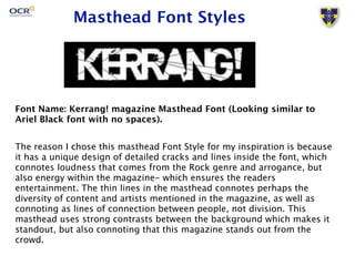
- 1. Masthead Font Styles Font Name: Kerrang! magazine Masthead Font (Looking similar to Ariel Black font with no spaces). The reason I chose this masthead Font Style for my inspiration is because it has a unique design of detailed cracks and lines inside the font, which connotes loudness that comes from the Rock genre and arrogance, but also energy within the magazine- which ensures the readers entertainment. The thin lines in the masthead connotes perhaps the diversity of content and artists mentioned in the magazine, as well as connoting as lines of connection between people, not division. This masthead uses strong contrasts between the background which makes it standout, but also connoting that this magazine stands out from the crowd.
- 2. Masthead Font Styles Font Name: Q magazine Masthead Font (Looking similar to LiSong Pro and other serif fonts. The reason I chose this masthead Font Style for my inspiration is because it has simplicity that makes the readers remember the Masthead. By only having one letter, it involves the audience into thinking what it stands for, what it means etc. The White and Red font style clearly contrasts each other and the fact that the letter is inside a box connotes elegance and professionalism. The slight drop shadow helps the font to look more interesting and have depth.
- 3. Masthead Font Styles Font Name: NME magazine Masthead Font (Looking similar to Ariel Black, Impact and other Sans-serif fonts. The reason I chose this masthead Font Style for my inspiration is because it is rare to see a very clear stroke around mastheads for music magazines (aside from Rolling Stone magazine as well). This stroke connotes modernness, as it adds variation to the masthead, instead of having a block of text only etc. This also connotes perhaps that NME magazine is creative and more interesting. The masthead consists of three letters, which is simplistic and helps the audiences remember the magazine as well, as the masthead is not long. The colour scheme for the masthead is simple and contrasting, and all three colours goes well together. Because the stroke is black, it helps the white stroke inside to stand out as well as the red font, so this is an important element within the font.
- 4. Masthead Font Styles Font Name: Classic Rock magazine Masthead Font (Looking similar to Popular Std (Non-Serif) and other serif fonts. - maybe strokes helps to bold the look. The reason I chose this masthead Font Style for my inspiration is because it has a good balance of the positions of words. The R and the K is purposely of a larger font, in order to place the word ‘Classic’ on top. This forms uniqueness as there are different font sizes within a masthead, but also brings excitement and movement to the readers. There are stars in the word Classic, and this is also something that only classic rock masthead has. The font is slightly serif which connotes respect and trust, and reminds the audiences the past, which formal lettering was used more often than the current. The colours are black, but it can vary. The bold coloring helps the masthead to contrast with the background or images etc.