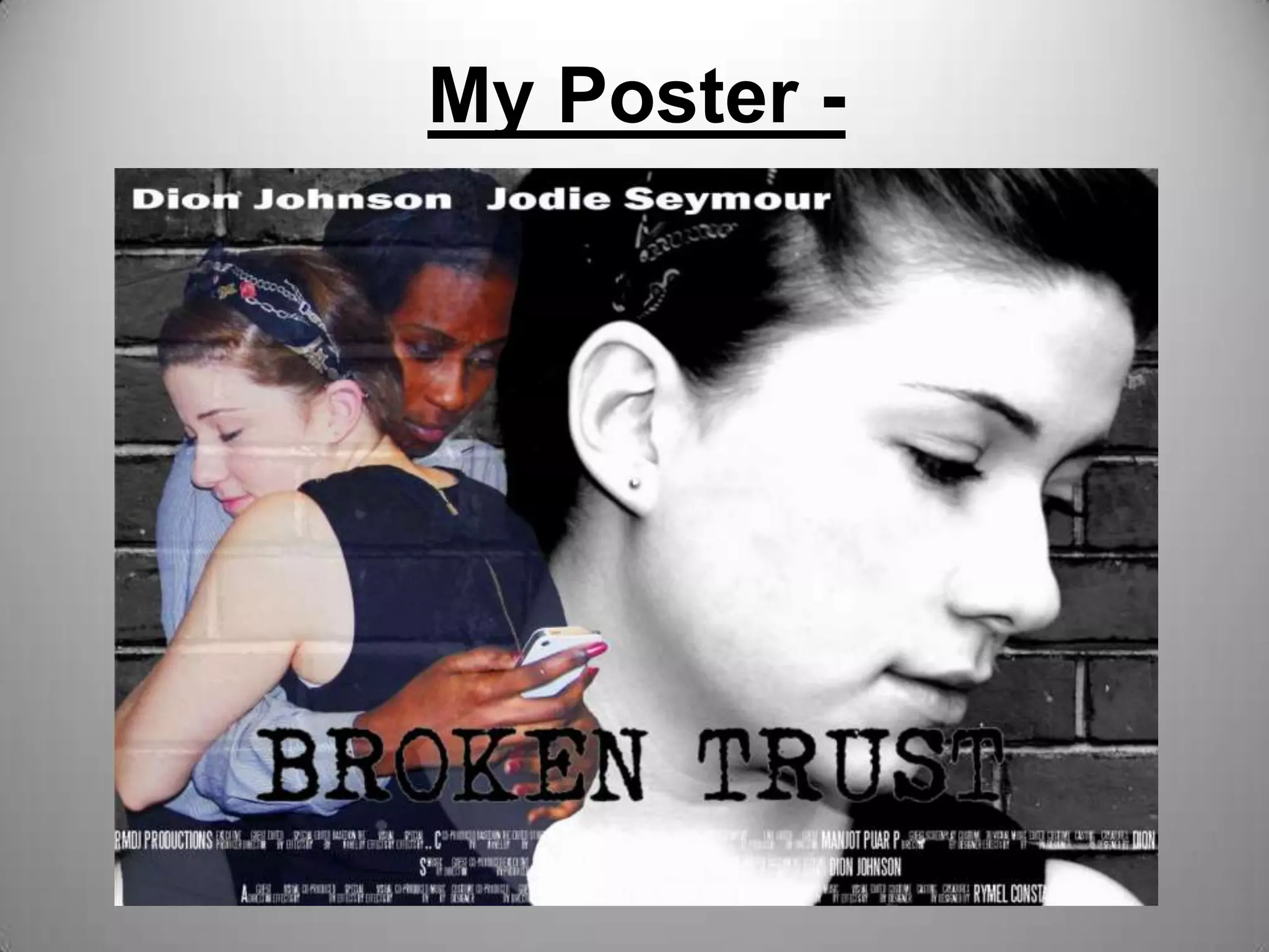
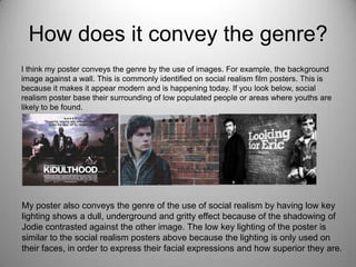
My Poster -
How is it linked to the film?
I feel that my poster links to the short film in a number of ways. Firstly, my poster clearly
displays the two main characters featured in the film. This is used to introduce the
characters but also demonstrating their personalities through it all. By having the contrast
of colour amongst both characters it takes the focus of the background image of Jodie
who plays Jennifer. This will enable to divert the audiences attention to the colouration of
the image when Jodie and I are hugging. I believe this effectively links to the film because
it portrays the storyline and ploy slightly without giving too much away. This is because it
shows that the film must contain a bit of tension and rivalry between the two characters.
Also, my poster links well with the film because it conveys the conventions of social
realism with the background image being against a brick wall, which shows gritty and a
realistic effect.
How does it promote the film?
My poster promotes my film by introducing the faces of the both main characters in the
film. This helps to promote the film because the audience will be able to recognise the
characters once they watch the film. My poster also features both of the characters name
at the top for people who are a fan of either one of these characters, they would be more
willing to watch the film. The credit block on my poster is a huge promotion of my film
because I state the production company, director, stars and cinematographer. This is
beneficial for my film because the audience will be able to gather important relevant
information about the film which could be encouraging for them to view the film. Also, as
my poster is a teaser poster due to having minimal details of the film it promotes the film
by using the title to illustrate a hidden message of the plot.
What aspects of the film does it
focus on?
My poster focuses on the aspects solely on the friendship between both
characters, this amplifies the betrayal. This is definitely an area of the
film that I wanted to show to the audience because I believe it is an
engaging way for the audience to form a relationship with both
characters as the dishonesty is really demonstrated through my poster.
My poster highlights the dishonesty aspect on my poster by having me
looking at phone behind my so called best friends back while hugging
her. The background image of Jodie looking away from the image of
the hug, she distraught, upset, isolation and sad. This is shown in the
film by having Jodie looking alone using high angle shots to show
vulnerability of Jodie’s state.
How does it take the codes and conventions of
the film into its design? [ images/ language/
fonts/colours etc]
The conventions of the film is using the style of social realism and gritty. On my
poster I tried to explore this by using a font that would be seen on a social
realism film poster, from the ones which I have researched. The design of my
poster is typical as a social realism because it shows a diversity between two
people within the same friendship group. The fonts and colours was an aspect
that I thought carefully about because I wanted to have a font style that would
attract a younger audience. By using a bolded and black and white themed I
feel that it gives it that edgy, unusual and urban effect for my poster. This is
because on a social realism poster it is unlikely that it will have bright, bold
colours such as, yellow, red or orange. This is because it will not offer a realistic
view of the film. Bright colours would work better for comedies as it is uplifting
and attractive for the audience to base their attention on.
How does it convey the genre?
I think my poster conveys the genre by the use of images. For example, the background
image against a wall. This is commonly identified on social realism film posters. This is
because it makes it appear modern and is happening today. If you look below, social
realism poster base their surrounding of low populated people or areas where youths are
likely to be found.
My poster also conveys the genre of the use of social realism by having low key
lighting shows a dull, underground and gritty effect because of the shadowing of
Jodie contrasted against the other image. The low key lighting of the poster is
similar to the social realism posters above because the lighting is only used on
their faces, in order to express their facial expressions and how superior they are.
What audience[s] does it target?
I think my poster targets 16-25 year olds because it hits upon real life social issues that is
happening in today’s society among teenagers today. I think this will be our secondary
audience, and our primary and niche would be focused on 16-19 because it does feature
two 18 year old girls that people over 20 might find a bit irrelevant and boring for them.
Therefore, keeping the audience at a young and mature bracket will definitely be
advisory. I think my poster can be targeted at males and females who fit the age bracket
above because by having two girls featured on it will attract the girls and the boys may
also want to see what the film unravels too.
Did your audience feedback support that?
I think my audience feedback did support the fact that there is a close link between my
poster and short film because they were able to identify the key aspects that were
demonstrated, most importantly, betrayal. This was important because it enabled me to
realise any strengths or weaknesses on poster in relation to not portraying the plot
effectively. My audience feedback allowed me to fewer improve my poster by contrasting
the colouration of images and make changes to the font style, in order to use the
conventions of social realism.

My poster

  • 1.
  • 2.
    How is itlinked to the film? I feel that my poster links to the short film in a number of ways. Firstly, my poster clearly displays the two main characters featured in the film. This is used to introduce the characters but also demonstrating their personalities through it all. By having the contrast of colour amongst both characters it takes the focus of the background image of Jodie who plays Jennifer. This will enable to divert the audiences attention to the colouration of the image when Jodie and I are hugging. I believe this effectively links to the film because it portrays the storyline and ploy slightly without giving too much away. This is because it shows that the film must contain a bit of tension and rivalry between the two characters. Also, my poster links well with the film because it conveys the conventions of social realism with the background image being against a brick wall, which shows gritty and a realistic effect.
  • 3.
    How does itpromote the film? My poster promotes my film by introducing the faces of the both main characters in the film. This helps to promote the film because the audience will be able to recognise the characters once they watch the film. My poster also features both of the characters name at the top for people who are a fan of either one of these characters, they would be more willing to watch the film. The credit block on my poster is a huge promotion of my film because I state the production company, director, stars and cinematographer. This is beneficial for my film because the audience will be able to gather important relevant information about the film which could be encouraging for them to view the film. Also, as my poster is a teaser poster due to having minimal details of the film it promotes the film by using the title to illustrate a hidden message of the plot.
  • 4.
    What aspects ofthe film does it focus on? My poster focuses on the aspects solely on the friendship between both characters, this amplifies the betrayal. This is definitely an area of the film that I wanted to show to the audience because I believe it is an engaging way for the audience to form a relationship with both characters as the dishonesty is really demonstrated through my poster. My poster highlights the dishonesty aspect on my poster by having me looking at phone behind my so called best friends back while hugging her. The background image of Jodie looking away from the image of the hug, she distraught, upset, isolation and sad. This is shown in the film by having Jodie looking alone using high angle shots to show vulnerability of Jodie’s state.
  • 5.
    How does ittake the codes and conventions of the film into its design? [ images/ language/ fonts/colours etc] The conventions of the film is using the style of social realism and gritty. On my poster I tried to explore this by using a font that would be seen on a social realism film poster, from the ones which I have researched. The design of my poster is typical as a social realism because it shows a diversity between two people within the same friendship group. The fonts and colours was an aspect that I thought carefully about because I wanted to have a font style that would attract a younger audience. By using a bolded and black and white themed I feel that it gives it that edgy, unusual and urban effect for my poster. This is because on a social realism poster it is unlikely that it will have bright, bold colours such as, yellow, red or orange. This is because it will not offer a realistic view of the film. Bright colours would work better for comedies as it is uplifting and attractive for the audience to base their attention on.
  • 6.
    How does itconvey the genre? I think my poster conveys the genre by the use of images. For example, the background image against a wall. This is commonly identified on social realism film posters. This is because it makes it appear modern and is happening today. If you look below, social realism poster base their surrounding of low populated people or areas where youths are likely to be found. My poster also conveys the genre of the use of social realism by having low key lighting shows a dull, underground and gritty effect because of the shadowing of Jodie contrasted against the other image. The low key lighting of the poster is similar to the social realism posters above because the lighting is only used on their faces, in order to express their facial expressions and how superior they are.
  • 7.
    What audience[s] doesit target? I think my poster targets 16-25 year olds because it hits upon real life social issues that is happening in today’s society among teenagers today. I think this will be our secondary audience, and our primary and niche would be focused on 16-19 because it does feature two 18 year old girls that people over 20 might find a bit irrelevant and boring for them. Therefore, keeping the audience at a young and mature bracket will definitely be advisory. I think my poster can be targeted at males and females who fit the age bracket above because by having two girls featured on it will attract the girls and the boys may also want to see what the film unravels too. Did your audience feedback support that? I think my audience feedback did support the fact that there is a close link between my poster and short film because they were able to identify the key aspects that were demonstrated, most importantly, betrayal. This was important because it enabled me to realise any strengths or weaknesses on poster in relation to not portraying the plot effectively. My audience feedback allowed me to fewer improve my poster by contrasting the colouration of images and make changes to the font style, in order to use the conventions of social realism.