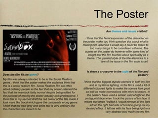
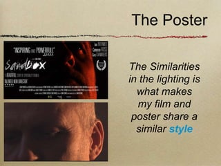
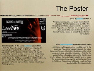
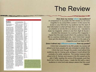
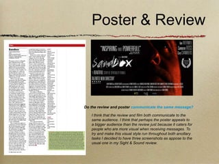
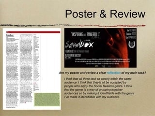
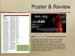
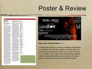
The document discusses how the filmmaker's poster and review complement their main film project. The filmmaker believes their poster and review communicate effectively with the intended audience for the film, which is viewers interested in the social realism genre. Both the poster and review reference themes of spirituality and art that are present in the film. Stylistically, the film, poster, and review share a similar lighting technique. The review provides more insight into the film's content and themes than the poster but both appeal to the target niche audience. Overall, the filmmaker aims to create a consistent style and message across all three of their products to market and discuss the film effectively.
George is planning a media project on the horror film franchise Jigsaw. He intends to create four character posters, a main movie poster, a DVD cover, and a trailer to promote a comedy/horror film concept. The concept involves George, a vlogger, becoming haunted by a ghostly nun from a local legend. He must work with his friend Sam, the cameraman, to prevent the nun and a possessed Billy the Puppet doll from meeting. George will need to use Adobe Photoshop, his phone, computer, camera, a Jigsaw doll prop, and a scary nun costume to create his promotional materials. He aims to target a male audience aged 16-36 who enjoy both comedy and
The document analyzes and describes the process of creating a horror movie poster. The creator was inspired by the poster for the movie Insidious. They edited a photo of one of the protagonists, adjusting colors and effects to make her eyes orange and scary. Text was added including the title, tagline, release date, and production company logos. Formatting and effects were applied to make the text stand out. The final poster uses a black, white, and orange color scheme to be intriguing while representing the horror genre.
The document discusses the effectiveness of combining a film poster and film review as ancillary tasks for a short film project. The poster uses a close-up image of the main character to convey her neutral sadness and follows drama film conventions. Inspiration was drawn from the poster for "Precious." The review uses simpler fonts and colors with images that provide context about the characters and plot. Both the poster and review aim to promote the film and provide insight in different ways to raise awareness and interest in the film.
The document discusses the effectiveness of combining a film poster and film review as ancillary tasks for a short film project. The poster uses a close-up image of the main character to convey emotion and intrigue, following drama film conventions. Inspiration was drawn from the successful film Precious. The review also aims for simplicity, using different fonts and images to portray the film's tone. Both the poster and review aim to promote the film and raise awareness through different perspectives.
The document discusses the effectiveness of combining a short film with ancillary tasks of a poster and film review magazine page. It describes how the poster uses a close-up image of the main character to convey emotion and intrigue without context, and features a simple color scheme to uphold the film's serious drama genre. The review compares the poster's inspiration from the successful film "Precious" and analyzes font and image choices to effectively promote the film within the constraints of magazine conventions. Both the poster and review aim to intrigue audiences and give insight into the film's plot and execution in a clear, simple manner to evaluate the combination of main product and supplementary marketing materials.
Evalution Question 2: How Effective Is The Combination Of Your Main Product A...mags249
The document discusses the effectiveness of combining a film poster and film review as ancillary tasks to promote a short film. The poster focuses on the main character's facial expression to convey emotion and intrigue without revealing details. Inspired by the poster for "Precious", it uses a simple color scheme and font. The review provides a plot summary, ratings, and images depicting relationships between characters in a darker light. Both follow conventions of their genres and complement each other in marketing the film while maintaining a theme of simplicity.
Evaluation Question 3 - What have you learnt from audience feedback?LStacy95
The feedback provided positive responses to various elements of the film trailer, poster, and magazine cover. The trailer's use of music to set tone, creative editing decisions, and final shot were all commented on. The association between the three promotional items and their representation of the film's time period and storyline were recognized. Overall, the feedback indicated the materials successfully promoted curiosity about the film and targeted the intended teenage/young adult female audience. A few suggestions were made but the feedback was overwhelmingly positive.
The document discusses the design process for a movie poster. It begins by researching conventions of typical movie posters such as including the title, credits, release date, and logo. Photos are taken of the main character in different poses. Fonts, colors, and backgrounds are experimented with to develop the visual style. Elements from example posters like Juno are incorporated, such as a hand-drawn effect. The poster aims to attract a young audience through its use of bold, bright colors and an emphasis on the comedic "nerdy" character.
In what ways does your media product useetaylorchs
The document discusses the design process for the front cover of a magazine advertising the author's film. Research was conducted on existing magazine covers to identify conventions. Key influences included the simplicity and minimalism of Entertainment Weekly. The cover features the film title in red, the tagline "School's Out This Summer", and a photo shoot of the main character. Additional stories and classmate film trailers are included to advertise other works.
The document discusses conventions used in movie trailers that the author took inspiration from for their own animated comedy trailer project. These include using a school bell at the start to indicate the school setting, introducing characters through animated titles or profiles, and juxtaposing dialogue to form fake conversations for comedic effect. The author analyzed trailers for films like Mean Girls, Angus Thongs and Perfect Snogging, Step Brothers, and Diary of a Wimpy Kid to find techniques to incorporate into their trailer.
The student used a variety of media technologies in constructing, researching, planning, and evaluating their promotional film package project. For research, they used online tools like Google search, YouTube, and bloggers. Planning was done using PowerPoint and Excel. Photoshop was the primary software for designing visual elements. Final Cut Pro was used to edit the film teaser. Evaluation involved Prezzi for a presentation, social media, and surveys to collect feedback. The student found some technologies like Photoshop and Final Cut Pro challenging to learn but beneficial. Overall, the technologies allowed for effective research, planning, and presentation of the project.
The document provides an evaluation of the author's media product. It discusses how the product uses and challenges conventions of real music videos. The author created a music video for a synth-wave genre of music, which challenges conventions by not including lyrics. Research showed music videos usually relate the video to the music. The author included fast pacing to match upbeat parts of the instrumental music. Feedback showed most viewers understood it as a montage and enjoyed the concept of a late night drive for self-discovery, though some found the camera work too shaky.
The student created a thriller film trailer and accompanying promotional materials. They conducted research by watching similar film trailers online. Feedback on the trailer was positive, praising the typical conventions used while also suggesting some ways to improve variety. The student learned from creating the materials and received feedback, identifying strengths like clear images and effective conventions, as well as weaknesses like needing more variety. Media technologies helped at all stages, from online research to filming, editing, and designing promotional items.
The document provides an evaluation of a graphic narrative comic book project. It summarizes the key decisions made in creating the comic book including choosing an open and closed linear structure with multi-stranded characters. Components like conflict, cause and effect, climax, and motivation were included. Images were constructed with textures, varied shapes, and solid lines. Captions and a combination of words, images, and text were used. The representation targeted older audiences interested in the historical topics of African and English cultures during slavery. Positives included emotional facial drawings and a well-thought out storyline, while weaknesses were difficulty drawing images and using editing software. Overall it was deemed a success despite flaws.
The target audience for the horror film poster and magazine review is male, aged 15-25 from urban areas who enjoy horror films. The poster uses dark imagery and minimal text to subtly imply death and mystery. While minimal, it would work as a "teaser poster". The magazine review includes stills from the film to set the atmosphere, compares the film to others in the genre, and gives an overall positive review, aiming to attract the target audience to the independent short film. Feedback suggested the poster effectively captured horror conventions while the article could be improved with a clearer layout and more film information.
The document discusses the creation of a film poster and film review as ancillary tasks to promote a short film. Photoshop was used to design both pieces as it allowed for professional manipulation of images and text. Color schemes, fonts, layouts, and images were carefully selected to convey the drama genre of the film and elicit interest from the target audience. Feedback acknowledged strengths in telling the film's story but also opportunities for improvement in the designs.
The document discusses the creation of a film poster and film review as ancillary tasks to promote a short film. Photoshop was used to design both pieces as it allowed for professional manipulation of images and text. Color schemes, fonts, layouts, and images were carefully selected to convey the drama genre of the film and elicit interest from the target audience. Feedback acknowledges room for improvement but concludes the poster and review largely accomplished the goal of advertising the film's storyline and intriguing potential viewers.
The document discusses the creation of a film poster and film review as ancillary tasks to promote a short film. Photoshop was used to design both pieces as it allowed for professional manipulation of images and text. Color schemes, fonts, layouts, and images were carefully selected to convey the drama genre of the film and elicit interest from the target audience. Feedback acknowledges strengths in telling the film's story but also opportunities for improvement in the designs.
The document discusses the effectiveness of combining a main media product (a short film) with ancillary tasks (a film poster and film review).
The goals of the ancillary tasks were to help promote the short film and target the intended audience. Considerations like color scheme, images, and fonts were chosen for both the poster and review to clearly reflect the drama genre of the film and allow audiences to understand the storyline.
Feedback is provided on how specific design elements of the poster and review met the goals, including conveying emotions, symbols, and hints about the film's plot. In conclusion, the document argues that the ancillary tasks were highly effective at promoting the film and engaging the target audience using drama conventions.
The document discusses how the author used real media conventions and new media technologies in creating their short film project. Specifically, it summarizes how they kept the protagonist centralized in frames, used shot angles for cinematic effect, and maintained consistent soundtrack to engage the audience. It also notes how feedback revealed a lack of close-up shots made the story confusing at times. Throughout, the author researched conventions online and used Adobe software, YouTube, and blogs to aid construction, research, planning and evaluation.
The document provides feedback from audiences on a short film and accompanying media products created by the author. Questionnaires given to 40 and 50 people found that drama was the most popular genre. For the film poster, most audience members were attracted to the main image but some thought it was a crime film rather than thriller. The author learned they should have included a billing block. Overall, audience research is beneficial but results may not be accurate and limited feedback was received. The author used online research, Photoshop, and InDesign in creating the film and ancillary texts.
The document provides feedback from an evaluation of a short film project. It discusses how the film incorporated conventions like mystery and tension to engage audiences. Research was done on existing films to understand conventions. Feedback was collected through questionnaires which found drama to be the most popular genre. Further feedback on the film found the main image attracted attention, while some thought it was a crime or horror film based on colors. Lessons were learned about including more images and a billing block to improve promotion. Media technologies like Photoshop, InDesign and online research were used in the project's production, planning and evaluation.
The document analyzes several film posters and how they use and challenge conventions of real film posters. It summarizes key conventions the posters employ, such as large eye-catching titles, intriguing images, and placement of text. It then examines how the document creator's media product poster draws influence from the analyzed posters in its use of a bold central image, font choices, and studio logos. Some conventions, like persuasive language or character names, are purposefully not included to simplify the design. The poster challenges conventions by centering the title and using an ambiguous layered image instead of a single focal point.
The document discusses the media student Carla Sharpe's evaluation of her horror movie trailer project. She used conventions like shadowy imagery, fonts suitable for horror genre, and age ratings to make her trailer resemble real trailers. She received feedback that helped her improve the professionalism of her trailer, poster, DVD cover, and magazine cover by adding elements like barcodes. She researched examples online using sites like Trailer Addict and created her products using Macromedia Fireworks for its user-friendly tools.
The document provides details on creating a teaser poster and film poster for a fantasy film project. It discusses inspiration taken from Tim Burton's unique fantasy style. Details are given on exploring locations, costumes, makeup inspiration from Helena Bonham Carter, and professional photographers like Tim Walker. Fonts, slogans, and editing techniques in Photoshop are tested out. Final drafts of the teaser poster featuring a pocket watch and the film poster with two lead characters are presented. The film poster is further refined by adding special effects, layers, quotes and production credits.
The document analyzes existing movie posters and a DVD cover to research design elements for a school project. Key aspects discussed include using hidden Easter eggs when brightness is adjusted, portraying different sides of a character's face, and including minimal text. Common features across posters are single character headshots and asymmetry. The student plans to include hidden brightness elements in their work to demonstrate design skill and passion.
Here are the key ways I used technologies in the construction, research, planning, and evaluation stages of my media production:
- Used Google Maps to scout filming locations during initial planning for Arboretum film
- Relied heavily on YouTube for tutorials to learn Photoshop skills for creating poster and review, like using layers and adjusting colors
- Facebook group chats helped organize focus group meetings and get feedback even when not together
- IMDB and Google provided background on films referenced in research, like details on director Edgar Wright's techniques
- Camera tutorials on YouTube helped set up Canon 550D to get best lighting and shots for actual production
- Presentation software like Prezi and PowToon made research and planning
The document discusses the conventions used and challenged in the production of a short horror film and its accompanying promotional materials, including the poster and double page spread.
For the film, conventions of low-key lighting, close-ups of characters, and voiceover were followed to develop tension and storytelling. Jump cuts and handheld camerawork were not used to maintain a sense of viewer comfort.
The poster followed conventions like a tagline and film title but placed them unconventionally. It featured a staged scene but missing a main character. Dark colors were used but the antagonist was removed.
The double page spread included a film summary, images, and a pull quote as per magazine conventions while challenging large centralized images
The document discusses the effectiveness of combining the main product (film) with ancillary tasks (poster and review). It finds that the poster and review complement the film well by communicating similar themes, issues, and audiences. Both the poster and review reference the film's realism genre through techniques like contrasted lighting. The review provides more context and insight than the poster, potentially attracting a wider audience. Overall, the author believes the three products work well together to represent the film and its intentions more fully than the film alone.
The document discusses the creation of a silent film targeted at a younger audience and the feedback received from test audiences. Key points:
- The film is a modernized silent film in the style of 1920s films, with the goal of appealing to and developing the silent film genre for younger viewers.
- Test audiences provided feedback that the storyline, effects, and music were well-done and helped change their perspective of silent films.
- Feedback also noted some areas for improvement, like certain camera shots being less direct and a longer gap between the murder and start of the film.
- Feedback on promotional materials found the poster could have had better colors and layout, while the review had a clear structure but some
The document discusses the filmmaker's process in creating a silent film targeted at a younger audience. They aimed to modernize conventions of 1920s silent films while keeping some traditional elements. This included using close-up shots, sped up editing, and black and white cinematography. Sound was limited to background music instead of effects. The filmmaker analyzed other directors' styles and sought to portray a version of reality relatable to youth through the characters and some modern elements in the plot. Feedback on an early cut helped them improve editing and visual elements for the final film.
The combination of the film poster and magazine review created for the film "Malice" effectively promote the film and tie together as ancillary texts. Both feature the main character Levi in a distressed facial expression to convey fear, the overarching emotion in the thriller/horror film, and establish him as the main character. Elements like the film stills running down the review page and similar designs and images used on both the poster and review help the audience instantly recognize the film being promoted. The classification rating, genre, and reviews presented aim to inform and appeal to the target audience. Overall, the ancillary texts work well together and with the film to create a cohesive brand identity around the post-production of "Malice
The combination of the filmmaker's main product (film) and ancillary texts (poster and magazine review) effectively promote the film. The poster and review tie into the film by featuring stills and conveying the film's emotion of fear/distress. Both highlight the main character Levi to create intrigue. Similar designs and imagery were used to connect the products and instantly signal they relate to the same film. The genre and plot are represented accurately across the materials to engage the intended audience. Overall, a cohesive brand identity was achieved through the consistent theme running through the finalized products.
This document describes the process of creating a film poster for a student's short film. The student went through three drafts, learning from mistakes in each version. The first draft used a shot directly from the film but was too revealing of the plot. The second draft included quotes from film reviews but had design issues. The final poster featured a darkened still image, simple color scheme, and production details to look more professional in line with real film posters. The student aimed to tease the film's themes without giving too much away through the iterative design process.
This document summarizes and analyzes the key features of a film poster and review page created by the author for their short film. The poster includes the film title, credits, and an image of the main character surrounded by woods to convey she feels powerless. The review page uses the same font and color scheme as the poster for consistency. It features an action shot of the main character looking confused, text about the film, and reviews. The author believes these products are effectively linked through their similar design features and contextual clues about the film's plot and characters.
F:\Media Studies\Evaluation Blog\Evaluation Blog Poster #1 Analysisbir
1) The document discusses a film poster design that uses conventions like including the title, release date, and main image while breaking conventions by not including a tagline or description of the unique selling point.
2) Specific design choices are explained like keeping the main image in black and white to fit the horror genre and "smudging" the text to appear ghostlike.
3) The poster aims to create mystery and focus attention on the main image by omitting explicit details about the plot or storyline.
This is my evaluation for question 2 of my A2 Media coursework. The question was: How effective is the combination of you main product (film trailer) and your two ancillary tasks (film poster + film magazine cover).
The document summarizes the creative choices made in producing a short film, poster, and film review. Key elements included using only images of the main male characters on the poster to avoid spoilers, selecting action-oriented images, using a lined paper background inspired by Diary of a Wimpy Kid, employing a masculine blue color scheme to appeal to male viewers, and consistently using a bold black and white title font along with a web address to promote the film across materials.
The document summarizes the creator's process for producing a short film along with two ancillary tasks - a poster and film review. Key details included choosing images for the poster and review that did not reveal plot details, using masculine blue colors and bold fonts to appeal to a male audience, and including consistent elements like a lined paper background and web address across the tasks to create cohesion.
The document discusses ideas for a film poster based on research of other similar films. It analyzes several film posters that effectively portray themes through images of characters in meaningful settings. Key ideas discussed include using backdrop images to represent themes, focusing on main characters by having others look at them, and blending character faces to show a close relationship while drawing the eye. The document considers incorporating these techniques while developing a unique poster that captures the genres and storyline of the original film.
1) The student created a film poster, magazine review, and short film for a thriller genre project. They researched conventions of thriller posters and magazine reviews to inform their designs.
2) For the poster, they chose a dark color scheme and included a mysterious photo and logline to intrigue viewers. Inspired posters used faces and text overlays.
3) The magazine review included standard elements like ratings, photos and details. It related to the poster through matching colors and images.
4) Overall, the student felt their poster worked best but that the poster, magazine and film complemented each other and would be moderately successful promoting a thriller.
This document discusses the process of researching and creating an art house film. It begins by analyzing conventions of art house films to better understand what techniques are commonly used or subverted in the genre. This allows the filmmaker to be more creative in developing their own film. Various drafting and planning techniques are discussed, including storyboarding, testing effects, and gaining audience feedback through surveys. Media technologies play a key role in all aspects of filmmaking, from research and planning to shooting, editing, and sharing the final product. The goal is to either follow or challenge conventions to effectively communicate the intended message.
This document discusses Lauren Knappett's short film "Mind Rewind" and the process of creating it. It explores how she researched art house film conventions by analyzing other films in the genre. This helped her understand how conventions could be followed or subverted. She created storyboards and test effects using Adobe Premiere. Surveys of her target demographic provided feedback that informed her filmmaking choices. The final film utilized unconventional techniques like reversing scenes and color/lighting effects to portray emotion.
How effective is the combination of your main product and ancillary texts?willgosling
The document discusses how a film poster and review attract different audiences. The poster uses a minimalist, natural style inspired by other social realism films to attract an audience interested in that genre. It creates ambiguity about the film to allow audience interpretation. The review is written in the sophisticated style of a film magazine, using more text than images to attract an intellectual audience interested in analysis. It also draws connections to other acclaimed films to suggest this one as worth watching.
The document discusses the creation of a film poster and film review as ancillary tasks to promote a short film. Photoshop was used to design both pieces as it allowed for professional manipulation of images and text. Color schemes, fonts, layouts, and images were carefully selected to convey the drama genre of the film and elicit emotion from the target audience. Feedback acknowledges room for improvement but concludes the poster and review largely succeeded in advertising the story and enticing viewers.
The document discusses the genre of psychological thrillers and how the author applied common conventions of the genre in their movie trailer, poster, and magazine. It explains that psychological thriller trailers are typically fast-paced, use voiceovers, and feature low lighting to build tension. The author's works include these elements to be consistent with the genre. Additionally, the poster features an extreme close-up of an eye to portray fear and the magazine follows standard magazine layouts.
The document discusses the effectiveness of ancillary tasks created to promote a short film. These included a film poster and film review created in Photoshop. The review used bold colors and fonts to stand out while matching the film's genres of drama, action, and fantasy. The poster features the main character with an intriguing expression to draw in viewers. Both ancillary tasks stuck to genre conventions and used familiar fonts and imagery to effectively promote the film and catch audience attention.
The student created a film poster and review for their short film project. They researched film posters and reviews from magazines to understand conventions. Their poster used photos from the film and fonts/layout inspired by the Avatar poster. Their review was inspired by Empire magazine's style. They felt their masculine-toned ancillary tasks effectively promoted the action-adventure genre film to their target audience.
1. How effective is the combination of your main
product and ancillary texts?
Evaluation Question Two
2. The Poster
Are themes and issues visible?
I think that the facial expression of the character on
the poster make you think question alot about what is
making him upset but I would say it could be linked to
too many things to be considered a theme. The
quotes on the poster do however offer some kind of
insight that the film touches about spirituality as a
theme. The painted style of the title also links to a
few of the issue in the film such as art.
Is there a crossover in the style of the film and
Does the film fit the genre? poster?
My film was always intended to be in the Social Realism
genre. I think that the poster makes the audience think that I think that the biggest stylistic element in both my film
this is a social realism film. Social Realism film are often and in my film is lighting. In the film I used a lot of
about ordinary people so the fact that my poster retained the different coloured lights to make the scenes look good
fact that the man look fairly normal despite being edited for as well as make connections with micro to macro. In
the purpose of making the poster actually look professional. I the poster I have used a similar kind of light on the
think that in my second draft the red colour of the title made it protagonist face when I took the picture of his face. It
look more like blood which gave the completely wrong genre. meant that when I edited it I could remove all the light
I think that the new grey and white text is very ordinary like left on the right had side of his face giving me my
the characters are meant to be. desired effect. It left me with his face being light in a
very abstract way much like my film.
4. The Poster
Does it promote my film ?
The poster uses quotes and award nominations to
tell people that other people have found the film
interesting. I think that but darkening the characters
face in the poster and therefore not giving him much
of an identity I have created intrigue that will
hopefully make a sense of curiosity that will entice
my audience
What preconceptions will the audience have?
Does the poster fit the same Audience as my film?
I think that my film poster gives very little away to the
I think that the poster is very simplistic yet intriguing. I’m
audience. No props or clues are seen in the actual
hoping that my audience for my film who I hope are
background image. I like to think that this would create a
appreciative of fine details will be the same with my film
sense of mystery around the character. I think that the
poster. Tiny elements of mise en scene such as his messy
paint like font will suggest to them that the film does
beard are what makes the film fit in genre so if they don’t
involve art as a theme, but again not allot is given away.
realize things like that they wouldn’t take a lot from either my
The quote does actually say that spirituality is a theme
film or poster. I have faith that my audience will be
in the film so the audience will have a very broad idea
appreciative of subtle representation instead of flashy over
about what the film could include.
the top graphics.
5. The Review
How does my review inform my audience?
In comparison to my poster the film review is a lot more
insightful to my actual films content. In this scene the
review is very informal to my audience but the style of
that information is what will help them to make a decision
on whether or not the film is a serious one. I decided to
base my magazine article on one from Sight & Sound. I
decided this because it is a serious film magazine. I
hoped that this style would inform the audience that my
film is a serious intellectual one. I don’t think that I would
have got the desired effect if I’d wrote it in the style of a
magazine such as Heat or OK!.
Does it attract any different audiences from my poster?
I think that compared to my film poster my review will
attract a lot more people who are intrested in artistic films.
I think that even though the poster could attract this
audience due to it being quite ambigus it could attract the
curiosity of a wider audience. The review however talks
about a lot of themes and issues in the film aswell as the
plot. If after reading this some of the people could feel
that it isn’t a film they’d enjoy. I made the film with a niech
audience in mind and was always aware that this could
happen.
6. The Review
Is the review bias and will this have an effect?
I think that my film review can’t help but be bias
because it was written by my. However when I was
writing the review I didn’t want to be blind for its flaws.
I think that if I had it would have effected the integrity
of the review itself. I don’t think that the review will
have a knock on effect. If it was a film actually being
distributed then the review surely would have sparked
a lot of controversy.
What do we learn about the genre & director intentions?
You learn a lot about my intentions. I think that
because I wrote the review I made sure that I included
things that I felt we’re close to my heart when making
the film. Genre is spoke about a lot more literally. I
actually refer to the film as being Social Realism a few
times. I don’t however talk about the effects that my
film will have on the genre, I thought that approaching
genre theory would have gone out of context on a film
review therefore failing it as an ancillary task.
7. Poster & Review
Do the review and poster communicate the same message?
I think that the review and film both communicate to the
same audience. I think that perhaps the poster appeals to
a bigger audience than the review just because it caters for
people who are more visual when receiving messages. To
try and make this visual style run throughout both ancillary
tasks I decided to have three screenshots as appose to the
usual one in my Sight & Sound review.
8. Poster & Review
Are my poster and review a clear reflection of my main task?
I think that all three task sit clearly within the same
audience. I think that they’d all be accepted by
people who enjoy the Social Realims genre. I think
that the genre is a way of grouping together
audiences so by making it identifiable with the genre
I’ve made it identifiable with my audience.
9. Poster & Review
What stylistic elements are used in all three products?
It is harder to link the review and the poster in stylistic
elements because I followed a format for my Sight &
Sound review. However in my poster and film I used
similar lighting that was just exaggerated in my film poster
to make room for text and titles. I also used the same title
in both my film and in my film poster. I think that this house
style is important because it allow all of my ancillary tasks
and film as one synergized product.
10. Poster & Review
Ways that all three tasks link
I wanted the products to have a seamless integration
so I wanted even the fine details to be this way. I’ve
used the same production titles in my film as I have
in m y poster. I also made sure that both the different
(made –up) roles actually where given to the same
people in both the review and in the film poster.