The document discusses various ways in which the media product challenges conventions of real magazines.
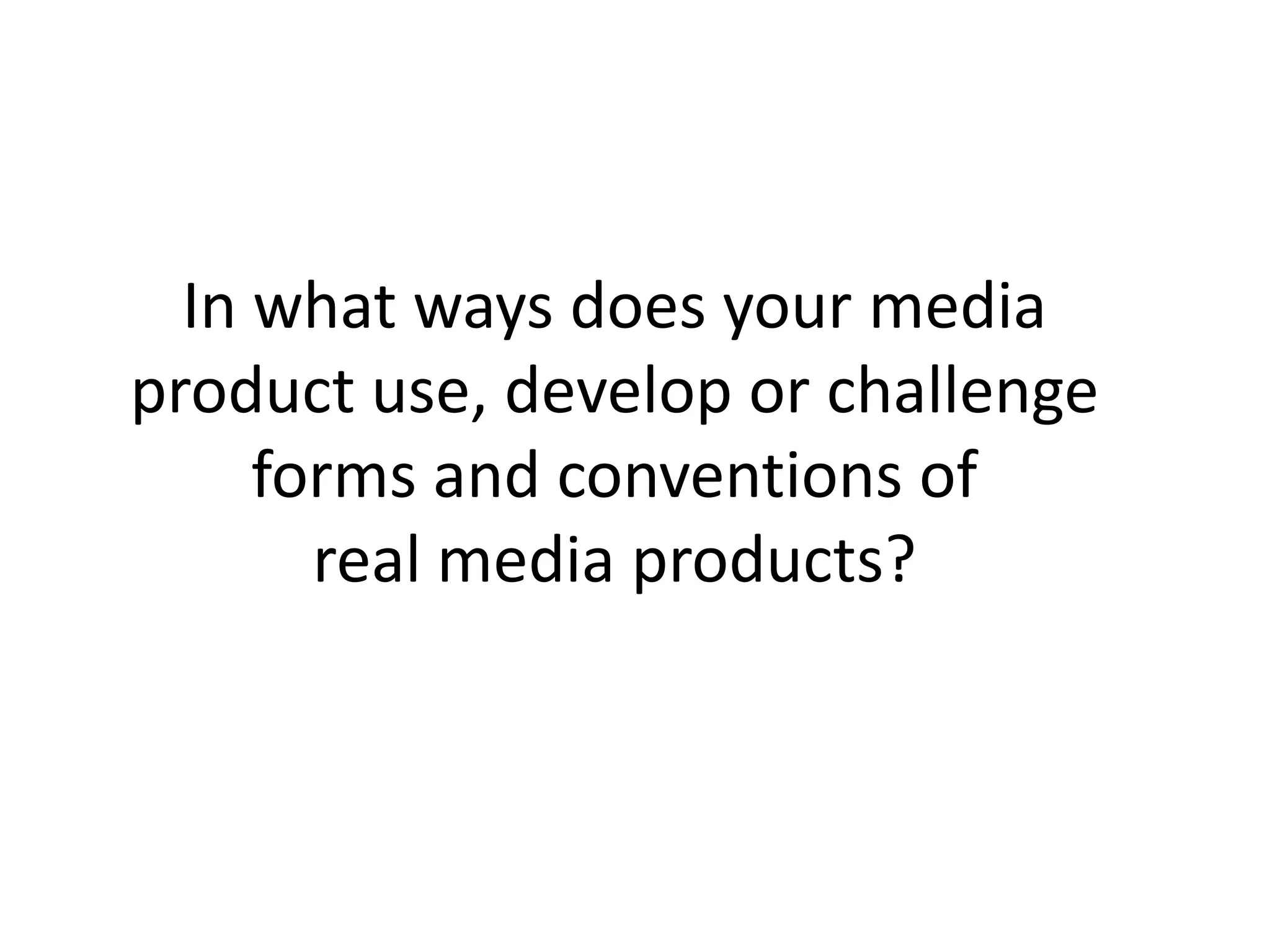
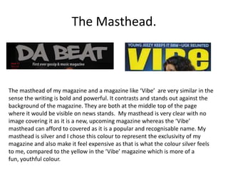
It describes making the masthead bold and visible like Vibe magazine but with a silver color to represent exclusivity. Studio photography is used instead of location shots to look professional.
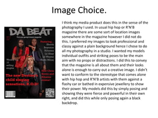
The front cover includes standard elements like masthead and barcode but keeps the simplicity with two colors. It also includes a QR code and slogan to engage readers.
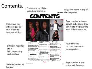
The contents page lists feature sections in bold and matches pictures to text. Individual models are labeled in the interview section unlike typical magazines.


![Evaluation[1]](https://cdn.slidesharecdn.com/ss_thumbnails/evaluation1-120305073155-phpapp01-thumbnail.jpg?width=640&height=640&fit=bounds)


