
Recommended
More Related Content
What's hot
What's hot (20)
Viewers also liked
Viewers also liked (20)
Similar to Molly question 5
Similar to Molly question 5 (20)
More from bir
More from bir (20)
Recently uploaded
Recently uploaded (20)
Molly question 5
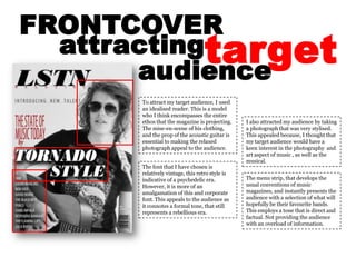
- 1. FRONTCOVER target attracting audience To attract my target audience, I used an idealised reader. This is a model who I think encompasses the entire ethos that the magazine is projecting. The mise-en-scene of his clothing, and the prop of the acoustic guitar is essential to making the relaxed photograph appeal to the audience. I also attracted my audience by taking a photograph that was very stylised. This appealed because, I thought that my target audience would have a keen interest in the photography and art aspect of music , as well as the musical. The font that I have chosen is relatively vintage, this retro style is indicative of a psychedelic era. However, it is more of an amalgamation of this and corporate font. This appeals to the audience as it connotes a formal tone, that still represents a rebellious era. The menu strip, that develops the usual conventions of music magazines, and instantly presents the audience with a selection of what will hopefully be their favourite bands. This employs a tone that is direct and factual. Not providing the audience with an overload of information.
- 2. CONTENTSPAGE target attracting audience To attract my target audience within my contents page I have changed the usual design of a contents page and I have incorporated screen-shots of four pages of the magazine. I think that this attracts to my target audience because it directly displays the bands that would be included in my magazine. Therefore, the audience are attracted to read more as the content is displayed more visually to them. I have incorporated a short piece of literary content into the contents page under the title of each page. This is similar to other magazines that are focused on the literary content of their magazines. Therefore this attracts my target audience because they can read a well written snippet of information regarding the page they want to read. The photographic material portrays a clear visual link to the bands, and this therefore links to the needs of my target audience because of their assumed interest in photographic content as well as music. Because these photos are of the highest quality that I think I could take, the target audience would want not only want to red the magazine but keep it for the visual attributes.
- 3. DOUBLEPAGESPREAD target attracting audience He photography in this section is similar to that of the entire magazine, therefore attracting my target audience though appealing to their ulterior interests. The colours of the image maintain a house style that follows the colours of the text headings and others headlines of the magazine. This maintains consistency and makes the magazine much easier to view. To appeal to my audience I have conformed to the conventions of a literary based music magazine, using a corporate font to portray my article. There much artistic merit in this as a formal design that can relate to the audience will capture their attention and take the contents of the article seriously.