Signs & Signifiers Textual Analysis of Music Magazines
Evaluation activity 5
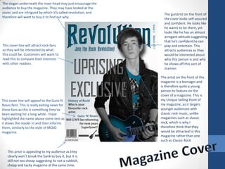
1. The slogan underneath the mast-head may just encourage the audience to buy the magazine. They may have looked at the cover, and are intrigued by which it’s called revolution, and therefore will want to buy it to find out why. The guitarist on the front of the cover looks self-assured and confident. He looks like he wants to be there, yet looks like he has an almost arrogant attitude suggesting that he’s confident he can play and entertain. This attracts audiences as they would be interested about who this person is and why he shows off this sort of manner. This cover line will attract rock fans as they will be interested by what this could be. Customers will want to read this to compare their interests with other readers. The artist on the front of the magazine is a teenager and is therefore quite a young person to feature on the cover of a magazine. This is my Unique Selling Point of my magazine, as it targets younger audiences with classic rock music, unlike magazines such as classic rock, which is why I therefore think that they would be attracted to this magazine rather than one such as Classic Rock This cover line will appeal to the Guns N Roses fans. This is really exiting news for these fans as this is something they’ve been waiting for a long while. I have highlighted the name above some text as it draws the reader in and then informs them, similarly to the style of MOJO magazine. Magazine Cover This price is appealing to my audience as they clearly won’t break the bank to buy it, but it is still not too cheap suggesting its not a rubbish, cheap and tacky magazine at the same time.
2. Contents Page Silhouette of a guitar. Fits in with theme and just makes the audience more interested in page Contents features a lot of rock related pages and a lot are based on classic rock stories and bands. This will interest audiences and make them want to buy the magazine to find out more. Again like NME and Kerrang. Here I have included a large image of my artist. This artist is the main story in the magazine and so is therefore is the largest picture, and the first thing you see. This will appeal to the audience, because this main story is the reason that they bought it in the first place. I have included a section about news, that talks about latest happenings in rock music. In this case, it is to do with Guns N’ Roses. This will interest my target market as they will want to know all the goings on, to see if their is a change in something that they are particularly interested in. I used a simple colour scheme by using mainly greys and blues as I thought this seems appealing to my audience. I used fewer images as I thought that my target audience would prefer less yet bigger images, a lot like an NME contents page. Events section shows upcoming festivals and tour dates. Readers will look for this page as they will want to know who they could possibly see in the near future. Another section is review, which will review new and old music and compare with others. This will interest the market as they may be looking for new music and this could find it for them
3. I have repeatedly used the silhouette of the guitar across the top of the page. This lets audience know that this is a rock magazine and is a nice feature to the magazine. It makes It more eye-catching and therefore the audience are more likely to enjoy the read, as they will be more open minded after seeing this. Double Page Spread There are plenty of images spread out across the DPS, showing the band in action by playing their instruments. This keeps the audience interested and clearly shows off the rock genre. Other magazines such as Kerrang also use this technique. I think by including these, the audience will interact more with the magazine. Article includes detail about the band and then a quote from each member. This way they find out some detail about the band and then get to read the bands own opinion, making it more interactive for the user. The band is made up of teenagers. I have included these in the magazine because these are the same types of people that will read this magazine. By using younger people in the magazine, I am more likely to attract younger people to it. This is my USP, and is why I have chosen these people for my magazine. The writing is a darker shade when there is a quote, and lighter when the magazine is talking. This makes it easier to identify and clearer to read. I also think it looks more aesthetically pleasing and more eye-catching.