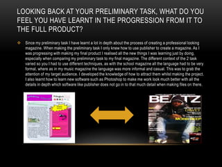
Kieron Savage.Media Evaluation
In what ways does your media product use, develop or challenge  forms and conventions of real media products?To make my magazine I looked a vibe magazines a lot for Ideas and examples of a successful magazine that focuses on a similar genre to mine. Looking at Vibe I noticed there is usually a colour scheme varying from 2-4 colours and this is kept consistent through most of the magazine. On my magazine I chose to use a colour scheme of Grey, White Black and Yellow. I chose these colours as these represent the colours that the artist on the front is wearing, and this again links the main focus back to the artist.
Around the main image I put some of my magazine features to show readers what else is going to be in the magazine. Using some of the big names such as “Usher” and “Nicki” (Nikki Minaj) which come up popular on my reader profile to help attract my target audience.  Also put other names which may attract a wider range of customers who are fans of these artists.
My Media Magazine uses a unique masthead of the magazine as the main image on the cover is intersecting part of the masthead, without making it unreadable. I used a consistent font throughout my front cover. With the title despite making it the largest text on the page I made it bold as well to help it stand out. This was something I was advised to after receiving feedback from peers.
My magazine continues stereotypical conventions of Hip-Hop and R&B which main focuses are on the artist themselves and their appearance, because in my cover I placed the image of the artist in the direct centre with the image taking up most of the front cover, automatically bringing your attention to him.I wanted to attract teenagers through the use of the main photo. I looked at Vibe mainly along with other Hip-Hop/R&B magazines, and noticed that many of the artists had a very laid back attitude about them, whilst also looking very confident and proud. This represented a  boastful attitude, which is the makes them attract their  fans. So I told I made my look very laid back whilst taking pictures for this.
Another technique od real media I used was where the image and the main masthead cross each other, it makes it look like the artist and the background have been separated and the text is in between. Using the style made the magazine look much more stylish then a simple title so I chose to adapt that into my magazine.My media product uses a form of a real media product through the layout. I took examples of Hip-Hop/R&B contents pages and created my own. The layout is simple like a Vibe magazine, making it easy to navigate through and find your page.
The main photo is almost directly in the middle of the page with a small paragraph underneath Hip-Hop/R&B magazines such as Vibe such as usually contain no more than 2 images with the main focus being on the artist featured on the front cover.
My media product uses the traditional convention of the bigger font for the headings on the page, such as “news” and “features” then the smaller font for the rest of the writing on the page. Only the writing connected directly with the images are using a bigger font then the rest of the text.For my double page spread I challenged a real media product as I have used a fairly simple image of the artist to take up the page. My genre of music usually displays the artist simply or takes the photograph in relation to the double page spread, as double page spread is just a general interview so I just kept the picture as a normal picture to match the theme of the interview. I chose to ignore the convention of including an instrument or any kind of props in the image so the focus could remain on the new artist.  I also used a few unedited images on the page so user would get a feel that he is still new and readers closer to him as there is no special effects been done on the images, representing that the images are real, as well as the artist.
I used the stereotypical convention of a music double page spread, which consists of the layout: an image covering a whole page, and then the text, which in this case is the interview covering the other page. I used this because the text is all about the artist, so I wanted to readers to be able to see the artist as they are reading the article.How does your media product represent particular social groups?My magazine appeals to both genders as the colour scheme consists of natural colours such as Black and Yellow being the colours most heavily featured throughout the magazine. If I wanted to appeal to just one gender I would have used a more subliminal leading colour scheme, such as pink to attract female customers. However the R&B/Hip-Hop fans are generally a very mixed gender fan-base so I kept the colours neutral.
The leading representation is not based purely on Music for the fan-base of this genre. Body image and appearance is a major factor in the R&B culture and has had a big effect on the followers of R&B's fashion.

Kieron's Media Magazine Evaluation

  • 1.
  • 2.
    In what waysdoes your media product use, develop or challenge forms and conventions of real media products?To make my magazine I looked a vibe magazines a lot for Ideas and examples of a successful magazine that focuses on a similar genre to mine. Looking at Vibe I noticed there is usually a colour scheme varying from 2-4 colours and this is kept consistent through most of the magazine. On my magazine I chose to use a colour scheme of Grey, White Black and Yellow. I chose these colours as these represent the colours that the artist on the front is wearing, and this again links the main focus back to the artist.
  • 3.
    Around the mainimage I put some of my magazine features to show readers what else is going to be in the magazine. Using some of the big names such as “Usher” and “Nicki” (Nikki Minaj) which come up popular on my reader profile to help attract my target audience. Also put other names which may attract a wider range of customers who are fans of these artists.
  • 4.
    My Media Magazineuses a unique masthead of the magazine as the main image on the cover is intersecting part of the masthead, without making it unreadable. I used a consistent font throughout my front cover. With the title despite making it the largest text on the page I made it bold as well to help it stand out. This was something I was advised to after receiving feedback from peers.
  • 5.
    My magazine continuesstereotypical conventions of Hip-Hop and R&B which main focuses are on the artist themselves and their appearance, because in my cover I placed the image of the artist in the direct centre with the image taking up most of the front cover, automatically bringing your attention to him.I wanted to attract teenagers through the use of the main photo. I looked at Vibe mainly along with other Hip-Hop/R&B magazines, and noticed that many of the artists had a very laid back attitude about them, whilst also looking very confident and proud. This represented a boastful attitude, which is the makes them attract their fans. So I told I made my look very laid back whilst taking pictures for this.
  • 6.
    Another technique odreal media I used was where the image and the main masthead cross each other, it makes it look like the artist and the background have been separated and the text is in between. Using the style made the magazine look much more stylish then a simple title so I chose to adapt that into my magazine.My media product uses a form of a real media product through the layout. I took examples of Hip-Hop/R&B contents pages and created my own. The layout is simple like a Vibe magazine, making it easy to navigate through and find your page.
  • 7.
    The main photois almost directly in the middle of the page with a small paragraph underneath Hip-Hop/R&B magazines such as Vibe such as usually contain no more than 2 images with the main focus being on the artist featured on the front cover.
  • 8.
    My media productuses the traditional convention of the bigger font for the headings on the page, such as “news” and “features” then the smaller font for the rest of the writing on the page. Only the writing connected directly with the images are using a bigger font then the rest of the text.For my double page spread I challenged a real media product as I have used a fairly simple image of the artist to take up the page. My genre of music usually displays the artist simply or takes the photograph in relation to the double page spread, as double page spread is just a general interview so I just kept the picture as a normal picture to match the theme of the interview. I chose to ignore the convention of including an instrument or any kind of props in the image so the focus could remain on the new artist. I also used a few unedited images on the page so user would get a feel that he is still new and readers closer to him as there is no special effects been done on the images, representing that the images are real, as well as the artist.
  • 9.
    I used thestereotypical convention of a music double page spread, which consists of the layout: an image covering a whole page, and then the text, which in this case is the interview covering the other page. I used this because the text is all about the artist, so I wanted to readers to be able to see the artist as they are reading the article.How does your media product represent particular social groups?My magazine appeals to both genders as the colour scheme consists of natural colours such as Black and Yellow being the colours most heavily featured throughout the magazine. If I wanted to appeal to just one gender I would have used a more subliminal leading colour scheme, such as pink to attract female customers. However the R&B/Hip-Hop fans are generally a very mixed gender fan-base so I kept the colours neutral.
  • 10.
    The leading representationis not based purely on Music for the fan-base of this genre. Body image and appearance is a major factor in the R&B culture and has had a big effect on the followers of R&B's fashion.