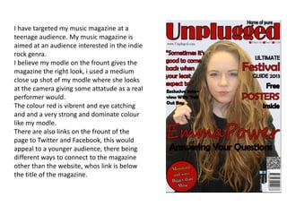
1. I have targeted my music magazine at a
teenage audience. My music magazine is
aimed at an audience interested in the indie
rock genra.
I believe my modle on the frount gives the
magazine the right look, i used a medium
close up shot of my modle where she looks
at the camera giving some attatude as a real
performer would.
The colour red is vibrent and eye catching
and and a very strong and dominate colour
like my modle.
There are also links on the frount of the
page to Twitter and Facebook, this would
appeal to a younger audience, there being
different ways to connect to the magazine
other than the website, whos link is below
the title of the magazine.
2. For my Contente page is stayed with the the
colour theme from the frount page.
I have another image of my modle this time
looking away from the camera listening to
music, this show the use of techonology. I felt
this image fitted in well with my contente
page as my modle is facing sidways with her
back to the writing.
In the bottom right hand corner i have given
the reader the option to subscribe and i have
added a smaller image of the frount cover of
my magazine.
3. For the doubble spread I again stuck to the main colours of my magazine frount
cover and content page.
I placed my image of my modle in the center of the page and shaped the writing
around the image. I choses this image and title to show that the interview is a little
edgy I believe the title entices the reader gives them a sence of interest to the
interview. The title then ties in with the image as she stiks out her toung.
I also added page numbers to make it look like a more althentic magazine.