
Recommended
More Related Content
What's hot
What's hot (20)
Similar to Contents pages analysis
Similar to Contents pages analysis (20)
Recently uploaded
Recently uploaded (20)
Contents pages analysis
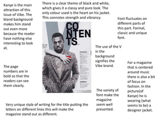
- 1. Font fluctuates on different parts of this part. Formal, classic and unique font. For a magazine that is centered around music there is also a bit of focus on fashion. In the picture(of Kanye) he is wearing (what seems to be) a designer jacket. Kanye is the main attraction of this issue of Vibe. The bland background makes him stand out even more because the reader have nothing else interesting to look at. Very unique style of writing for the title putting the letters on different lines this will make the magazine stand out as different. There is a clear theme of black and white, which gives it a classy and pure look. The only colour used is the heart on his jacket. This connotes strength and vibrancy. The page numbers are in bold so that the readers can see them clearly. The use of the V in the background signifies the Vibe brand. The variety of font make the magazine seem well presented.
- 2. The mentions of the main artists are in bold so that the readers can see it and point it out straight away. The main artist is wearing a bandana around his neck that represents the gangster stereotype that comes with hip hop music. It perceives him as a thug. Page numbers are in bold so that the readers can read it easily His clothing represents his careless attitude. This is also shown by his body language. Not serious. Notable quote from the artist on the contents page in bold. So that the audience read this first His fists are clenched that shows his strength and force The colours used(black, red and white) are all colours that are normally associated with hip hop magazines The hoodie and leather jacket are a cool gangster type clothing. His body language(head looking up and under a hood) links to his fame. He is so famous(and wealthy) that he doesn’t even have to look at the camera
- 3. The most notable/important features of this magazine have there title in bold and yellow font The subject has a moody expression on his face. His could be to express his hip hop/thug style. The low key of tone showing he is a shady/dark sided character. The names of well known artists are in bold so that the readers don’t miss them. The curtains in the background represent his showmanship. Also it references a well known album of Eminem “curtain call”. He is wearing a black suit. Black is associated with power, elegance, formality, death, evil, and mystery. Power is definitely a word that is synonymous with the artist Eminem so that they stand out and are the first ones the audience sees/reads.