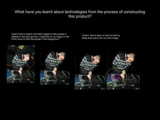
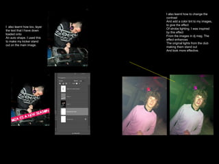
The document is an evaluation of a magazine called RELOAD! created by the author. Some key points:
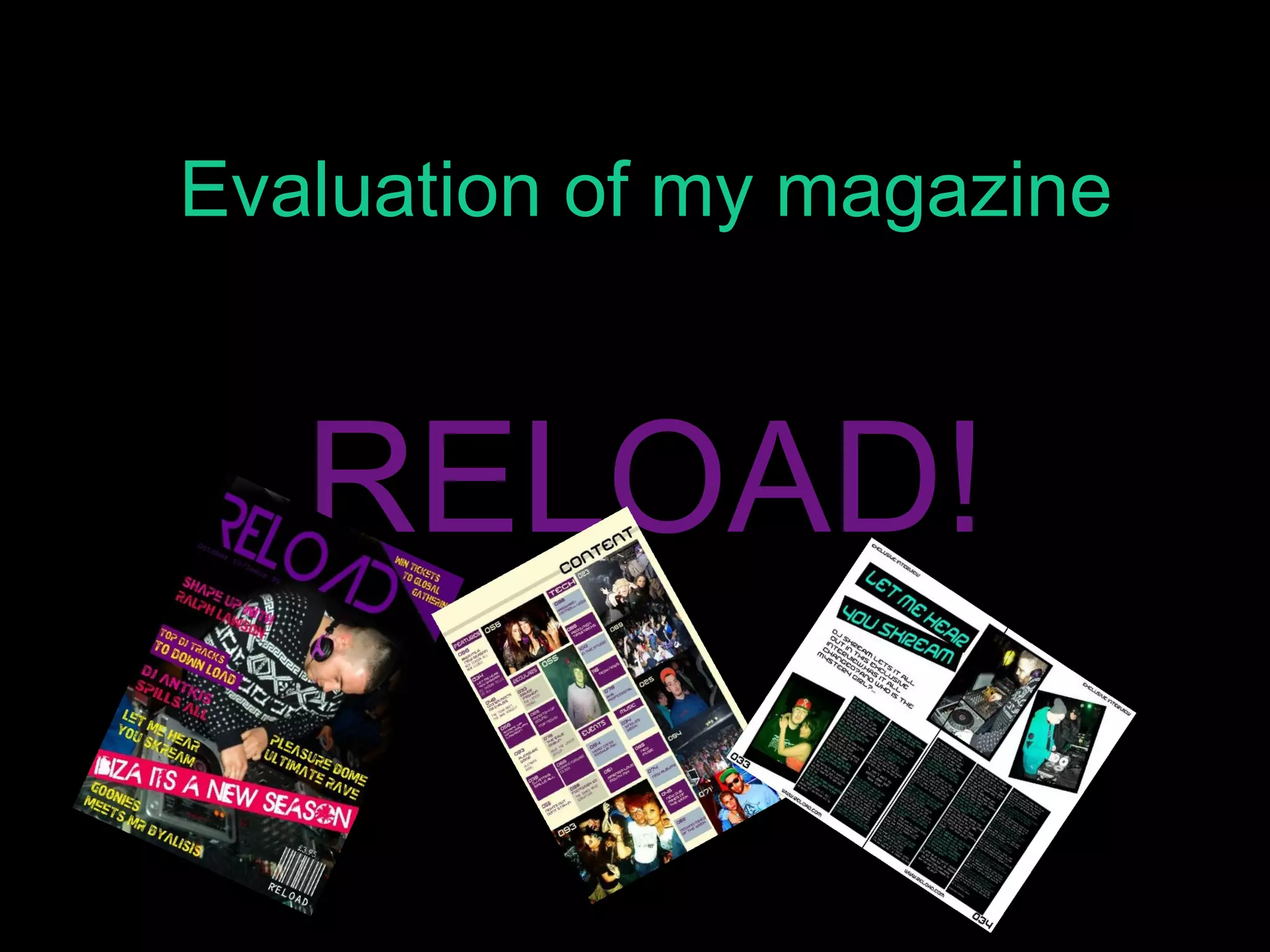
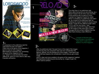
- The front cover was inspired by DJ Mag in its font, layout, imagery and use of bright colors. Unstaged photography was used.
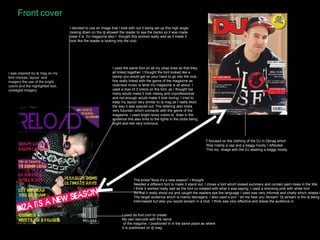
- The contents page uses consistent purple headings to aid navigation and pastel colors to avoid clutter. Imagery breaks up text and looks unstaged to relate to the target audience.
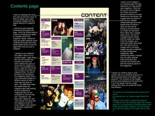
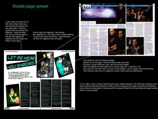
- A double page spread uses wordplay in the title and consistent fonts/layout. Images of DJs playing are included alongside an informal interview.
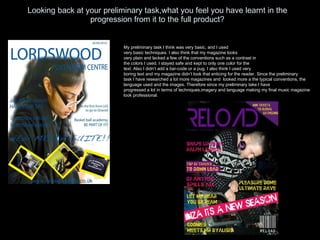
The magazine aims to represent club/rave culture through its style, colors, and unstaged photography while developing