Double page spread draft
•Download as DOCX, PDF•
0 likes•128 views
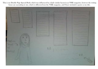
This double page spread draft was influenced by a layout in NME magazine but includes writing boxes that ascend in size rather than being the same size. A quote is used as the title which differs from the magazine layout that inspired this draft.
Report
Share
Report
Share
Recommended
Dps comparison
My double page spread is successful because it uses conventional magazine layout techniques seen in other indie magazines, such as a collage of images similar to one used in NME and dividing the body copy into three columns, helping the magazine seem more professional.
Analysis of professional double page spread presentation
This document analyzes the design elements used in a professional two-page magazine spread. Key elements include a large main image that bleeds across both pages to identify the subject, article text arranged in columns for readability, smaller supporting images, a bold headline to draw attention, the artist's name highlighted in a distinct color, a drop capital used to indicate where to start reading, and consistent colors and fonts that reflect the magazine's genre. Common elements like quotes, page numbers, and photo credits are also included to provide context and attribution.
Block designs contents page
This magazine article features images and stories about celebrities and models, including a main image for each section along with accompanying text providing details about the person featured and their story. Sections are delineated by titles and include additional images and text throughout providing more coverage of what is included in the magazine along with page numbers for reference.
Sketches
The document discusses conventions for the front cover, contents page, and double page spread of a magazine. For the front cover, it will include a pug to attract the target audience, a main image using direct address, catchy masthead and typography, barcode, free CD, footer claiming "world's best magazine", and main storyline. The contents page will include masthead about using synergy, eye-catching main image relating to the genre, page numbers, and date relating to the front cover. The double page spread will include masthead about using synergy, eye-catching and addressing main image, standfirst to introduce the article, quotes to involve readers, and layout conventions of a double page spread.
Sketches
The document discusses conventions for the front cover, contents page, and double page spread of a magazine. For the front cover, it will include a pug to attract the target audience, a catchy main image using direct address, masthead and typography, barcode, free CD, footer claiming "world's best magazine", and a main storyline. The contents page will include the masthead using synergy, a genre-related main image, page numbers, and date matching the front cover. The double page spread will also include the masthead using synergy, an eye-catching genre-related main image using direct address, a standfirst introducing the article, engaging quotes, and a conventional layout.
Codes and conventions of a contents page
A contents page for a magazine or publication follows certain codes and conventions in its layout and design. It typically uses a column format with the magazine logo and title at the top, then lists the article titles, images, and issue number in a structured format separated by dividers. Sub-images and explanatory text are also often included to provide more detail about the content.
Front cover draft 2
This document discusses a second draft of a magazine front cover. The author thought of the name "MUSAC" for their magazine while working on a failed previous cover in Photoshop. They changed the picture on the front cover because the previous image did not fit the intended indie/indie rock magazine style.
gemiusDirectEffect: мониторинг и измерение эффективности рекламных кампаний в...
gemiusDirectEffect: мониторинг и измерение эффективности рекламных кампаний в...Engage Communications
Mониторинг и измерение эффективности
рекламных кампаний в реальном времениRecommended
Dps comparison
My double page spread is successful because it uses conventional magazine layout techniques seen in other indie magazines, such as a collage of images similar to one used in NME and dividing the body copy into three columns, helping the magazine seem more professional.
Analysis of professional double page spread presentation
This document analyzes the design elements used in a professional two-page magazine spread. Key elements include a large main image that bleeds across both pages to identify the subject, article text arranged in columns for readability, smaller supporting images, a bold headline to draw attention, the artist's name highlighted in a distinct color, a drop capital used to indicate where to start reading, and consistent colors and fonts that reflect the magazine's genre. Common elements like quotes, page numbers, and photo credits are also included to provide context and attribution.
Block designs contents page
This magazine article features images and stories about celebrities and models, including a main image for each section along with accompanying text providing details about the person featured and their story. Sections are delineated by titles and include additional images and text throughout providing more coverage of what is included in the magazine along with page numbers for reference.
Sketches
The document discusses conventions for the front cover, contents page, and double page spread of a magazine. For the front cover, it will include a pug to attract the target audience, a main image using direct address, catchy masthead and typography, barcode, free CD, footer claiming "world's best magazine", and main storyline. The contents page will include masthead about using synergy, eye-catching main image relating to the genre, page numbers, and date relating to the front cover. The double page spread will include masthead about using synergy, eye-catching and addressing main image, standfirst to introduce the article, quotes to involve readers, and layout conventions of a double page spread.
Sketches
The document discusses conventions for the front cover, contents page, and double page spread of a magazine. For the front cover, it will include a pug to attract the target audience, a catchy main image using direct address, masthead and typography, barcode, free CD, footer claiming "world's best magazine", and a main storyline. The contents page will include the masthead using synergy, a genre-related main image, page numbers, and date matching the front cover. The double page spread will also include the masthead using synergy, an eye-catching genre-related main image using direct address, a standfirst introducing the article, engaging quotes, and a conventional layout.
Codes and conventions of a contents page
A contents page for a magazine or publication follows certain codes and conventions in its layout and design. It typically uses a column format with the magazine logo and title at the top, then lists the article titles, images, and issue number in a structured format separated by dividers. Sub-images and explanatory text are also often included to provide more detail about the content.
Front cover draft 2
This document discusses a second draft of a magazine front cover. The author thought of the name "MUSAC" for their magazine while working on a failed previous cover in Photoshop. They changed the picture on the front cover because the previous image did not fit the intended indie/indie rock magazine style.
gemiusDirectEffect: мониторинг и измерение эффективности рекламных кампаний в...
gemiusDirectEffect: мониторинг и измерение эффективности рекламных кампаний в...Engage Communications
Mониторинг и измерение эффективности
рекламных кампаний в реальном времени«Занимательная психолингвистика»
Добрый день! Выпуск называется «Занимательная психолингвистика» и расскажет Вам о том, что можно узнать о личностных особенностях человека, внимательно слушая его речь.
Будьте хорошим слушателем, и Вы будете вознаграждены более точным представлением о вашем собеседнике и его намерениях.
Желаем Вам успехов! Наталия Викторовна Щербакова
http://psypractica.com
Panorama listo
Este documento proporciona información general sobre los factores de riesgo de una empresa llamada pagaduria. Identifica varios factores de riesgo relacionados con la inseguridad en las instalaciones como ventanas y cortinas dañadas, una lámpara e instalaciones eléctricas defectuosas, y falta de mantenimiento general. Se recomienda realizar mantenimiento en las instalaciones, reparar el techo y reorganizar las instalaciones eléctricas.
Percentuais copa do mundo (fevereiro de 2013)
O documento apresenta o status de execução de obras para a Copa do Mundo de 2014 no Brasil, com porcentuais de conclusão variando de 24% a 48% em dezembro de 2012/fevereiro de 2013, e previsões de conclusão entre setembro de 2013 a junho de 2014.
Tugas tik
Dokumen tersebut membahas tentang hubungan back street dan konflik-konflik yang mungkin timbul. Beberapa poin penting yang diangkat adalah (1) pengertian back street yaitu hubungan yang disembunyikan dari orangtua atau faktor lain, (2) keuntungan yang dirasakan seperti masih single dan bisa dekat dengan orang lain, (3) saran untuk memahami alasan dibalik back street, dan (4) konflik-konflik yang mungkin
Planetas adrián
The document describes the 8 planets in our solar system: Mercury is the closest planet to the sun and has no moons. Venus is the second planet and is most similar to Earth. Earth is our planet and has day/night cycles from its rotation and orbits the sun in 365 days with 1 moon. Mars is the red planet with 2 moons. Jupiter is the biggest planet and is made of gas with many moons. Saturn has rings composed of rocks and many moons. Uranus is the third biggest planet with 27 moons and rotates on its axis every 18 hours. Neptune is the coldest planet with 13 moons and rotates every 16 hours.
1289 p1-spk-teknik kendaraan ringan
Dokumen ini berisi soal ujian praktik kejuruan untuk SMK bidang Teknik Kendaraan Ringan yang meliputi tune up mesin bensin, engine overhaul, perawatan transmisi manual, dan perawatan sistem kelistrikan kendaraan. Siswa diminta melakukan pekerjaan sesuai SOP selama 14 jam serta membuat presentasi diagnosis kerusakan komponen kendaraan dan dilakukan pengamatan sikap siswa selama proses pengerjaan.
Alba
This document provides brief descriptions of the eight planets in our solar system: Mercury is closest to the Sun; Venus is the second planet and third largest; Earth is the only planet that can support life; Mars has an iron oxide surface that makes it appear red; Jupiter is the largest planet after the Sun; Saturn is notable for its rings; Uranus is the third largest planet; and Neptune is the farthest planet from the Sun. The document was created by Alba Garcia and provides basic information about each planet in our solar system.
«Лидер и борьба»
Добрый день! Выпуск посвящен теме «Лидер и борьба» и раскрывает механизмы формирования имиджа лидера.
«Чтобы выжить в профессиональном отношении, мы должны что-то значить (иметь что сказать). В конечном счете, никто… ни начальник, ни товарищ по команде, ни технология… не смогут сделать этого за нас. Наша судьба и карьера сейчас больше, чем когда-либо (намного больше) зависят от нас самих». Том Питерс
Желаем Вам успехов! С уважением, Наталия Викторовна Щербакова
http://psypractica.com
Puasa+arafah
Puasa pada hari Arafah dianggap sunnah bagi seluruh umat Islam kecuali bagi mereka yang sedang melaksanakan wuquf di Arafah. Rasulullah tidak berpuasa saat berada di Arafah untuk melaksanakan wuquf, namun ada pendapat yang mengatakan beliau tetap berpuasa walaupun di Arafah. Bagi yang tidak berada di Arafah, puasa pada hari itu dianggap dapat menghapus dosa-dosa ringan selama set
«Мотивация vs манипуляция»
Добрый день! В презентации отражены отличительные признаки двух типов психологического воздействия – мотивационного и манипулятивного.
Манипулятивные техники также как и мотивационные направлены на побуждение человека к действию. Но в отличие от мотивационного воздействия манипуляция не оставляет человеку выбора. Находясь под воздействием манипулятора, он совершает действия, не совпадающие с его действительным намерениями. Рано или поздно это приводит к утрате доверительных отношений.
Самый простой способ борьбы с манипулятором – техники активного слушания и аргументации. Если вы хотите воспринимать информацию без искажений – задавайте вопросы!
С уважением, Наталия Викторовна Щербакова
http://psypractica.com
17. patrimonio kanasin
Este documento propone mejorar la calidad de vida de los ciudadanos de Kanasín a través de planes que ayudarán a obtener un mejor futuro para todos los habitantes. Se pide a la gente que se una a esta causa para mejorar la comunidad trabajando juntos.
Contents page
This document provides a comparison of contents pages from the Bible and a school magazine for girls. It notes that the Bible contents page is plain and uniform without colors or fonts to set a serious tone, while the school magazine contents page features pictures of only girls and purple colored writing to indicate it is for a girls' school through more decorative design choices.
Audience interview magazine
This document discusses an audience evaluation interview conducted by Connor Gay. The interview focused on gathering feedback from audience members about a recent performance or event. Connor aimed to understand what aspects of the performance or event the audience enjoyed and what could be improved for future events through speaking directly with attendees.
Magazine pages evaluation
1. The document evaluates the design choices made for a music magazine cover focusing on indie artist Lauren Taylor. Gold, blue, purple, and grey colors are used throughout to draw the eye across the page and create cohesion.
2. Bold fonts, prominent headings, and eye-catching images are utilized to clearly communicate the magazine's title and contents. Quotes, pictures of other artists, and band listings help advertise the range of music covered.
3. Additional design elements like a barcode, subscription information, and editor responses provide credibility and incentives for readers to purchase the magazine issue focusing on Lauren Taylor.
Contents page analysis
The document contains reviews of the contents pages of three different magazines - Q magazine, Billboard magazine, and Rock Sound magazine. The reviewer criticizes the Q magazine contents page for having a large band photograph that takes up too much space, leaving little room for other information. They suggest using a smaller photo and adding a band index or editor responses. In contrast, they praise the Billboard magazine page for its use of color, pictures, different fonts and sizes to guide the eye around the page. Finally, they analyze the Rock Sound page and say it effectively conveys its focus on rock music through images of tattooed musicians and references to rock bands, while also amusing readers with a comment about pop star Justin Bieber.
Double page spreads
This double page spread in a magazine provides information about four bands, including the featured band The Teenagers. The blue color scheme draws the eye across the text and photos. While there is not much text specifically about The Teenagers, there is context provided about other similar bands. This spread will attract readers who enjoy the music genres represented. The large quote is intended to draw readers into the story below. The black and red colors, and use of newspaper cuttings, tie into the rock music theme of rebellion. An attractive photo and quote from the artist aim to connect readers to her and encourage them to learn more in the article.
Responses
The document discusses the results of a survey conducted to help design a new music magazine. Based on the survey results, the magazine's target audience will be 16-17 year old females from working-class backgrounds. The magazine will feature indie music and include band photos, information about new releases, and details on bands on the cover to most appeal to readers.
More Related Content
Viewers also liked
«Занимательная психолингвистика»
Добрый день! Выпуск называется «Занимательная психолингвистика» и расскажет Вам о том, что можно узнать о личностных особенностях человека, внимательно слушая его речь.
Будьте хорошим слушателем, и Вы будете вознаграждены более точным представлением о вашем собеседнике и его намерениях.
Желаем Вам успехов! Наталия Викторовна Щербакова
http://psypractica.com
Panorama listo
Este documento proporciona información general sobre los factores de riesgo de una empresa llamada pagaduria. Identifica varios factores de riesgo relacionados con la inseguridad en las instalaciones como ventanas y cortinas dañadas, una lámpara e instalaciones eléctricas defectuosas, y falta de mantenimiento general. Se recomienda realizar mantenimiento en las instalaciones, reparar el techo y reorganizar las instalaciones eléctricas.
Percentuais copa do mundo (fevereiro de 2013)
O documento apresenta o status de execução de obras para a Copa do Mundo de 2014 no Brasil, com porcentuais de conclusão variando de 24% a 48% em dezembro de 2012/fevereiro de 2013, e previsões de conclusão entre setembro de 2013 a junho de 2014.
Tugas tik
Dokumen tersebut membahas tentang hubungan back street dan konflik-konflik yang mungkin timbul. Beberapa poin penting yang diangkat adalah (1) pengertian back street yaitu hubungan yang disembunyikan dari orangtua atau faktor lain, (2) keuntungan yang dirasakan seperti masih single dan bisa dekat dengan orang lain, (3) saran untuk memahami alasan dibalik back street, dan (4) konflik-konflik yang mungkin
Planetas adrián
The document describes the 8 planets in our solar system: Mercury is the closest planet to the sun and has no moons. Venus is the second planet and is most similar to Earth. Earth is our planet and has day/night cycles from its rotation and orbits the sun in 365 days with 1 moon. Mars is the red planet with 2 moons. Jupiter is the biggest planet and is made of gas with many moons. Saturn has rings composed of rocks and many moons. Uranus is the third biggest planet with 27 moons and rotates on its axis every 18 hours. Neptune is the coldest planet with 13 moons and rotates every 16 hours.
1289 p1-spk-teknik kendaraan ringan
Dokumen ini berisi soal ujian praktik kejuruan untuk SMK bidang Teknik Kendaraan Ringan yang meliputi tune up mesin bensin, engine overhaul, perawatan transmisi manual, dan perawatan sistem kelistrikan kendaraan. Siswa diminta melakukan pekerjaan sesuai SOP selama 14 jam serta membuat presentasi diagnosis kerusakan komponen kendaraan dan dilakukan pengamatan sikap siswa selama proses pengerjaan.
Alba
This document provides brief descriptions of the eight planets in our solar system: Mercury is closest to the Sun; Venus is the second planet and third largest; Earth is the only planet that can support life; Mars has an iron oxide surface that makes it appear red; Jupiter is the largest planet after the Sun; Saturn is notable for its rings; Uranus is the third largest planet; and Neptune is the farthest planet from the Sun. The document was created by Alba Garcia and provides basic information about each planet in our solar system.
«Лидер и борьба»
Добрый день! Выпуск посвящен теме «Лидер и борьба» и раскрывает механизмы формирования имиджа лидера.
«Чтобы выжить в профессиональном отношении, мы должны что-то значить (иметь что сказать). В конечном счете, никто… ни начальник, ни товарищ по команде, ни технология… не смогут сделать этого за нас. Наша судьба и карьера сейчас больше, чем когда-либо (намного больше) зависят от нас самих». Том Питерс
Желаем Вам успехов! С уважением, Наталия Викторовна Щербакова
http://psypractica.com
Puasa+arafah
Puasa pada hari Arafah dianggap sunnah bagi seluruh umat Islam kecuali bagi mereka yang sedang melaksanakan wuquf di Arafah. Rasulullah tidak berpuasa saat berada di Arafah untuk melaksanakan wuquf, namun ada pendapat yang mengatakan beliau tetap berpuasa walaupun di Arafah. Bagi yang tidak berada di Arafah, puasa pada hari itu dianggap dapat menghapus dosa-dosa ringan selama set
«Мотивация vs манипуляция»
Добрый день! В презентации отражены отличительные признаки двух типов психологического воздействия – мотивационного и манипулятивного.
Манипулятивные техники также как и мотивационные направлены на побуждение человека к действию. Но в отличие от мотивационного воздействия манипуляция не оставляет человеку выбора. Находясь под воздействием манипулятора, он совершает действия, не совпадающие с его действительным намерениями. Рано или поздно это приводит к утрате доверительных отношений.
Самый простой способ борьбы с манипулятором – техники активного слушания и аргументации. Если вы хотите воспринимать информацию без искажений – задавайте вопросы!
С уважением, Наталия Викторовна Щербакова
http://psypractica.com
17. patrimonio kanasin
Este documento propone mejorar la calidad de vida de los ciudadanos de Kanasín a través de planes que ayudarán a obtener un mejor futuro para todos los habitantes. Se pide a la gente que se una a esta causa para mejorar la comunidad trabajando juntos.
Viewers also liked (15)
Hikmah bencana alam antara musibah dan buruknya ri’ayah
Hikmah bencana alam antara musibah dan buruknya ri’ayah
More from Connor96Ryan
Contents page
This document provides a comparison of contents pages from the Bible and a school magazine for girls. It notes that the Bible contents page is plain and uniform without colors or fonts to set a serious tone, while the school magazine contents page features pictures of only girls and purple colored writing to indicate it is for a girls' school through more decorative design choices.
Audience interview magazine
This document discusses an audience evaluation interview conducted by Connor Gay. The interview focused on gathering feedback from audience members about a recent performance or event. Connor aimed to understand what aspects of the performance or event the audience enjoyed and what could be improved for future events through speaking directly with attendees.
Audience interview magazine
This document discusses an audience evaluation interview conducted by Connor Gay. The interview focused on gathering feedback from audience members about a recent performance or event. Connor aimed to understand what aspects of the performance or event the audience enjoyed and what could be improved for future events through speaking directly with attendees.
Magazine pages evaluation
1. The document evaluates the design choices made for a music magazine cover focusing on indie artist Lauren Taylor. Gold, blue, purple, and grey colors are used throughout to draw the eye across the page and create cohesion.
2. Bold fonts, prominent headings, and eye-catching images are utilized to clearly communicate the magazine's title and contents. Quotes, pictures of other artists, and band listings help advertise the range of music covered.
3. Additional design elements like a barcode, subscription information, and editor responses provide credibility and incentives for readers to purchase the magazine issue focusing on Lauren Taylor.
Contents page analysis
The document contains reviews of the contents pages of three different magazines - Q magazine, Billboard magazine, and Rock Sound magazine. The reviewer criticizes the Q magazine contents page for having a large band photograph that takes up too much space, leaving little room for other information. They suggest using a smaller photo and adding a band index or editor responses. In contrast, they praise the Billboard magazine page for its use of color, pictures, different fonts and sizes to guide the eye around the page. Finally, they analyze the Rock Sound page and say it effectively conveys its focus on rock music through images of tattooed musicians and references to rock bands, while also amusing readers with a comment about pop star Justin Bieber.
Double page spreads
This double page spread in a magazine provides information about four bands, including the featured band The Teenagers. The blue color scheme draws the eye across the text and photos. While there is not much text specifically about The Teenagers, there is context provided about other similar bands. This spread will attract readers who enjoy the music genres represented. The large quote is intended to draw readers into the story below. The black and red colors, and use of newspaper cuttings, tie into the rock music theme of rebellion. An attractive photo and quote from the artist aim to connect readers to her and encourage them to learn more in the article.
Responses
The document discusses the results of a survey conducted to help design a new music magazine. Based on the survey results, the magazine's target audience will be 16-17 year old females from working-class backgrounds. The magazine will feature indie music and include band photos, information about new releases, and details on bands on the cover to most appeal to readers.
Media mag eval
This document summarizes the influences and design choices for a music magazine called MUSAC. It was influenced by the layout and stylistic elements of real magazines like NME and Q. Specific conventions borrowed include a bold and outlined title, picture contents pages, and a subscription tab. Color schemes and backgrounds were also influenced by magazines focused on mature artists like Adele. The intended audience is males and females aged 14-19 interested in indie music. Photoshop skills were developed in creating the magazine layout. Market research informed shifting the focus from alternative rock to the more popular indie genre.
Contents page draft
This is a draft contents page for a document. The author used existing contents pages from NME magazines as inspiration for the layout and structure of their own contents page. The draft contents page aims to concisely list the key sections and information contained within the document.
Front cover draft 1
This 3 sentence summary provides the high level information from the document:
The document discusses a first draft of a front cover for a magazine. However, the author has not yet decided on a name for the magazine. In just a few sentences, the author notes they are working on their first draft for a magazine cover but are still determining the magazine's name.
Double page spread flat plan
This double page spread features an interview with an artist, including exclusive information and quotes from the interview. A photograph of the band is shown, with the artist's name and song lyrics from a quote. Key details from the interview are summarized in 3 sentences or less.
Front cover and contents page flat plan
This document appears to be a magazine, as it contains sections such as masthead, contents page, photographs of artists, and information about gossip, quotes, and opportunities. The magazine also includes an index of bands and extended information like subscriptions and editor's comments.
Magazine pitch
The author plans to create a magazine targeted towards teenage indie music fans. They will conduct interviews with their target audience to learn what types of content and magazine formats are most appealing. Their magazine will feature upcoming concerts and album releases, exclusive artist information, band gossip and photos. It will be affordably priced and offer online subscriptions to attract working class readers. Contests and prizes will also entice readers. Approximately 50 pages of content along with a supporting website and social media pages will provide a professional product that keeps the audience interested in purchasing each issue.
Media mag eval
This document summarizes a student's evaluation of their media magazine project. It discusses how the student drew inspiration from real music magazines like NME and Q for the design of their magazine. They also discuss targeting their magazine towards a broad audience of 14-19 year olds that enjoy indie music. The student reflects on learning Photoshop skills like using the liquify tool and how testing different colors suited representing indie music styles.
Responses
This magazine's target audience is primarily female aged 16-17 from working class backgrounds. To attract this audience, the magazine will feature an attractive man on the cover and focus on bands preferred by younger teenagers. It will also keep costs low and offer freebies to appeal to its working class readers who have less disposable income.
More from Connor96Ryan (15)
Double page spread draft
- 1. This is my Double Page Spread Draft, which was influenced by a fairly similar layout in an NME magazine, however the writing boxes are ascending in size, which is different from the NME magazine, and I have included a quote as my title.