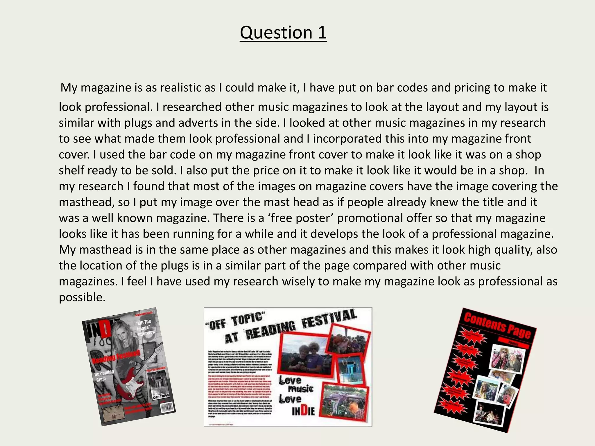
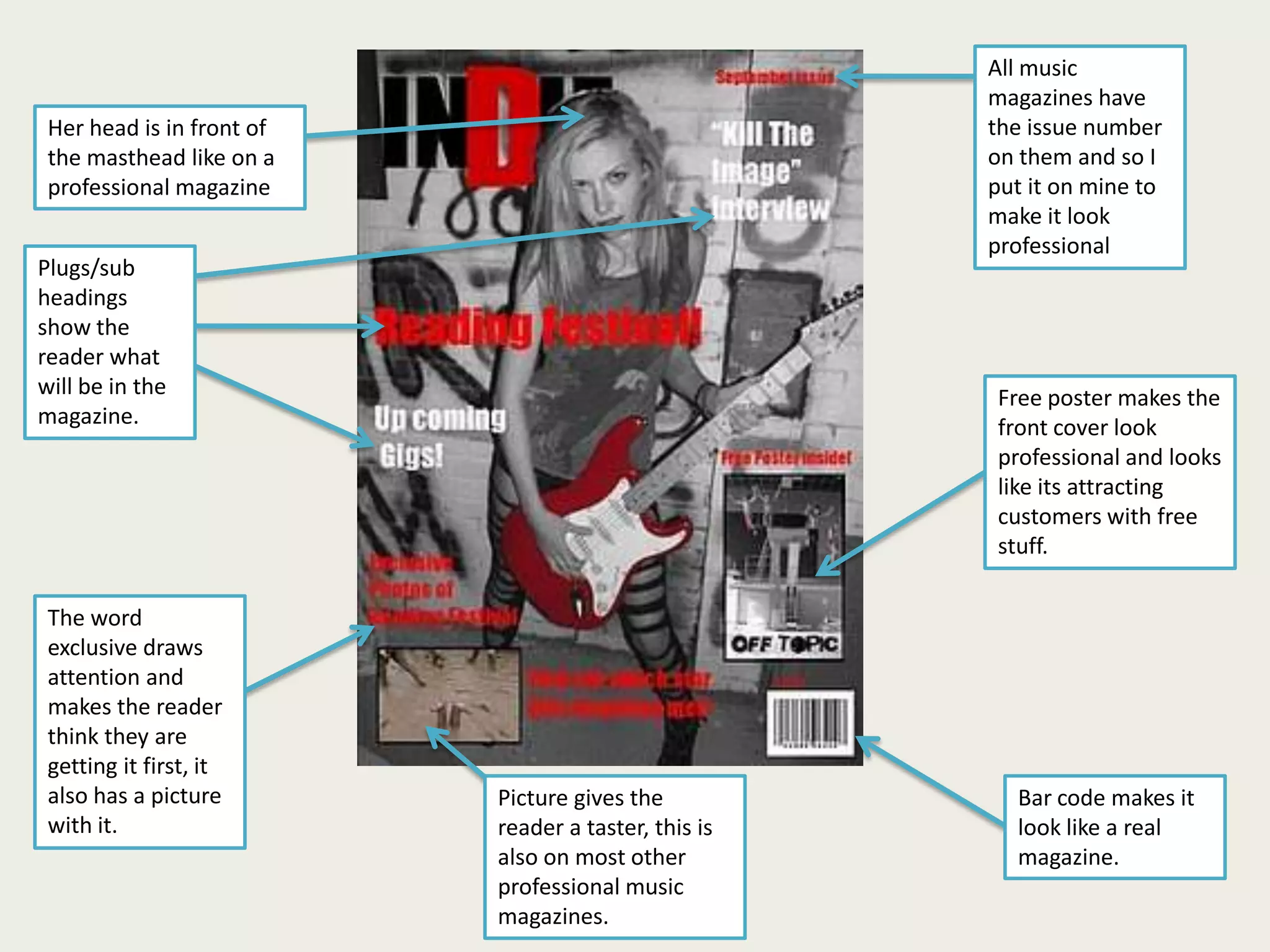
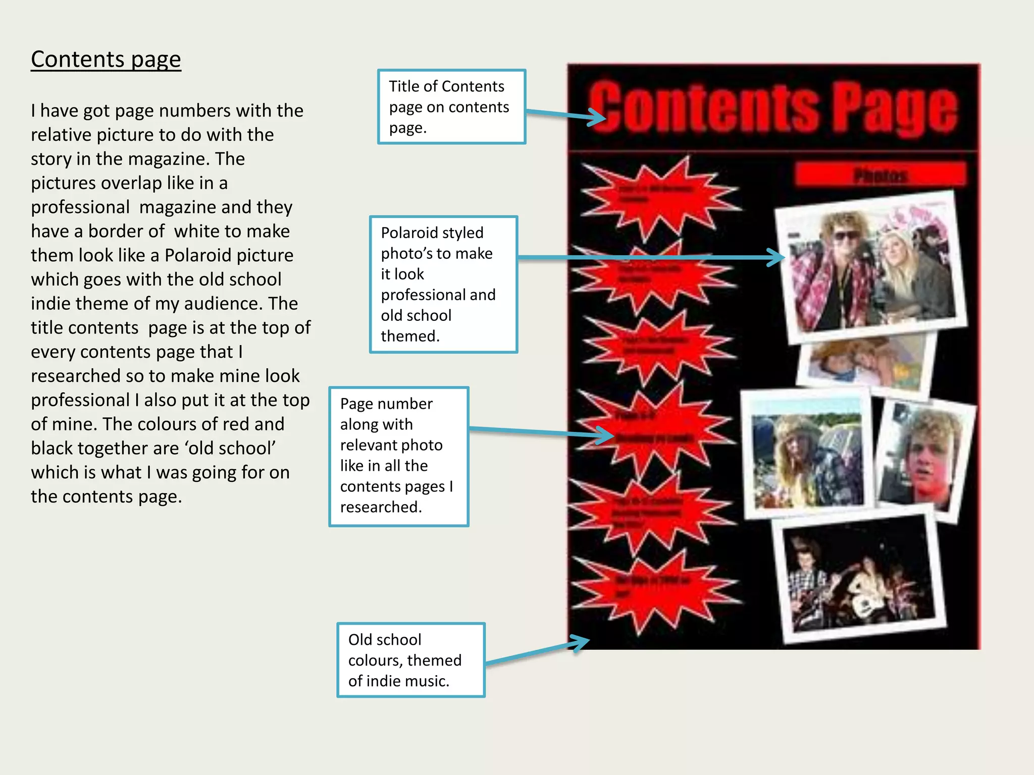
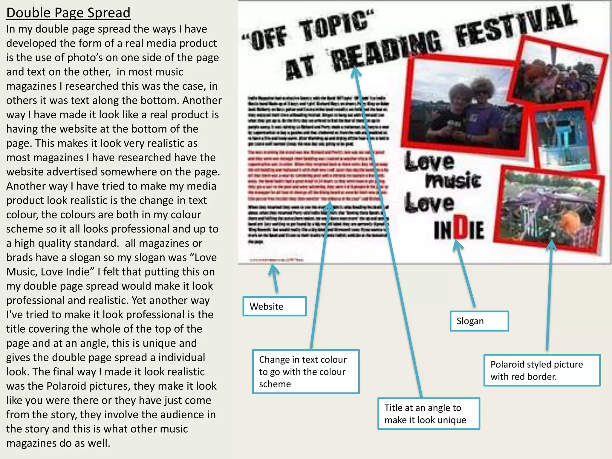
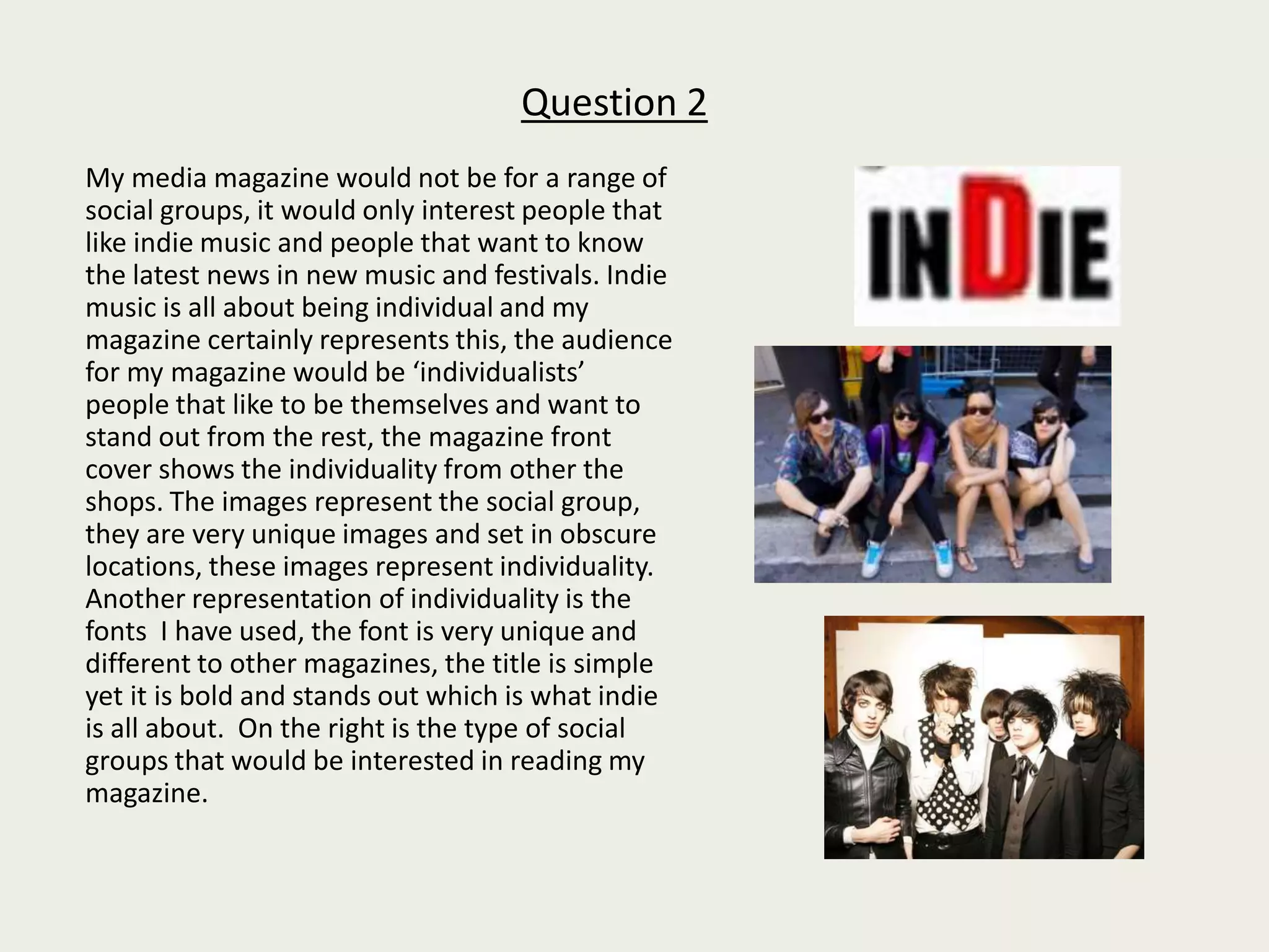
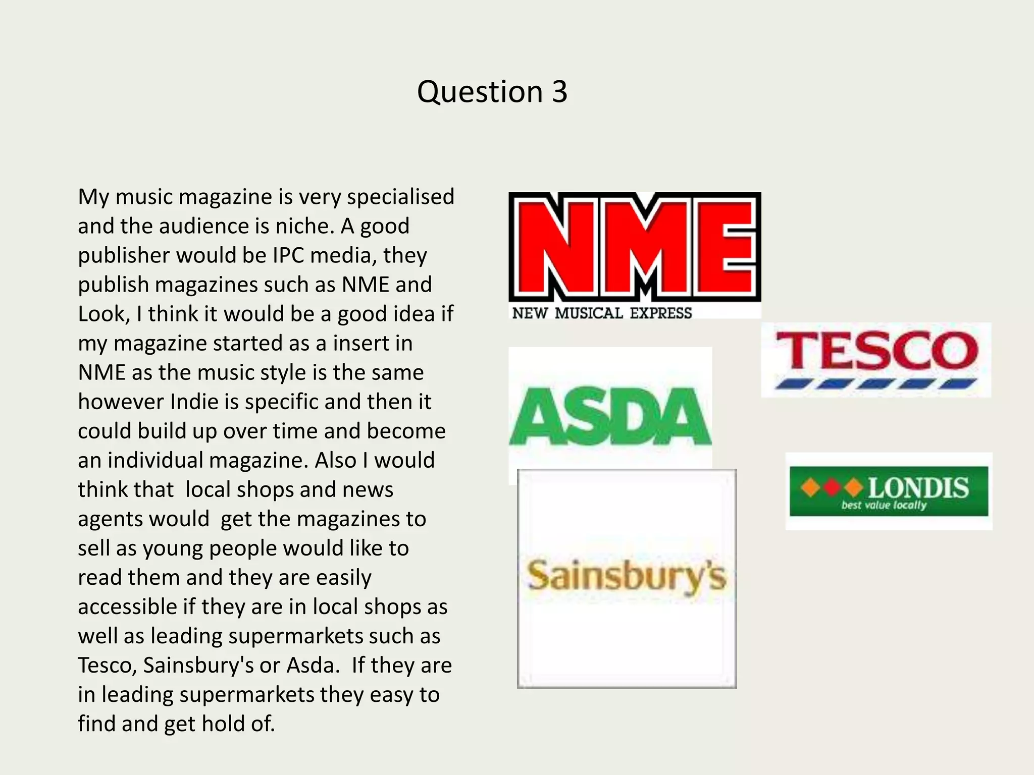
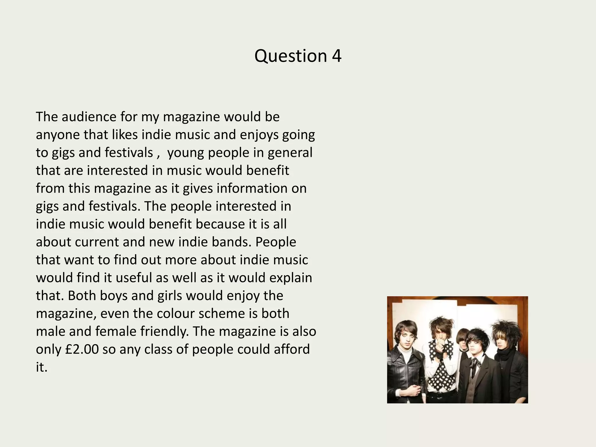
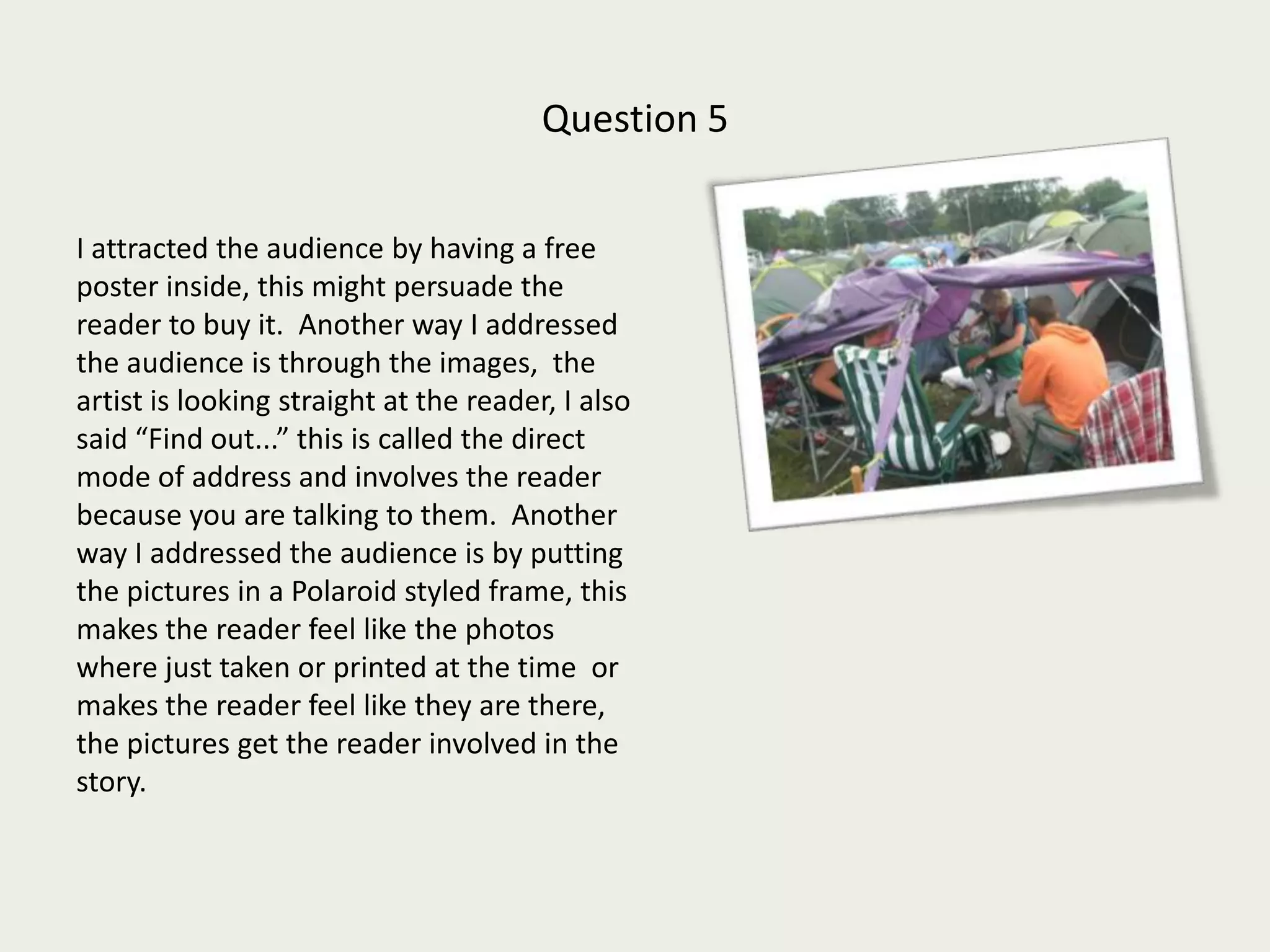
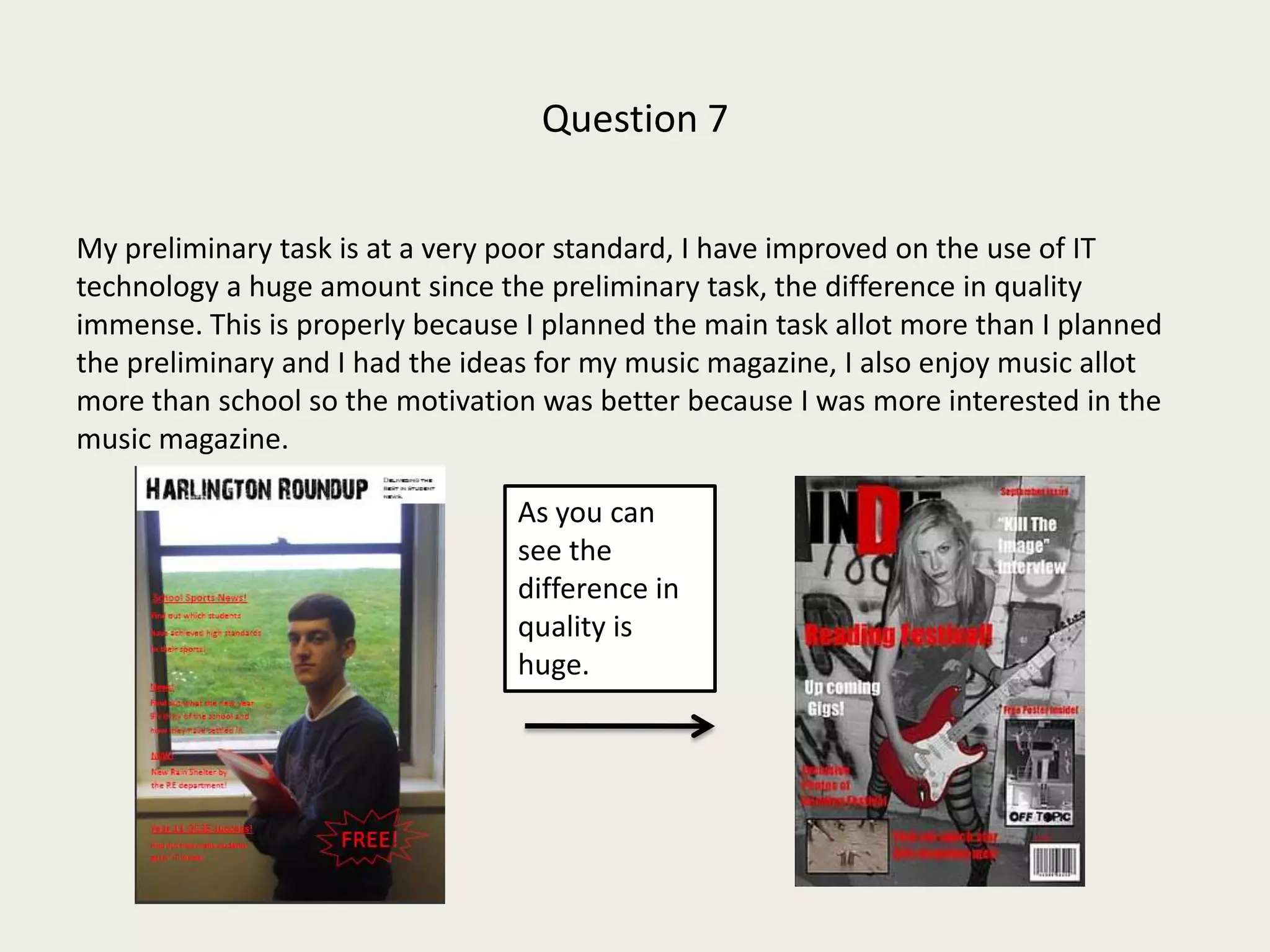
Media EvaluationIndie Magazine
Question 1   In what ways does your media product use, develop or challenge forms and conventions of real media products?
Question 1My magazine is as realistic as I could make it, I have put on bar codes and pricing to make it look professional. I researched other music magazines to look at the layout and my layout is similar with plugs and adverts in the side. I looked at other music magazines in my research to see what made them look professional and I incorporated this into my magazine front cover. I used the bar code on my magazine front cover to make it look like it was on a shop shelf ready to be sold. I also put the price on it to make it look like it would be in a shop.  In my research I found that most of the images on magazine covers have the image covering the masthead, so I put my image over the mast head as if people already knew the title and it was a well known magazine. There is a ‘free poster’ promotional offer so that my magazine looks like it has been running for a while and it develops the look of a professional magazine. My masthead is in the same place as other magazines and this makes it look high quality, also the location of the plugs is in a similar part of the page compared with other music magazines. I feel I have used my research wisely to make my magazine look as professional as possible.
All music magazines have the issue number on them and so I put it on mine to make it look professional Her head is in front of the masthead like on a professional magazinePlugs/sub headings show the reader what will be in the magazine.Free poster makes the front cover look professional and looks like its attracting customers with free stuff.The word exclusive draws attention and makes the reader think they are getting it first, it also has a picture with it.Picture gives the reader a taster, this is also on most other professional music magazines.Bar code makes it look like a real magazine.
Contents page I have got page numbers with the relative picture to do with the story in the magazine. The pictures overlap like in a professional  magazine and they have a border of  white to make them look like a Polaroid picture  which goes with the old school indie theme of my audience. The title contents  page is at the top of every contents page that I researched so to make mine look professional I also put it at the top of mine. The colours of red and black together are ‘old school’ which is what I was going for on the contents page.Title of Contents page on contents page.Polaroid styled photo’s to make it look professional and old school themed.Page number along with relevant photo like in all the contents pages I researched.Old school colours, themed of indie music.
Double Page SpreadIn my double page spread the ways I have  developed the form of a real media product is the use of photo’s on one side of the page and text on the other,  in most music magazines I researched this was the case, in others it was text along the bottom. Another way I have made it look like a real product is having the website at the bottom of the page. This makes it look very realistic as most magazines I have researched have the website advertised somewhere on the page.  Another way I have tried to make my media product look realistic is the change in text colour, the colours are both in my colour scheme so it all looks professional and up to a high quality standard.  all magazines or brads have a slogan so my slogan was “Love Music, Love Indie” I felt that putting this on my double page spread would make it look professional and realistic. Yet another way I've tried to make it look professional is the title covering the whole of the top of the page and at an angle, this is unique and gives the double page spread a individual look. The final way I made it look realistic was the Polaroid pictures, they make it look like you were there or they have just come from the story, they involve the audience in the story and this is what other music magazines do as well. WebsiteSlogan Change in text colour to go with the colour schemePolaroid styled picture with red border. Title at an angle to make it look unique
How does your media product represent particular social groups?
Question 2       My media magazine would not be for a range of social groups, it would only interest people that like indie music and people that want to know the latest news in new music and festivals. Indie music is all about being individual and my magazine certainly represents this, the audience for my magazine would be ‘individualists’  people that like to be themselves and want to stand out from the rest, the magazine front cover shows the individuality from other the shops. The images represent the social group, they are very unique images and set in obscure locations, these images represent individuality. Another representation of individuality is the fonts  I have used, the font is very unique and different to other magazines, the title is simple yet it is bold and stands out which is what indie is all about.  On the right is the type of social groups that would be interested in reading my magazine.
What kind of media institution might distribute your media product and why?
Question 3        My music magazine is very specialised and the audience is niche. A good publisher would be IPC media, they publish magazines such as NME and Look, I think it would be a good idea if my magazine started as a insert in NME as the music style is the same however Indie is specific and then it could build up over time and become an individual magazine. Also I would think that  local shops and news agents would  get the magazines to sell as young people would like to read them and they are easily accessible if they are in local shops as well as leading supermarkets such as Tesco, Sainsbury's or Asda.  If they are in leading supermarkets they easy to find and get hold of.
Who would be the audience for your media product?
Question 4 The audience for my magazine would be anyone that likes indie music and enjoys going to gigs and festivals ,  young people in general that are interested in music would benefit from this magazine as it gives information on gigs and festivals. The people interested in indie music would benefit because it is all about current and new indie bands. People that want to find out more about indie music would find it useful as well as it would explain that. Both boys and girls would enjoy the magazine, even the colour scheme is both male and female friendly. The magazine is also only £2.00 so any class of people could afford it.
How did you attract/address your audience?
Question 5I attracted the audience by having a free poster inside, this might persuade the reader to buy it.  Another way I addressed the audience is through the images,  the artist is looking straight at the reader, I also said “Find out...” this is called the direct mode of address and involves the reader because you are talking to them.  Another way I addressed the audience is by putting the pictures in a Polaroid styled frame, this makes the reader feel like the photos where just taken or printed at the time  or makes the reader feel like they are there, the pictures get the reader involved in the story.
What have you learnt about technologies from the process of constructing this product?
Question 6 I had never used Photoshop until this project, there were some complications, and I found it difficult to cut out images and to get the photo’s I wanted on there in the correct size, after this complication I found it easy to use as the rest was rather simple.  Photoshop is really helpful because it allows you to edit the images to a high standard. I also used blog spot to post my work and I found this programme easy to use. Another programme I used was publisher, I found it hard to get the images from paint or wherever they were onto publisher, the files were either to big or to small or distorted, i eventually got round this problem.
Looking back at your preliminary task, what do you feel you have learnt in the progression from it to the full product?
Question 7My preliminary task is at a very poor standard, I have improved on the use of IT technology a huge amount since the preliminary task, the difference in quality immense. This is properly because I planned the main task allot more than I planned the preliminary and I had the ideas for my music magazine, I also enjoy music allot more than school so the motivation was better because I was more interested in the music magazine. As you can see the difference in quality is huge.

Media evaluation task

  • 1.
  • 2.
    Question 1 In what ways does your media product use, develop or challenge forms and conventions of real media products?
  • 3.
    Question 1My magazineis as realistic as I could make it, I have put on bar codes and pricing to make it look professional. I researched other music magazines to look at the layout and my layout is similar with plugs and adverts in the side. I looked at other music magazines in my research to see what made them look professional and I incorporated this into my magazine front cover. I used the bar code on my magazine front cover to make it look like it was on a shop shelf ready to be sold. I also put the price on it to make it look like it would be in a shop. In my research I found that most of the images on magazine covers have the image covering the masthead, so I put my image over the mast head as if people already knew the title and it was a well known magazine. There is a ‘free poster’ promotional offer so that my magazine looks like it has been running for a while and it develops the look of a professional magazine. My masthead is in the same place as other magazines and this makes it look high quality, also the location of the plugs is in a similar part of the page compared with other music magazines. I feel I have used my research wisely to make my magazine look as professional as possible.
  • 4.
    All music magazineshave the issue number on them and so I put it on mine to make it look professional Her head is in front of the masthead like on a professional magazinePlugs/sub headings show the reader what will be in the magazine.Free poster makes the front cover look professional and looks like its attracting customers with free stuff.The word exclusive draws attention and makes the reader think they are getting it first, it also has a picture with it.Picture gives the reader a taster, this is also on most other professional music magazines.Bar code makes it look like a real magazine.
  • 5.
    Contents page Ihave got page numbers with the relative picture to do with the story in the magazine. The pictures overlap like in a professional magazine and they have a border of white to make them look like a Polaroid picture which goes with the old school indie theme of my audience. The title contents page is at the top of every contents page that I researched so to make mine look professional I also put it at the top of mine. The colours of red and black together are ‘old school’ which is what I was going for on the contents page.Title of Contents page on contents page.Polaroid styled photo’s to make it look professional and old school themed.Page number along with relevant photo like in all the contents pages I researched.Old school colours, themed of indie music.
  • 6.
    Double Page SpreadInmy double page spread the ways I have developed the form of a real media product is the use of photo’s on one side of the page and text on the other, in most music magazines I researched this was the case, in others it was text along the bottom. Another way I have made it look like a real product is having the website at the bottom of the page. This makes it look very realistic as most magazines I have researched have the website advertised somewhere on the page. Another way I have tried to make my media product look realistic is the change in text colour, the colours are both in my colour scheme so it all looks professional and up to a high quality standard. all magazines or brads have a slogan so my slogan was “Love Music, Love Indie” I felt that putting this on my double page spread would make it look professional and realistic. Yet another way I've tried to make it look professional is the title covering the whole of the top of the page and at an angle, this is unique and gives the double page spread a individual look. The final way I made it look realistic was the Polaroid pictures, they make it look like you were there or they have just come from the story, they involve the audience in the story and this is what other music magazines do as well. WebsiteSlogan Change in text colour to go with the colour schemePolaroid styled picture with red border. Title at an angle to make it look unique
  • 7.
    How does yourmedia product represent particular social groups?
  • 8.
    Question 2 My media magazine would not be for a range of social groups, it would only interest people that like indie music and people that want to know the latest news in new music and festivals. Indie music is all about being individual and my magazine certainly represents this, the audience for my magazine would be ‘individualists’ people that like to be themselves and want to stand out from the rest, the magazine front cover shows the individuality from other the shops. The images represent the social group, they are very unique images and set in obscure locations, these images represent individuality. Another representation of individuality is the fonts I have used, the font is very unique and different to other magazines, the title is simple yet it is bold and stands out which is what indie is all about. On the right is the type of social groups that would be interested in reading my magazine.
  • 9.
    What kind ofmedia institution might distribute your media product and why?
  • 10.
    Question 3 My music magazine is very specialised and the audience is niche. A good publisher would be IPC media, they publish magazines such as NME and Look, I think it would be a good idea if my magazine started as a insert in NME as the music style is the same however Indie is specific and then it could build up over time and become an individual magazine. Also I would think that local shops and news agents would get the magazines to sell as young people would like to read them and they are easily accessible if they are in local shops as well as leading supermarkets such as Tesco, Sainsbury's or Asda. If they are in leading supermarkets they easy to find and get hold of.
  • 11.
    Who would bethe audience for your media product?
  • 12.
    Question 4 Theaudience for my magazine would be anyone that likes indie music and enjoys going to gigs and festivals , young people in general that are interested in music would benefit from this magazine as it gives information on gigs and festivals. The people interested in indie music would benefit because it is all about current and new indie bands. People that want to find out more about indie music would find it useful as well as it would explain that. Both boys and girls would enjoy the magazine, even the colour scheme is both male and female friendly. The magazine is also only £2.00 so any class of people could afford it.
  • 13.
    How did youattract/address your audience?
  • 14.
    Question 5I attractedthe audience by having a free poster inside, this might persuade the reader to buy it. Another way I addressed the audience is through the images, the artist is looking straight at the reader, I also said “Find out...” this is called the direct mode of address and involves the reader because you are talking to them. Another way I addressed the audience is by putting the pictures in a Polaroid styled frame, this makes the reader feel like the photos where just taken or printed at the time or makes the reader feel like they are there, the pictures get the reader involved in the story.
  • 15.
    What have youlearnt about technologies from the process of constructing this product?
  • 16.
    Question 6 Ihad never used Photoshop until this project, there were some complications, and I found it difficult to cut out images and to get the photo’s I wanted on there in the correct size, after this complication I found it easy to use as the rest was rather simple. Photoshop is really helpful because it allows you to edit the images to a high standard. I also used blog spot to post my work and I found this programme easy to use. Another programme I used was publisher, I found it hard to get the images from paint or wherever they were onto publisher, the files were either to big or to small or distorted, i eventually got round this problem.
  • 17.
    Looking back atyour preliminary task, what do you feel you have learnt in the progression from it to the full product?
  • 18.
    Question 7My preliminarytask is at a very poor standard, I have improved on the use of IT technology a huge amount since the preliminary task, the difference in quality immense. This is properly because I planned the main task allot more than I planned the preliminary and I had the ideas for my music magazine, I also enjoy music allot more than school so the motivation was better because I was more interested in the music magazine. As you can see the difference in quality is huge.