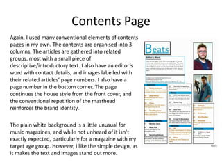
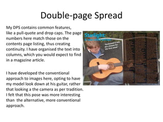
Evaluation Question 1
In what ways does your media product
use, develop or challenge forms and
conventions of real media products?
For the most part, I have stuck to the
conventions of magazines. To do otherwise
would have been perhaps rather counter-
productive, as such a design could quite possibly
be unrecognisable as a magazine, the front
cover maybe looking more like a poster of some
kind. In addition, it could possibly alienate a
mainstream audience.
Mode of Address
I created an informal mode of address in my
magazine, which is perhaps comparable to
Kerrang! or Q.
I used informal language, mid-to-low register,
with the occasional slang word thrown in. I tried
to create a conversational, slightly chatty tone
which would fit in with the language used by my
target audience.
Front Cover
I used many of the conventional
aspects of a front cover, so that my
product would have the appearance
of a music magazine, and not a
poster. For example, I placed my
masthead at the top of the pace, in
the right-hand corner, which is a
classic location. I have also included
features such as coverlines, images
of ‘music artists’, a puff and a
barcode. Also, I used a conventional
mid-shot for my central image.
Contents Page
Again, I used many conventional elements of contents
pages in my own. The contents are organised into 3
columns. The articles are gathered into related
groups, most with a small piece of
descriptive/introductory text. I also have an editor’s
word with contact details, and images labelled with
their related articles’ page numbers. I also have a
page number in the bottom corner. The page
continues the house style from the front cover, and
the conventional repetition of the masthead
reinforces the brand identity.
The plain white background is a little unusual for
music magazines, and while not unheard of it isn’t
exactly expected, particularly for a magazine with my
target age group. However, I like the simple design, as
it makes the text and images stand out more.
Double-page Spread
My DPS contains common features,
like a pull-quote and drop caps. The page
numbers here match those on the
contents page listing, thus creating
continuity. I have organised the text into
columns, which you would expect to find
in a magazine article.
I have developed the conventional
approach to images here, opting to have
my model look down at his guitar, rather
that looking a the camera as per tradition.
I felt that this pose was more interesting
than the alternative, more conventional
approach.

Media eval Question 1

  • 1.
    Evaluation Question 1 Inwhat ways does your media product use, develop or challenge forms and conventions of real media products?
  • 2.
    For the mostpart, I have stuck to the conventions of magazines. To do otherwise would have been perhaps rather counter- productive, as such a design could quite possibly be unrecognisable as a magazine, the front cover maybe looking more like a poster of some kind. In addition, it could possibly alienate a mainstream audience.
  • 3.
    Mode of Address Icreated an informal mode of address in my magazine, which is perhaps comparable to Kerrang! or Q. I used informal language, mid-to-low register, with the occasional slang word thrown in. I tried to create a conversational, slightly chatty tone which would fit in with the language used by my target audience.
  • 4.
    Front Cover I usedmany of the conventional aspects of a front cover, so that my product would have the appearance of a music magazine, and not a poster. For example, I placed my masthead at the top of the pace, in the right-hand corner, which is a classic location. I have also included features such as coverlines, images of ‘music artists’, a puff and a barcode. Also, I used a conventional mid-shot for my central image.
  • 5.
    Contents Page Again, Iused many conventional elements of contents pages in my own. The contents are organised into 3 columns. The articles are gathered into related groups, most with a small piece of descriptive/introductory text. I also have an editor’s word with contact details, and images labelled with their related articles’ page numbers. I also have a page number in the bottom corner. The page continues the house style from the front cover, and the conventional repetition of the masthead reinforces the brand identity. The plain white background is a little unusual for music magazines, and while not unheard of it isn’t exactly expected, particularly for a magazine with my target age group. However, I like the simple design, as it makes the text and images stand out more.
  • 6.
    Double-page Spread My DPScontains common features, like a pull-quote and drop caps. The page numbers here match those on the contents page listing, thus creating continuity. I have organised the text into columns, which you would expect to find in a magazine article. I have developed the conventional approach to images here, opting to have my model look down at his guitar, rather that looking a the camera as per tradition. I felt that this pose was more interesting than the alternative, more conventional approach.