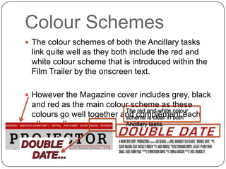
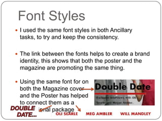
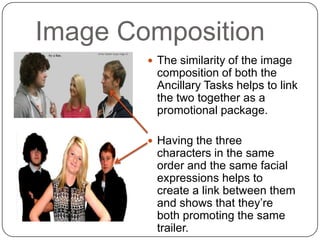
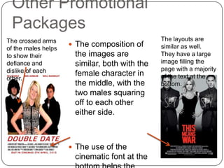
Combination
Film Trailer and Ancillary Tasks
Colour Schemes
 The colour schemes of both the Ancillary tasks
 link quite well as they both include the red and
 white colour scheme that is introduced within the
 Film Trailer by the onscreen text.

 However the Magazine cover includes grey, black
 and red as the main colour scheme as these
                           The red and white colour
 colours go well together and complement each
                           scheme is clear in both
 other well.               Ancillary tasks.
Font Styles
 I used the same font styles in both Ancillary
 tasks, to try and keep the consistency.

 The link between the fonts helps to create a brand
 identity, this shows that both the poster and the
 magazine are promoting the same thing.

 Using the same font for on
 both the Magazine cover
 and the Poster has helped
 to connect them as a
 promotional package
Image Composition
         The similarity of the image
         composition of both the
         Ancillary Tasks helps to link
         the two together as a
         promotional package.

         Having the three
         characters in the same
         order and the same facial
         expressions helps to
         create a link between them
         and shows that they’re
         both promoting the same
         trailer.
Other Promotional
 Packages
The crossed arms                               The layouts are
                      The composition of      similar as well.
of the males helps
to show their         the images are           They have a large
defiance and          similar, both with the   image filling the
dislike of each                                page with a majority
                      female character in      of the text at the
other.
                      the middle, with the     bottom.
                      two males squaring
                      off to each other
                      either side.


                      The use of the
                      cinematic font at the

Media Combination Evaluations

  • 1.
  • 2.
    Colour Schemes  Thecolour schemes of both the Ancillary tasks link quite well as they both include the red and white colour scheme that is introduced within the Film Trailer by the onscreen text.  However the Magazine cover includes grey, black and red as the main colour scheme as these The red and white colour colours go well together and complement each scheme is clear in both other well. Ancillary tasks.
  • 3.
    Font Styles  Iused the same font styles in both Ancillary tasks, to try and keep the consistency.  The link between the fonts helps to create a brand identity, this shows that both the poster and the magazine are promoting the same thing.  Using the same font for on both the Magazine cover and the Poster has helped to connect them as a promotional package
  • 4.
    Image Composition  The similarity of the image composition of both the Ancillary Tasks helps to link the two together as a promotional package.  Having the three characters in the same order and the same facial expressions helps to create a link between them and shows that they’re both promoting the same trailer.
  • 5.
    Other Promotional Packages Thecrossed arms The layouts are  The composition of similar as well. of the males helps to show their the images are They have a large defiance and similar, both with the image filling the dislike of each page with a majority female character in of the text at the other. the middle, with the bottom. two males squaring off to each other either side.  The use of the cinematic font at the