This document discusses the promotional package created for a horror film, including a trailer, magazine cover, and poster. The key elements are:
1) A consistent "house style" was used across all materials with a dark color palette, blurred images of the villain, and similar fonts to tie the pieces together.
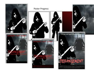
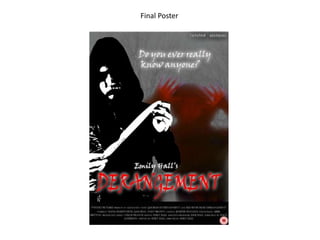
2) The poster prominently features the sharp, red title against a black and grey backdrop to signal the horror genre.
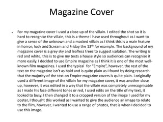
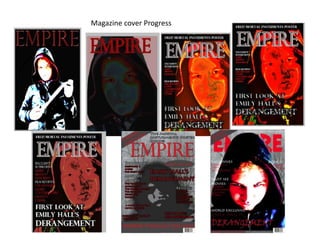
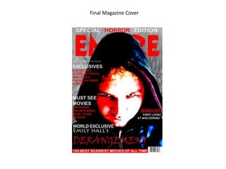
3) The magazine cover shows a close-up of the blurred villain and uses Empire magazine's format with red and white text.
4) Edits to the trailer build tension through changing music, faster cuts, and darker footage before ending with a scare.