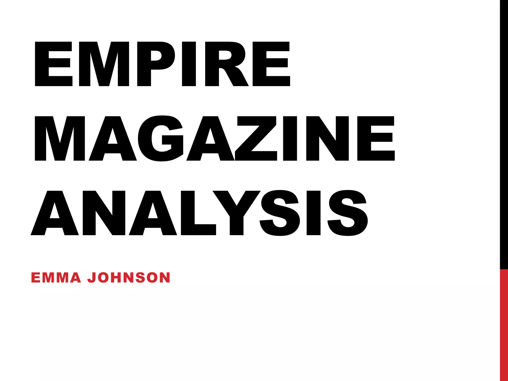
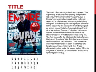
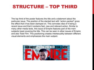
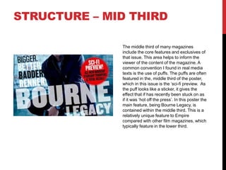
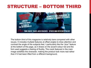
EMPIRE
MAGAZINE
ANALYSIS
EMMA JOHNSON
The title for Empire magazine is synonymous. This
is primarily due to the bold lettering and post box
red colour. Unlike many other magazine, due to
Empire’s commercial success the title no longer
needs to be fully featured on the magazine, giving
designers scope to expand visual graphic elements.
In this poster the title works effectively bringing out
an accent colour that also features in the puff and
other exclusives. The use of pillar box red makes
the title immediately stand out and reflects the
statement colour in traditional cinemas being red.
The font chosen for the title is similar to the famous
Hollywood ‘Anastasia’ font. This font is reminiscent
of Broadway and 1950s cinema. Thus it could be
connoted that Empire has been established for a
long time and has a history with film. These
elements together make the viewer feel as if Empire
magazine is experienced with cinema and thus the
right magazine to buy.
TITLE
CENTRAL IMAGE
The magazine uses a very strong central
image featuring Jeremy Renner. The position
of Renner crouching creates an intimate effect
making the viewer feel included in the content.
This is further emphasized through Renner
breaking the fourth wall by looking directly at
the viewer. As Renner is wearing black in the
image, it enables the text to be lifted off of the
background thus further enhancing the 3D
effect of the poster. Perspective is also
created in the central image due to the angled
stance Renner assumes and the angles of the
wall behind. This helps the composite layers
of the cover to stand out and appear as if they
were taken with the image.
STRUCTURE – TOP THIRD
The top third of the poster features the title and a statement about the
particular issue. The position of the slanted text with “action packed” gives
the effect that it has been stamped on. This connotes idea of it being a
recent issue and that it contains fast, new and relevant action. Similar to
many other media texts, this issue of Empire features part of the main
subjects head covering the title. This can be seen in other issues of Empire
and also Total Film. This positioning creates intertexuality between different
visual elements and emphasizes the main subject.
STRUCTURE – MID THIRD
The middle third of many magazines
include the core features and exclusives of
that issue. This area helps to inform the
viewer of the content of the magazine. A
common convention I found in real media
texts is the use of puffs. The puffs are often
featured in the, middle third of the poster,
which in this issue is the ‘sci-fi preview. As
the puff looks like a sticker, it gives the
effect that if has recently been stuck on as
if it was ‘hot off the press’. In this poster the
main feature, being Bourne Legacy, is
contained within the middle third. This is a
relatively unique feature to Empire
compared with other film magazines, which
typically feature in the lower third.
STRUCTURE – BOTTOM THIRD
The bottom third of this magazine is relatively bare compared with other
issues. It includes multiple features at offset angles to draw attention and
contrast the angle of the subjects feet. I particularly like the “plus” feature
at the bottom of the page, as it draws on the accent colour red and the
font used suggests a feeling of fluidity. The crack featured in the main
image solidifies the character, making the product look more real rather
than if it had been lifted from a different background.

Empire magazine analysis

  • 1.
  • 2.
    The title forEmpire magazine is synonymous. This is primarily due to the bold lettering and post box red colour. Unlike many other magazine, due to Empire’s commercial success the title no longer needs to be fully featured on the magazine, giving designers scope to expand visual graphic elements. In this poster the title works effectively bringing out an accent colour that also features in the puff and other exclusives. The use of pillar box red makes the title immediately stand out and reflects the statement colour in traditional cinemas being red. The font chosen for the title is similar to the famous Hollywood ‘Anastasia’ font. This font is reminiscent of Broadway and 1950s cinema. Thus it could be connoted that Empire has been established for a long time and has a history with film. These elements together make the viewer feel as if Empire magazine is experienced with cinema and thus the right magazine to buy. TITLE
  • 3.
    CENTRAL IMAGE The magazineuses a very strong central image featuring Jeremy Renner. The position of Renner crouching creates an intimate effect making the viewer feel included in the content. This is further emphasized through Renner breaking the fourth wall by looking directly at the viewer. As Renner is wearing black in the image, it enables the text to be lifted off of the background thus further enhancing the 3D effect of the poster. Perspective is also created in the central image due to the angled stance Renner assumes and the angles of the wall behind. This helps the composite layers of the cover to stand out and appear as if they were taken with the image.
  • 4.
    STRUCTURE – TOPTHIRD The top third of the poster features the title and a statement about the particular issue. The position of the slanted text with “action packed” gives the effect that it has been stamped on. This connotes idea of it being a recent issue and that it contains fast, new and relevant action. Similar to many other media texts, this issue of Empire features part of the main subjects head covering the title. This can be seen in other issues of Empire and also Total Film. This positioning creates intertexuality between different visual elements and emphasizes the main subject.
  • 5.
    STRUCTURE – MIDTHIRD The middle third of many magazines include the core features and exclusives of that issue. This area helps to inform the viewer of the content of the magazine. A common convention I found in real media texts is the use of puffs. The puffs are often featured in the, middle third of the poster, which in this issue is the ‘sci-fi preview. As the puff looks like a sticker, it gives the effect that if has recently been stuck on as if it was ‘hot off the press’. In this poster the main feature, being Bourne Legacy, is contained within the middle third. This is a relatively unique feature to Empire compared with other film magazines, which typically feature in the lower third.
  • 6.
    STRUCTURE – BOTTOMTHIRD The bottom third of this magazine is relatively bare compared with other issues. It includes multiple features at offset angles to draw attention and contrast the angle of the subjects feet. I particularly like the “plus” feature at the bottom of the page, as it draws on the accent colour red and the font used suggests a feeling of fluidity. The crack featured in the main image solidifies the character, making the product look more real rather than if it had been lifted from a different background.