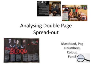
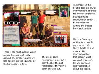
Analysing Double Page
Spread-out
This is a really good
double page spread
out. The
writing, colour and
image fits really well
with each other.
The caption is really
good, and it includes
page numbers which
are key in a magazine.

The image is really
eye-catching. Its bold
and interesting and
each person is
looking at the
camera.

There is no disadvantages of this as it looks very
professional and well laid out. However, there are
so many good points on this, such as the catchy
cover line, in red, which stands it out and the
capital letters in the text.
The images in this
double page are awful
in my opinion. There is
too much background
distraction and
colour, which doesn’t
fit well with the
writing and quotes
from each person.

There is too much colours which
makes the page look really
packed. The smaller images are
bad quality, like too squished or
the lighting is too dark.

The use of page
numbers are okay, but I
didn’t notice them at
first because they don’t
seem to stand out.

There isn’t enough
writing for a double
page spread out.
There should be a lot
more written
information than
that as from what I
can read, it doesn’t
tell you anything
really interesting
about the people.
The lay out on
this double page
spread out
doesn’t link. The
image doesn’t fit
with the writing
as there's no
interaction. If the
picture was
places in a
different position
and not
separated onto
the next page the
in would work
better.
The image has really bad lighting. There's nothing
really eye-catching or standing out in it as the
quality of the photo is very poor. The masthead is
very good though as it stands out, but there is no
cover line to interest you to read more.
Also, there are no page numbers, which are key
to a magazine!

The background colour
of the left hand side
shouldn’t be black, I
think that’s what is
making the image and
the text not link.

Analysing double page

  • 1.
  • 2.
    This is areally good double page spread out. The writing, colour and image fits really well with each other. The caption is really good, and it includes page numbers which are key in a magazine. The image is really eye-catching. Its bold and interesting and each person is looking at the camera. There is no disadvantages of this as it looks very professional and well laid out. However, there are so many good points on this, such as the catchy cover line, in red, which stands it out and the capital letters in the text.
  • 3.
    The images inthis double page are awful in my opinion. There is too much background distraction and colour, which doesn’t fit well with the writing and quotes from each person. There is too much colours which makes the page look really packed. The smaller images are bad quality, like too squished or the lighting is too dark. The use of page numbers are okay, but I didn’t notice them at first because they don’t seem to stand out. There isn’t enough writing for a double page spread out. There should be a lot more written information than that as from what I can read, it doesn’t tell you anything really interesting about the people.
  • 4.
    The lay outon this double page spread out doesn’t link. The image doesn’t fit with the writing as there's no interaction. If the picture was places in a different position and not separated onto the next page the in would work better. The image has really bad lighting. There's nothing really eye-catching or standing out in it as the quality of the photo is very poor. The masthead is very good though as it stands out, but there is no cover line to interest you to read more. Also, there are no page numbers, which are key to a magazine! The background colour of the left hand side shouldn’t be black, I think that’s what is making the image and the text not link.