Idea Development
Joseph Manship
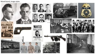
Mood board, image styles
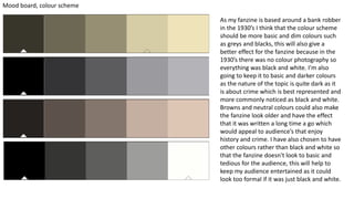
Mood board, colour scheme
As my fanzine is based around a bank robber
in the 1930’s I think that the colour scheme
should be more basic and dim colours such
as greys and blacks, this will also give a
better effect for the fanzine because in the
1930’s there was no colour photography so
everything was black and white. I'm also
going to keep it to basic and darker colours
as the nature of the topic is quite dark as it
is about crime which is best represented and
more commonly noticed as black and white.
Browns and neutral colours could also make
the fanzine look older and have the effect
that it was written a long time a go which
would appeal to audience’s that enjoy
history and crime. I have also chosen to have
other colours rather than black and white so
that the fanzine doesn't look to basic and
tedious for the audience, this will help to
keep my audience entertained as it could
look too formal if it was just black and white.
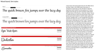
Mood board, font styles
I have chosen the hand written fonts for the effect that it
has been made in the 1930’s when there was no
computers to type text up. This will help to make the
experience more realistic for the audience as if it was a
modern font that was san serif it wouldn't really match
with the theme of the fanzine. I chose the ’Jesper’ font as
it is bold and easy to read as the text will be small on the
fanzine and may be harder to read for older audience’s.
The font ‘linotype mild’ is a nice handwritten font which
would fit the theme but also is a stylish san serif font as
some there is lettering such as the ‘J’ and ‘Y’ that looks
serif which was more popular in the 1930’s. the font
‘eyes wide open’ is a very stylish font that would suit the
theme but is very thin which why I don’t think that I
would use it compared to the other bolder fonts as I feel
some the text would get lost in the background and not
display the full information. The ‘ducelin’ font is a very
stylish and abstract serif font that I think may be a bit too
stylish to give the effect of hand written as it would be
difficult to write like that all the time. If I was to use I
would use the font for subheadings and title’s as it would
look better in short amounts of texts and also be easier
to read if it were a larger font size as the majority of
subheadings are in a lager font. The ‘Samantha’ font is
probably my favourite font out of choice’s and the one
I’m most likely to use in my fanzine, the reason for it is
that I think it looks the most realistic for the the theme of
my fanzine and is also bold enough to be seen by older
audience’s and not get lost in the background. I also like
it, as it is a serif font which is usually linked in with old
fashioned text type.
Pagination:
A plan for the pages of your book. What will be the cover? What will be the running order? What will go in it? How many
pages for each item? This is important to get right if you want it to print correctly later on. It will also help you plan the space
you have.
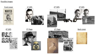
Front cover: I will have a wanted poster with john Dillinger's mugshot on it so that the audience can see that it is
about crime and that the federations wanted him that badly that they stated that they didn't care if he was dead or
alive. This would cause people that didn’t have a very good knowledge of who he was, to wonder why they wanted
him so badly and what he would have had to do to get himself in that situation.
1st DPS: An introduction to Mr. Dillinger's life and briefly discussing why he turned to a life of crime (the great
depression era and the amount of gang’s at that time. Who he met in his first spell in prison). Possible images; the
men he met in prison, a picture of a 1930’s gang. An introduction would be useful as if people don’t know who he
is, will be reading the facts about Mr. Dillinger and not having a full knowledge on why he robbed all them banks.
2nd DPS: My second double page spread will be about all the different banks that he robbed and in the short time
that he robbed them, explaining also that he robbed the weaponry and armor from police stations to further him in
his bank robbing career. Possible images: the banks, the weaponry they stole (Thompson submachine guns, tear gas
bullet proof vest’s).
3rd DPS: For my third double page spread I will talk about his imprisonment and how many times he was in prison,
when he was in prison, what he was imprisoned for and how he broke out of prison using a wooden gun. Possible
images: a picture of his mugshot again, the wooden gun he escaped with, the car he escaped with.
Pagination:
A plan for the pages of your book. What will be the cover? What will be the running order? What will go in it? How many
pages for each item? This is important to get right if you want it to print correctly later on. It will also help you plan the space
you have.
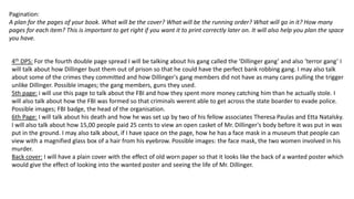
4th DPS: For the fourth double page spread I will be talking about his gang called the ‘Dillinger gang’ and also ‘terror gang’ I
will talk about how Dillinger bust them out of prison so that he could have the perfect bank robbing gang. I may also talk
about some of the crimes they committed and how Dillinger's gang members did not have as many cares pulling the trigger
unlike Dillinger. Possible images; the gang members, guns they used.
5th page: i will use this page to talk about the FBI and how they spent more money catching him than he actually stole. I
will also talk about how the FBI was formed so that criminals werent able to get across the state boarder to evade police.
Possible images; FBI badge, the head of the organisation.
6th Page: I will talk about his death and how he was set up by two of his fellow associates Theresa Paulas and Etta Natalsky.
I will also talk about how 15,00 people paid 25 cents to view an open casket of Mr. Dillinger's body before it was put in was
put in the ground. I may also talk about, if I have space on the page, how he has a face mask in a museum that people can
view with a magnified glass box of a hair from his eyebrow. Possible images: the face mask, the two women involved in his
murder.
Back cover: I will have a plain cover with the effect of old worn paper so that it looks like the back of a wanted poster which
would give the effect of looking into the wanted poster and seeing the life of Mr. Dillinger.
Front cover
Possible images
1st DPS 2nd DPS 3rd DPS
4th DPS 5th Page 6th Page Back cover
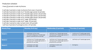
Production schedule:
Weeks/Days Monday (Full day) Wednesday (3 periods) Thursday (2 periods)
Week 1 • I will design my front cover.
• I will start to design my 1st double page
spread. (2 periods left the next day)
• I will finish my 1st double page spread.
• I will start my 2nd double page spread. (3
periods left the next day)
• I continue my 2nd double page spread
production. (1 period left the next day)
Week 2 • I will finish my 2nd double page spread.
• I will start my 3rd double page spread. (1
period left the next day)
• I will finish my 3rd double page spread.
• I will start my 4th double page spread. (2
periods left the next day)
• I will finish my 4th double page spread.
Week 3 • I will design my 5th page.
• I will design my 6th page.
• I will design my back cover.
• Contingency.
• Contingency
I have 27 periods to make my fanzine.
It will take 2 periods to make my fanzine front cover. (2 period)
It will take 4 periods to make my 1st double page spread. (6 periods)
It will take 4 periods to make my 2nd double page spread. (10 periods)
It will take 4 periods to make my 3rd double page spread. (14 periods)
It will take 4 periods to make my 4th double page spread. (18 periods)
It will take 2 periods to make my 5th page. (20 periods)
It will take 2 periods to make my 6th page. (22 periods)
It will take 1 period to make my back cover. (23 periods)
I will have 4 periods of contingency time. (27 periods)

2. idea development yr2

  • 1.
  • 2.
  • 3.
    Mood board, colourscheme As my fanzine is based around a bank robber in the 1930’s I think that the colour scheme should be more basic and dim colours such as greys and blacks, this will also give a better effect for the fanzine because in the 1930’s there was no colour photography so everything was black and white. I'm also going to keep it to basic and darker colours as the nature of the topic is quite dark as it is about crime which is best represented and more commonly noticed as black and white. Browns and neutral colours could also make the fanzine look older and have the effect that it was written a long time a go which would appeal to audience’s that enjoy history and crime. I have also chosen to have other colours rather than black and white so that the fanzine doesn't look to basic and tedious for the audience, this will help to keep my audience entertained as it could look too formal if it was just black and white.
  • 4.
    Mood board, fontstyles I have chosen the hand written fonts for the effect that it has been made in the 1930’s when there was no computers to type text up. This will help to make the experience more realistic for the audience as if it was a modern font that was san serif it wouldn't really match with the theme of the fanzine. I chose the ’Jesper’ font as it is bold and easy to read as the text will be small on the fanzine and may be harder to read for older audience’s. The font ‘linotype mild’ is a nice handwritten font which would fit the theme but also is a stylish san serif font as some there is lettering such as the ‘J’ and ‘Y’ that looks serif which was more popular in the 1930’s. the font ‘eyes wide open’ is a very stylish font that would suit the theme but is very thin which why I don’t think that I would use it compared to the other bolder fonts as I feel some the text would get lost in the background and not display the full information. The ‘ducelin’ font is a very stylish and abstract serif font that I think may be a bit too stylish to give the effect of hand written as it would be difficult to write like that all the time. If I was to use I would use the font for subheadings and title’s as it would look better in short amounts of texts and also be easier to read if it were a larger font size as the majority of subheadings are in a lager font. The ‘Samantha’ font is probably my favourite font out of choice’s and the one I’m most likely to use in my fanzine, the reason for it is that I think it looks the most realistic for the the theme of my fanzine and is also bold enough to be seen by older audience’s and not get lost in the background. I also like it, as it is a serif font which is usually linked in with old fashioned text type.
  • 5.
    Pagination: A plan forthe pages of your book. What will be the cover? What will be the running order? What will go in it? How many pages for each item? This is important to get right if you want it to print correctly later on. It will also help you plan the space you have. Front cover: I will have a wanted poster with john Dillinger's mugshot on it so that the audience can see that it is about crime and that the federations wanted him that badly that they stated that they didn't care if he was dead or alive. This would cause people that didn’t have a very good knowledge of who he was, to wonder why they wanted him so badly and what he would have had to do to get himself in that situation. 1st DPS: An introduction to Mr. Dillinger's life and briefly discussing why he turned to a life of crime (the great depression era and the amount of gang’s at that time. Who he met in his first spell in prison). Possible images; the men he met in prison, a picture of a 1930’s gang. An introduction would be useful as if people don’t know who he is, will be reading the facts about Mr. Dillinger and not having a full knowledge on why he robbed all them banks. 2nd DPS: My second double page spread will be about all the different banks that he robbed and in the short time that he robbed them, explaining also that he robbed the weaponry and armor from police stations to further him in his bank robbing career. Possible images: the banks, the weaponry they stole (Thompson submachine guns, tear gas bullet proof vest’s). 3rd DPS: For my third double page spread I will talk about his imprisonment and how many times he was in prison, when he was in prison, what he was imprisoned for and how he broke out of prison using a wooden gun. Possible images: a picture of his mugshot again, the wooden gun he escaped with, the car he escaped with.
  • 6.
    Pagination: A plan forthe pages of your book. What will be the cover? What will be the running order? What will go in it? How many pages for each item? This is important to get right if you want it to print correctly later on. It will also help you plan the space you have. 4th DPS: For the fourth double page spread I will be talking about his gang called the ‘Dillinger gang’ and also ‘terror gang’ I will talk about how Dillinger bust them out of prison so that he could have the perfect bank robbing gang. I may also talk about some of the crimes they committed and how Dillinger's gang members did not have as many cares pulling the trigger unlike Dillinger. Possible images; the gang members, guns they used. 5th page: i will use this page to talk about the FBI and how they spent more money catching him than he actually stole. I will also talk about how the FBI was formed so that criminals werent able to get across the state boarder to evade police. Possible images; FBI badge, the head of the organisation. 6th Page: I will talk about his death and how he was set up by two of his fellow associates Theresa Paulas and Etta Natalsky. I will also talk about how 15,00 people paid 25 cents to view an open casket of Mr. Dillinger's body before it was put in was put in the ground. I may also talk about, if I have space on the page, how he has a face mask in a museum that people can view with a magnified glass box of a hair from his eyebrow. Possible images: the face mask, the two women involved in his murder. Back cover: I will have a plain cover with the effect of old worn paper so that it looks like the back of a wanted poster which would give the effect of looking into the wanted poster and seeing the life of Mr. Dillinger.
  • 7.
    Front cover Possible images 1stDPS 2nd DPS 3rd DPS 4th DPS 5th Page 6th Page Back cover
  • 8.
    Production schedule: Weeks/Days Monday(Full day) Wednesday (3 periods) Thursday (2 periods) Week 1 • I will design my front cover. • I will start to design my 1st double page spread. (2 periods left the next day) • I will finish my 1st double page spread. • I will start my 2nd double page spread. (3 periods left the next day) • I continue my 2nd double page spread production. (1 period left the next day) Week 2 • I will finish my 2nd double page spread. • I will start my 3rd double page spread. (1 period left the next day) • I will finish my 3rd double page spread. • I will start my 4th double page spread. (2 periods left the next day) • I will finish my 4th double page spread. Week 3 • I will design my 5th page. • I will design my 6th page. • I will design my back cover. • Contingency. • Contingency I have 27 periods to make my fanzine. It will take 2 periods to make my fanzine front cover. (2 period) It will take 4 periods to make my 1st double page spread. (6 periods) It will take 4 periods to make my 2nd double page spread. (10 periods) It will take 4 periods to make my 3rd double page spread. (14 periods) It will take 4 periods to make my 4th double page spread. (18 periods) It will take 2 periods to make my 5th page. (20 periods) It will take 2 periods to make my 6th page. (22 periods) It will take 1 period to make my back cover. (23 periods) I will have 4 periods of contingency time. (27 periods)

Editor's Notes

  • #3  Mood Boards: A range of ideas to take forward in to production. Should include images, colour schemes and font choices. Could include mock ups and evidence of existing design work which is inspiring you.
  • #4  Mood Boards: A range of ideas to take forward in to production. Should include images, colour schemes and font choices. Could include mock ups and evidence of existing design work which is inspiring you.
  • #5  Mood Boards: A range of ideas to take forward in to production. Should include images, colour schemes and font choices. Could include mock ups and evidence of existing design work which is inspiring you.
  • #9 You have 3 weeks to complete your book along with any improvements. You need to plan this. What will you be doing each week? How long should you spend on each task? How will you know if you are head or behind schedule?