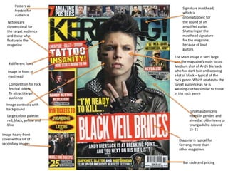
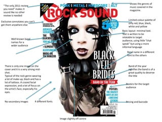
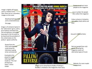
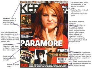
Front
Cover analysis
• Kerrang!
• Rock Sound
• Alternative Press
• Older Kerrang! cover
Signature masthead,
which is
onomatopoeic for
the sound of an
amplified guitar.
Shattering of the
masthead signature
for the magazine,
because of loud
guitars
The Main image is very large
and the magazine’s main focus.
Medium shot of Andy Biersack,
who has dark hair and wearing
a lot of black – typical of the
rock genre. Which relates to the
target audience as he is
wearing clothes similar to those
in the rock genre
Bar code and pricing
Diagonal is typical for
Kerrang, more than
other magazines
Posters as
freebie for
audience
Tattoos are
conventional for
the target audience
and those who
feature in the
magazine
Competition for rock
festival tickets
To attract target
audience
Image heavy front
cover with a lot of
secondary images
4 different fonts
Large colour palette:
red, black, yellow and
blue
Image in front of
masthead
Image contrasts with
background
Target audience is
mixed in gender, and
aimed at older teens or
young adults. Around
15-21
Shows the genres of
music covered in the
magazine.
Limited colour palette of
only red, blue, black,
white and yellow
Exclusive connotates you can’t
get them anywhere else
Band of the year
signifies the band is of a
great quality to deserve
the title
Band name in a different
font to the others
Posters for the target
audience
Pricing and barcode
There is only one image on the
cover and it is a very strong mid-
shot.
Typical of the rock genre wearing
a lot of make-up, black and has a
lot of tattoos. A crazed facial
expression, and a lot of focus on
the artist’s face, especially his
eyes.
Well known band
names for a
wider audience
4 different fonts
“The only 2011 review
you need” makes it
sound like no other
review is needed
Basic layout- minimal text.
Text is written to be
relatable to target
audience, using little “chat
speak” but using a more
informal language
No secondary images
Image slightly off centre
Masthead behind image,
and is stretched across
the page.
Image is of someone typical in
the “alternative” genre, with a
lot of tattoos and black hair.
The microphones connotate
how easy it is for his voice to
be heard and the president of
the united states on the
podium signals authority.
Quote from the
main interview that
could show the
interview is going
to be controversial
Contradicts the
powerful image,
referring to the
model as “The real
all American
reject.” entice
reader
Posters to attract more
people to the magazine
Not just people from rock
genre, showing the
magazine covers all
alternative types of music
Stands out to show Ronnie Radke of Falling in
Reverse is involved in the magazines main story.
Website, for more reader
involvement
Colour scheme is limited to
red, yellow, black white and
blue.
Around 5 different fonts
Issue number, for people
who collect the magazine
Image is slightly off centre,
and is a medium shot.
Also, there are no secondary
images on this cover
The image of the female
connotates
rebellion, and, unlike a lot
of magazines featuring
women on their front
covers, the gesture of the
model is not of a sexual
nature, showing the
magazine is aimed at a
different audience, and is
not using sexuality to attract
a larger audience.
Free is used to attract more people
to buy the magazine, and the poster
special of a very well known band is
used to attract more people to buy
the magazine
Plus is used to show there are other
bands covered in the magazine, not
just the band on the cover.
5 different fonts
Paramore is made bigger
to show they’re the main
band in the magazine
Helps the target audience
learn more about the bands
featured in the
magazine, and could possibly
relate to the band on a more
personal level.
Well known bands in
secondary stories, to
attract even more
readers to the magazine
Signature masthead, which
is onomatopoeic for the
sound of an amplified
guitar.
Shattering of the masthead
signature for the
magazine, because of loud
guitars
Colour scheme is
black, orange, white
and red
Very few secondary
images

Front cover analysis

  • 1.
    Front Cover analysis • Kerrang! •Rock Sound • Alternative Press • Older Kerrang! cover
  • 2.
    Signature masthead, which is onomatopoeicfor the sound of an amplified guitar. Shattering of the masthead signature for the magazine, because of loud guitars The Main image is very large and the magazine’s main focus. Medium shot of Andy Biersack, who has dark hair and wearing a lot of black – typical of the rock genre. Which relates to the target audience as he is wearing clothes similar to those in the rock genre Bar code and pricing Diagonal is typical for Kerrang, more than other magazines Posters as freebie for audience Tattoos are conventional for the target audience and those who feature in the magazine Competition for rock festival tickets To attract target audience Image heavy front cover with a lot of secondary images 4 different fonts Large colour palette: red, black, yellow and blue Image in front of masthead Image contrasts with background Target audience is mixed in gender, and aimed at older teens or young adults. Around 15-21
  • 3.
    Shows the genresof music covered in the magazine. Limited colour palette of only red, blue, black, white and yellow Exclusive connotates you can’t get them anywhere else Band of the year signifies the band is of a great quality to deserve the title Band name in a different font to the others Posters for the target audience Pricing and barcode There is only one image on the cover and it is a very strong mid- shot. Typical of the rock genre wearing a lot of make-up, black and has a lot of tattoos. A crazed facial expression, and a lot of focus on the artist’s face, especially his eyes. Well known band names for a wider audience 4 different fonts “The only 2011 review you need” makes it sound like no other review is needed Basic layout- minimal text. Text is written to be relatable to target audience, using little “chat speak” but using a more informal language No secondary images Image slightly off centre
  • 4.
    Masthead behind image, andis stretched across the page. Image is of someone typical in the “alternative” genre, with a lot of tattoos and black hair. The microphones connotate how easy it is for his voice to be heard and the president of the united states on the podium signals authority. Quote from the main interview that could show the interview is going to be controversial Contradicts the powerful image, referring to the model as “The real all American reject.” entice reader Posters to attract more people to the magazine Not just people from rock genre, showing the magazine covers all alternative types of music Stands out to show Ronnie Radke of Falling in Reverse is involved in the magazines main story. Website, for more reader involvement Colour scheme is limited to red, yellow, black white and blue. Around 5 different fonts Issue number, for people who collect the magazine Image is slightly off centre, and is a medium shot. Also, there are no secondary images on this cover
  • 5.
    The image ofthe female connotates rebellion, and, unlike a lot of magazines featuring women on their front covers, the gesture of the model is not of a sexual nature, showing the magazine is aimed at a different audience, and is not using sexuality to attract a larger audience. Free is used to attract more people to buy the magazine, and the poster special of a very well known band is used to attract more people to buy the magazine Plus is used to show there are other bands covered in the magazine, not just the band on the cover. 5 different fonts Paramore is made bigger to show they’re the main band in the magazine Helps the target audience learn more about the bands featured in the magazine, and could possibly relate to the band on a more personal level. Well known bands in secondary stories, to attract even more readers to the magazine Signature masthead, which is onomatopoeic for the sound of an amplified guitar. Shattering of the masthead signature for the magazine, because of loud guitars Colour scheme is black, orange, white and red Very few secondary images