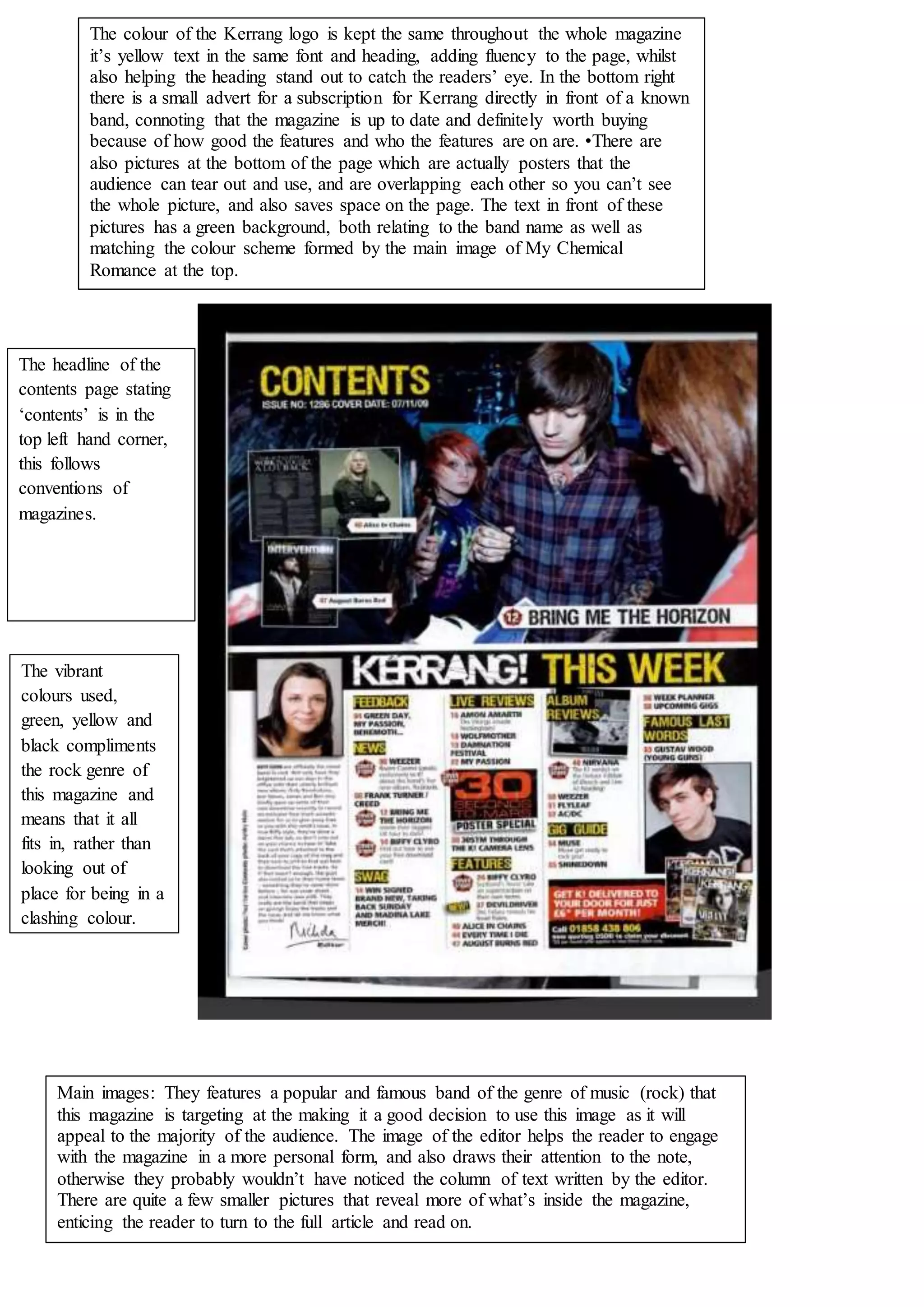
The document discusses the design elements of a magazine page for Kerrang magazine. It keeps the yellow logo and font consistent to provide fluency and catch readers' eyes. It includes a small subscription ad near a featured band to convey the magazine is up-to-date. It also has overlapping band posters that readers can tear out, with a green text background matching the main image's color scheme.
