- Rock Sound is a monthly British magazine focused on rock music that was launched in 1999.
- It has a circulation of 13,220 and targets readers ages 16 and older who have a strong interest in rock music.
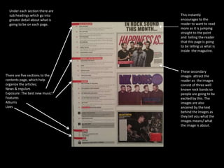
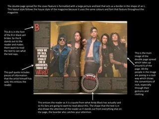
- The magazine covers news, new music, album reviews, features, and concert listings. It uses a consistent style with bold fonts, red and black colors to portray a rock theme.