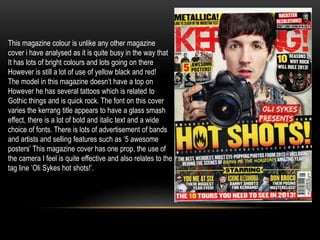
What is genre? 
‘A style or category of art, music and literature.’
Pop 
Rock 
Pop rock is a music genre which mixes a 
catchy pop style and light lyrics in its 
(typically) guitar-based rock songs. There 
are varying definitions of the term, ranging 
from a slower and mellower form of rock 
music to a subgenre of pop music.
Use of colors are mainly red, white, blue 
and black. The theme of this magazine 
would be quite gothic with the dark black 
make up around the eyes and the white 
face. The font is bold and in your face, the 
font of the text stands out sitting on a black 
background as well as the capitols. The 
sell lines used are quite short however 
catchy causing people to want to read on 
, and the photography is also catching to 
the eye, something about the main 
photo makes you want to read more as 
it is a bold feature with interesting 
effects, the model is wearing quite dim 
colors black over coat and a white color 
but the white face brings out bright 
colors, this particular magazine cover 
doesn't used props.
This magazine uses a lot more bright color, there is 
lots of pinks and purple which indicates it focuses 
more on the pop rather than rock, this magazine 
theme is quite girlie as Britney spears appeals to 
young girls, the use of bright feminine colors also 
suggests a feminine theme. There is several fonts 
used on this cover the use of italics on the main sell 
line draws people in and appeals to the younger 
generation. the article sell lines are aimed at 
younger people due to its lexical choices such as 
'pop star' and 'oh behave, Britney!' The main photo 
used on this magazine cover is Britney Spears she 
does have quite a lot of flesh showing however the 
top she is wearing is quite rock with the one sleeve 
and slit and there is a smaller photo of a band 
wearing all black which stands out due to all the 
bright colors, Once again this magazine doesn't use 
any props.
This magazine is also based around red and 
black colours like the mojo magazine front 
cover similarly there is the same white washed 
out face and back ground with dark lips and eye 
Make up which seems to be a common feature 
of rock/pop magazines, the models style is also 
black and white which stands out on the 
background. 
The title is quite hidden by the model however it is a 
bold font, the text at the bottom of the magazine is 
italic which stands up as well throughout the front 
cover uses varied aspects of bold and italic fronts. 
There is catchy article sell lines such as ‘the girl who 
broke the rules’ which sounds appealing.
This magazine colour is unlike any other magazine 
cover i have analysed as it is quite busy in the way that 
It has lots of bright colours and lots going on there 
However is still a lot of use of yellow black and red! 
The model in this magazine doesn’t have a top on 
However he has several tattoos which is related to 
Gothic things and is quick rock. The font on this cover 
varies the kerrang title appears to have a glass smash 
effect, there is a lot of bold and italic text and a wide 
choice of fonts. There is lots of advertisement of bands 
and artists and selling features such as ‘5 awesome 
posters’ This magazine cover has one prop, the use of 
the camera I feel is quite effective and also relates to the 
tag line ’Oli Sykes hot shots!’.
Genre Research

Genre Research

  • 1.
    What is genre? ‘A style or category of art, music and literature.’
  • 2.
    Pop Rock Poprock is a music genre which mixes a catchy pop style and light lyrics in its (typically) guitar-based rock songs. There are varying definitions of the term, ranging from a slower and mellower form of rock music to a subgenre of pop music.
  • 3.
    Use of colorsare mainly red, white, blue and black. The theme of this magazine would be quite gothic with the dark black make up around the eyes and the white face. The font is bold and in your face, the font of the text stands out sitting on a black background as well as the capitols. The sell lines used are quite short however catchy causing people to want to read on , and the photography is also catching to the eye, something about the main photo makes you want to read more as it is a bold feature with interesting effects, the model is wearing quite dim colors black over coat and a white color but the white face brings out bright colors, this particular magazine cover doesn't used props.
  • 4.
    This magazine usesa lot more bright color, there is lots of pinks and purple which indicates it focuses more on the pop rather than rock, this magazine theme is quite girlie as Britney spears appeals to young girls, the use of bright feminine colors also suggests a feminine theme. There is several fonts used on this cover the use of italics on the main sell line draws people in and appeals to the younger generation. the article sell lines are aimed at younger people due to its lexical choices such as 'pop star' and 'oh behave, Britney!' The main photo used on this magazine cover is Britney Spears she does have quite a lot of flesh showing however the top she is wearing is quite rock with the one sleeve and slit and there is a smaller photo of a band wearing all black which stands out due to all the bright colors, Once again this magazine doesn't use any props.
  • 5.
    This magazine isalso based around red and black colours like the mojo magazine front cover similarly there is the same white washed out face and back ground with dark lips and eye Make up which seems to be a common feature of rock/pop magazines, the models style is also black and white which stands out on the background. The title is quite hidden by the model however it is a bold font, the text at the bottom of the magazine is italic which stands up as well throughout the front cover uses varied aspects of bold and italic fronts. There is catchy article sell lines such as ‘the girl who broke the rules’ which sounds appealing.
  • 6.
    This magazine colouris unlike any other magazine cover i have analysed as it is quite busy in the way that It has lots of bright colours and lots going on there However is still a lot of use of yellow black and red! The model in this magazine doesn’t have a top on However he has several tattoos which is related to Gothic things and is quick rock. The font on this cover varies the kerrang title appears to have a glass smash effect, there is a lot of bold and italic text and a wide choice of fonts. There is lots of advertisement of bands and artists and selling features such as ‘5 awesome posters’ This magazine cover has one prop, the use of the camera I feel is quite effective and also relates to the tag line ’Oli Sykes hot shots!’.