
Recommended
More Related Content
What's hot
What's hot (17)
Viewers also liked
Similar to Gaga
Similar to Gaga (20)
More from kodjoe
Recently uploaded
Recently uploaded (8)
Gaga
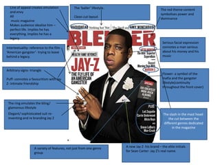
- 1. Line of appeal creates emulation The ‘baller’ lifestyle. The red theme content and envy symbolises power and All Clean cut layout dominance music magazine Makes audience idealise him – perfect life. Implies he has everything. Implies he has a legacy. Serious facial expression Intertextuality- reference to the film connotes a man serious ‘American gangster’- trying to leave about his money and his behind a legacy. music Arbitrary signs- triangle Flower- a symbol of the Puff- connotes a favouritism with Jay mafia and the gangster Z- intimate friendship lifestyle(continuity throughout the front cover) The ring emulates the bling/ glamorous lifestyle Elegant/ sophisticated suit re- The slash in the mast head- inventing and re branding Jay Z the cut between the different genres dedicated in the magazine A variety of features, not just from one genre A new Jay Z- his brand – the elite initials group for Sean Carter- Jay Z’s real name.
- 2. The Large L dominates the whole page, linked to the singers name Lady Gaga. It represents a takeover of the music industry as the L takes over the page and the visual aspect of the double page spread. The Red connotes power and sexuality, and it also is in keep with her personality, being an over the top and almost off character. There is no title on the double page spread just the artists name, ‘Lady Gaga’. The size of the L and the size of However the ‘lady’ is her photo, symbolise the written in lower case largeness of her personality and italics , taking of the dominance of her music and emphasise of the her as an artist. ‘lady’, sophisticated side of her, but drawing attention to The photo has been edited into gray the ‘ GAGA’, shocking scale, to create a 1950’s looks, as performance name another way to enhance her attraction. The medium shot of Lady Gaga depicts her looks directly into the The Photo also being in gray scale, camera, with a sultry look, in keeping with her known forward emphasises the red L, allowing that sexuality, and holding her breasts. Lady Gaga is wearing only a colour to dominate the double page necklace that lays across most of her chest. There is a temptation that spread. was purposely intended with this picture that can contrast as an editorial photo, for a fashion magazine, and also to entice more of the male audience- both widening her target audience.
- 3. Florence’s bright red hair and the vibrant red of the American flag are the only Arbitrary – the lyrics ‘got the love’ from colours on the double page spread. Florence’s no. 1 single is something a fan that Florence is well known for the colour of her knows her music well would know, helps to hair, the only colour on the double page identify her audience and attract her target spread helps the double page spread relate audience. to her as an artist. The colours on the double page spread are red black and white, in keeping with a rock genre Clean layout of text helps to identify her with a more sophisticated audience but also the mise en scene helps to identify her with the more heavy rock artist- her dress and shoes jet black against her flame red hair creates an edgy style artist. Florence is sitting on the American flag although she is from the UK, it is The large image of Florence sitting on the representing her flag dominates most of the double page impact on the US spread emphasising her new dominance and also in the music industry and the impact she broadening her has had as a new artist. target audience us wide.
- 4. Band index- helping the audience to identify which artists will be featuring in the magazine without having to flip through each page. Big heading- brand The layout of the identity contents page is organised as it in lines of three however adhering to a rock genre, there is a lot going on in the page with bold fonts and the font colours red, black and white Additional scenery emphasise the image of ‘worlds dominant and almost greatest music venue’- angry connotations you receive within a adhering to the rock genre. audience interest in the artist and the music industry. The magazine has a give away, to attract its target audience and it is also a way to get a repeat buyer in the magazine.